


无论何时,色彩对设计的诱惑、设计对色彩的探索,都从未中止。它们暧昧地相互试探,似有章法,却无规矩,微妙牵引着视觉的神经末梢。
——设谷空间设计
At any time,the temptation of colours to design,and the exploration of colours in design have never stopped. They slyly test each other, seemingly ruled but actually not,subtly pulling our visual nerve endings.
——By SGD
几十年前,美国设计师夫妻档–伊姆斯夫妇创造出“红非正红,黑非纯黑”的全新色彩,注入伊姆斯椅。
A few decades ago,the American designer couple Charles and Ray Eames created some new colours like “between red and non-red,black and non-black”,and injected them into the Eames Plastic Chair.
建筑大师柯布西耶不断进行色彩实验,创造出了魏森霍夫实验住宅、法国巴黎的马赛公寓(2016 年被列为世界遗产)等作品,惊艳世界。
After the famous architect Le Corbusier experimenting with colours again and again,he created the Weissenhof-Siedlung Houses 14 and 15 and the Marseille apartment in Paris,France.The latter is now a World Heritage Site from 2016,amazing the whole world.
经典的色彩绵延至今,从未流俗。究其原因,应是表象下色彩自带的情绪和暗示。“度”的把握难以言明,这种有趣的能量也须得收放自如,才最为合宜。
The classic colours are still stunning in these days and never been out of date because of the emotions and hints beneath these visual appearances. The degree of colours is so hard to control that without professional manipulation it won‘t be performed beautifully or freely.

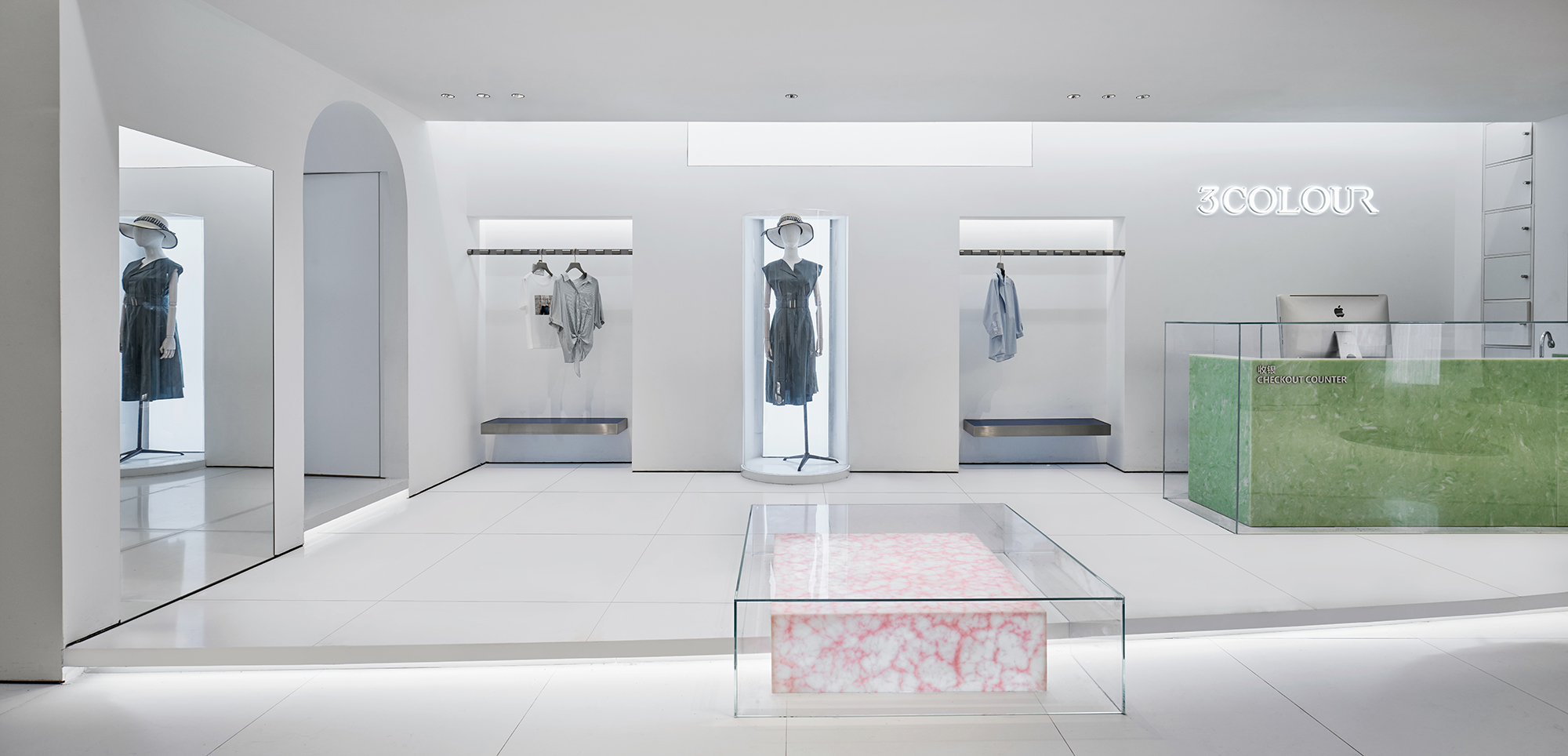
我们从「3COLOUR 三彩」的三原色着手,简单、纯粹、干净,却又衍生出万千富丽的基础三色,一如女性的情感世界,流动变化,细腻丰富。
We started ’3COLOUR‘brand’s design with the Three Primary Colours,which is simple,pure and clean.But they can change into thousands of vivid scenes,just like women‘s multivariant emotions.

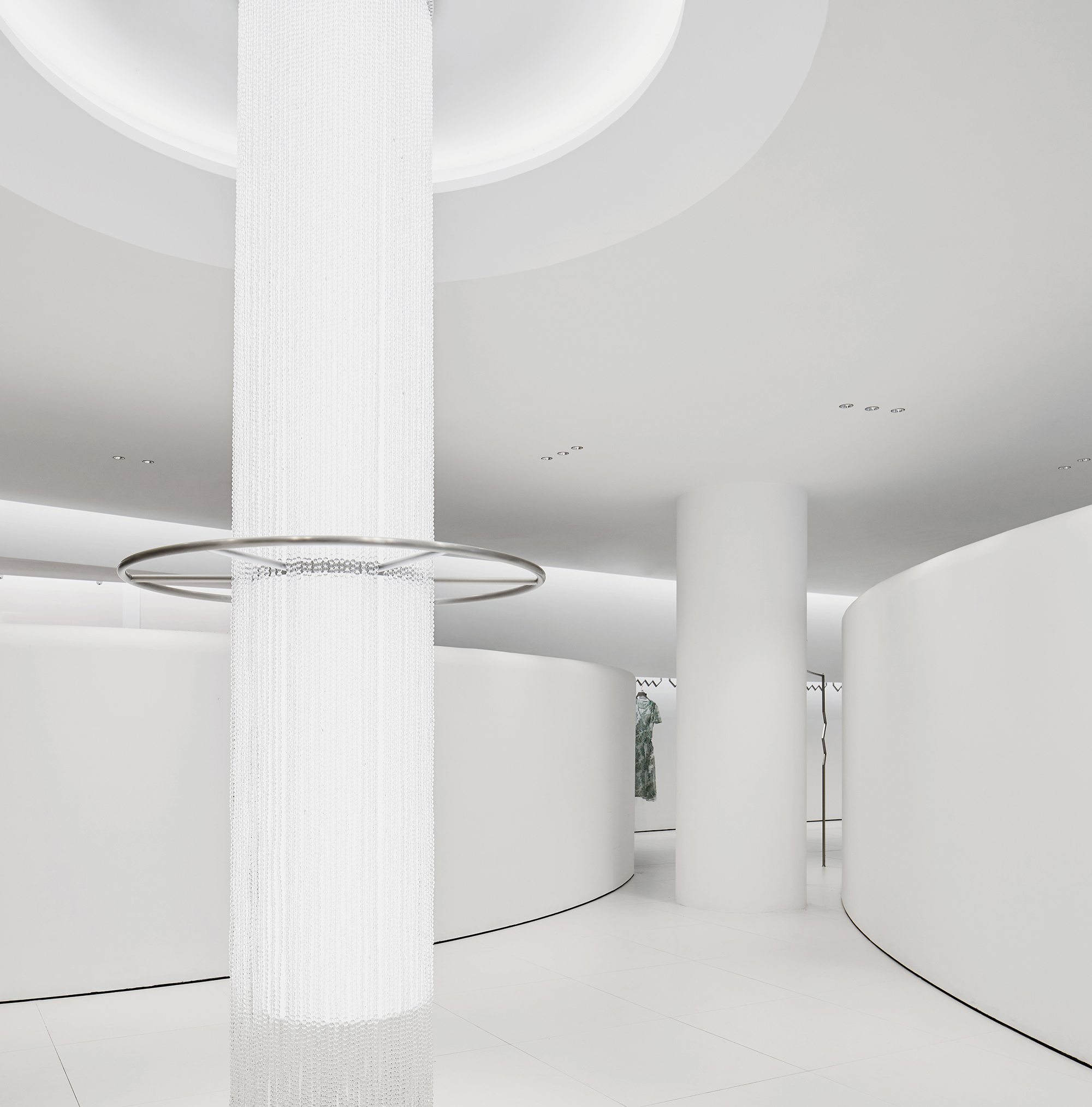
门店通体是最干净的白,灯光恰到好处打出明暗层次,如折射的镜中世界。空间边界得以淡化,虚实模糊,坚硬感于是层层褪去,满眼俱是澄明,宽敞、自在而舒心。
The store is all in purest white,and the light is just right to point out where the focus and layers are,picturing a world just like in mirror. With boundaries of space fading away,and reality blurring,everything become so clear,spacious and comfortable.
即便白色是各种色彩能量的中和,初入之时,顾客难免要深吸一口气,为之动容。干干净净的缄默与存在,本就是不言自明的静水流深。
Even if white represents the neutralization energies of all colours,when customers enter, they will still be touched and inevitably take a deep breath. White and silence exists together, it happens so naturally just like water flowing.
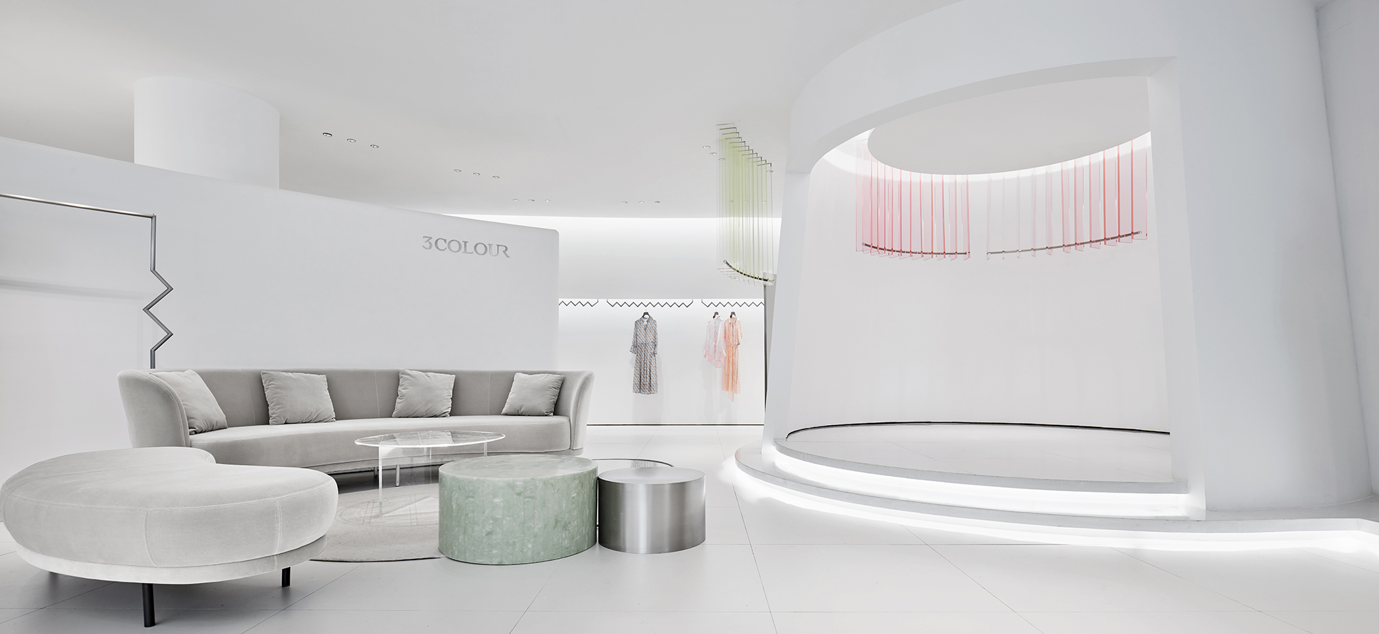
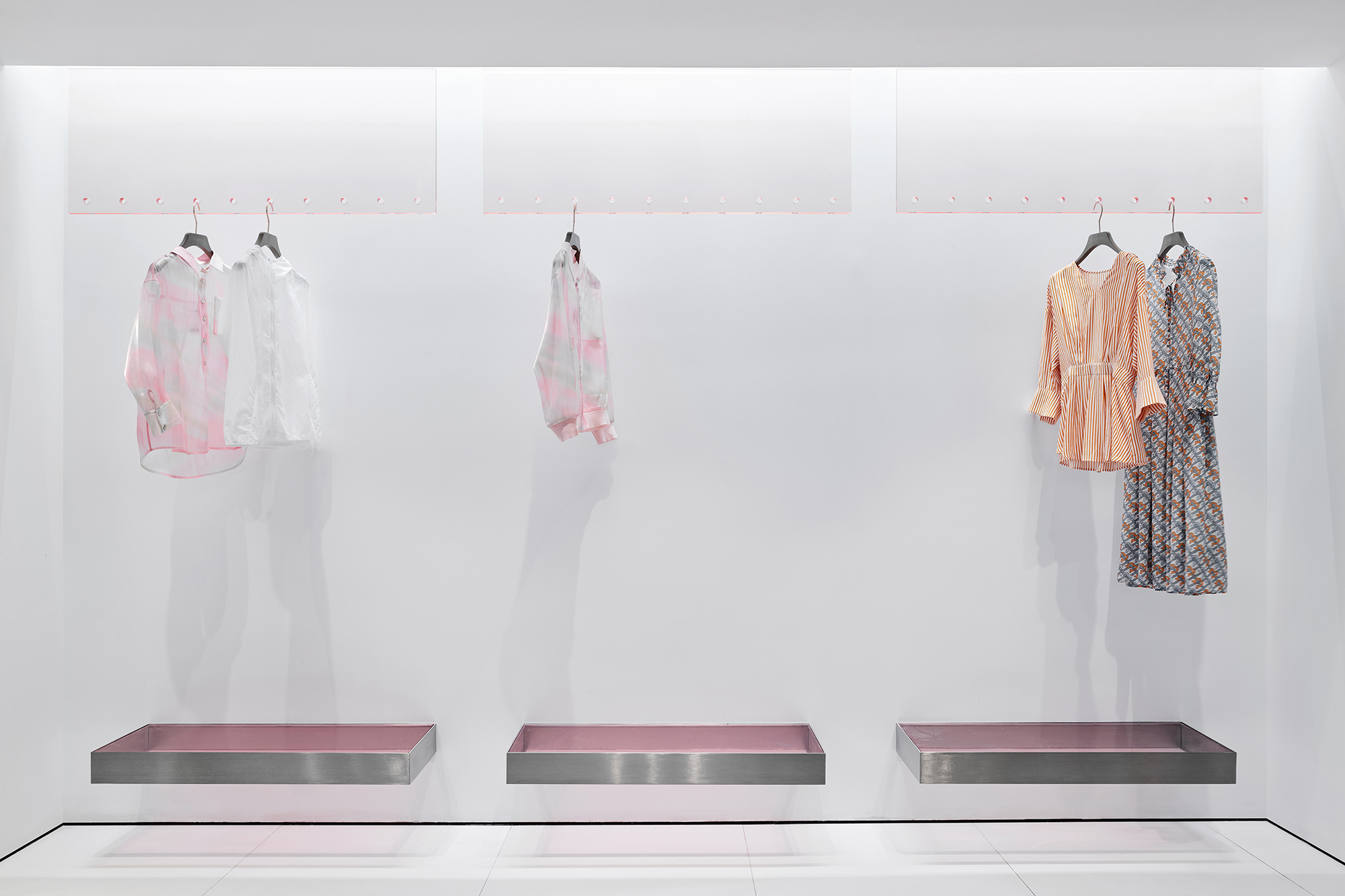
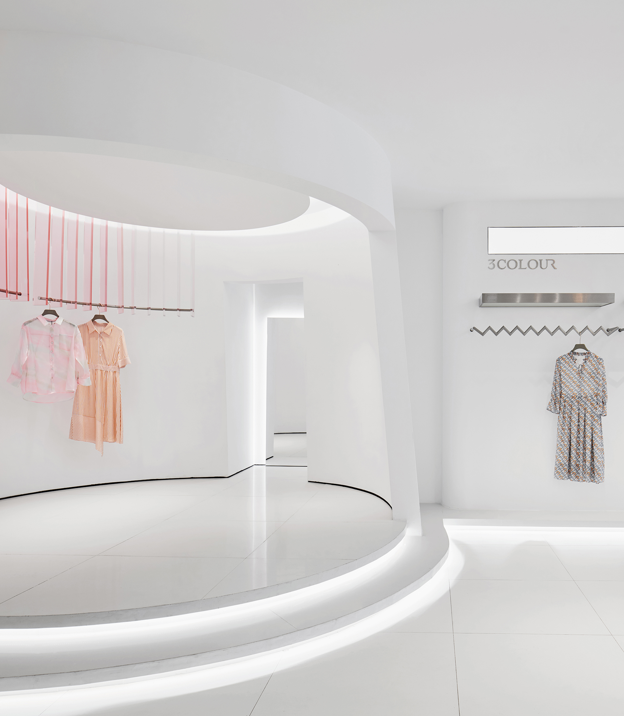
真正的色彩游戏,只是发生在道具和点缀上。轻浅透明的三原色,就像心尖上荡漾的涟漪。
The real colour game only happens to props and embellishments. The light and transparent Three Primary Colours are like the ripples on the apex of the heart.
浅红的少女心、浅黄的明朗感、浅蓝的清新感,循序渐进触发着顾客的心绪,明朗而温柔。
The warm feeling of light red,the clear feeling of pale yellow,and the fresh feeling of light blue,gradually trigger the customer’s mood,clearly and gently.
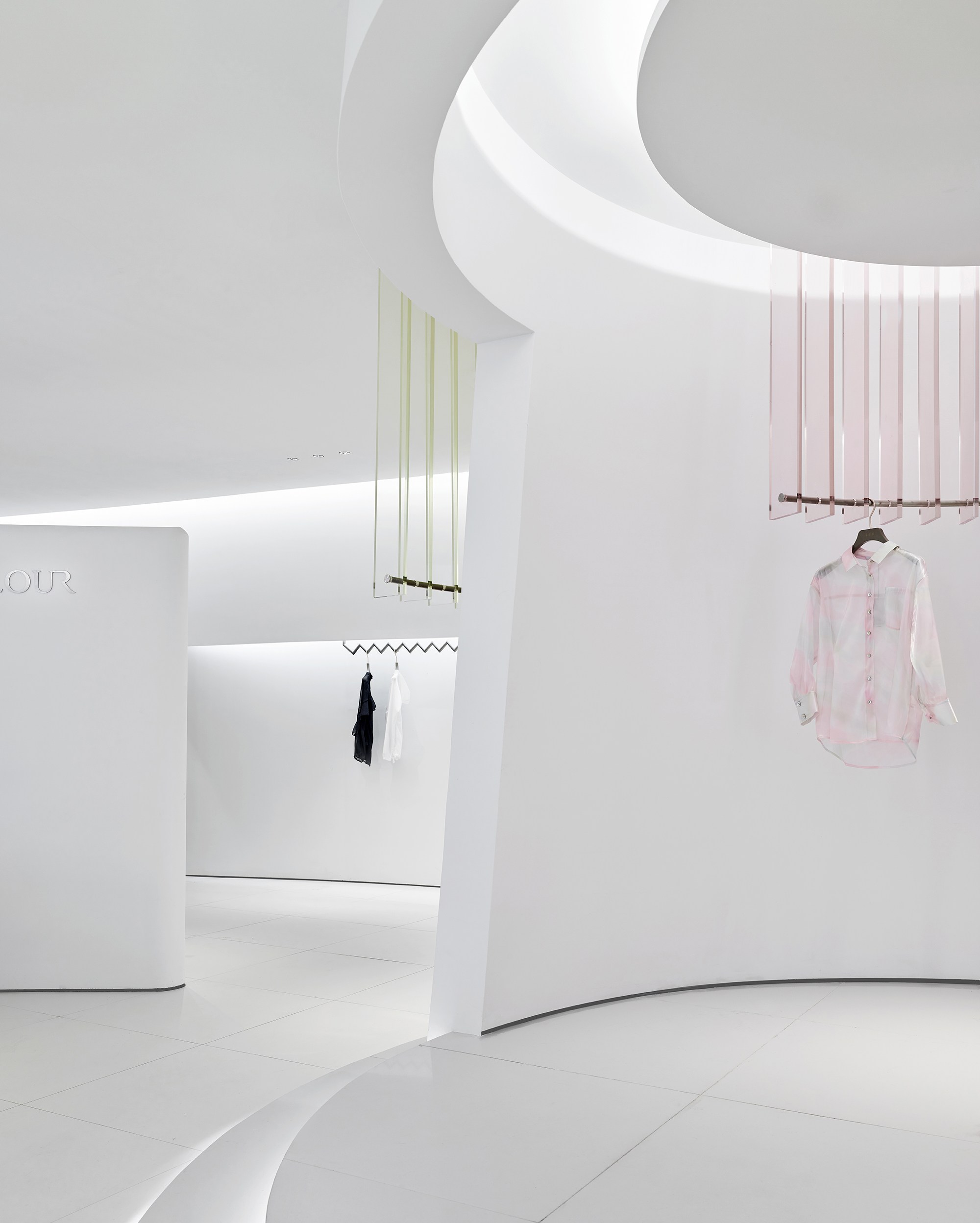
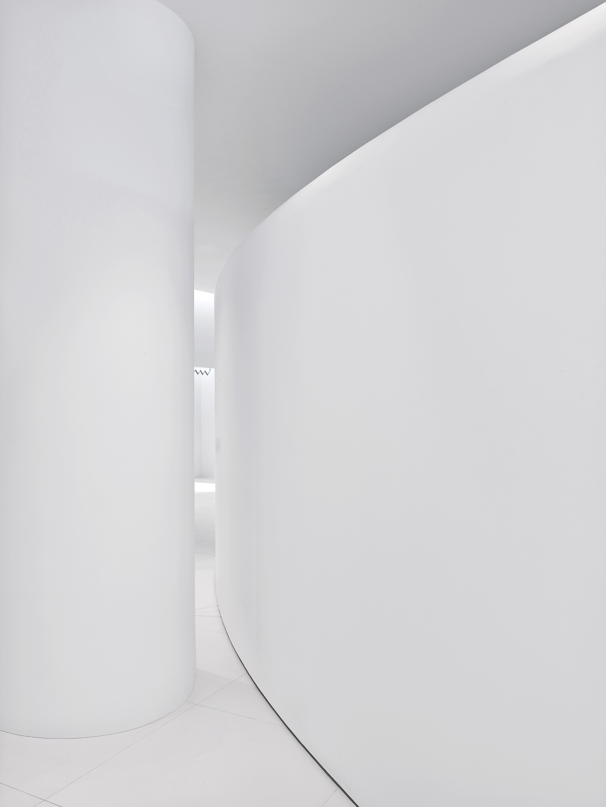
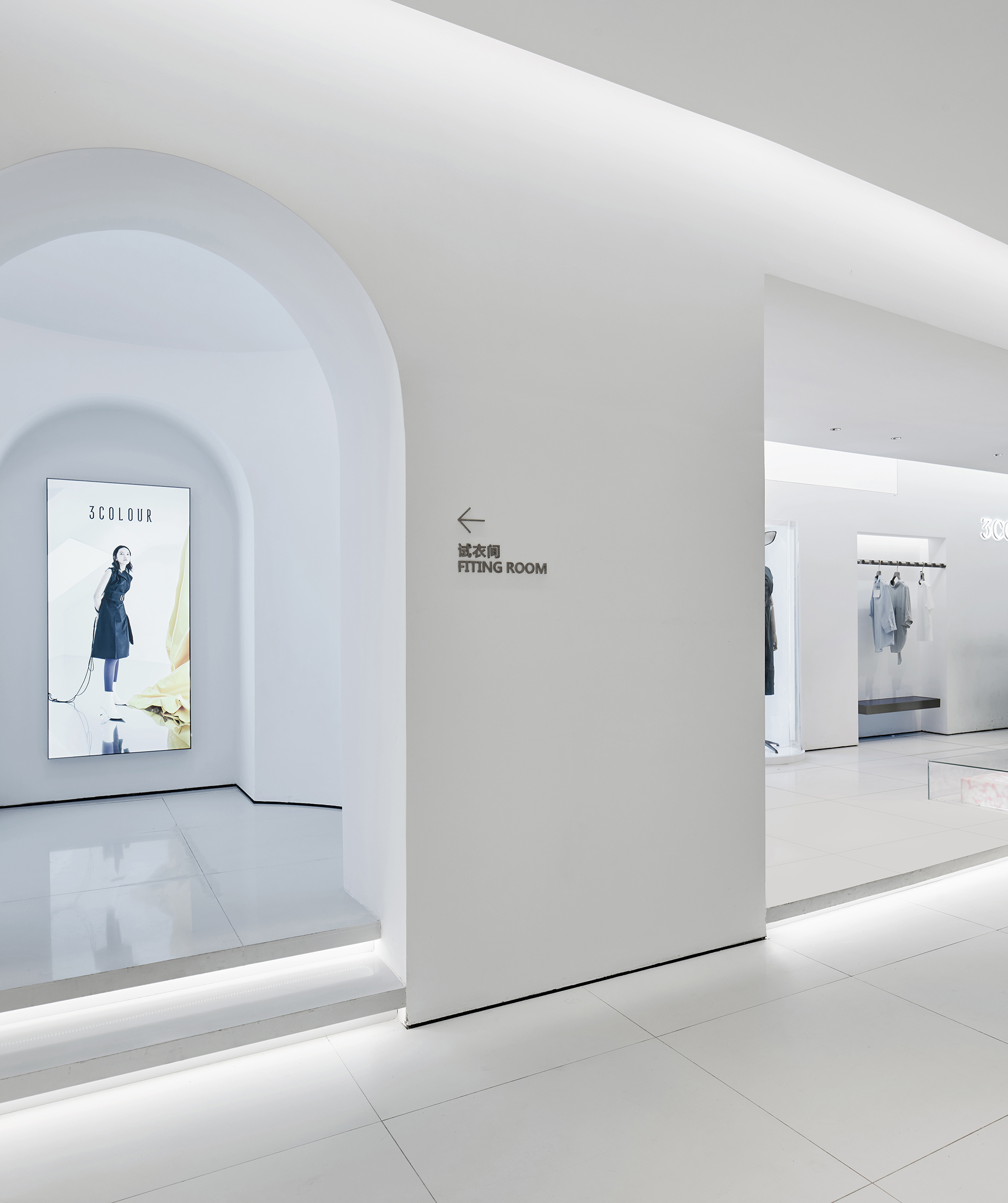
从纯白环境、三原色修饰到服装主体,色彩渐浓,表达出明确而协调的主题指向性。空间中随处可见弧形元素,宛如女性的优美曲线,辗转变化,隐现自如。吊顶与台阶处,盘旋的圆弧,通过一堵不完全的墙体连接,部分流逝于视线之外,却更有留白之意。
From the pure white environment,the Three Primary Colours to the colourful clothing,the colours are getting thicker,expressing a clear and coordinated theme. The arc-shaped elements can be seen everywhere in the space,just like the most catching curves of women,changing and looming. Between the ceiling and the steps,the circular arc is connected by an incomplete wall,with part of it stay beyond eyesight,leaving us unlimited imagination.
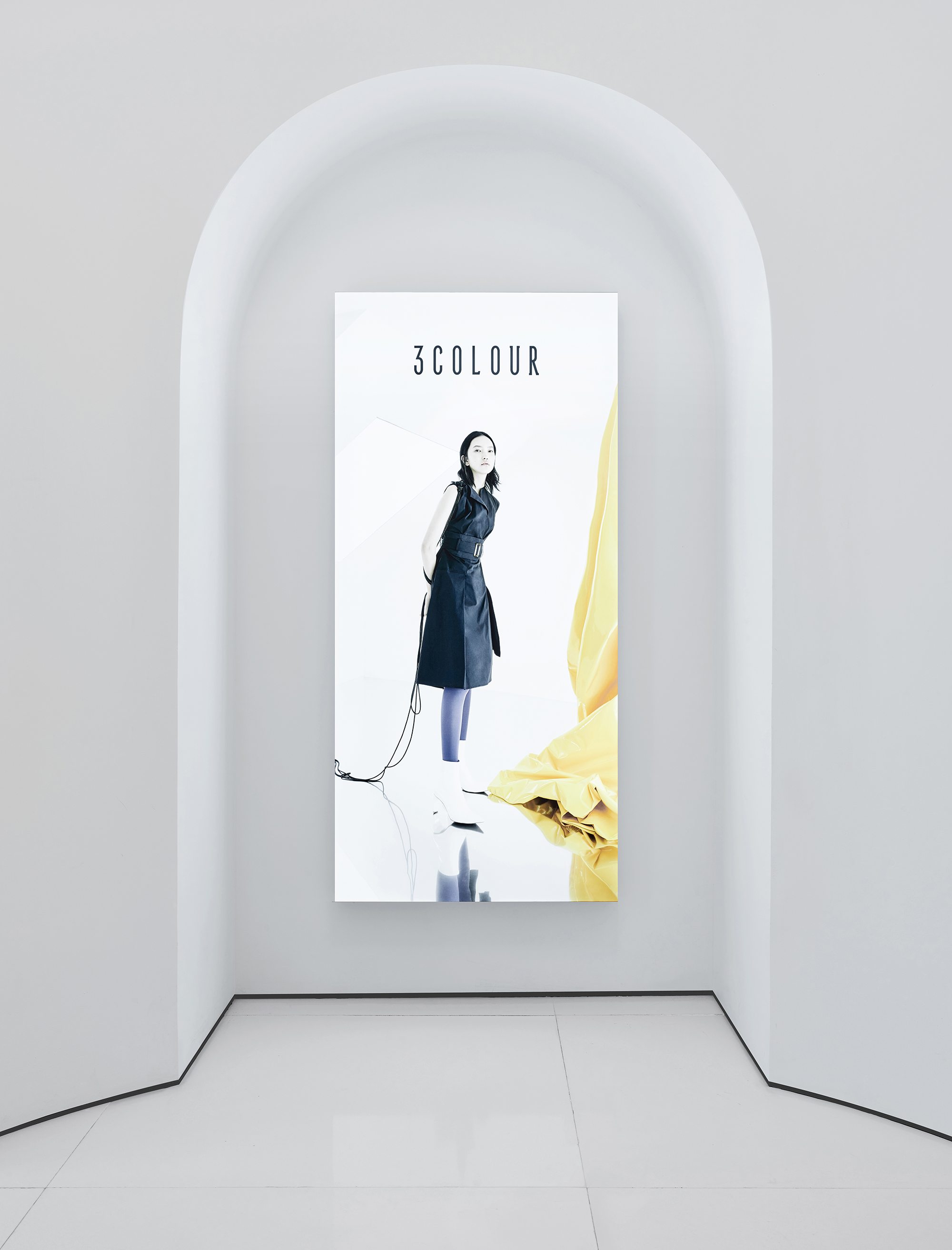
面对素简但具有线条美的设计,有巧思的顾客们不难发现,维度开合、曲直迭拼的长墙,简直是记录自己魅力的绝佳pose 取景点。
Facing with simple designed but beautiful lines,customers will happily realise this long wall of nice dimension is so perfect a place for photographs-taking.

另外,「3COLOUR 三彩」门头的处理是整个设计最值得一提之处。因为门店处于建筑喇叭形位置的最深处,所以本该处于弱势。但结合回环的地理位置,我们将门头做了扭转,这样,当展示面垂直于顾客的视线出现,「3COLOUR 三彩」的整体形象将最大限度展现于前。
In addition,the most worthy part of the store‘s design is the door head of the ’3COLOUR‘. Because the store located in the deepest part of the horn-shape building, it should be its weakness. However,we considered of its loopback topography and reversed the door, so that its surface eventually be vertical to the customer’s line of sight,maximizing the overall image of “3COLOUR” displayed to everyone.

当顾客缓步靠近,不经意间于曲径通幽处发现一方通透敞亮的艺术型内空间–高高的门头下,淡淡的色彩晕染着,绮丽而不失轻盈,简约却颇具新意,不知会否产生“柳暗花明”的微妙感觉?
When the customer slowly approachs,inadvertently find an artistic interior space in the secluded path.Under the high door head,the faint colour is smudged,beautiful and light,simple but quite new. I wonder is there someone who can escape from the feeling of such ‘Surprise’?

项目信息——
设计团队:设谷设计事务所
主创设计:谢银秋、龚海明
空间摄影:王大丑
完工时间:2019 年6 月
Project information——
Project Name: 3COLOUR Clothing (West Lake Times Square Store)
Design Team: Shegu Design
The main creative design: Xie Yinqiu, Gong Haiming
Space photography: Wang Dawu
Completion time: June 2019
主创设计师丨谢银秋
设谷设计事务所创始人/主持设计


-50x50.jpg)


