

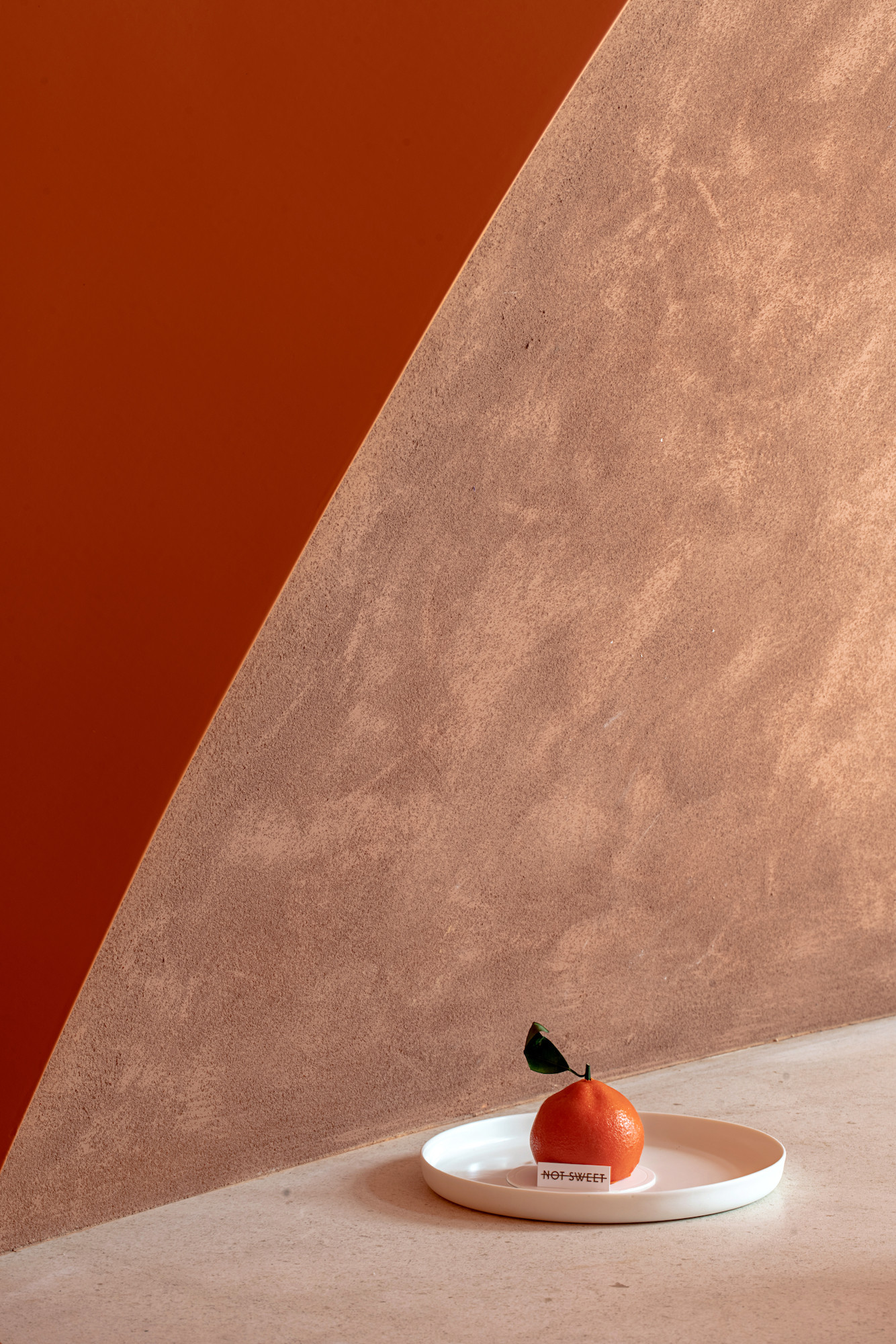
我们用暧昧与冲突表达“NOT SWEET不甜”的甜与不甜。
We use ambiguity and conflict to express the sweetness and non-sweetness of “NOT SWEET”.

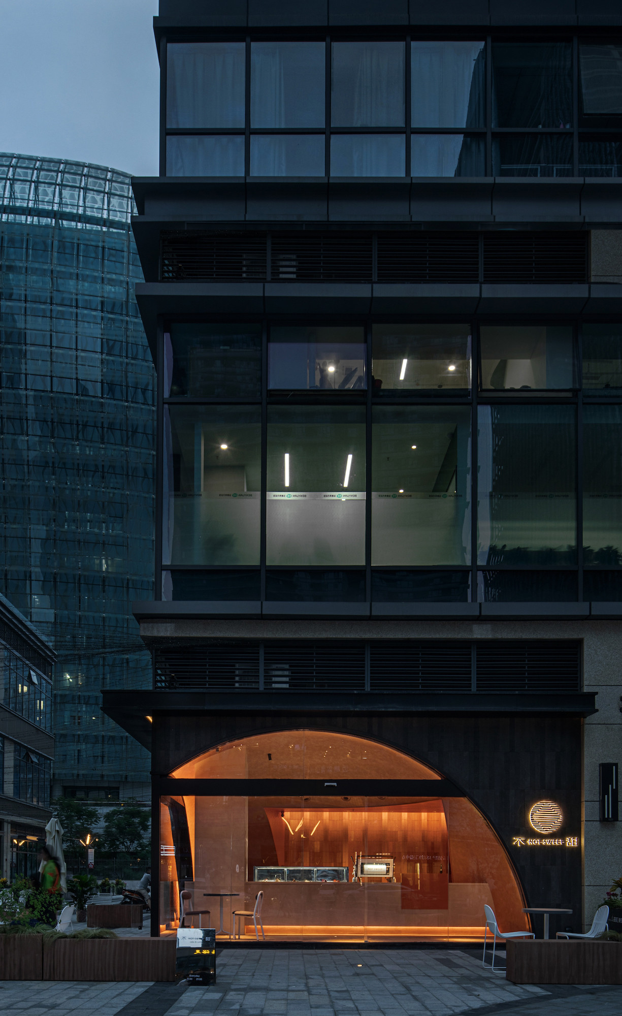
▲店铺外观,exterior view of the store
社区商业是我们生活的一部分,但千篇一律的形式却没有丝毫精彩,我们总是一如既往的忽视萦绕在旁的这种存在。“NOT SWEET不甜”的出现就是要打破这种常态,以一种平凡且寂静的姿态地隐匿于周遭,毫无矫揉造作的融入我们日常的生活。
Community commerce is a part of our life, but the machine-made form is without any splendidness, we ignore such existence around us as always. The appearance of “NOT SWEET” is designated to break such status, hide around us with an ordinary and quiet pose, and integrate into our daily without mincement.
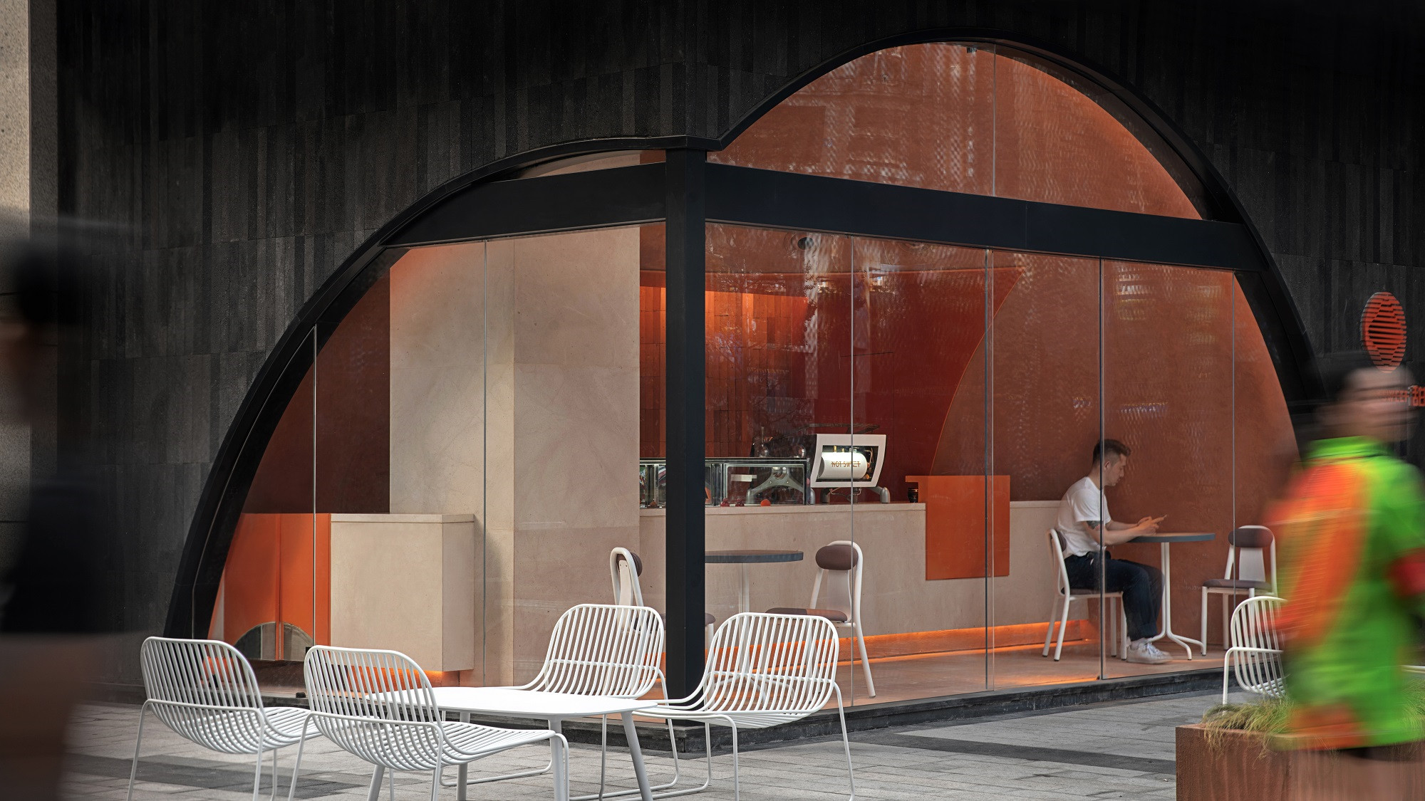
▲店铺外观,exterior view of the store
小懒桔旗下品牌“NOT SWEET不甜”是一个充满戏剧性的店名,面对甜与不甜本身的矛盾性,我们以什么样的方式介入,以及对空间的思考提出新的要求。
The brand “NOT SWEET” under Xiaolanju is a dramatic shop name. in face of the conflict between sweet and not sweet, new requirements are proposed for what kind of method should we use to intervene and the consideration for space.
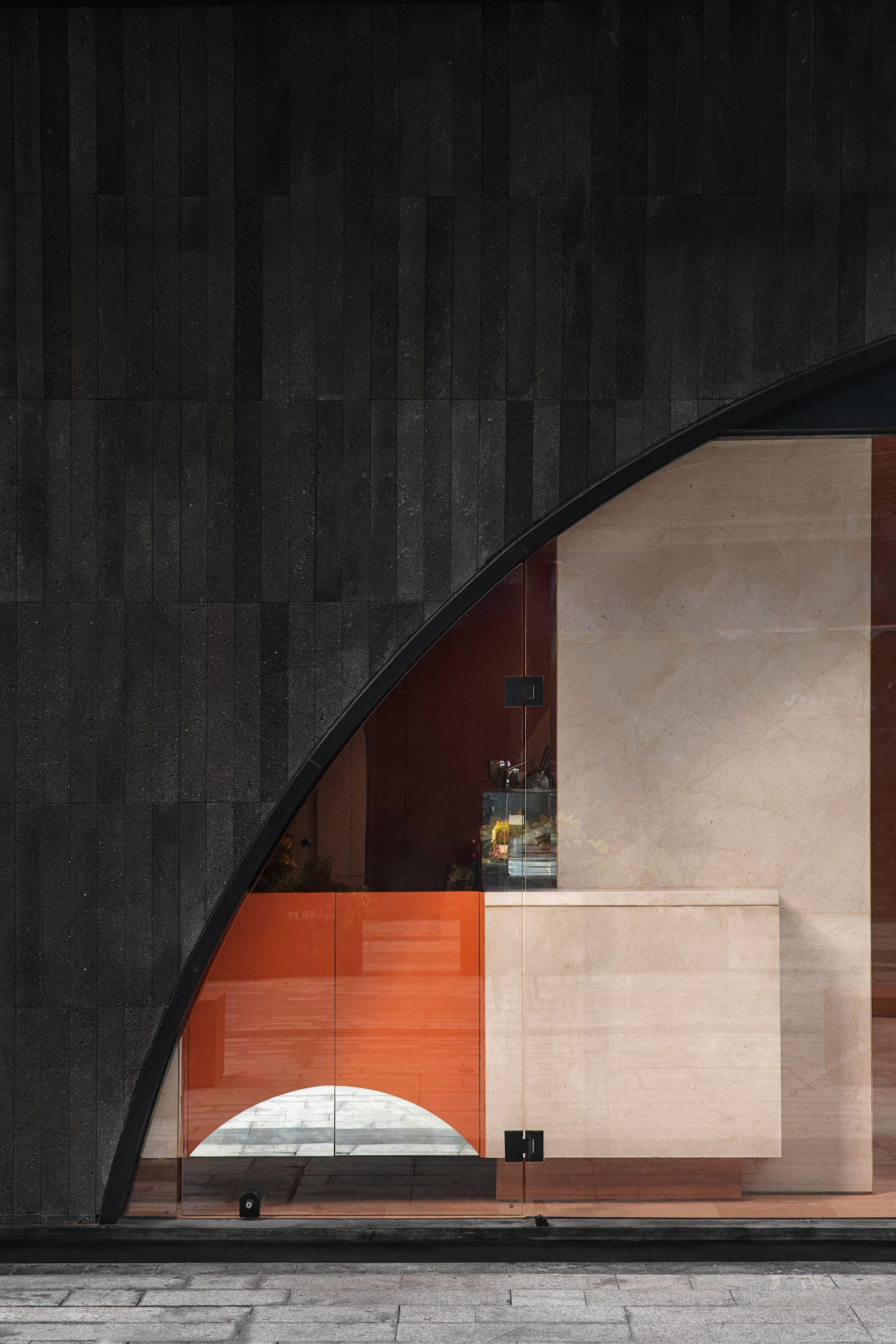
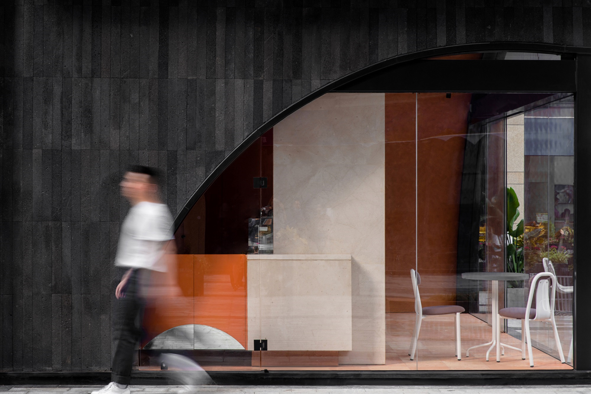
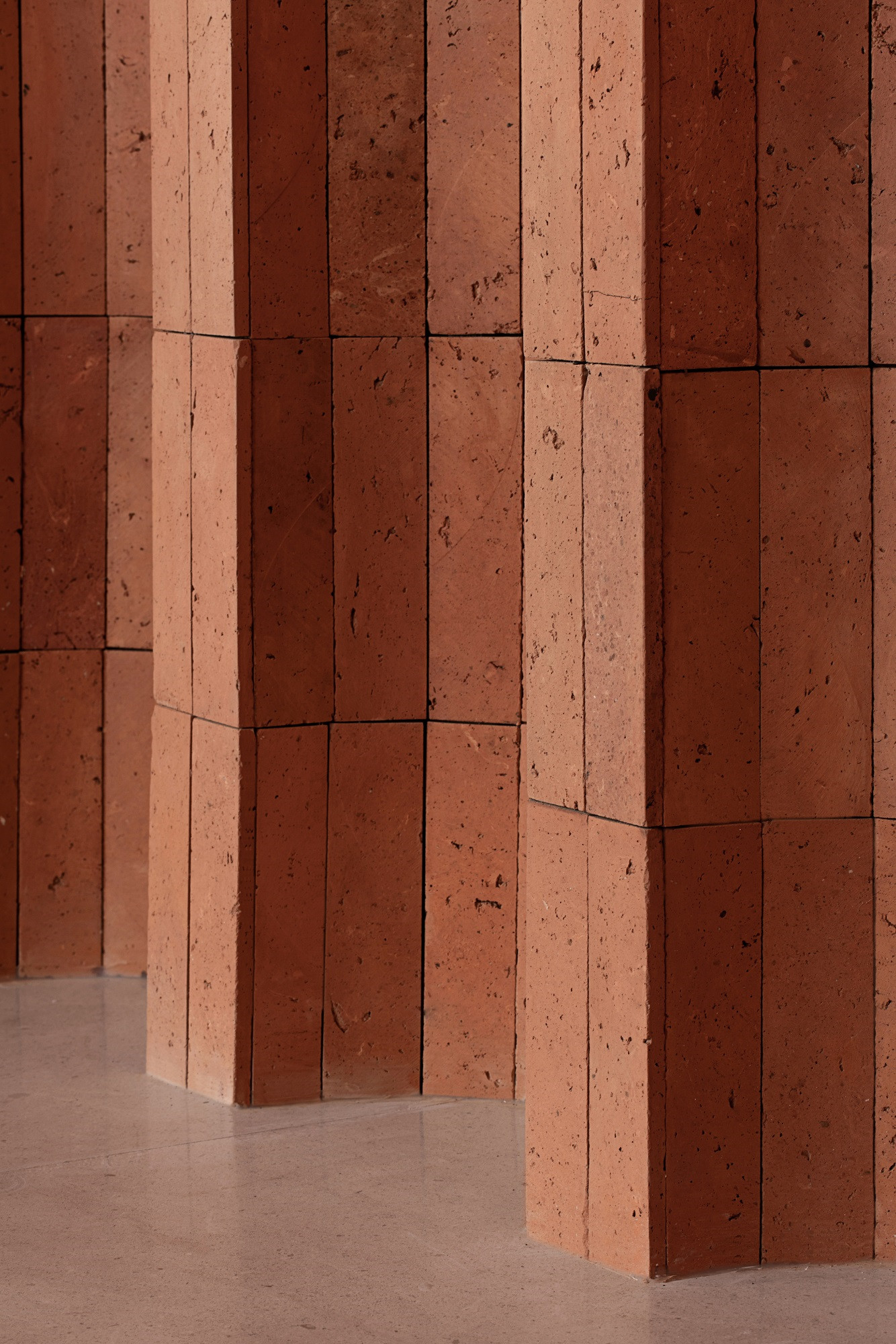
▲外立面细节,facade details


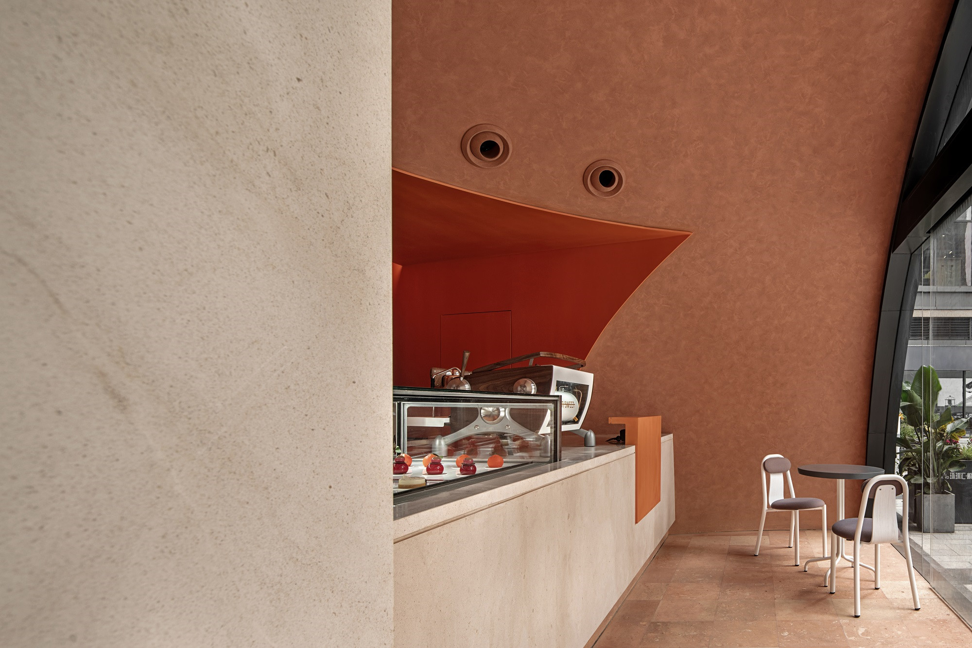
▲空间主、次入口,entrance
对内,在不足50㎡的空间,不仅要满足甜品店具备的所有功能,还需要化解一根单边长1米的承重柱对空间的干扰。对外,不仅要体现品牌意志还要尽量避免与周边环境产生冲突。
Internally, within the space less than 50㎡, it will not only meet all functions possessed by the dessert shop, but also resolve the interference caused by the bearing column with unilateral length of 1m for the space. Externally, it should not only reflect the brand effect but avoid the conflict with the surrounding environment as much as possible.
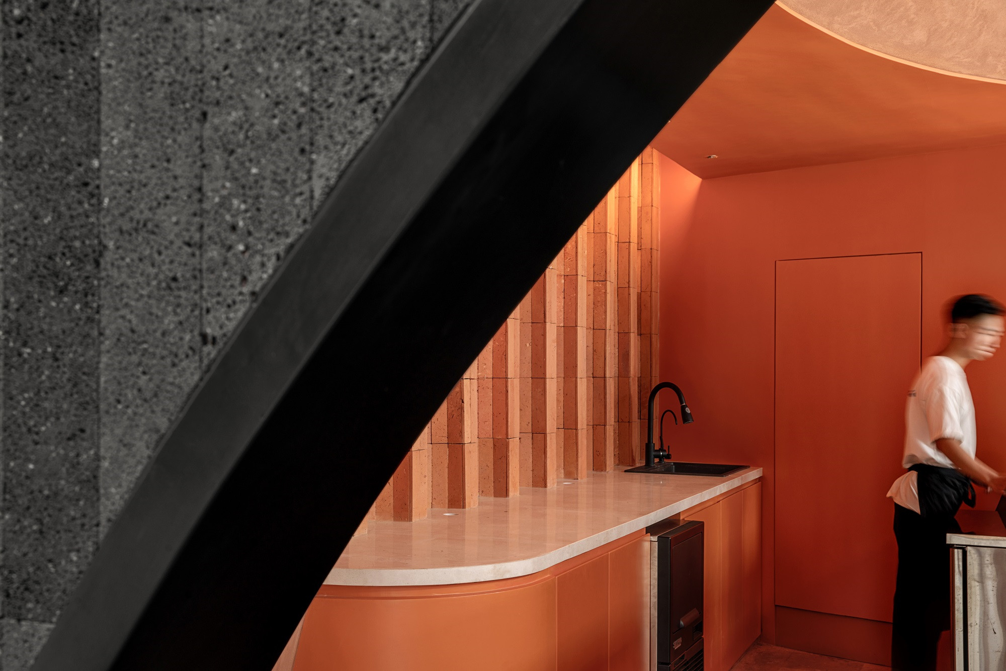
▲从侧入口看室内,viewing the patisserie from the entrance
我们构思,从品牌本身出发,以“桔子”的几何形态具象的在空间中形成符号化的表达。
We conceive to form the expression of signalization from our own brand and with the specific geometric shape of “orange” in the space.
空间以一个小尺度的简单开放的盒子为基础,“桔子”作为另一个几何体嵌入盒子体内,挖空两个几何体之间的重叠部分,使之成为新的使用空间。
The space takes a small-scale simple and open box as basis, takes “orange” as another geometry to embed into the box, and makes it into a new use space by hollowing the overlaps part between the two geometries.

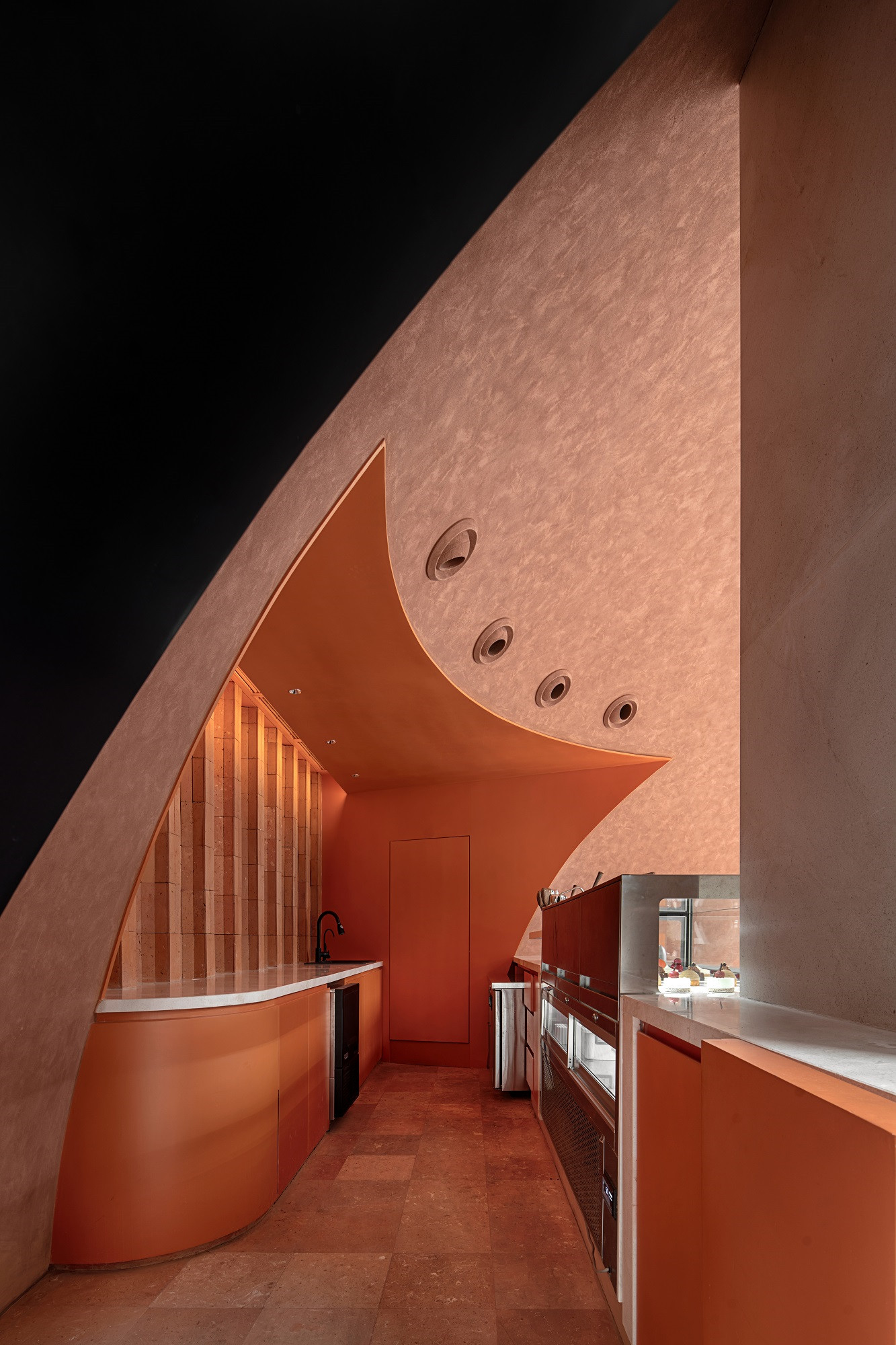
▲室内概览,interior overview
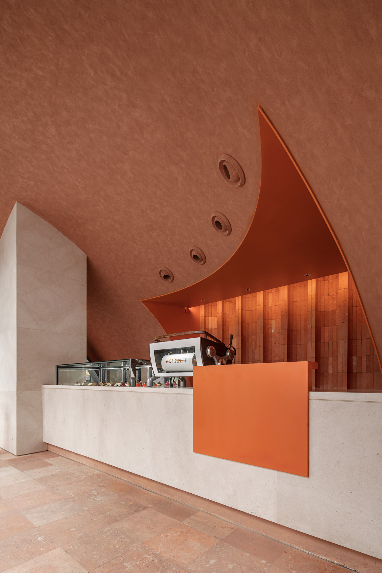
甜品展示、咖啡机和服务台组合成一个整体,底部内退形成悬空的横向体块,再和竖向承重柱形成交叉,共同组成空间中一个新的结构体,造型如丝带般轻盈的悬浮空中。不仅解决了功能需求,在视觉上增加了立体感的同时也化解了承重柱对空间的干扰。
The dessert exhibition, coffee machine and service counter are joined into a harmonious whole. The bottom internal retreat will form impending horizontal blocks, and then they will cross with the vertical bearing column, to form a new structural body in space, with the sculpt suspended into the air as light as silk ribbon. It not only solves the function demands, increases the third dimension in vision, but also resolves the interference of bearing column for space.

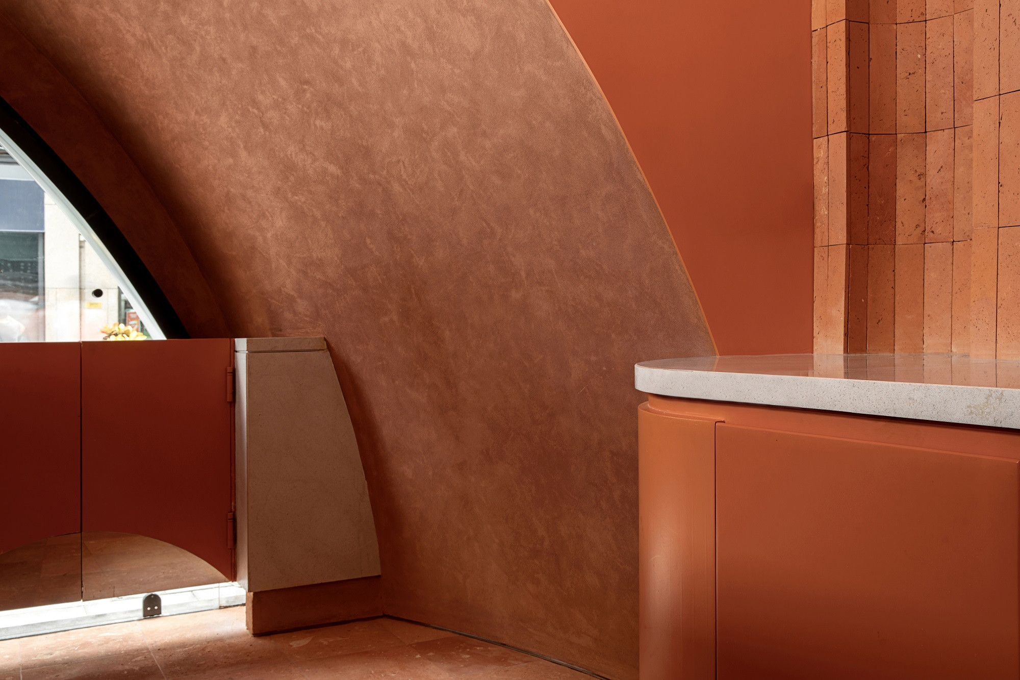
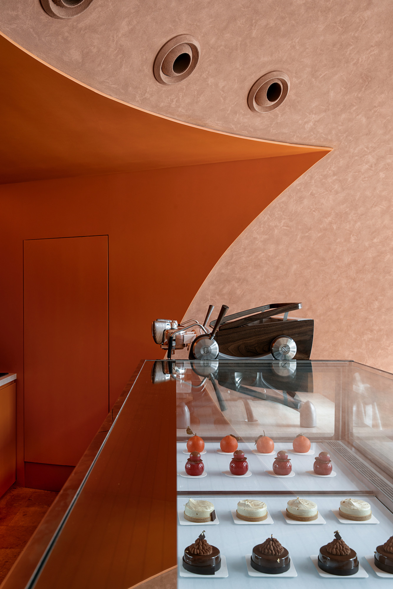
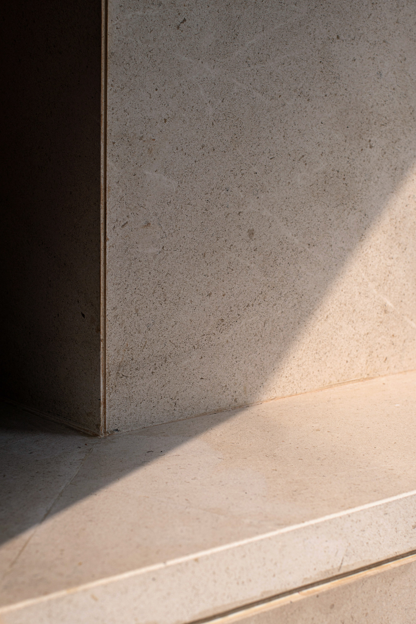
▲室内细部,interior details
完成空间的塑造,我们运用灯光、材料和色彩来暗示“NOT SWEET不甜”暧昧与冲突。
After completing the shaping of space, we use light, material and color to imply the ambiguity and conflict of NOT SWEET.


▲天棚细部,ceiling details


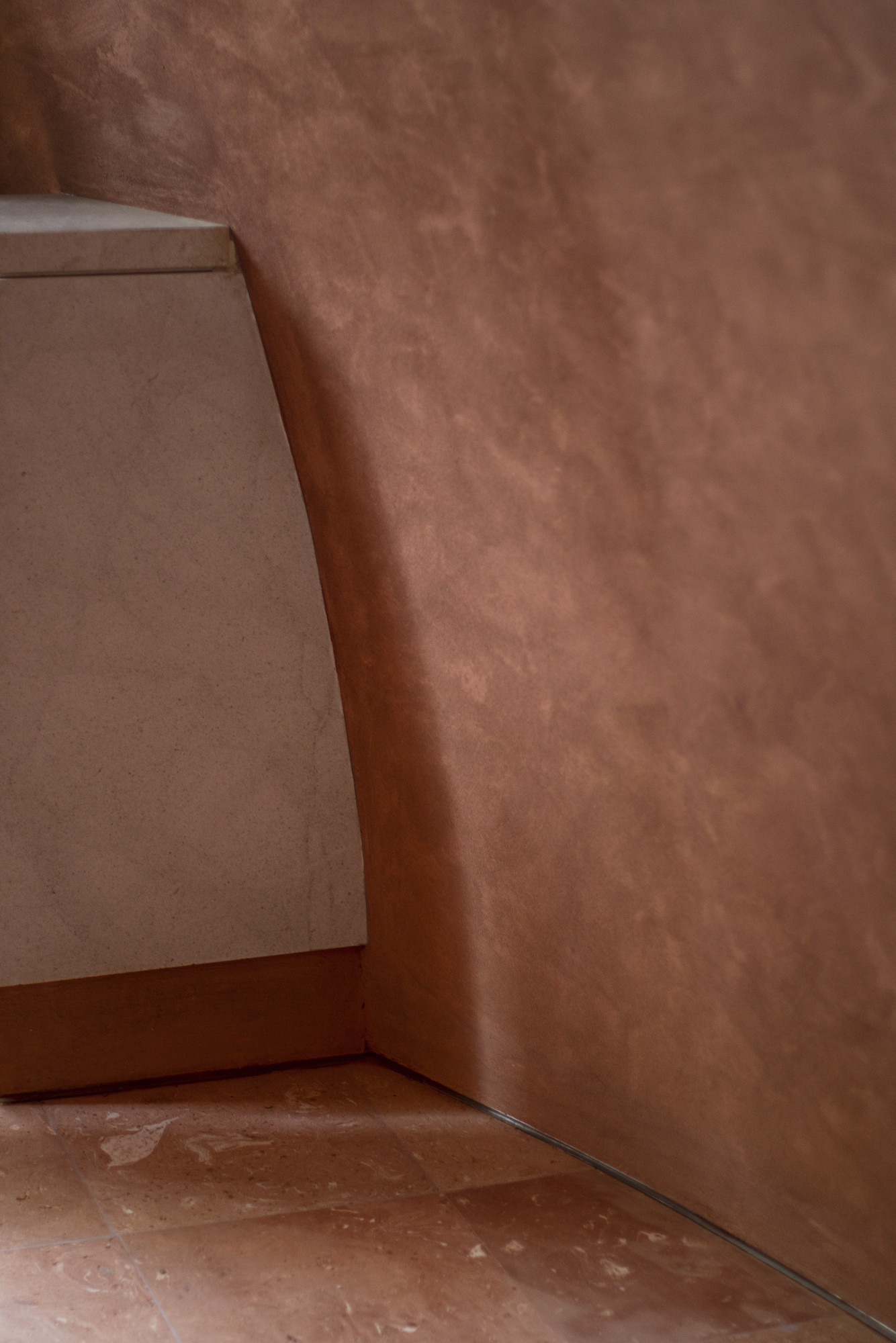
▲墙面细部,wall details
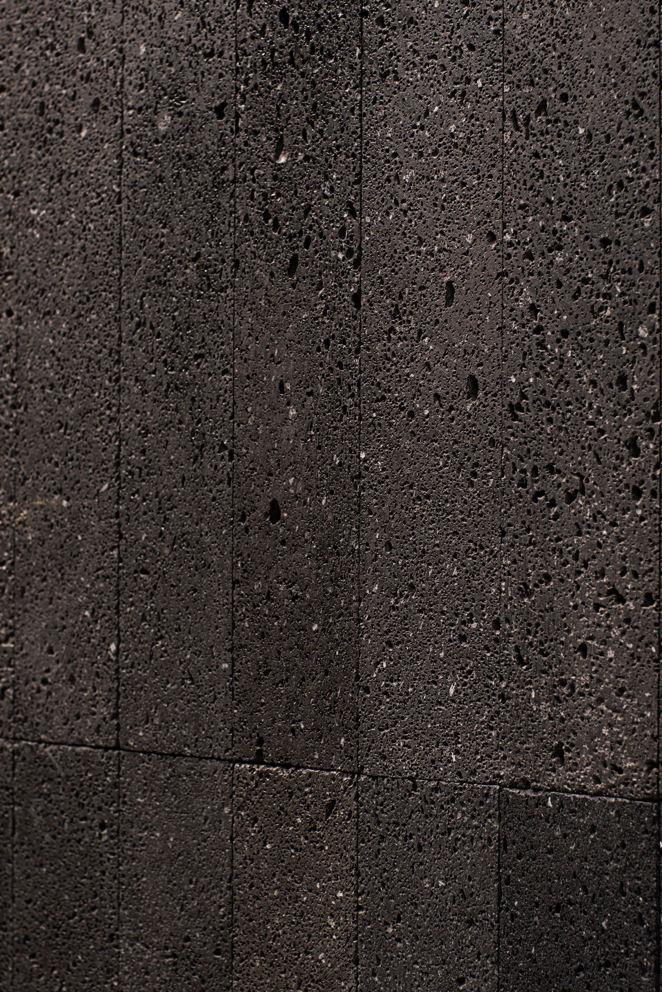
▲材料细部,material details
球形空间中的暖色光线通过橙色肌理墙面所产生的漫射让结构体块和材质随着人的视角变化时而模糊时而清晰,空间氛围温柔暧昧,与黑色火山石外墙表皮形成冲突。
The warm light in the spherical space makes the structural blocks and texture become vague sometimes and clear sometimes along with the change of people’s angle of view through the diffusion generated by the wall surface with orange texture, the space atmosphere will become gentle and ambiguous, to form conflict with the black lava external wall surface.
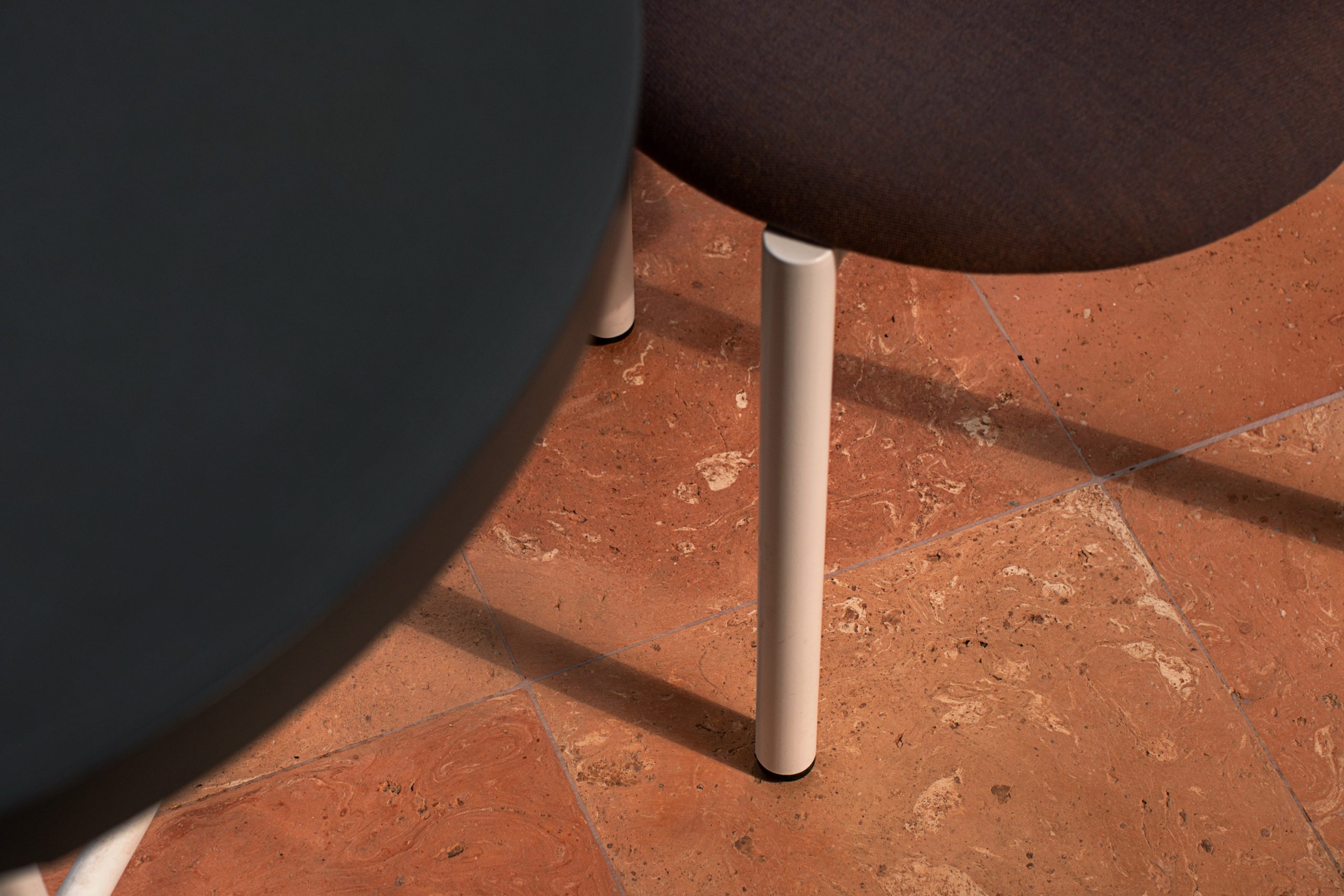

▲地面细部,floor details
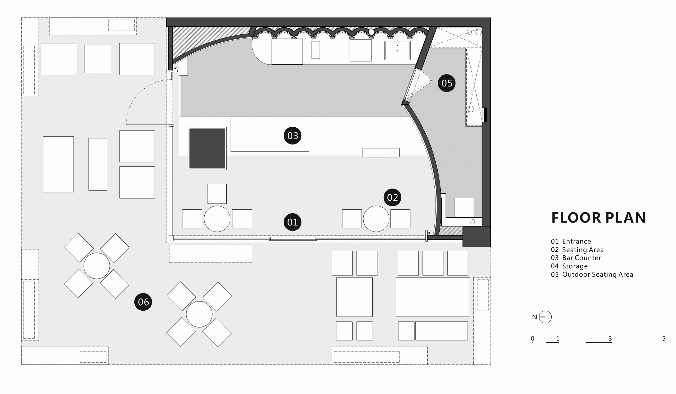
▲平面布置图,layout plan
项目信息——
项目名称:NOT SWEET 不甜
项目类型:甜品店
设计公司:Geemo Design 治木设计
设计团队:石朝思、易毅、杨巧
项目地址:成都
主要材料:涂料、石材、黏土砖
完工时间:2020.06
项目面积:47平方米
摄影团队:偏方摄影
施工单位:南玺迅雅
Project information——
Project name: NOT SWEET
Program: Pastry
Design firm: Geemo Design
Designer team: Kirin Shi, Eleven Yi, Cathy
Project location: Chengdu, China
Completion time: 2020.06
Area: 47sqm
Photograph: Pian Fang
construction company:NanXiXunYa


