

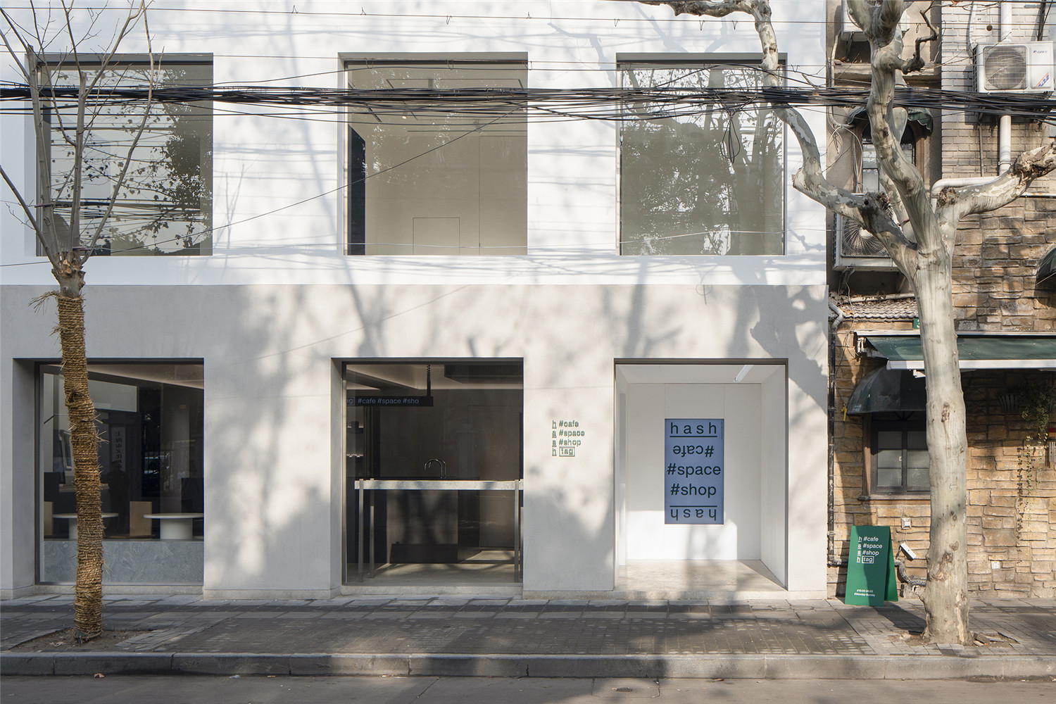
建筑位于上海徐汇的法国梧桐树下的街道上,是一个由80年代砖混结构建筑改造而成的室内建筑项目。建筑共有两层,总面积200平方米,改造前身为一座2层的砖混结构办公建筑。作为法租界商圈的重要组成部分,永嘉路一带以更市井和绵密的方式组织起城市中的日常消费生活。
The building is located on a street that is lined with plane trees in Xuhui, Shanghai. The interior of the building has gone through a project which has completely transformed this brick-concrete building of the 1980’s into its modern view. The building has two floors with a total area of 200 square meters. Before the renovation, this building was a two-story brick-concrete building that was used as offices. As an important part of the French Concession business district, the Yongjia Road and its surroundings are working as a more engaging and integrated platform for the city’s daily consumer life. The owner of the space aims to manage an independent space in this vibrate environment.
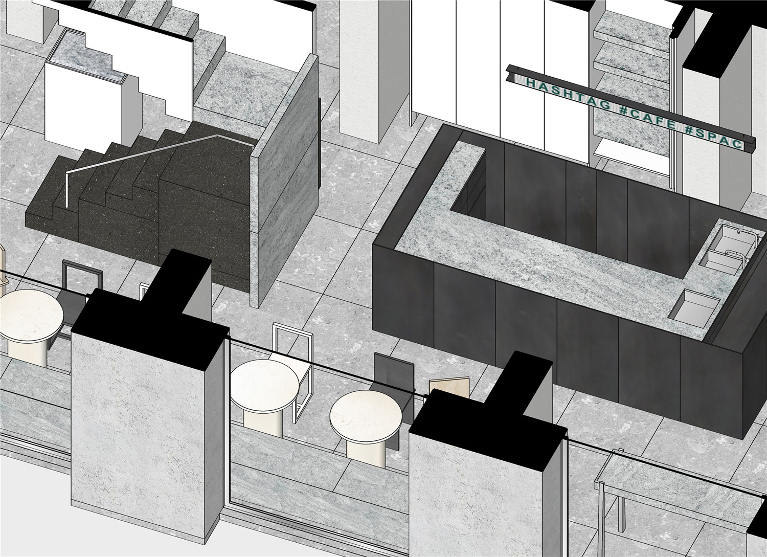
空间的拥有者希望在这样的环境中通过一个独立的空间进行经营。一个可以被扩展功能、重新定义的空间需求也因此出现 HASHTAG#cafe#space#shop 是集咖啡简餐、展览空间、酒吧和零售于一体的综合生活空间,这三个单词很好定义了整个空间。
The owner creates this unique space whose function is extendable and redefinable. HASHTAG # cafe # space # shop is a comprehensive living space that combines a cafe, an exhibition venue, a bar and a retail shop. The words # cafe # space # shop are three of the best terms used to define this site.
原建筑的二层部分略突出一层,通过一个隐秘的直跑楼梯在建筑的背面进入。改造设计首先将原有的体量关系进行梳理,使用简洁抽象的体量,将新建筑的二层部分推进,使底层突出。再通过颜色的区分将原有体量的“上大下小”逆转为新的形式。首层和退缩的二层分别用了不一样的材质,首层是希望相对粗燥,低调的质感,我们用了模仿混凝土砂浆质感的浅灰色质感砂,二层是纯白色的外墙涂料。建筑师希望让建筑外与室内看起来是一致的,室内功能也能通过室外观察可以分辩出来,所以同样的质感效果延伸到了室内,首层是米灰色的质感砂墙面,整个空间设计是极简的,低调而有质感的材质都是经过慎重的选择,石灰石地面,砂岩桌子,黑色的火山岩和灰色花岗岩组成的楼梯,“道具”的设计也是以哑光材质为主。二层还是延续了外立面的白色色调为主的空间,以展览空间为核心,白色墙面,灰色的自流平地面,都是展览空间常用的材质。
The first floor of the original building protruded slightly from the ground floor and entered the back of the building through an inconspicuous straight staircase. The renovation team firstly reconsidered and redesigned the volume and the proportion of the building with a minimal touch, indented the second floor of the new building, making the ground floor protrusive and formed a trapezoidal shape. The change of the proportion not only reduced the sense of oppression of the first floor onto the street, but also make it easier for passersby to look into the windows and have an idea of the activities that take place on the first floor. A hidden drainage ditch is set at the top of the protruding ground floor, which ensures a clean facade and brings a certain sense of strangeness to the project site.
除了可以减少对街道的压迫感,也使人们在街道上可以更容易观察到二层的活动。突出的底层顶部设置了隐藏的排水沟,保证立面清洁的同时,为项目所处的场地带来了一定的陌生感。这种底层突出的动作可以被很轻易的察觉,但又不具备阳台等具体功能空间的尺度。我们希望通过这种抽象的操作给体验带来不确定性,而不仅仅是完成一个图像,这种操作在建筑内部同样存在。(改造设计外部与城市的关系)
The protruding ground floor could be easily sensed, but it does not have any actual working function, such as being a balcony. The design team aim to create uncertainty to the guests’ experience from such alteration.(Relationship between exterior design and the city).
▲入口序厅
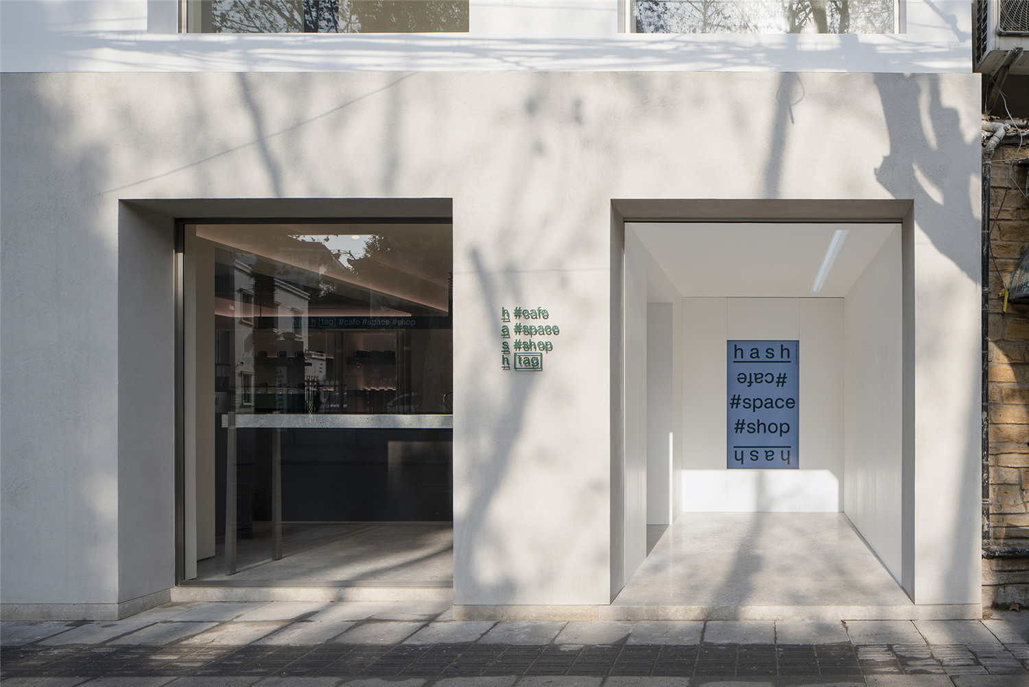
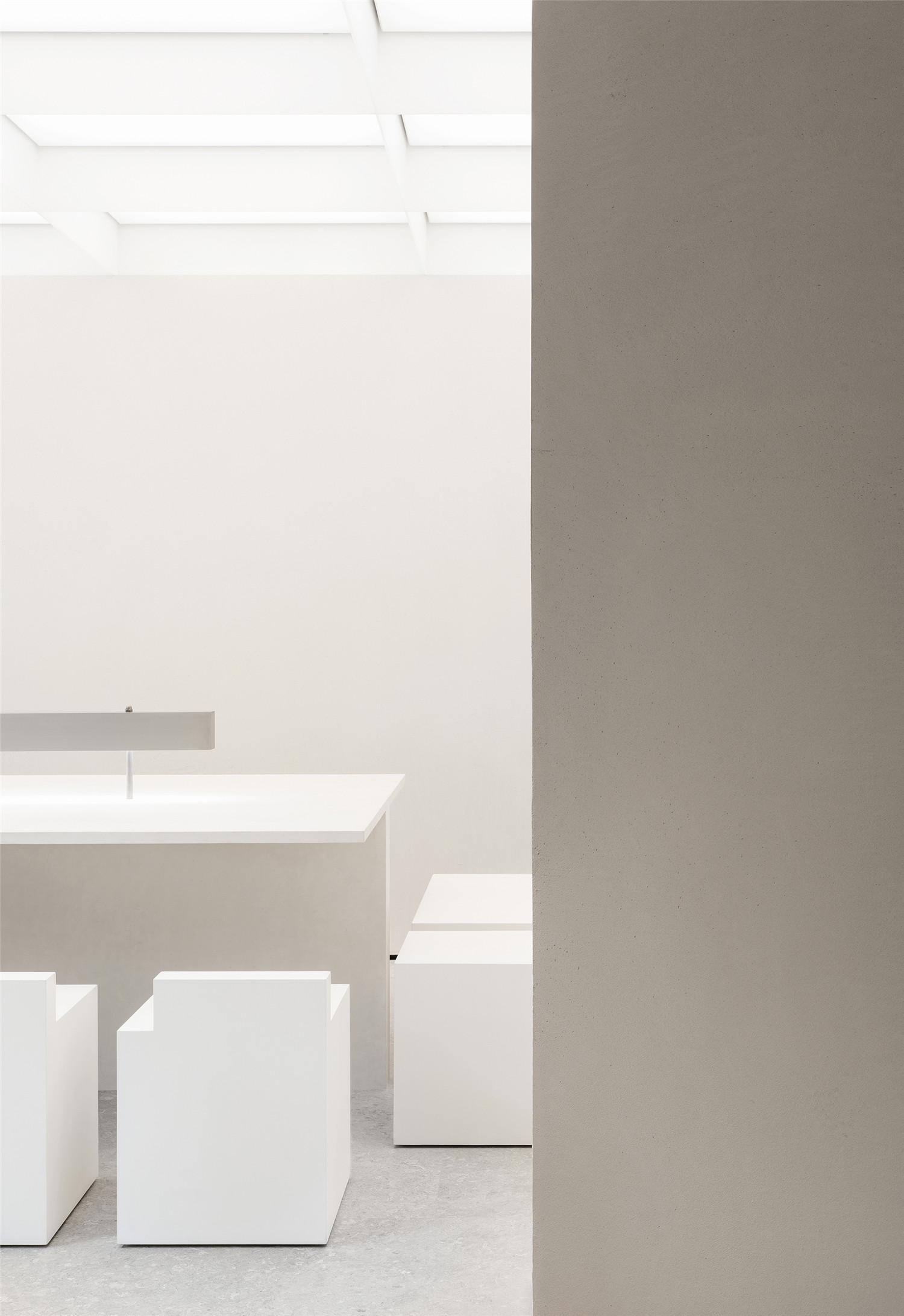
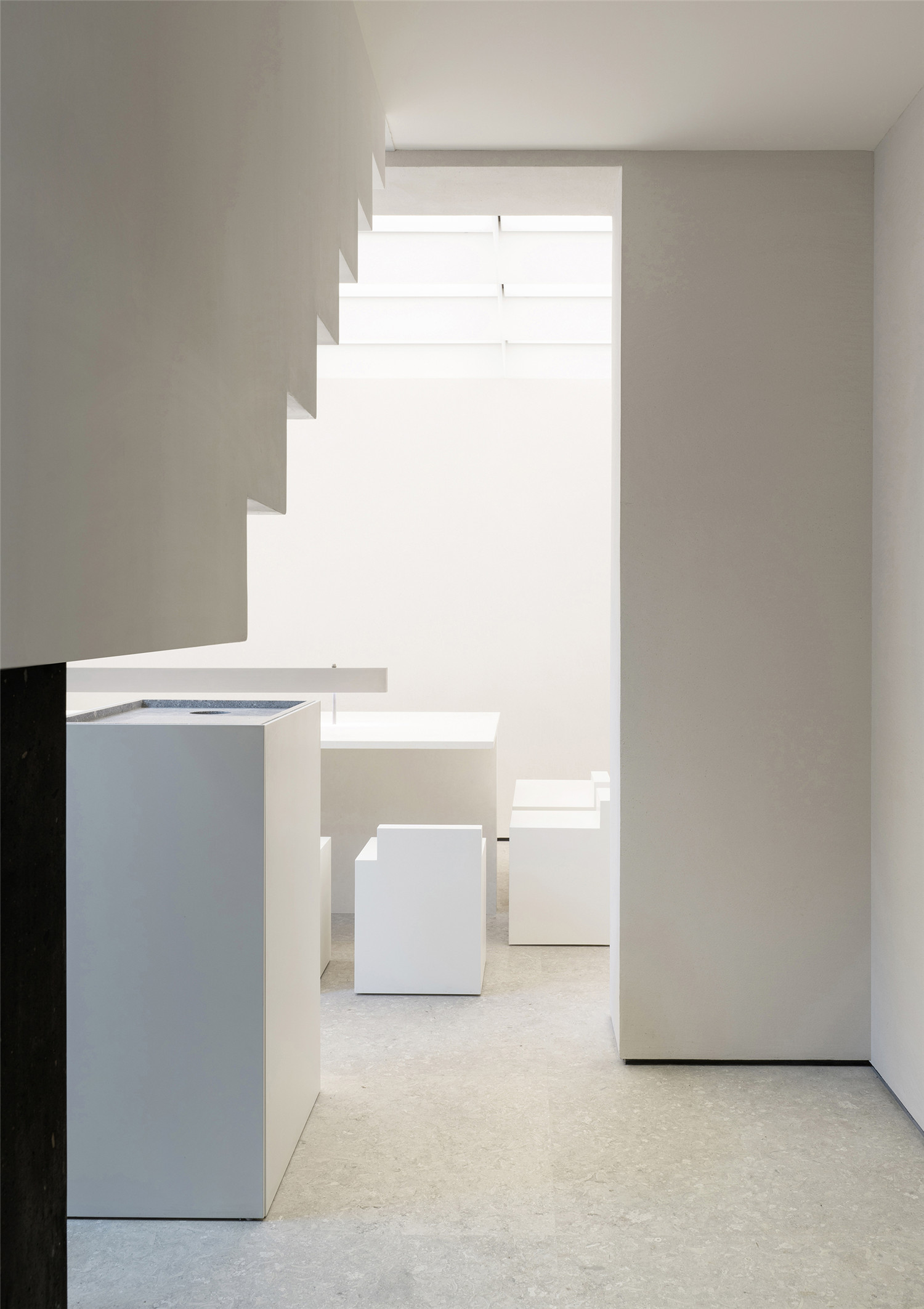
为了适应功能的灵活性和保证建筑的结构安全,改造对原有建筑的基础和梁进行了加固,并在开口处补充构造柱,重新浇筑了部分的楼板。与其说是改造,新的结构更像是对原有建筑的一次修复。由于城市管理的规定,改造后的店铺无法在建筑外部悬挂招牌,因此底层右侧端部的一小间房间变成了进入建筑的序厅,面向城市开放。店招与展览信息在这里通过电子屏幕和海报展示,也给客人躲雨和短暂停留提供一个有遮蔽的半开放空间。
In order to adapt to the flexibility of the function and ensure the structural safety of the building, the renovation team reinforced the foundation and the beam of the original building, supplemented the construction column at the opening, and re-cast part of the floor slab. The new structure is more like a restoration of the original building rather than a renovation. Due to the regulations of the City Management Bureau, the renovated building cannot hang signboards outside the building. Therefore, the team planned a small room at the right end of the ground floor as a parlour where the public could have access to the building. The parlour could not only display the signboard and exhibition information via LCD screens and posters, but also provide a covered, semi-open space for guests to shelter from rain and for short stays.
▲空间概览
▲多功能活动空间
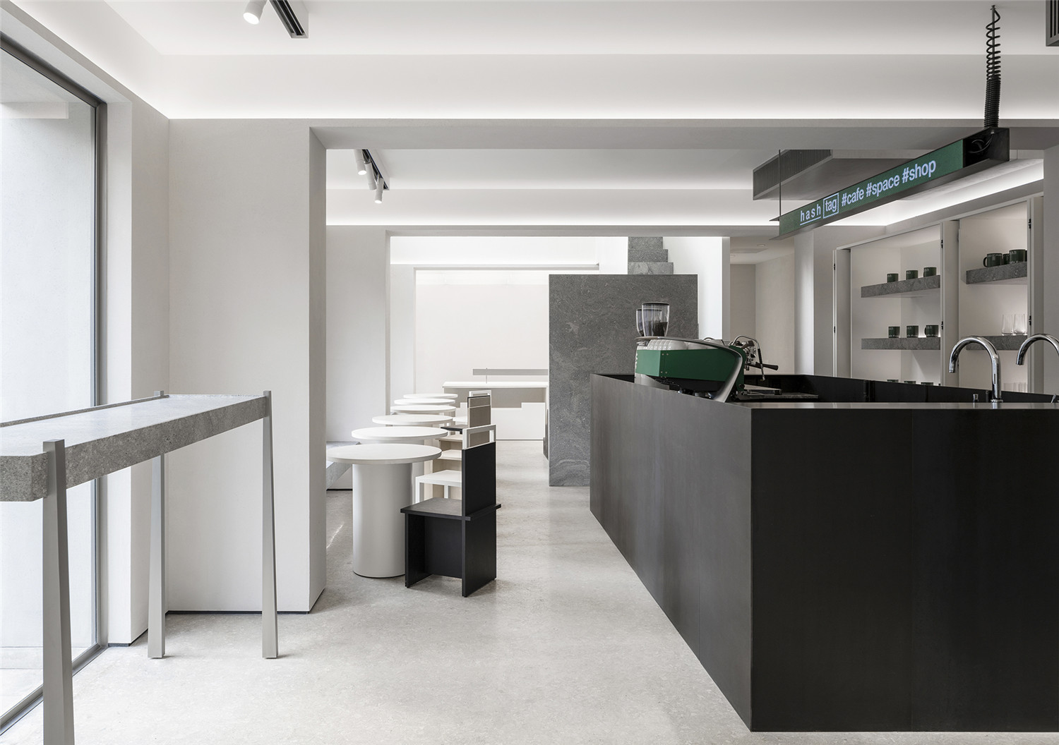
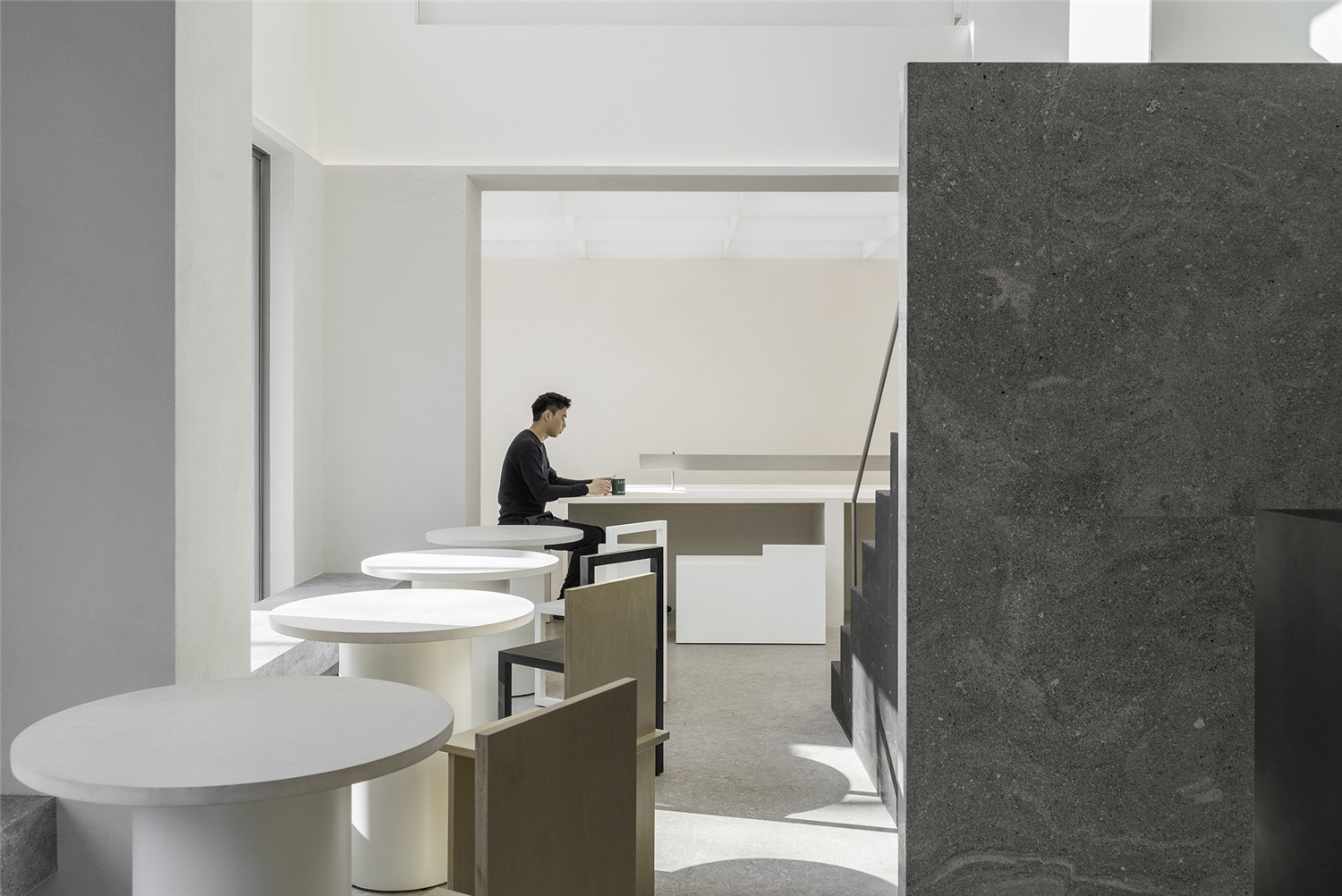
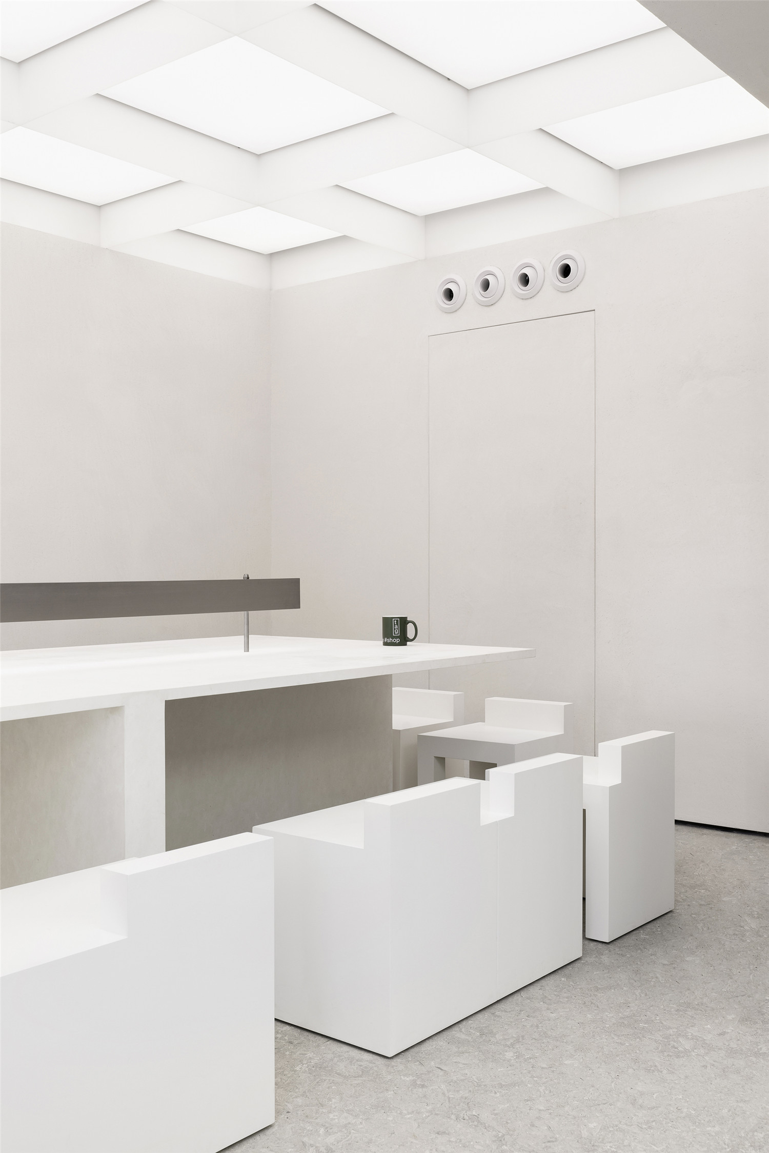
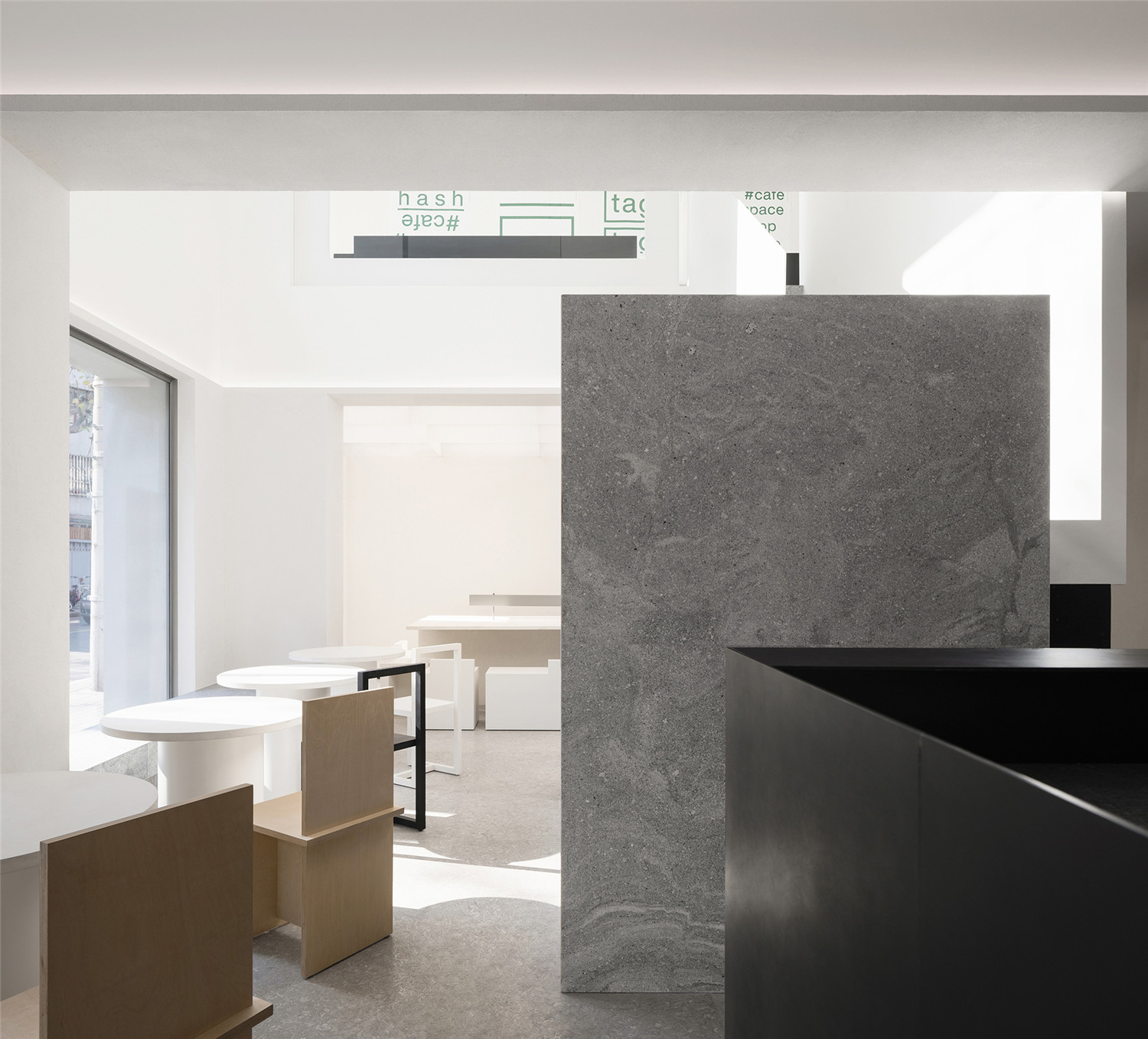
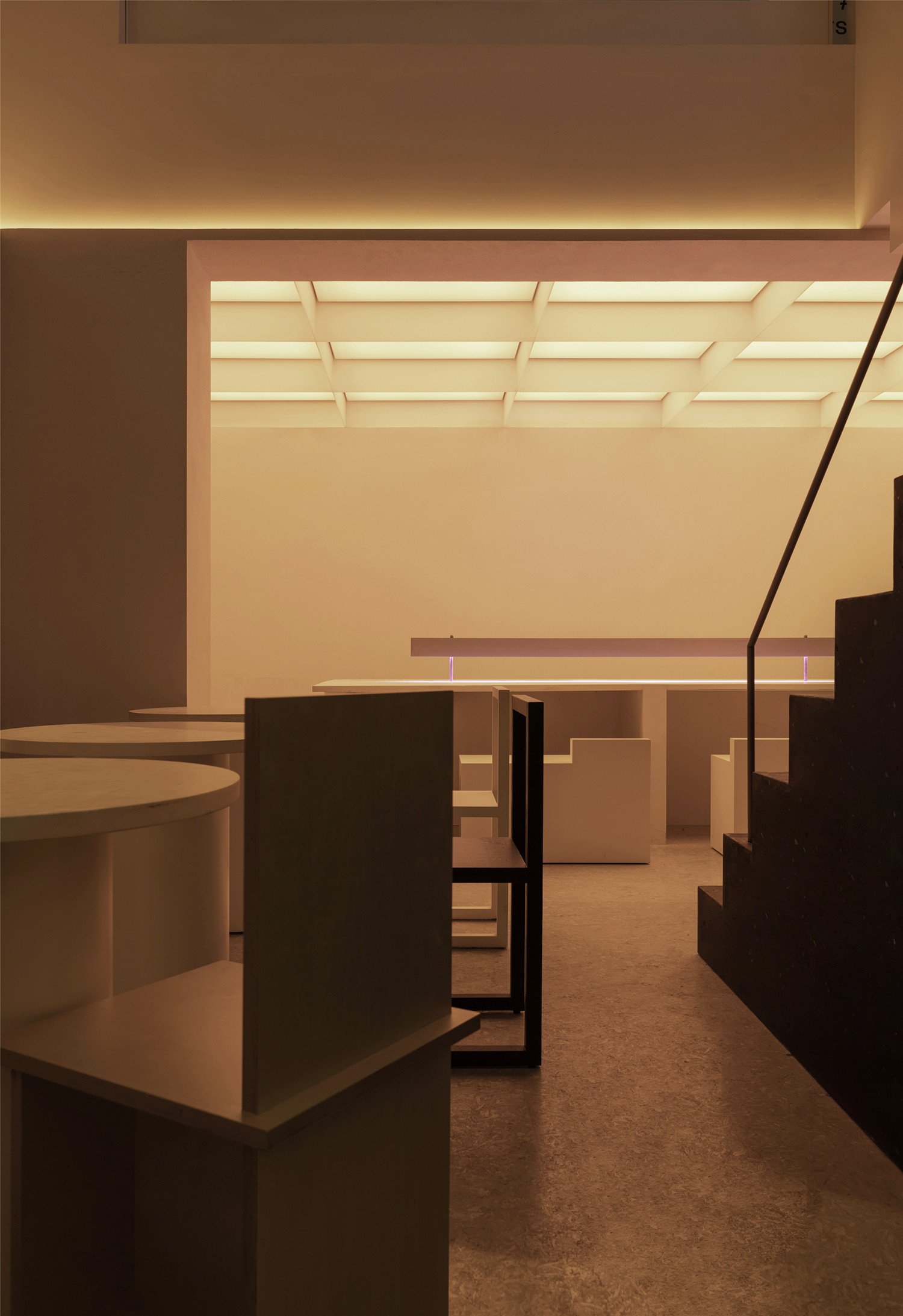
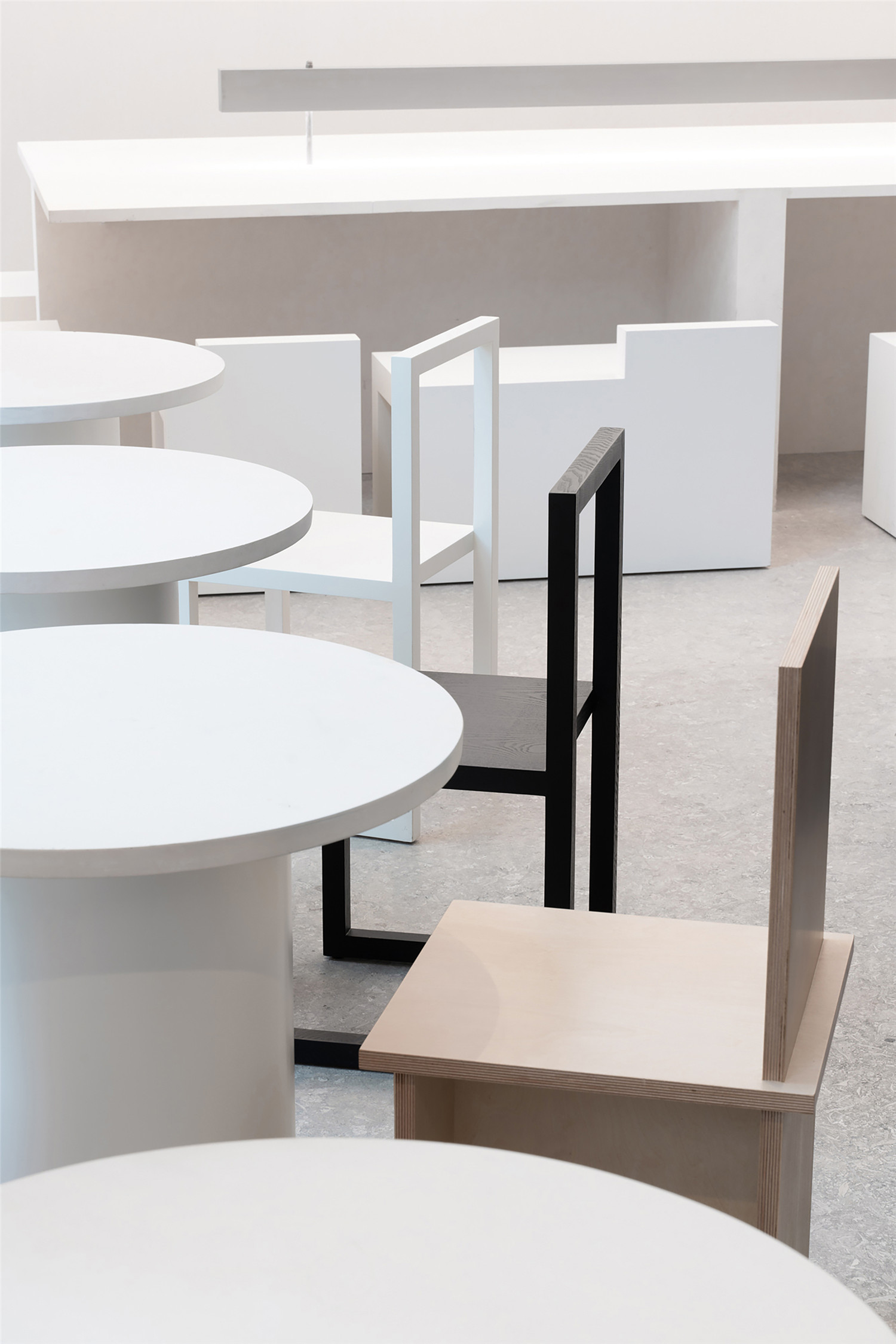
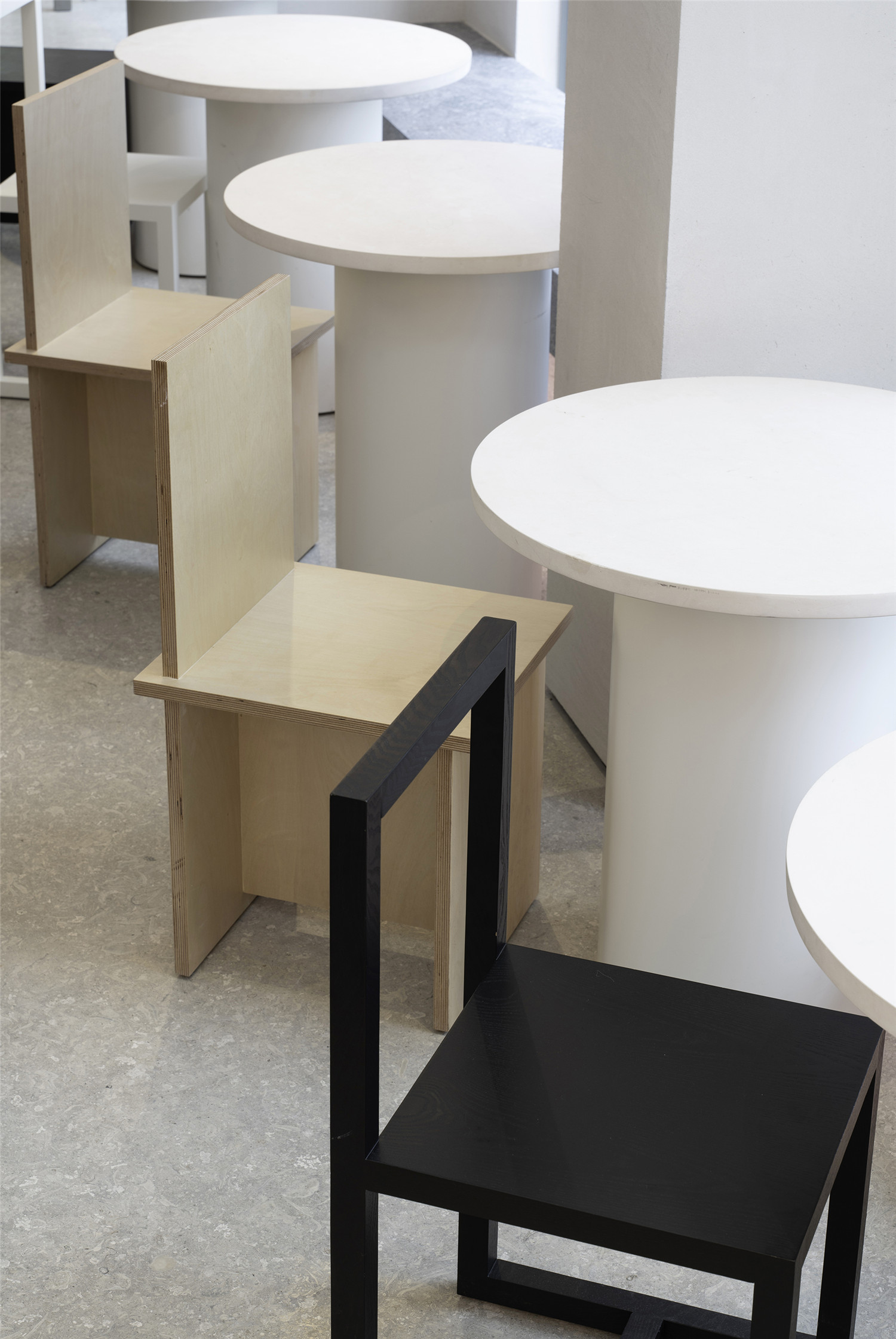
完全进入建筑后,人的视线可以一直贯穿到建筑的最尽端。三组被加固的“洞口”形成了主要的空间序列,洞口的边缘延续了室外建筑“下大上小”的操作,使用一个装饰性的薄边来消解梁的厚重感。尽端的开间放置了一张由白砂岩做成的大桌子,人们可以围着桌子进行不同状态的使用。矮凳被设计成矮椅背的墩子,举办活动时可被完整地收纳到桌面下方。
After fully entering the building, the guests could look through to the end of the building. The three groups of reinforced “holes” form the main spatial sequence. The edge of the hole corresponds to the trapezoidal style of the exterior and uses a decorative thin edge to dispel the sense of weight of the beam. A large table made of white sandstone is placed in the open space at the end of the space, and people can conduct a variety of activities around this table. The stools are designed with lower backs, to enable them to be completely stored under the table whenever needed(Internal space design).
▲楼梯
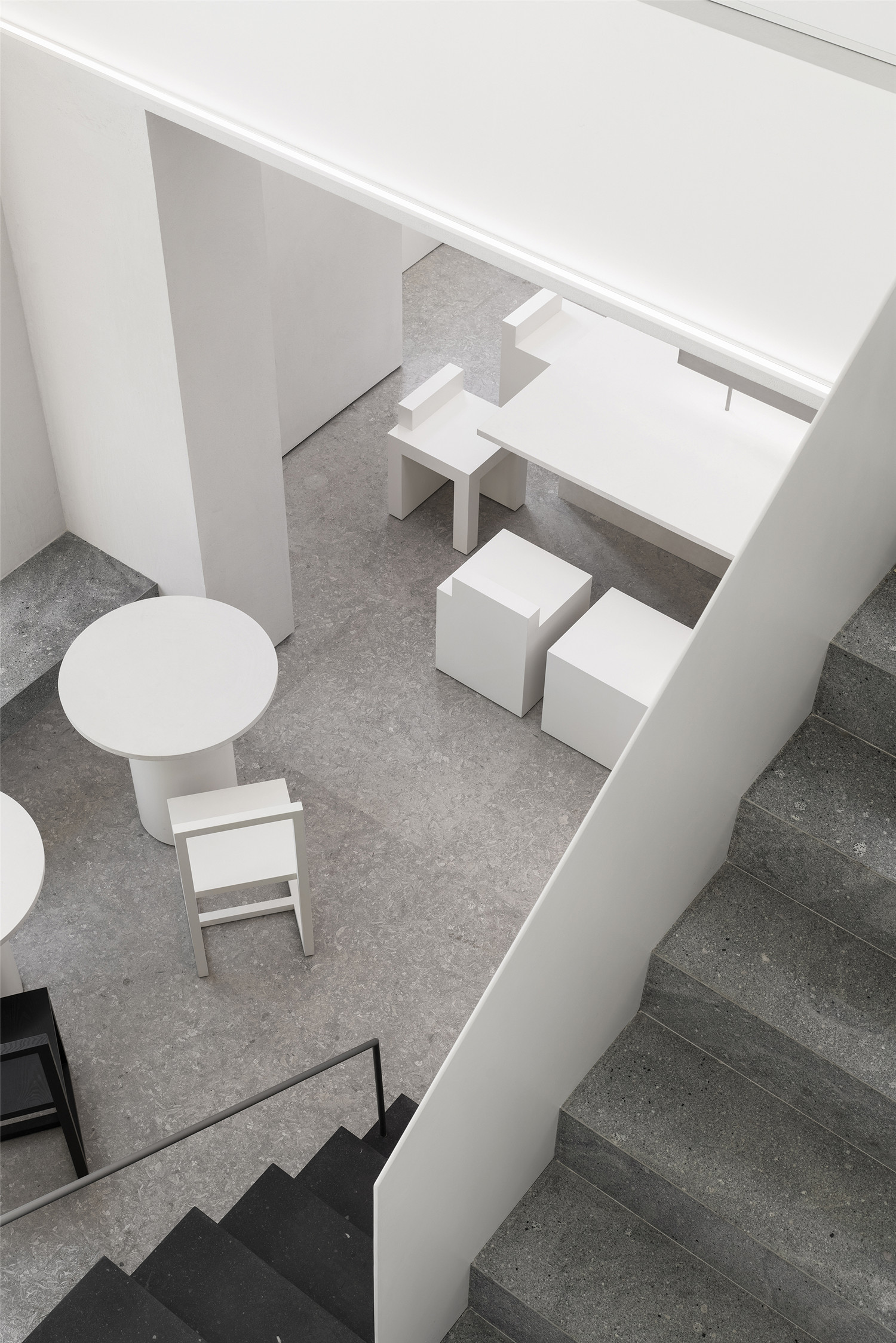
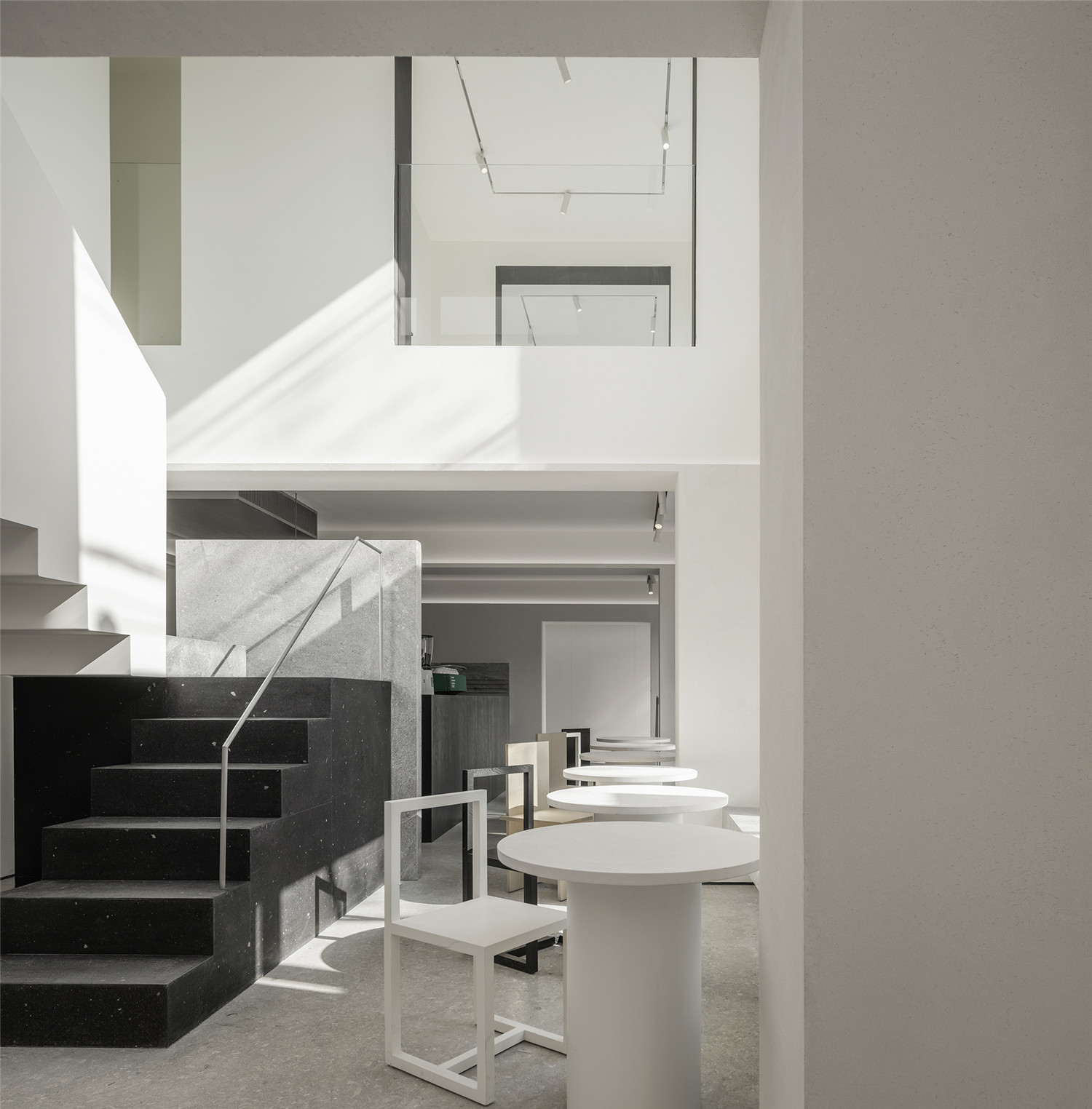
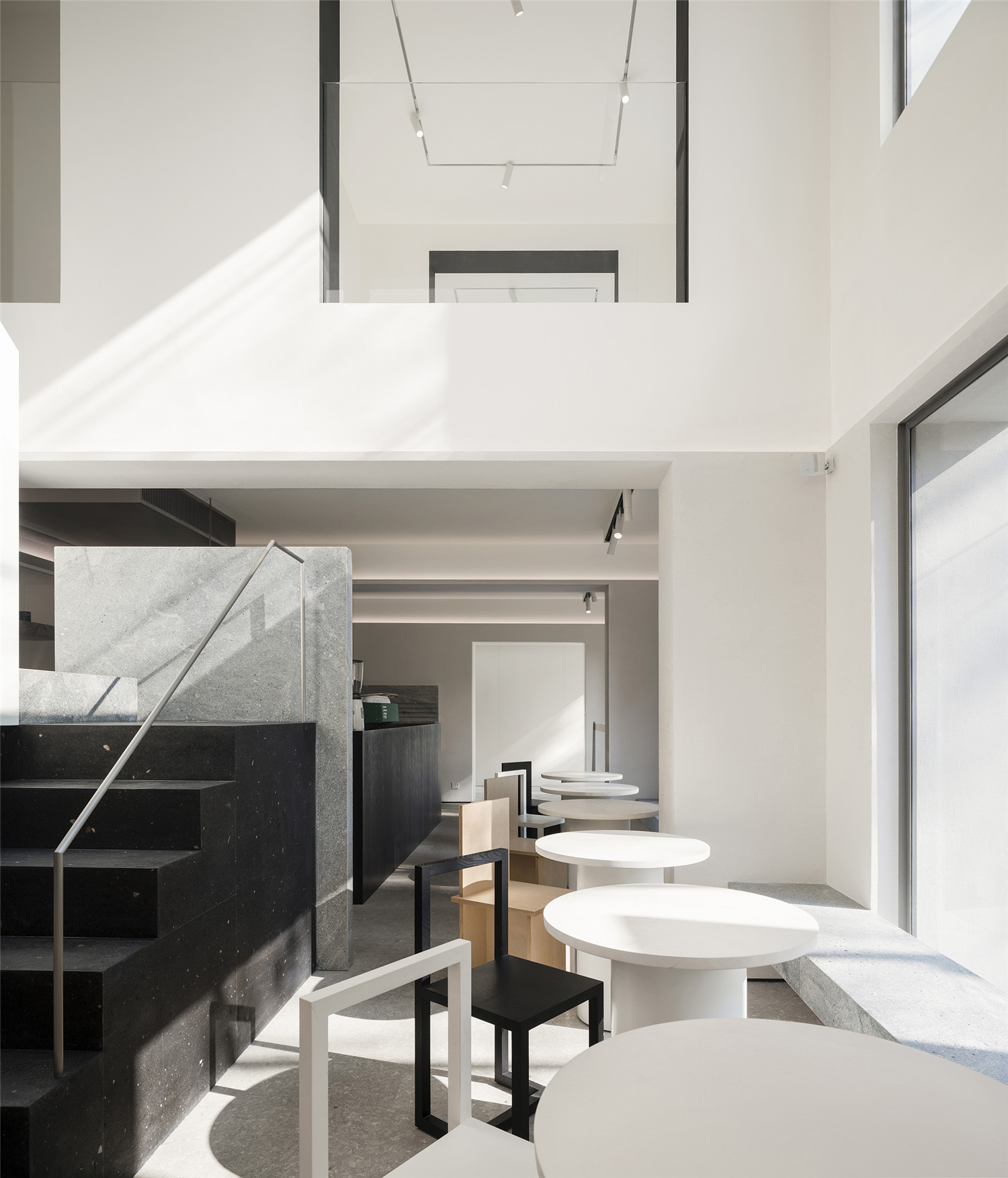
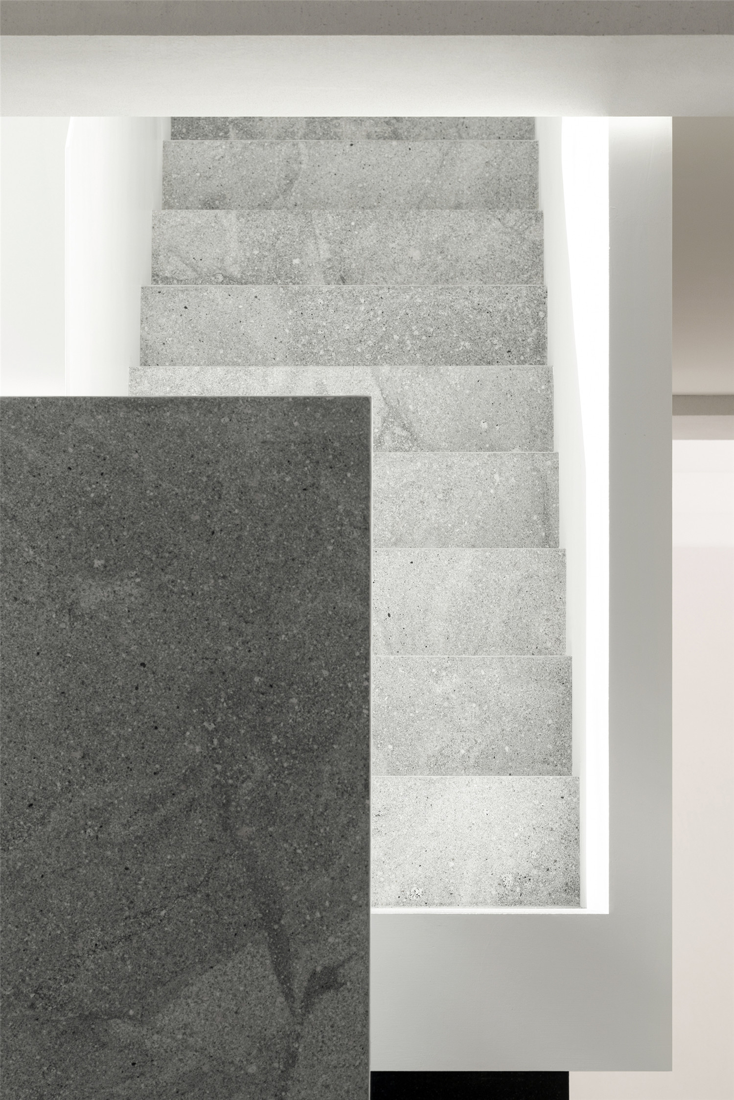
改造保留了原有建筑的楼梯作为后勤通道,与此同时,我们希望在两个水平层之间提供一个通高的空间,既形成尺度上的差异,让尽可能多的街道和城市生活从视觉上进入室内,又可以解决顾客上下楼的流线。楼梯从下至上,通过三种颜色的材料,从黑色火山岩、灰色花岗岩到白色涂料,延续了室内外贯穿的色彩方案,即底部纯色,上部白盒子的策略。
The renovation preserves the stairs of the original building as a logistic passage. At the same time, the design team aim to provide a visually tall space between the two horizontal levels, which not only forms a difference in scale, but also increases the size of the scenery that the guests could see from inside the building. Additionally, this design could also cope with the flow of guests going up and down the stairs.From the bottom to the top of the stairs, the design team has used three colours, from black volcanic rock, gray granite to white paint. Continuing the color scheme of indoor and outdoor penetration, that is, the strategy of solid color at the bottom and white box at the top.
▲吧台
▲收纳柜
▲靠窗长凳
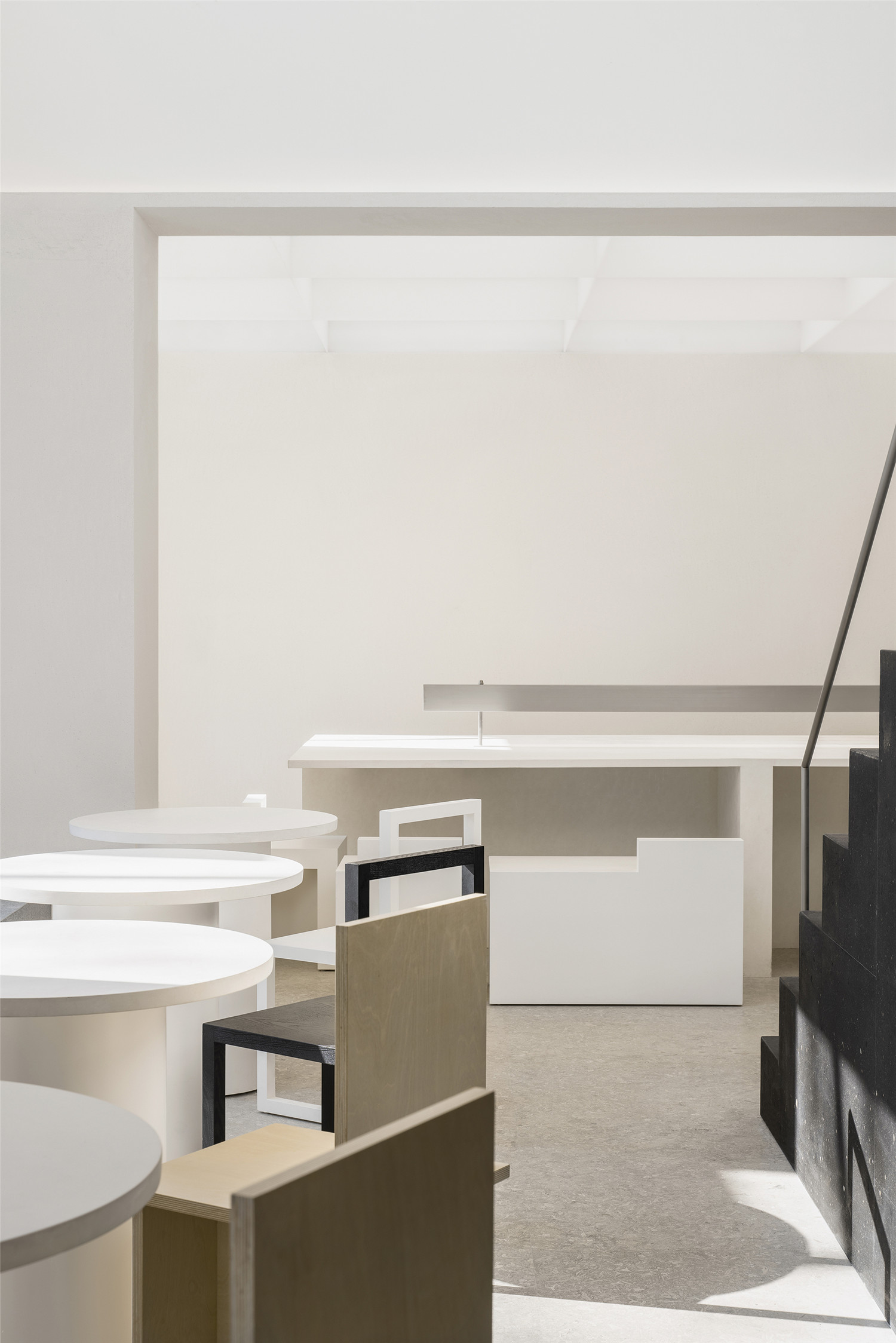
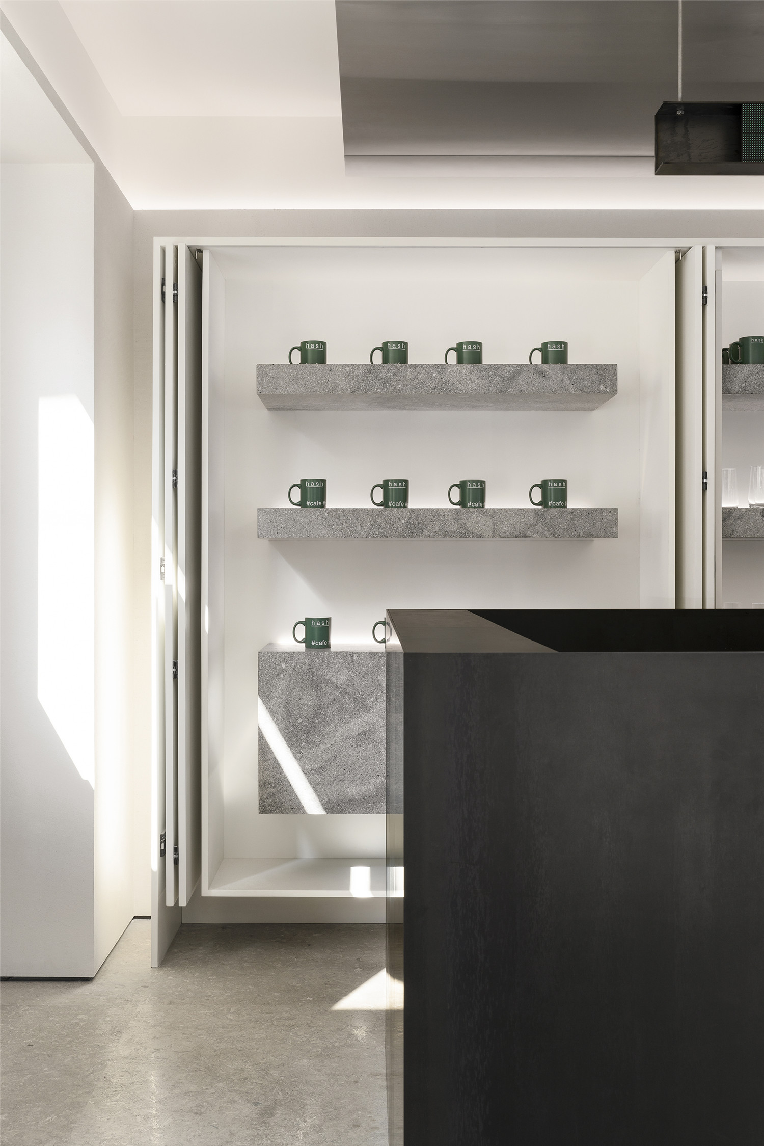
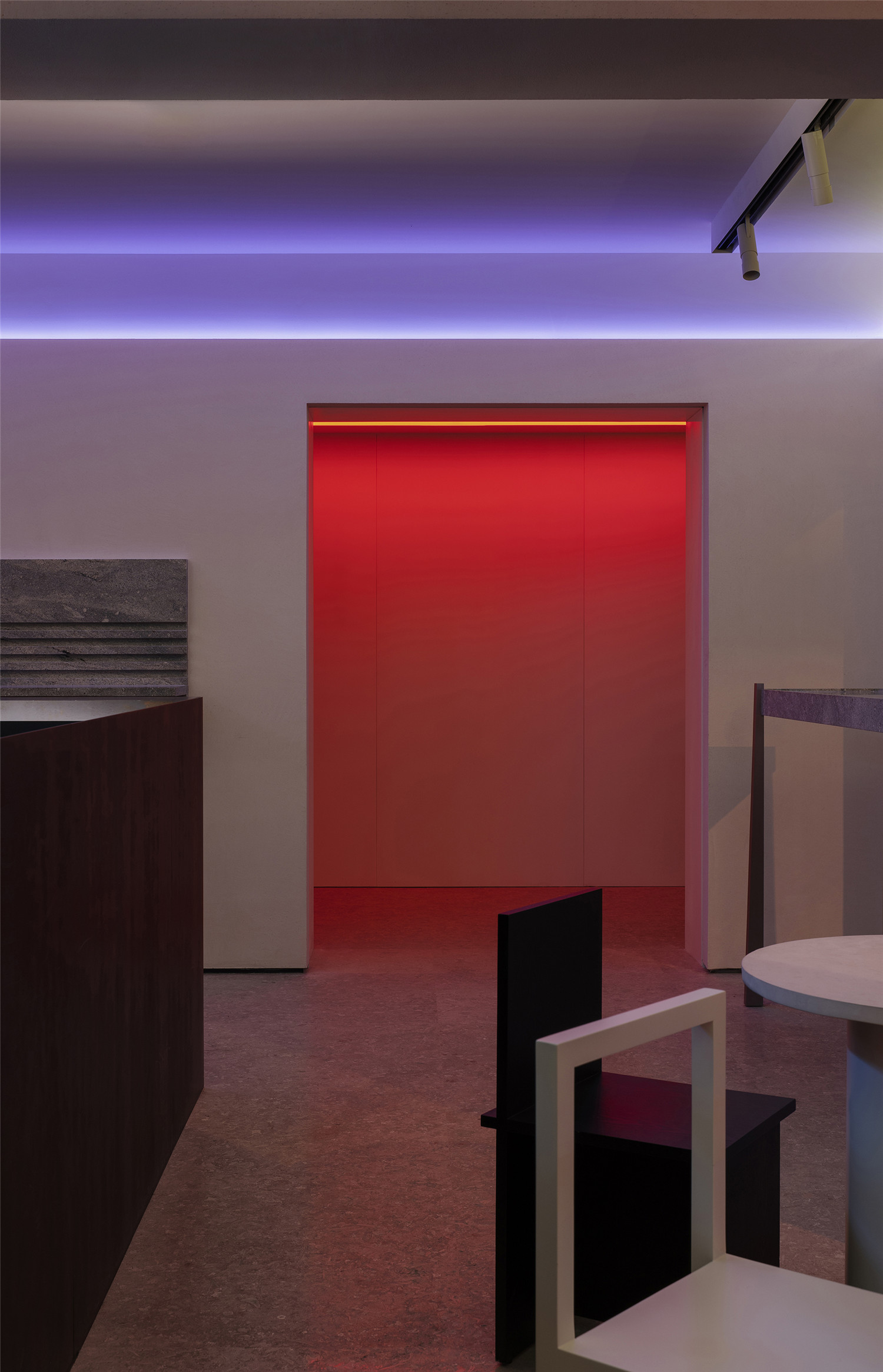
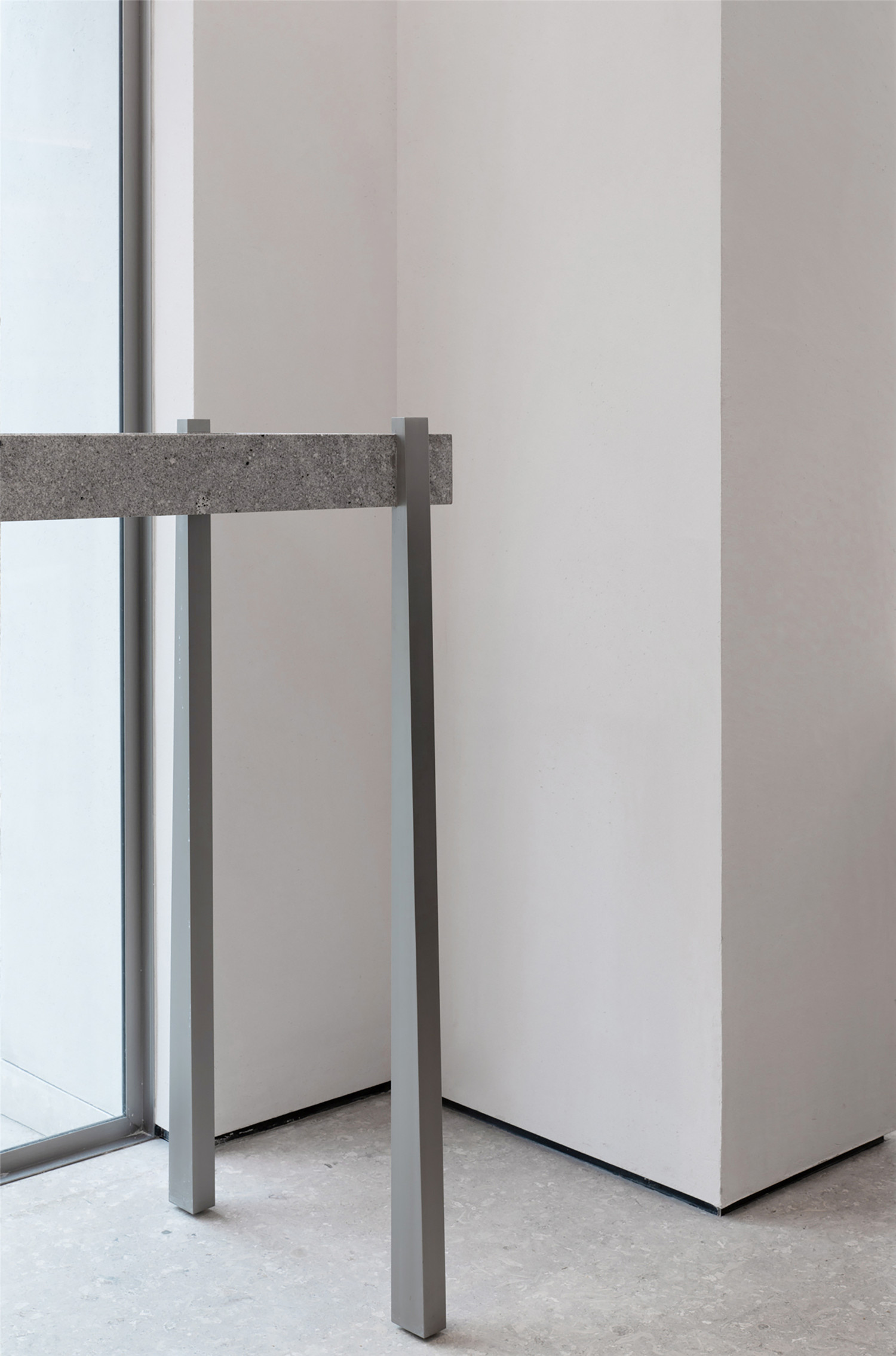
设计师希望营造灵活的空间体验,建筑内除墙体外,所有的物件都被设计成独立的形态。从入口处可被环绕的吧台、脱离墙体的收纳柜、悬挂在天花下的空调出风口,到靠窗的长凳甚至以往尽可能被隐藏的干垃圾筒收纳,都被单独零散地放置在室内。在室内材料的选择上,尽量使用纹路较浅的、哑光的纯色材质,比如吧台的黑色热轧铁板和楼梯的火山岩材质,一眼看上去是一种单色的块面,靠近后才会显现出细腻的肌理。
The design team has created a flexible and relaxing space for the guests. All objects in the building except the walls are designed to be independent. From the bar that can be surrounded at the entrance, the storage cabinets that are off the walls, the air-conditioning outlets hanging under the ceilings, to the benches by the windows, or even the dry trash cans that are normally hidden in conventional interior design, all of these items are all placed independently. In the selection of interior materials, the design team used materials with flattened texture with matte finish and pure colour. For example, the materials of the bar are made from black hot rolled iron plate and the stairs are featuring volcanic rocks. At first glance, these materials look like a monochrome surface, but when look closer, these materials show a finer texture.
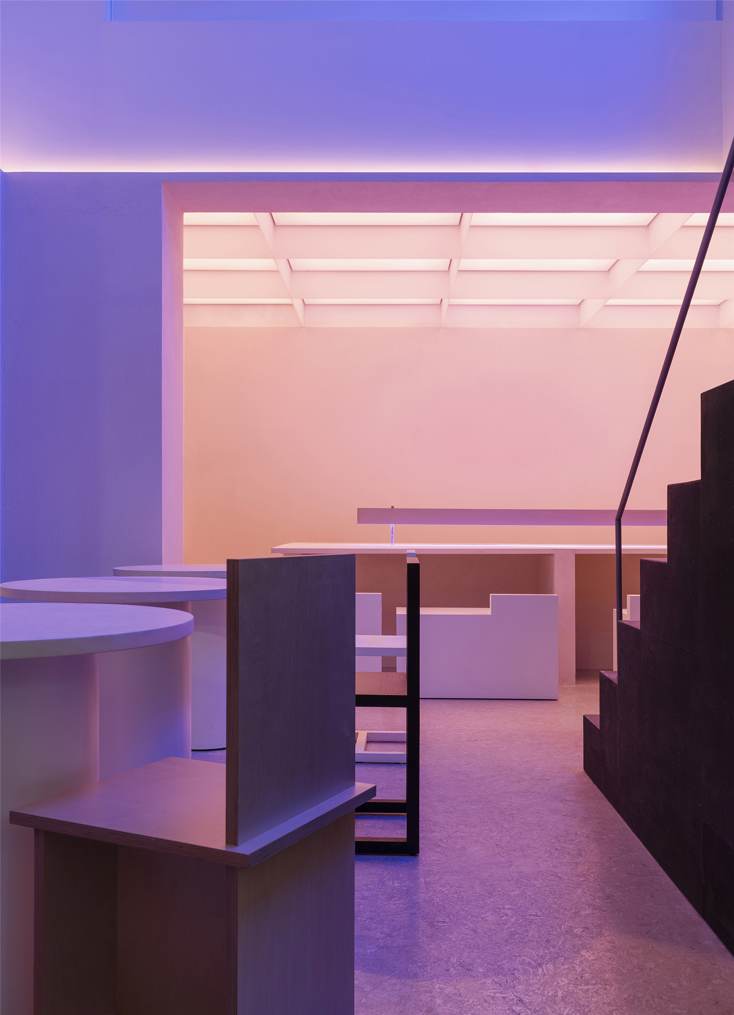
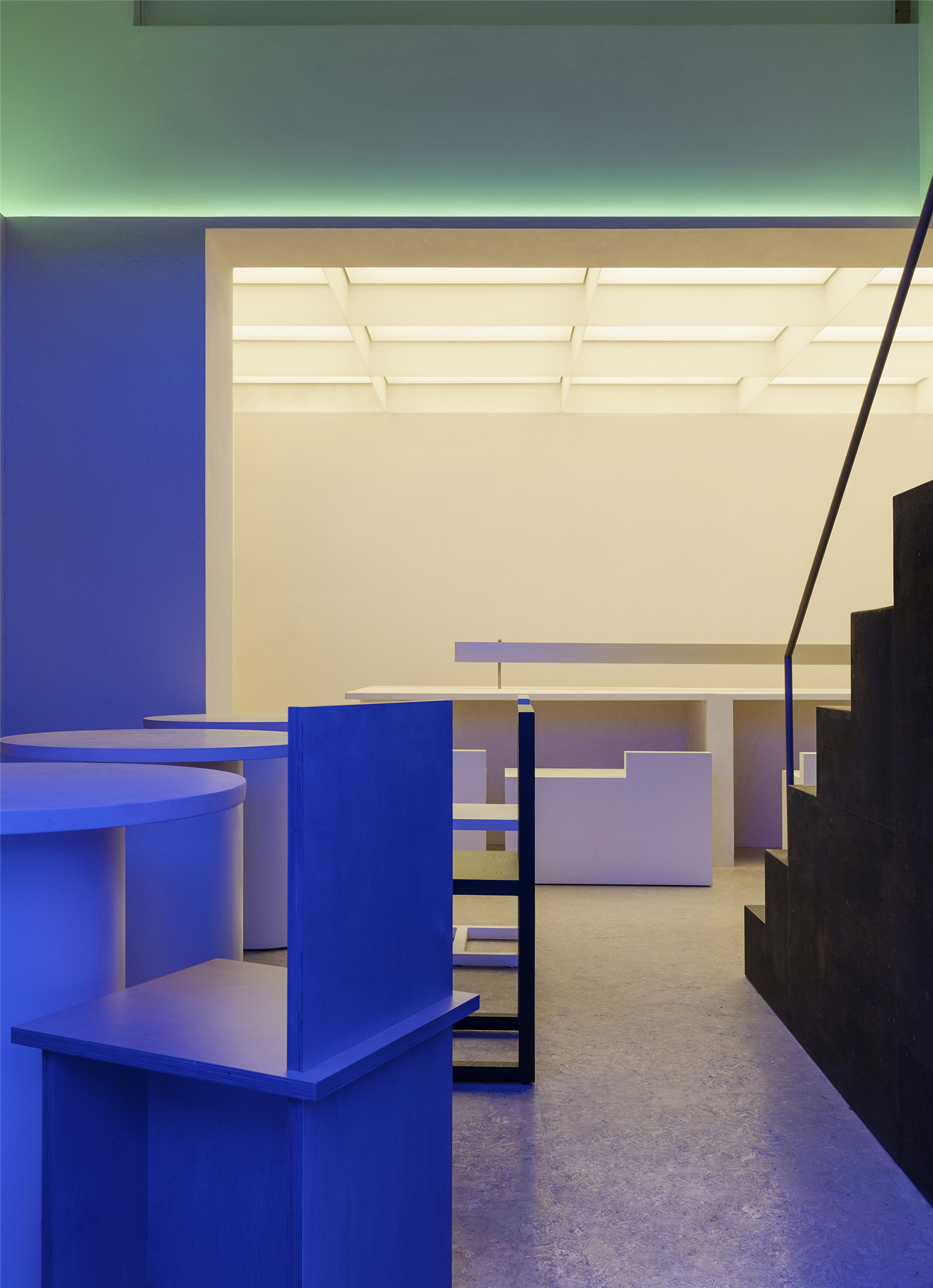
由于晚上首层要作为鸡尾酒酒吧使用,在一个极简低调的空间里,灯光的设计起了重要的作用,我们在首层墙体上与梁底做了一圈可调色的RGBW灯带和发光等膜,并且设置成跟随音乐的变化而变化出任何一种颜色。白色就固定一种暖白光模式,晚上是幻彩色,一周七天都是不一样的效果。让这个白天低调简洁的空间到了晚上则变成色彩斑斓的鸡尾酒酒吧。道具化的布置增添了室内临时的、动态的体验,在夜晚,底层的灯光颜色随着音乐而变化,人们就可以在这些道具中走动交谈,而不必端坐在一个位置。
Since the ground floor will be used as a cocktail bar at nighttime, in a minimalist and inconspicuous space, the lighting design plays an important role. We made a circle of colorur-adjustable RGBW light strips and luminous film on the walls of ground floor, and they are set to change to various colours with the change of music. The lights are set to warm white light mode in the daytime and iridescent colours in the night-time. The lighting changes every day, seven days a week, to make this plain and simple space in the daytime transforms into a colorful cocktail bar at night. The prop-like arrangement adds a temporary, dynamic experience to the space. At night, the colours of the lights on the ground floor changes with music and people can walk around and talk among these props without having to sit in one place.


▲二层空间
为了在二层的端部营造自然的光线,改造去除了部分预制板屋面并浇筑了新的天窗,狭小的空间因此不至于闭塞不堪。除了一个可以用餐的区域和后厨外,二层尽端的三跨都被定义为展览空间,因此墙面和地面选择了更容易被反复修复的材料。“策展”的概念逐渐开始被商业场所所接纳,店铺的经营者希望用这样的空间作为艺术家的作品展示和为品牌活动提供场地。在互联网时代,消费空间似乎难以逃脱网红打卡的图像式诉求,在店铺的设计中,我们也是用简洁扎实的当代手法探索一些图像之外的体验。
In order to create natural light at the end of the first floor, part of the prefabricated roof was removed, and new skylights were added, to visually expand the space with the play of lights. In addition to a dining area and a kitchen, the three spans at the end of the second floor are all defined as exhibition spaces, so the materials of the walls and floors are covered with low-maintenance materials which could be easily restored. The concept of “curating” is gradually being accepted by commercial venues. The store manager wished to use this space as an exhibition venue for artworks and a venue for brand activities. In this Internet era, it seems difficult for commercial spaces to avoid the tag of “internet-famous site”. In the design of the store, we also use simple and strong contemporary methods to explore some of the experiences outside the image.
▲空间细节

▲轴测图

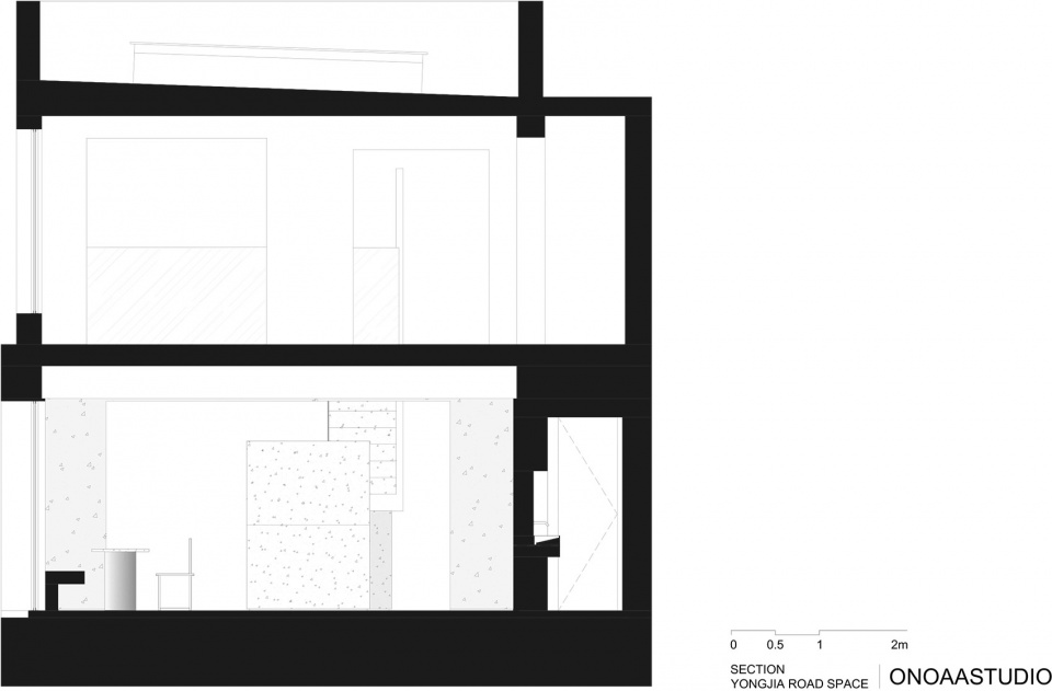
▲剖面图
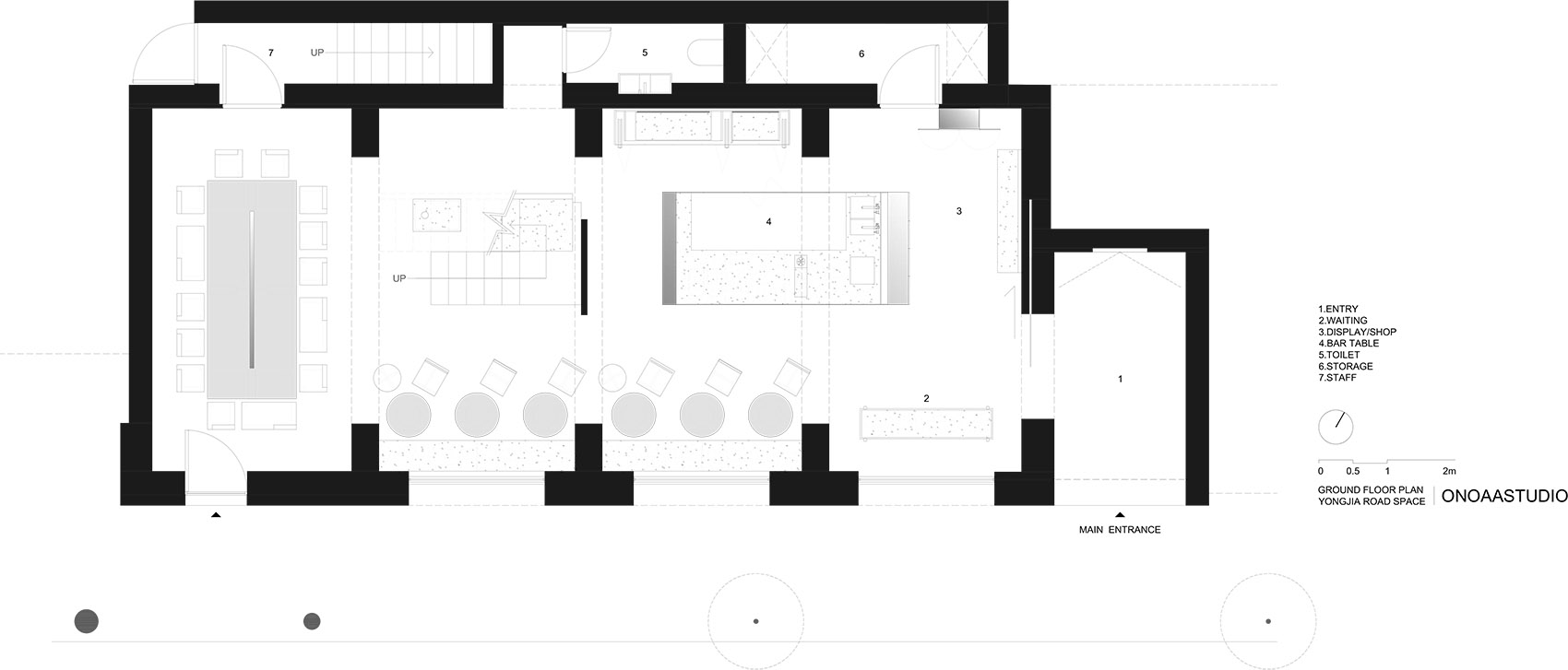
▲一层平面图

▲二层平面图
项目信息——
项目名称:HASHTAG#cafe#space#shop
地点:上海市永嘉路380号
项目完成时间:2020年1月
建筑面积:200㎡
设计:ONOAA STUDIO
项目设计师:Chen Penn, Gao Ya
工作室邮箱:info@onoaastudio.com
摄影:Wen Studio
Project Information——
Project name:HASHTAG #cafe #space #shop
Location: 380 Yongjia Road, Shanghai
Project Completion Time: January 2020
Building area: 200㎡
Building Reconstruction and Interior Design: ONOAA STUDIO
Email: info@onoaastudio.com
Project Designer: Penn Chen / Gao Ya
Photography: Wen Studio


