

当国民零食品牌亲亲在上海设立全新的办公总部时,邀请JYDP间睦设计进行室内焕新设计。JYDP思索该办公场域不仅要为亲亲不断扩大的线上和线下团队提供激励交流和协作的空间,还应呼应品牌始终秉持的企业理念——“better food , better life”。伴随着亲亲食品品牌的全面升级,JYDP以品牌全新logo——“微笑的嘴角”的平面元素为设计灵感,致力为品牌打造独立与共享兼容、工作于休闲并济的多功能办公空间,助力企业业务发展和彰显人文关怀。
When JYDP was invited to design the new office for Qin Qin, a national snack brand in China, we ponder that the office should not only provide incentive communication and work space for their expanding teams, but also incorporate with the brand‘s philosophy – “better food, better life”. With the upgrading of Qin Qin brand, JYPD’s design draws inspirations from their new logo – “the smiling mouth”, and is committed to creating a multi-functional office with independent, co-working as well as leisure space. The ultimate goal is also to empower help the business development of Qin Qin and deliver the humanity care embedded in the brand.

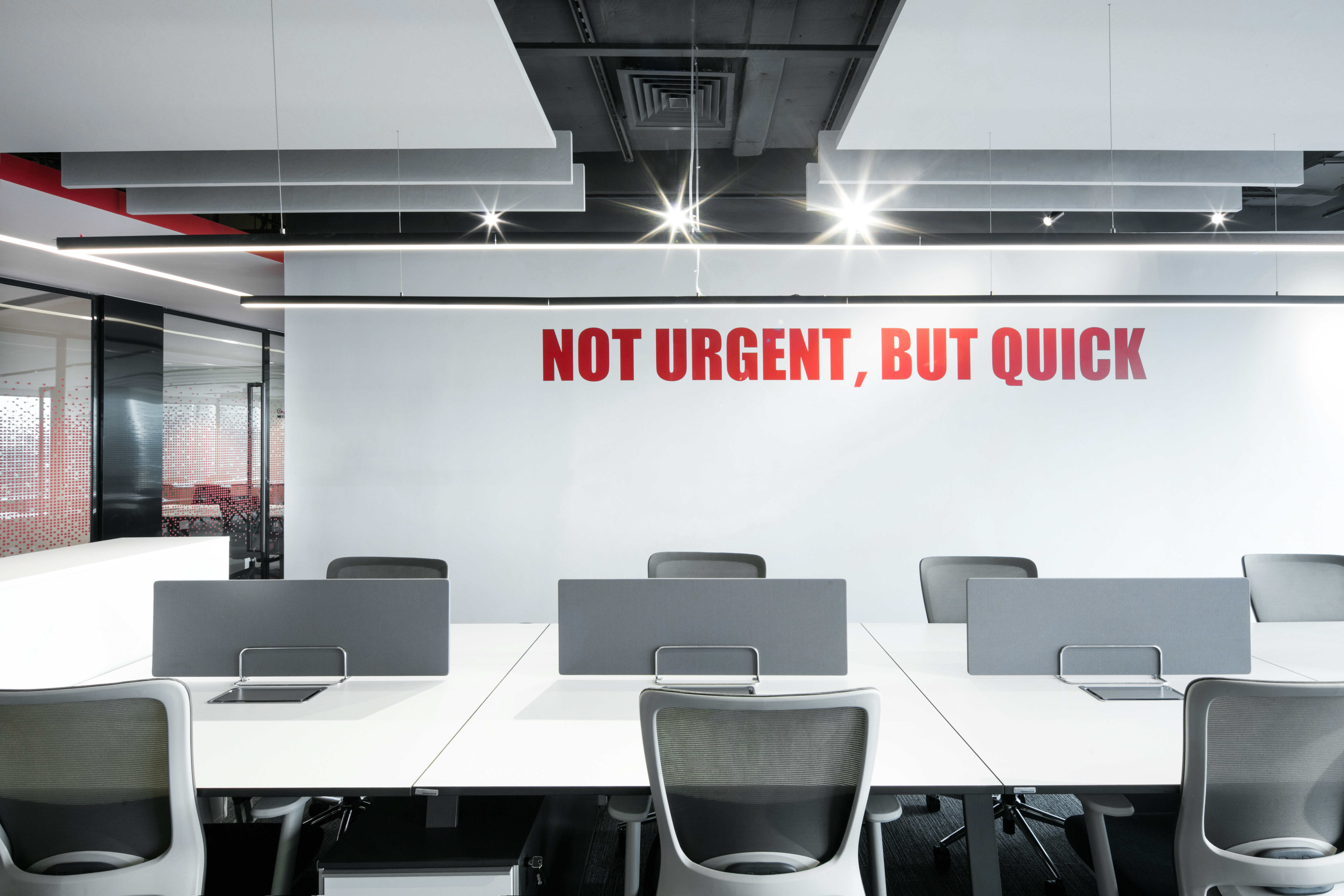
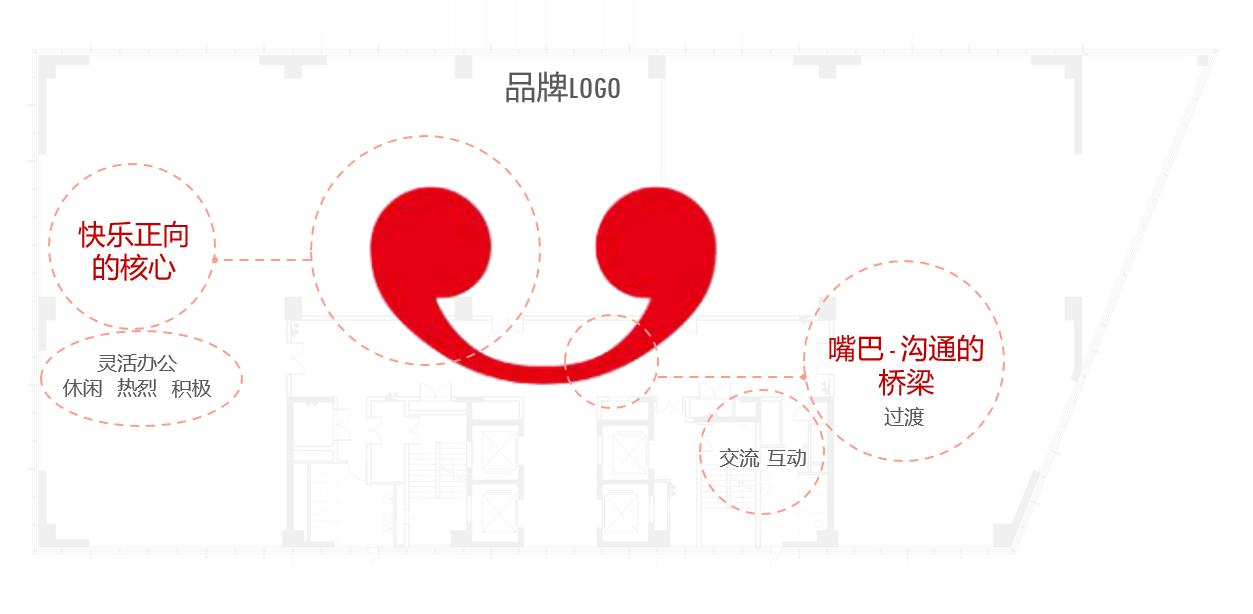
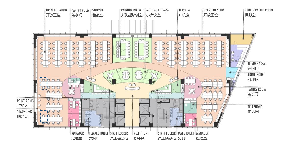
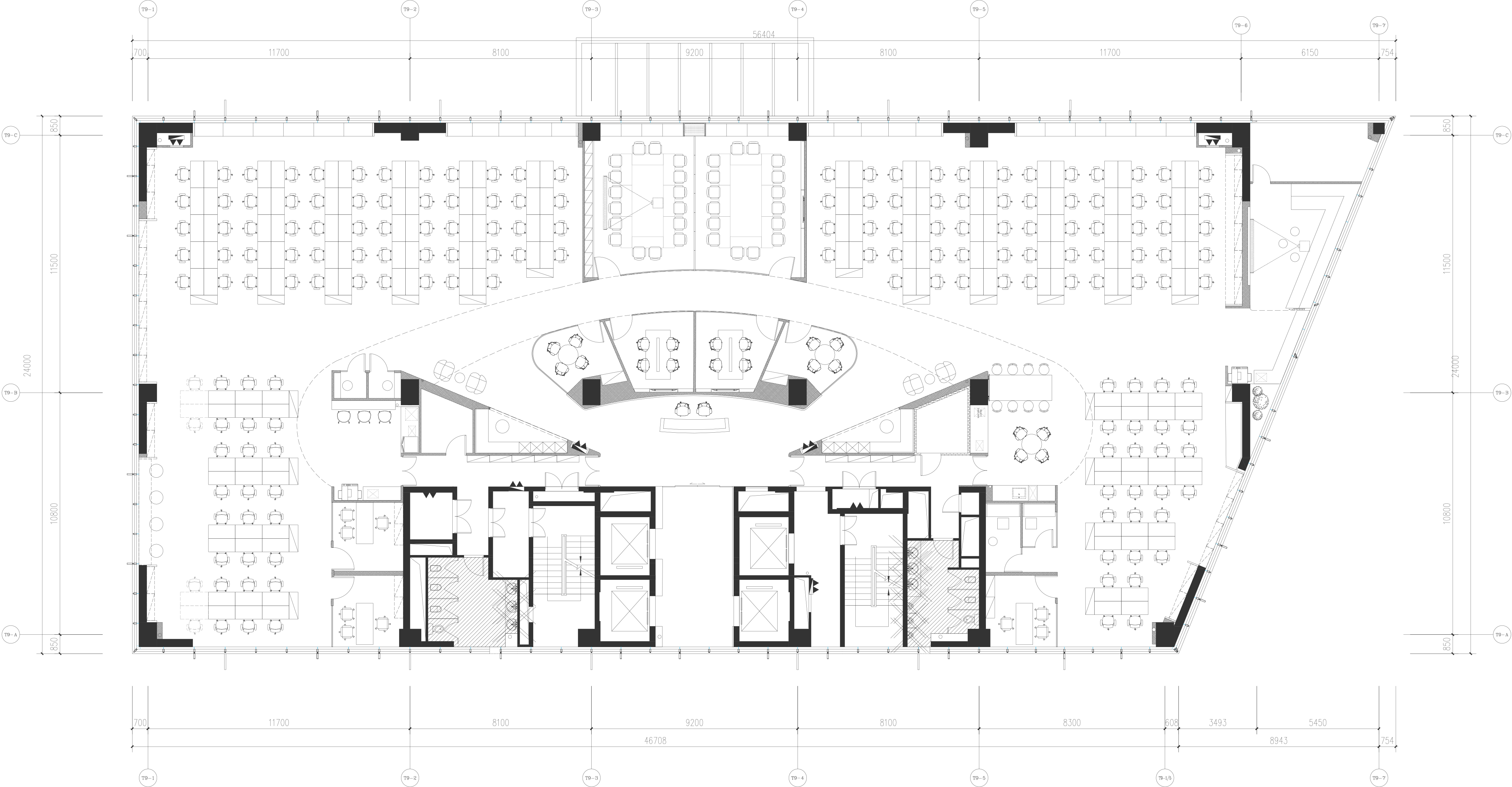
设计师提取“微笑的嘴角”平面意义上的灵感——两个对称的圆代表快乐正向的核心,于办公空间则意味着开放、活力补给的休闲区域;中间连接两个圆的曲线则代表了“微笑的嘴巴”,也是沟通的桥梁,于办公空间则意味着交流、互动协作的共享区域。设计师巧妙地将logo形状的意向对应到办公平面布局中,界定整个空间为较为对称的左右部分,合理分配给到不同的部门配给工位。两处圆形位置则形成茶水休闲区,而中间连接的曲线部分则为入口接待及连接左右两边的通道。通道两侧设立大小不一的讨论区及会议室,可满足各种会议、讨论、培训需求。整体空间上,以品牌衍生元素中活泼跳脱的红色系和点状辅助图形统一细节和配色,打造一个蕴涵创造性、活力感的现代办公空间。
JYDP takes cues from the graphic elements of “the smiling mouth” – the two symmetrical circles representing the core of happiness, while in the office space, they mean an open and energetic leisure area; the curve connecting the two circles in the middle is the “mouth”, which is the “bridge” for communication, while in the office space, it means a shared area for communication and co-working. The designer has applied the symbols of the graphic elements to the office layout, defining the whole space to the symmetrical left and right areas, and reasonably allocating to different departments. Additionally, the two circular areas situated in both sides form the pantries for people to relax, while the curve part was planned to generate the reception and the passageway connecting the left and right sides. Discussion areas and conference rooms of different sizes are set up on both sides to meet the needs of various meetings and training. In the overall space, the lively red and the dotted auxiliary graphics extracted from the brand‘s VI are employed to unify the color pattern and all the details, creating a creative, dynamic, modern office space.
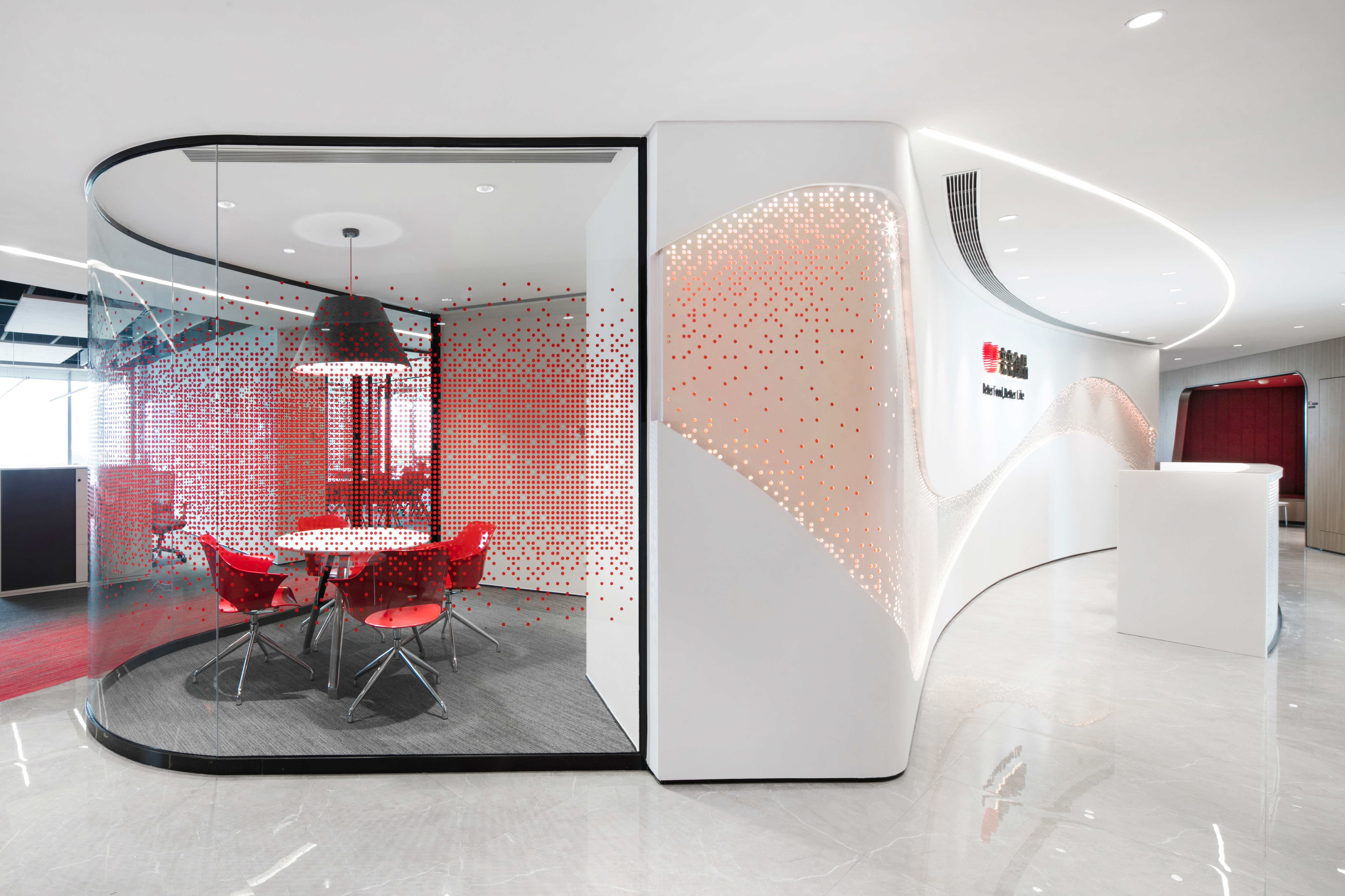

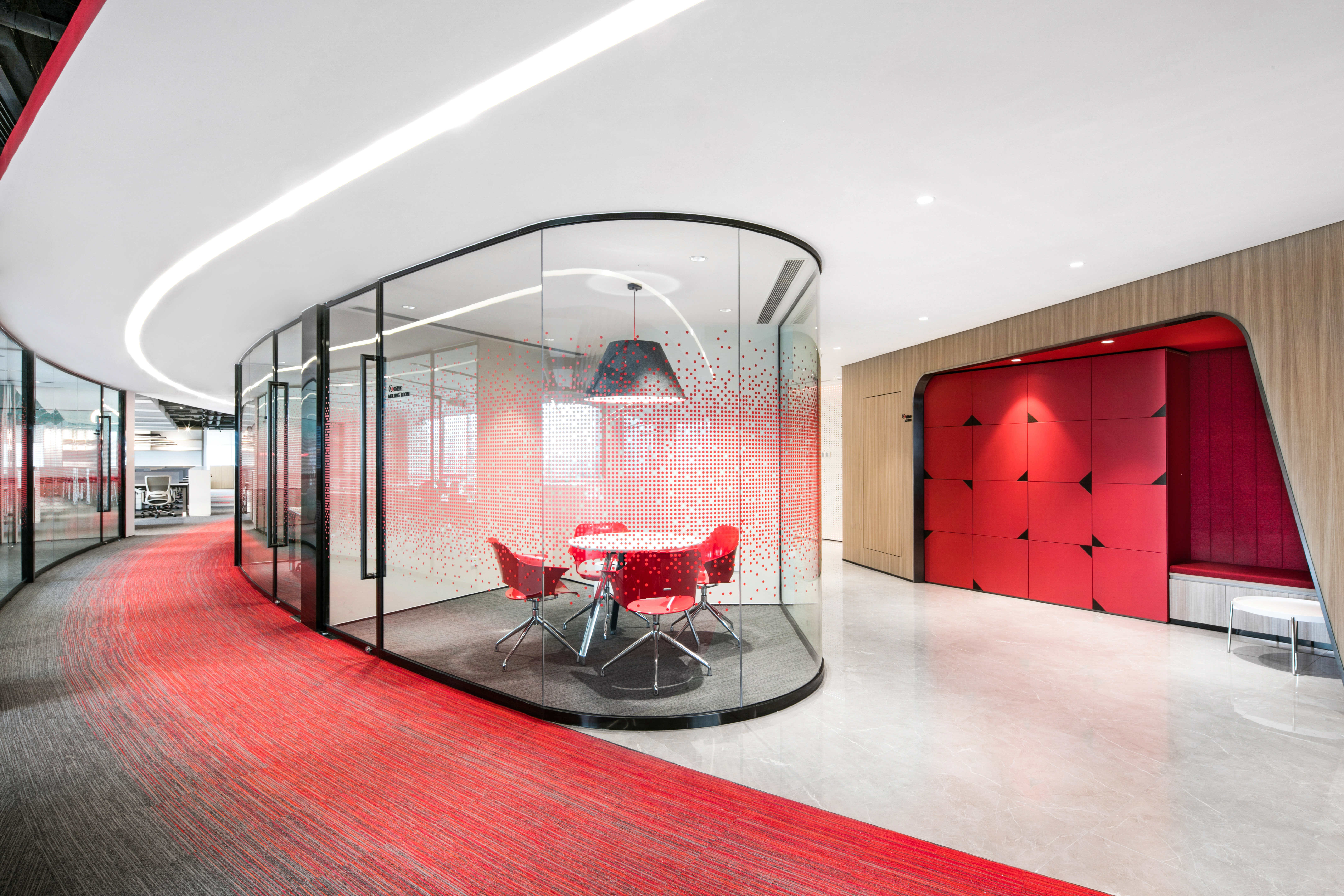

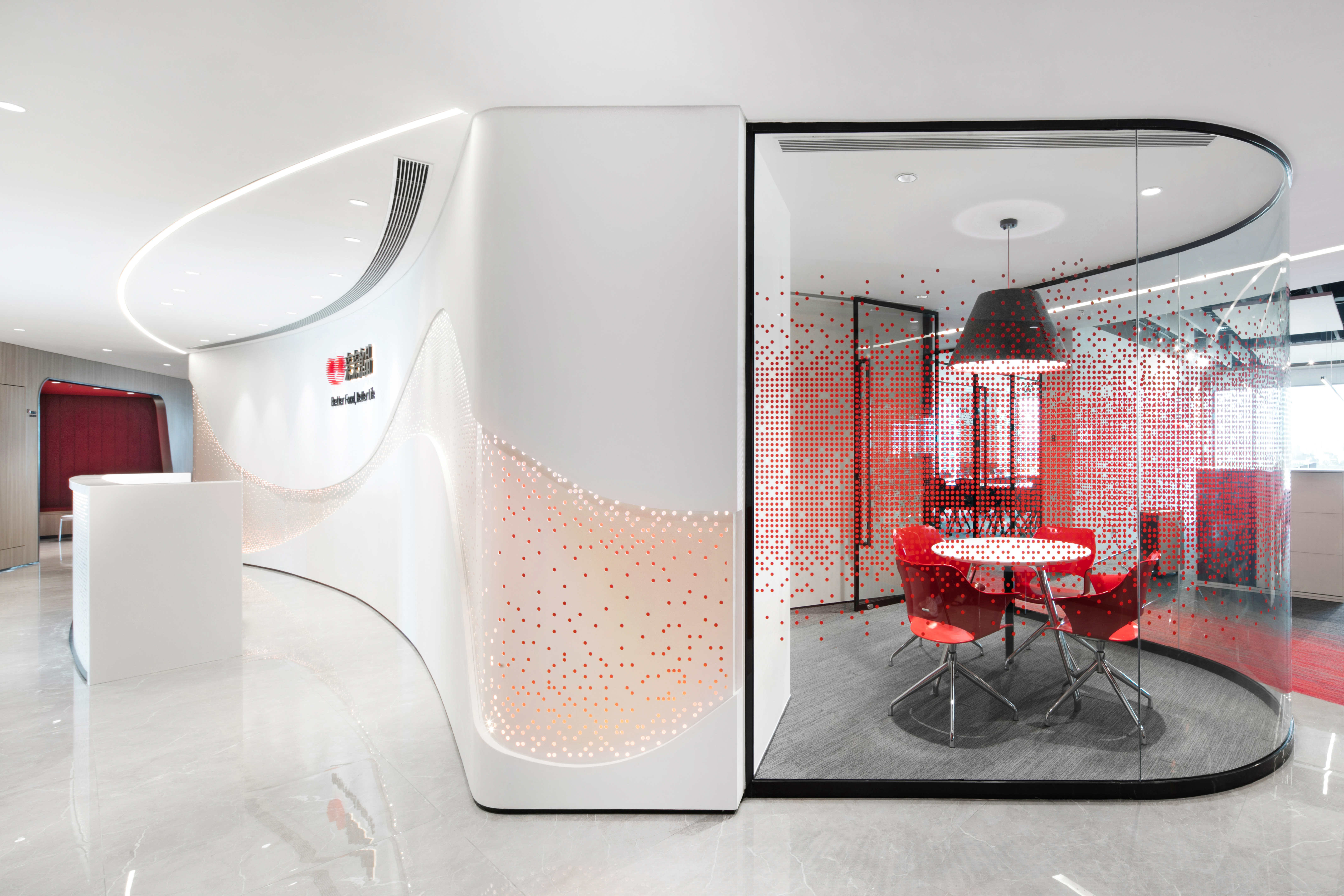
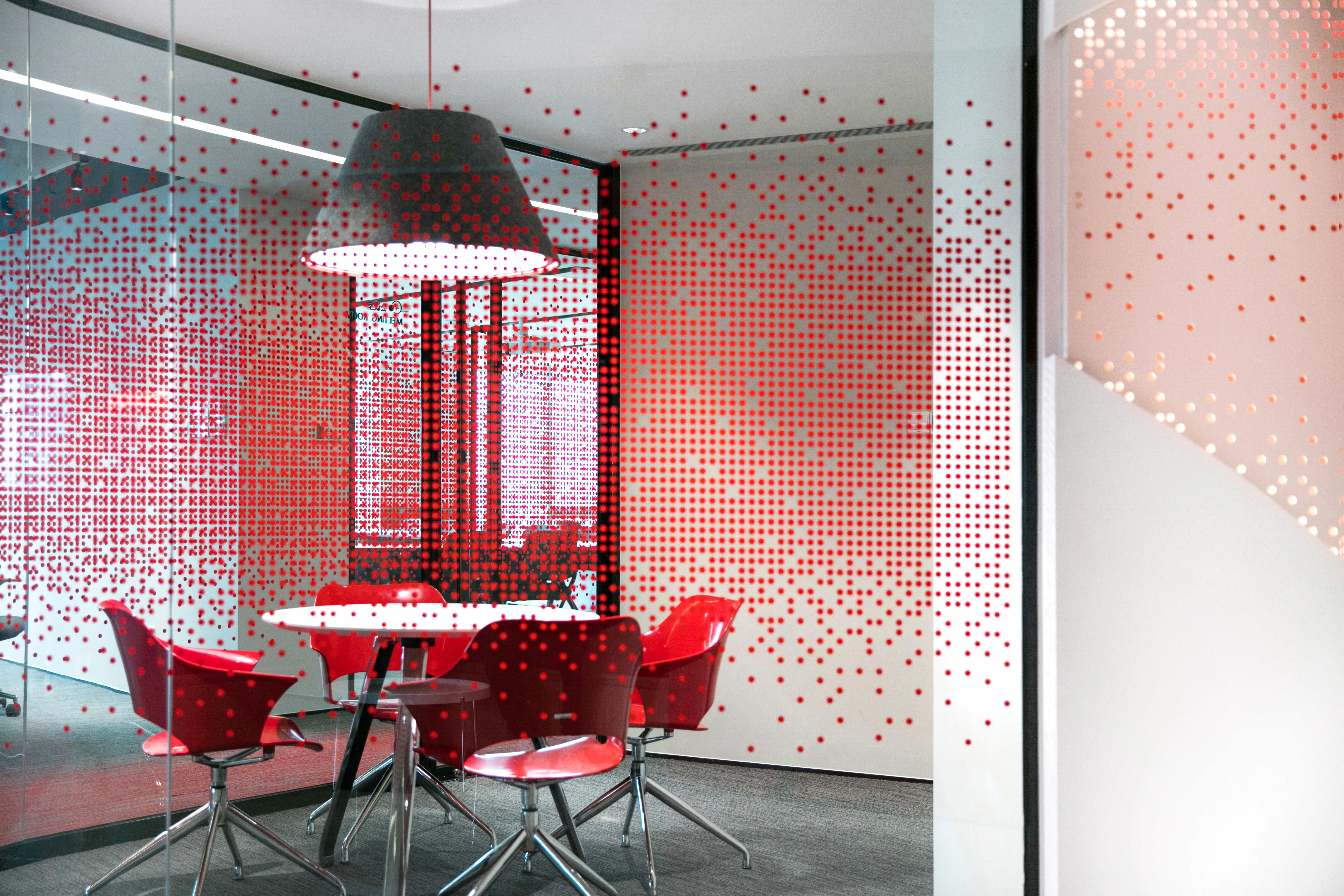
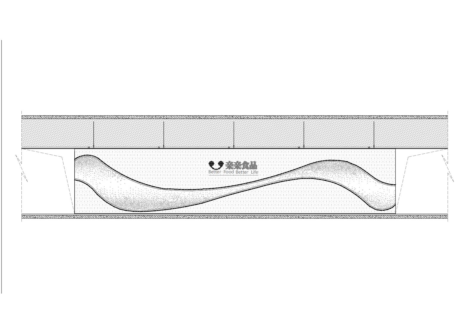
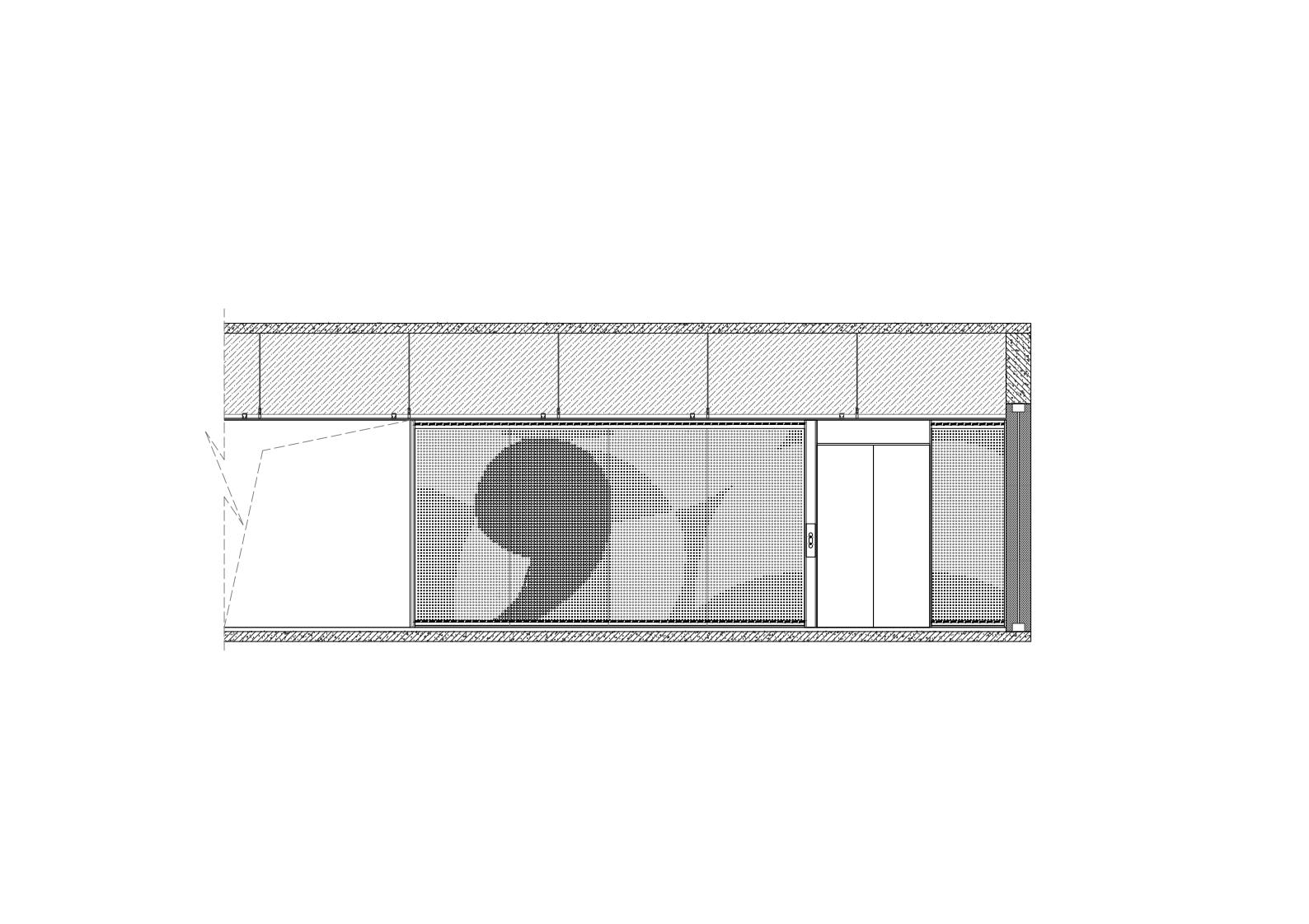
在思考如何合理利用1004平方米的空间满足180余人办公时,设计师有效地对空间和各个区域进行划分。进入办公室的电梯间由印有亲亲品牌图案的白色冲孔板墙面装饰,在上下灯带和红色背景的映衬中掩映渐变的品牌图案肌理。通过玻璃门进入同样采用冲孔板材料的接待台后,可以清晰感知到整个设计的延续性。通过不同大小和密度的冲孔排列形成的整个曲面的背景墙,在平面上由图案元素形成一条连贯的冲孔曲线,细节处理用来体现背景墙的立体层次感,连接着左右两边对称的走道。在两边走道的一侧对称形成的三角空间则设置储藏柜和用作休闲讨论区,接待台背景墙之后形成的扇形空间则形成4个连贯的小型会议室,会议走道的对面靠窗的空间形成了2间可灵活分隔的培训会议室。走道的红色渐变地毯呼应整个前台区域的吊顶,形成的曲线连接也来源于品牌标志的设计灵感。
When thinking about how to maximize the 1004 sqm space, to accommodate more than 180 people, the designer effectively divided the space to different areas with respective functions. The elevator hall has been decorated with Qin Qin’s significant patterns and logos on the perforated panel walls. The vague texture of the brand pattern is hidden in the red background, with the shadows lighting strips from up and down. One can sense the continuity of the design when arriving at the reception which is also made of perforated panels through a glass door. The background was made of a perforated panel wall with dots of different sizes and densities, which graphically forms the perforated curve line to extend the stereo perceptions of two layers. While in the circulation, the wall was designed to connect the left and right symmetrical walkways. The triangle space formed symmetrically on one side of the corridor are set up with storage cabinets and used as a open discussion area. The fan-shaped space behind the background wall of the reception were designed with four small consecutive conference rooms. The space opposite the conference corridor by the window are planned as two training and meeting rooms which can be flexibly separated. The gradient red carpet of the corridor echoes the ceiling at the reception, and the curve design is also derived from the inspiration of Qin Qin‘s new logo.


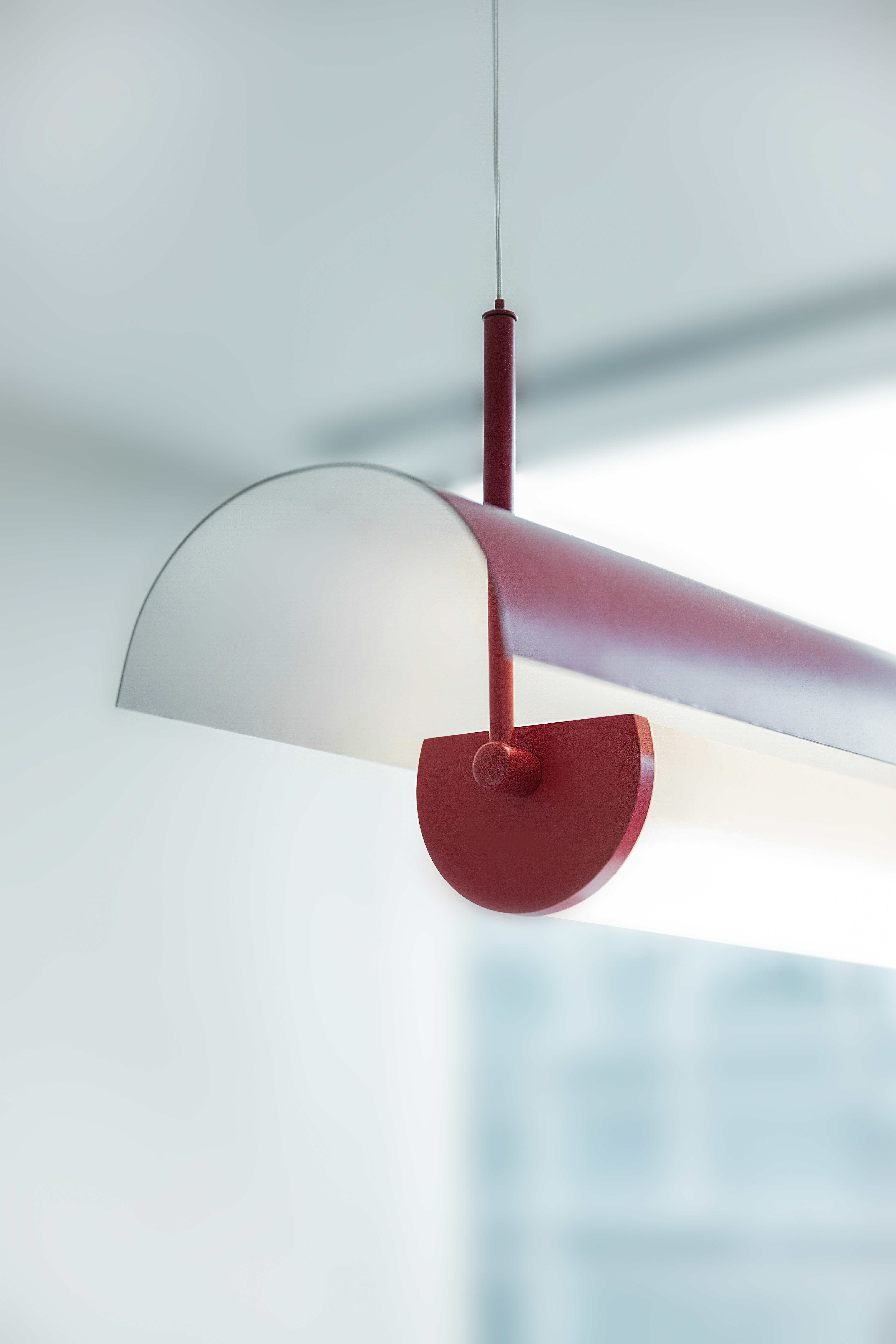
亲亲食品办公室是JYDP在紧凑的环境语境下,设计打造的富有创意的休闲办公和共享空间体系,合理划分、统一的设计语言使整个项目的设计富有层次细节及整体连贯性。以“微笑的嘴角”平面意向出发,连续运用的冲孔板材料搭配品牌主视觉的红色灯带,特别设计定制了同概念的装饰灯具,为整个办公空间奠定了专属亲亲的独特氛围,也助力每一位使用者在空间内不断创造不同的工作喜悦和日常感动,体现亲亲“不断创造喜欢和感动”的价值观。
Qin Qin Office is a creative corporate workplace with open and sharing space designed by JYDP in the context of quite a compact interior. Reasonable divisions, juxtaposed with unified design language enable the space to possess different layers and the overall coherence. With the graphic inspirations of “the smiling mouth”, the perforated panels, the lively red lighting belts and the customized pedants that were continuously used in the interior aimed to present a sophisticated ambient which is unique to Qin Qin. JYDP’s design also adhere to the brand‘s philosophy – “constantly creating joyful and moving moments”, suitable for every user to experience different work accomplishments and daily life happiness.


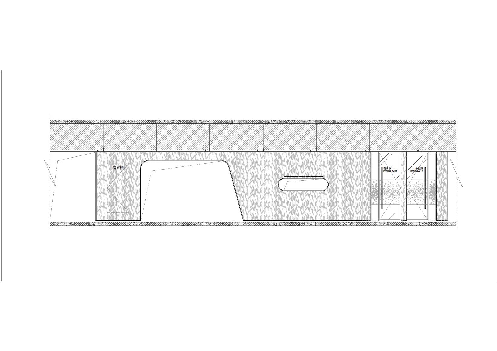
▲概念图纸
▲项目图纸
项目信息——
项目名称:亲亲食品办公室
设计师:JYDP间睦设计
项目类型:办公场所
场地地址: 中国上海
完工日期:2020年05月
面积:1004平方米
设计团队: 孙雅馨(主创设计师)、李霖、王莎莎
摄影师:刘瑞特
软装家具: 科尔卡诺
Project Information——
Project Name:Qin Qin Office
Architect/Interior Designer:JY Design Practice
Project Type:workplace
Location:Shanghai, China
Completion Date:May, 2020
GFA:1004 sqm
Design Team:Michelle Sun (Leading Designer), Leah Li, Shirley Wang
Photographer:Raitt Liu
Materials:metal perforated panel, carpet, floor tile, felt acoustic panel, wood veneer
FF&E:kano


