

极简美学在建筑界兴起,在某种意义上是人们回归自身的体现。注重自我,聆听心语,你会发现自己真正需要的,比想象中少。
The minimalist aesthetics of low saturation is rising in the architectural field, which is the embodiment of people’s return to themselves in a sense. Pay attention to yourself and listen to your heart. You will find that you really need less than you think.
今年6月初业主找到我们进行设计,项目交付的时间比较赶,定在7月10号。第一天,我们对现场做了常规的测量与勘察,第二天就和业主讨论方案到深夜,我们认为只有深入地去了解业主所在领域和他对项目的期待,才能做出更加趋于完美的作品。
At the beginning of June this year, the owner came to us for design, and the delivery time of the project was relatively fast. It was scheduled to be July 10. On the first day, we made a routine survey and survey on the site, and the next day we discussed the plan with the owner until late at night. We think that only by deeply understanding the owner’s field and his expectations of the project can we make more perfect works.

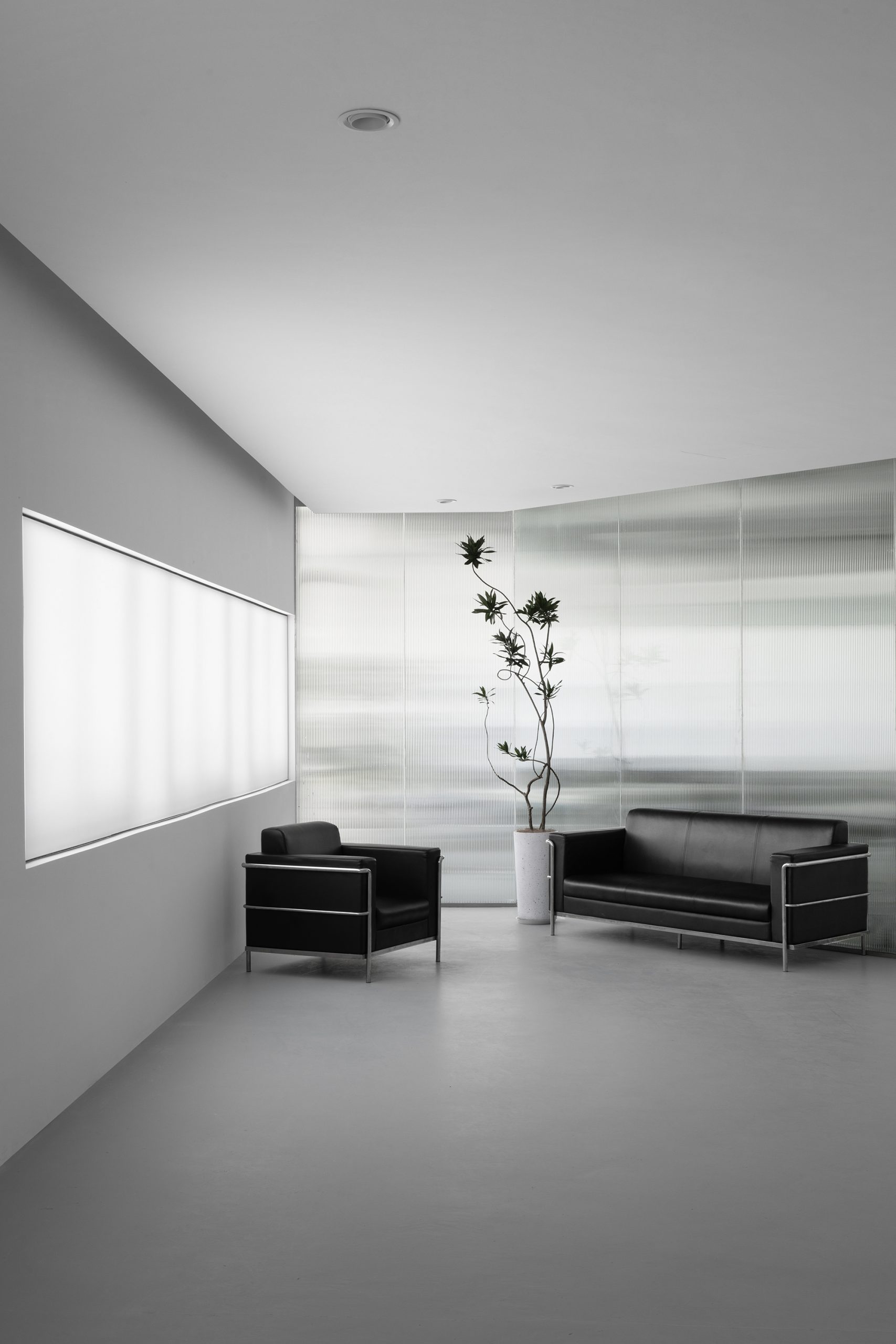
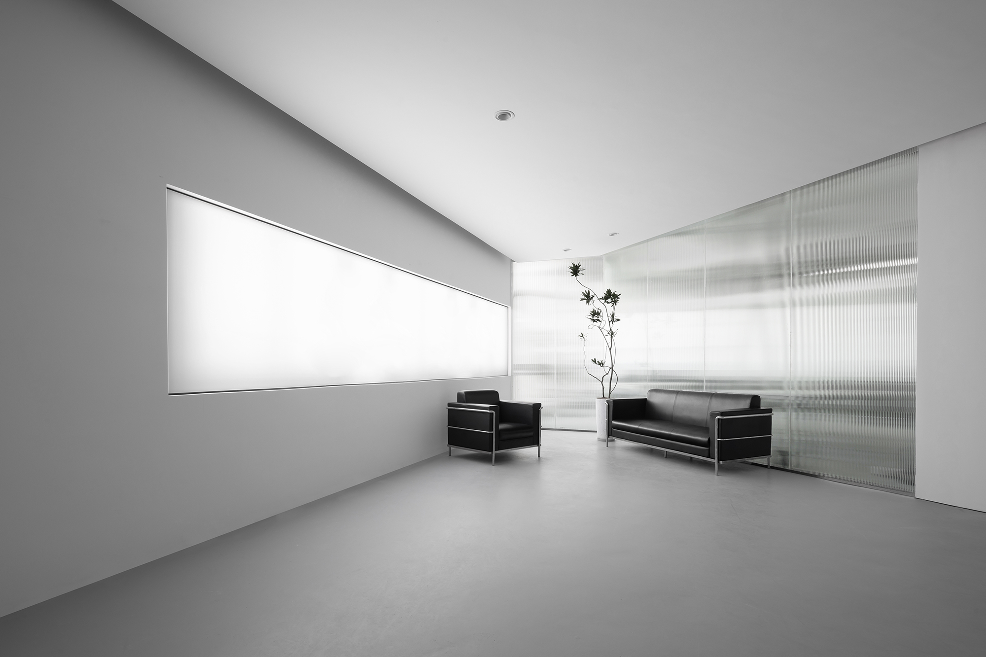
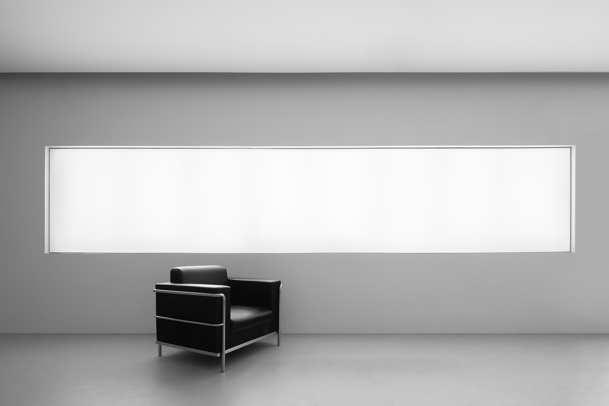
▲展厅休息区,lobby lounge
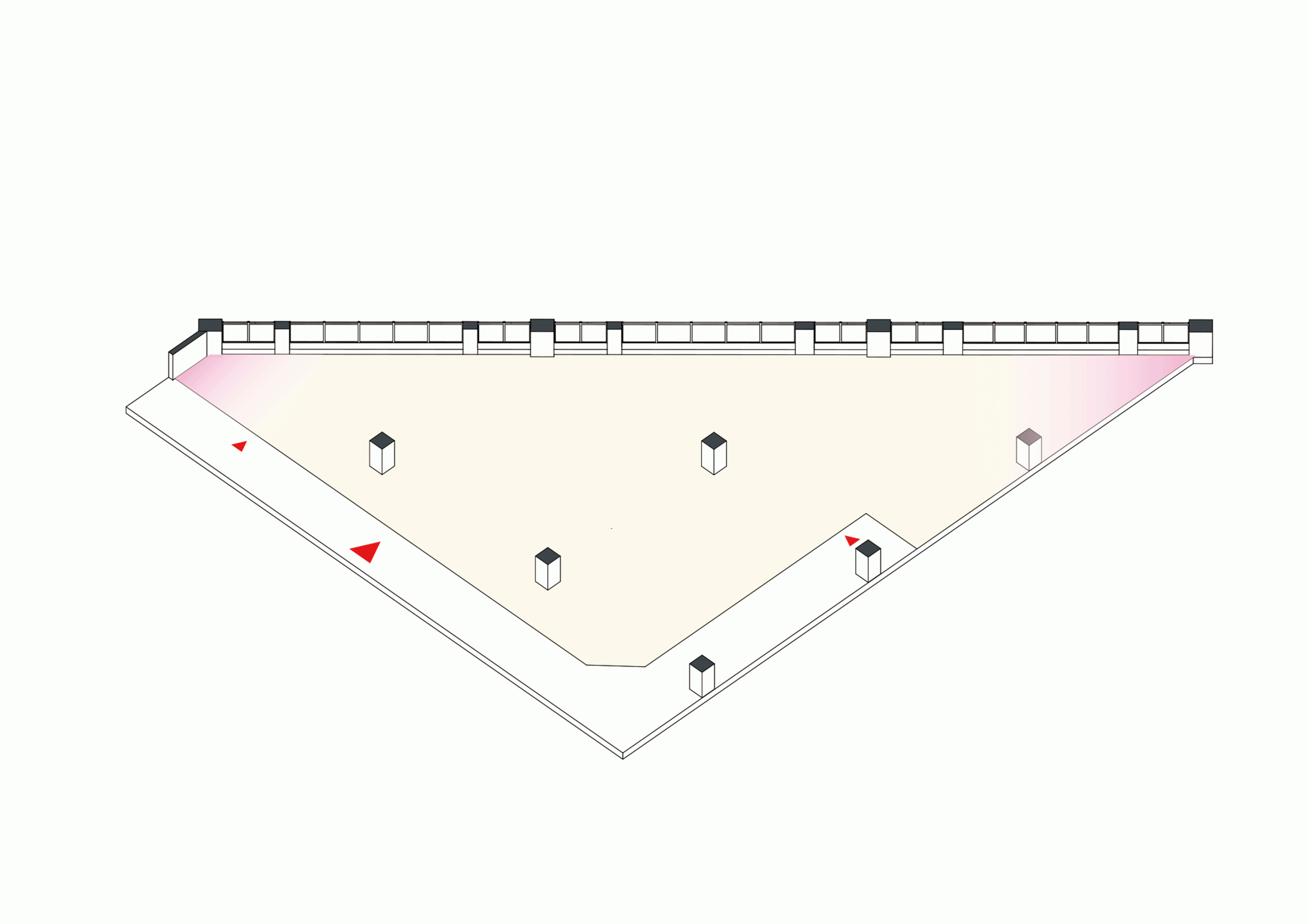
第一次到场地,给我印象就是这个空间有太多死角不能使用了,从平面上看,整个空间是一个锐角三角形,更要命的是还有几根柱子存在于这个空间里。与业主沟通完得知,他们需要3个功能区块,分别为:摄影区、展厅、工作区。所以我们把平面进行了分割。整个区域被划分为展厅-办公区。
The first time I went to the venue, I was impressed that there were too many dead corners in this space. From the plane, the whole space was an acute triangle. What’s more, there were several columns in this space. After communication with the owners, they need three functional blocks, namely: Photography area, exhibition hall and work area. So we split the plane.The whole area is divided into exhibition hall office area.
▲分析图,Analysis Diagram
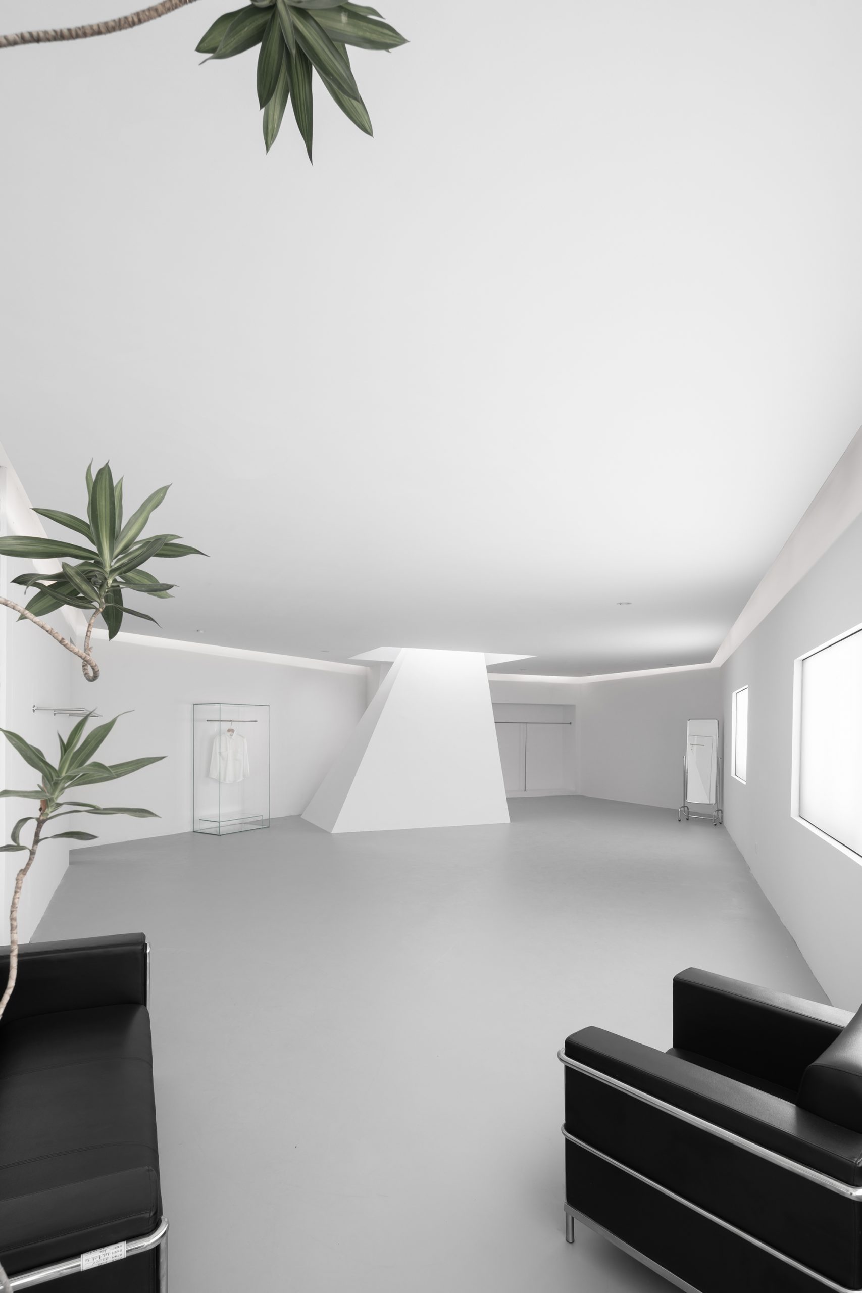
▲室内概览,interior overview
可以看到,最终作品的呈现出的是——工业园区、三角形象这两个关键词。空间的张力吸引源源不绝的灵感,令最终的呈现清晰直白,又奇妙神秘。
It can be seen that the final work presents the two key words of Industrial Park and triangle image. The tension of space attracts endless inspiration, making the final presentation clear, straightforward and mysterious.
01. RECEPTION AREA 入口

▲展厅入口,lobby entrance
入口处最大的阻碍是原有的两根立柱,而我们的设计师巧妙地把它改为平行斜面体,化阻滞为流畅。
The biggest obstacle at the entrance is the original two columns, and our designers cleverly changed it into a parallel inclined body, turning the block into fluency and changing the rigid pattern into a myriad of images!
 ▲入口细节,detail of the entrance
从工作动线上,正面入口通往办公区,侧面入口则是通往展厅区域。
From the working line, the front entrance leads to the office area, and the side entrance leads to the exhibition hall area.
 ▲入口细节,detail of the entrance
另外,因为西晒的原因,我们把入口进行了偏一边的做法。
In addition, because of the western sun drying, we made the entrance to one side.
02.EXHIBITION HALL 展厅

▲展厅概览,lobby overview
 ▲展厅概览,lobby overview
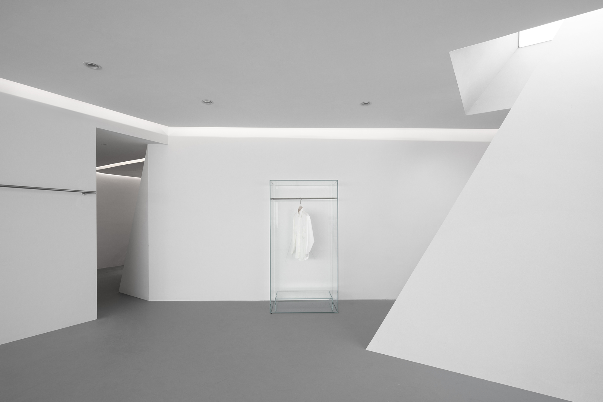
空间只是衬托,我们采用大面积的纯白色乳胶漆以及海灰色地坪漆,弱化背景,让原本的主角-“服装”留有余地去探寻到更多可能。
In the indoor exhibition area, we use simple materials and do not choose too many colors. Because space is just a foil, we hope to break the color and material background, so that the original protagonist – “clothing” to explore more.
▲展厅休息区,lobby lounge
 ▲展厅休息区,lobby lounge
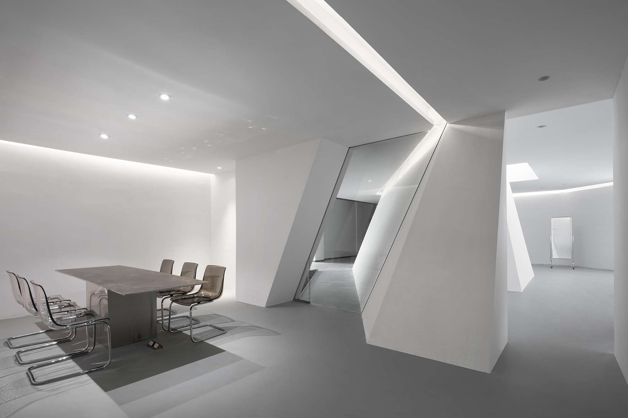
从入口延伸至展厅休息区是一眼到底的清晰明了,休息区与办公室采用的是8cm厚的长虹玻璃面做隔断。相邻角的光线折射于玻璃面,科技与梦幻交相辉映。
Extending from the entrance to the rest area of the exhibition hall, the rest area and office are painted with sea grey floor matte paint on the 8cm thick Changhong glass surface. The light refraction outside the adjacent 60 degree angle and glass, space beauty and sense of technology complement each other.
▲长虹玻璃面,Changhong glass surface
 ▲展厅立体屏风区域,lobby three dimensional screen area
 ▲展厅立体屏风区域,lobby three dimensional screen area
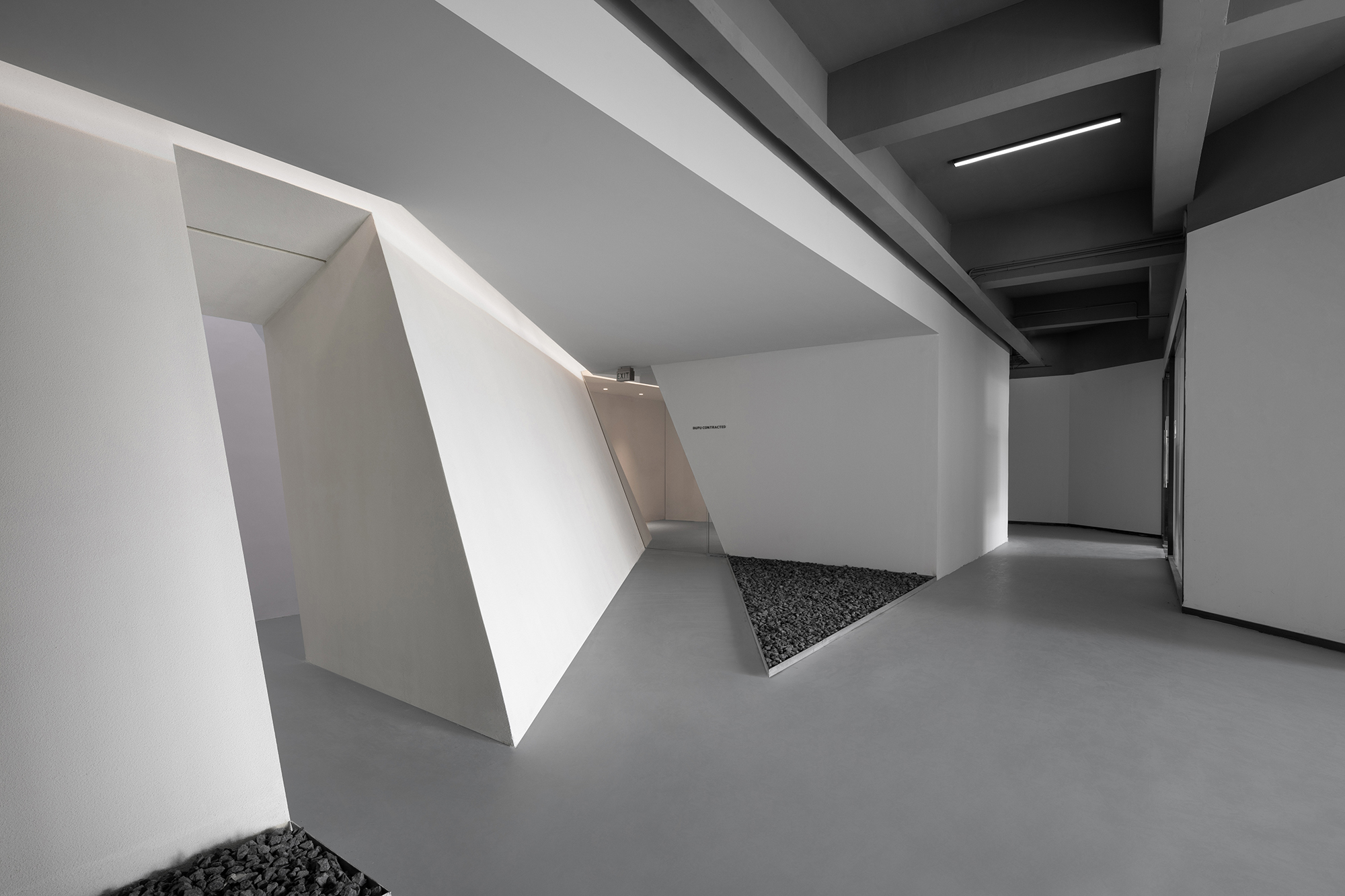
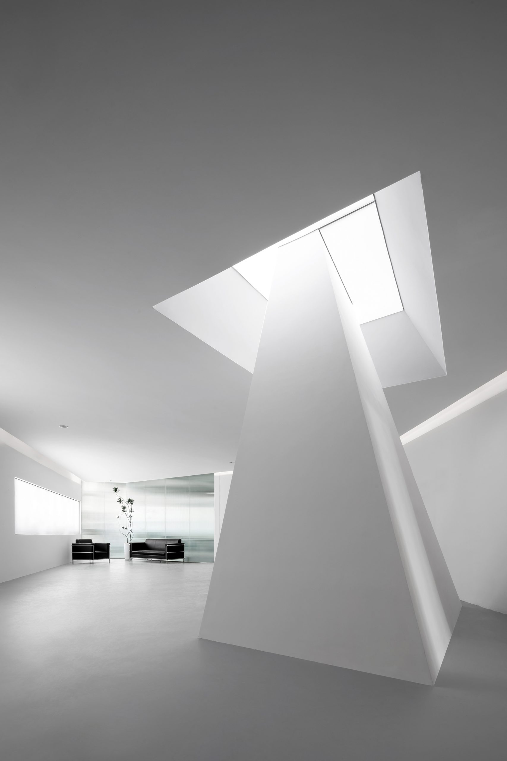
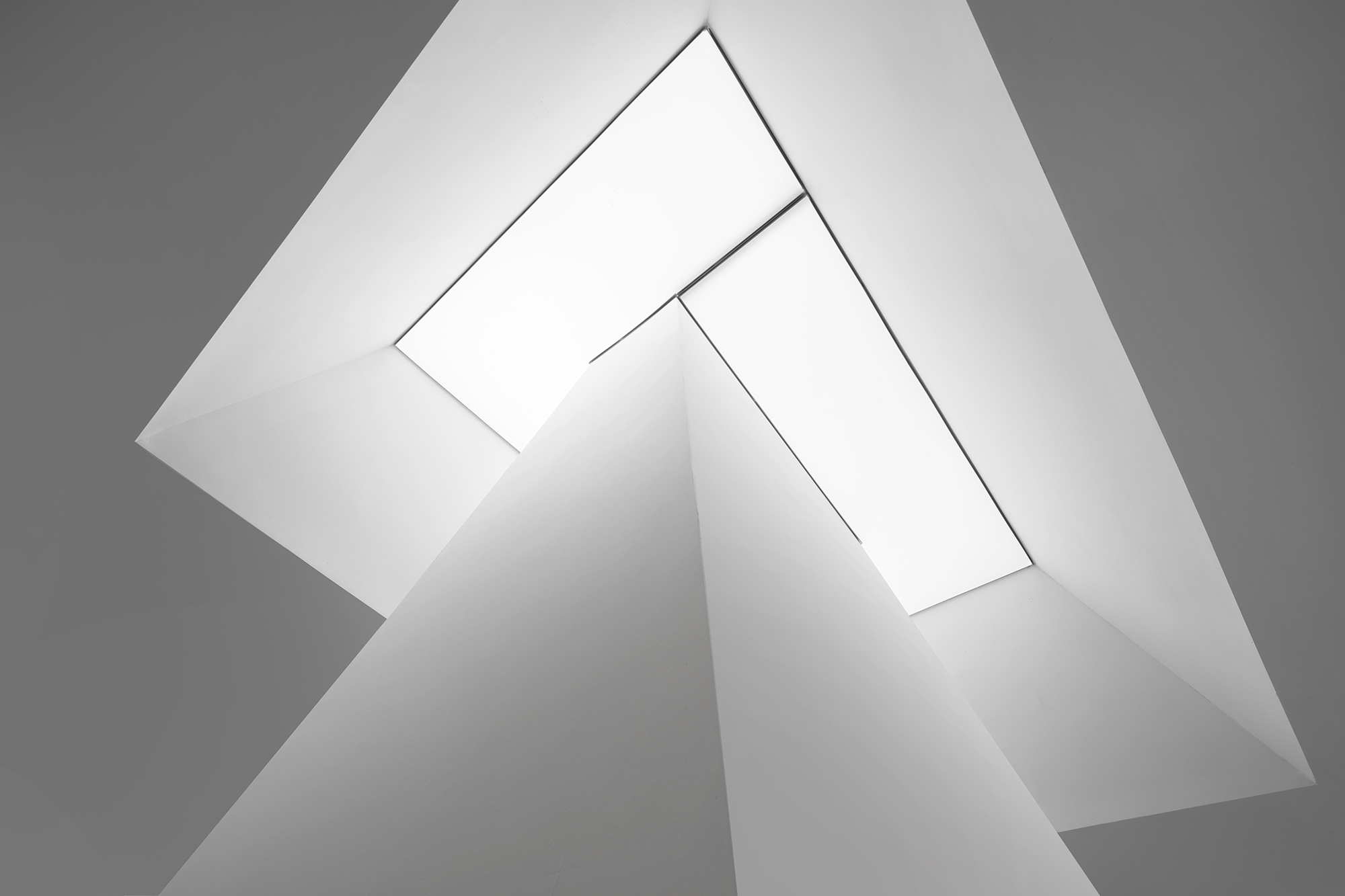
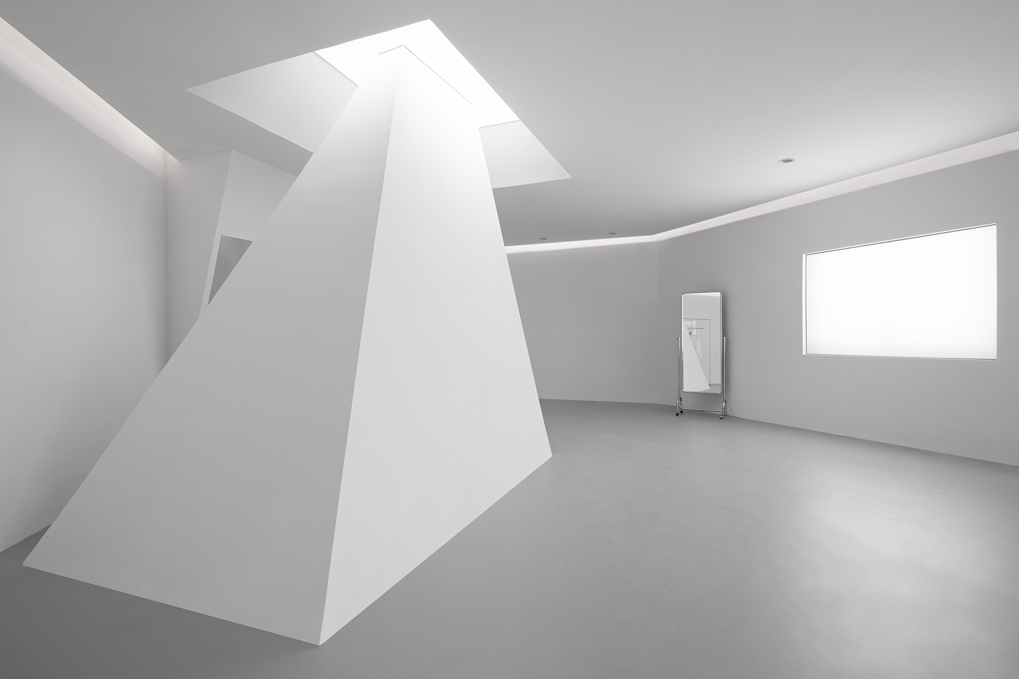
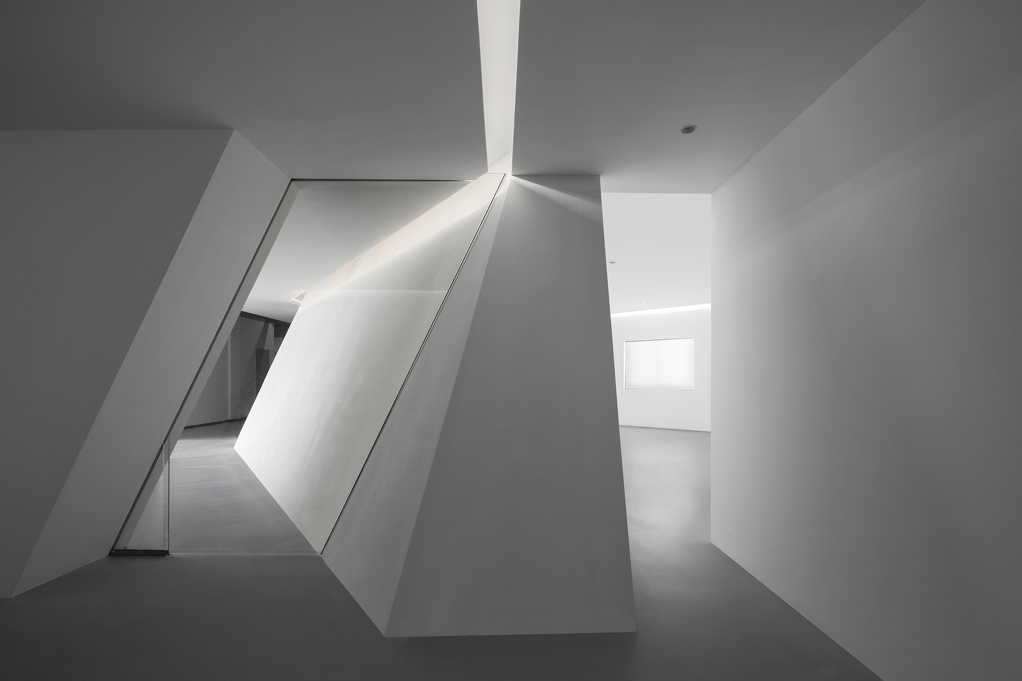
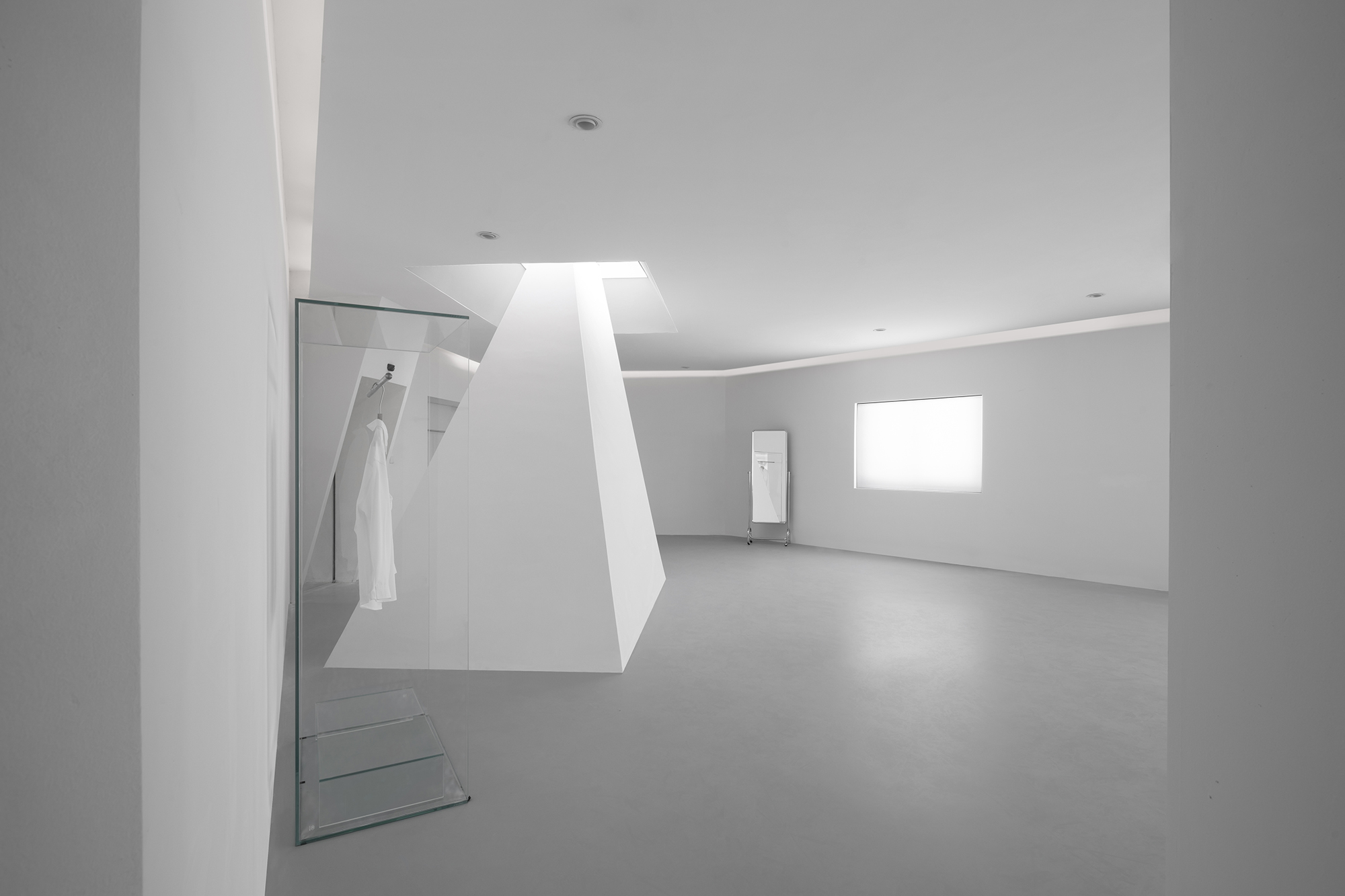
展厅空间因为入口平面格局的变化变成了不规则长条形的空间,我们在这样的空间在希望能寻找到用力量的点,所以我们在入口处设置了一个高于吊顶面的巨大棱锥体,仿佛是天井投射下来的光线凝结而成,由上而下的明暗渐变将光影之美展现得淋漓尽致。当然视觉上还有“挡”的屏风作用。
Due to the change of the entrance plane pattern, the exhibition hall space has become an irregular strip-shaped space. In such a space, we hope to find a point of strength. Therefore, we set up a huge pyramid higher than the ceiling surface at the entrance, which is like the condensation of the light line projected from the patio. The light and shade gradient from top to bottom shows the beauty of light and shadow incisively and vividly. At the same time, this shape also acts as a screen at the entrance of the exhibition hall.

▲屏风作用,Screen function
 ▲屏风作用,Screen function
 ▲屏风作用,Screen function
 ▲展厅立体屏风区域,lobby three dimensional screen area
 ▲展厅立体屏风区域,lobby three dimensional screen area

▲展厅立体屏风区域,lobby three dimensional screen area
大量留白设计,都是为了彰显不设限与雕饰,不拘束于规则。
A large number of blank design, are to highlight the unlimited and carving, not bound by the rules.
03. ADMINISTRATIVE AREA 办公区
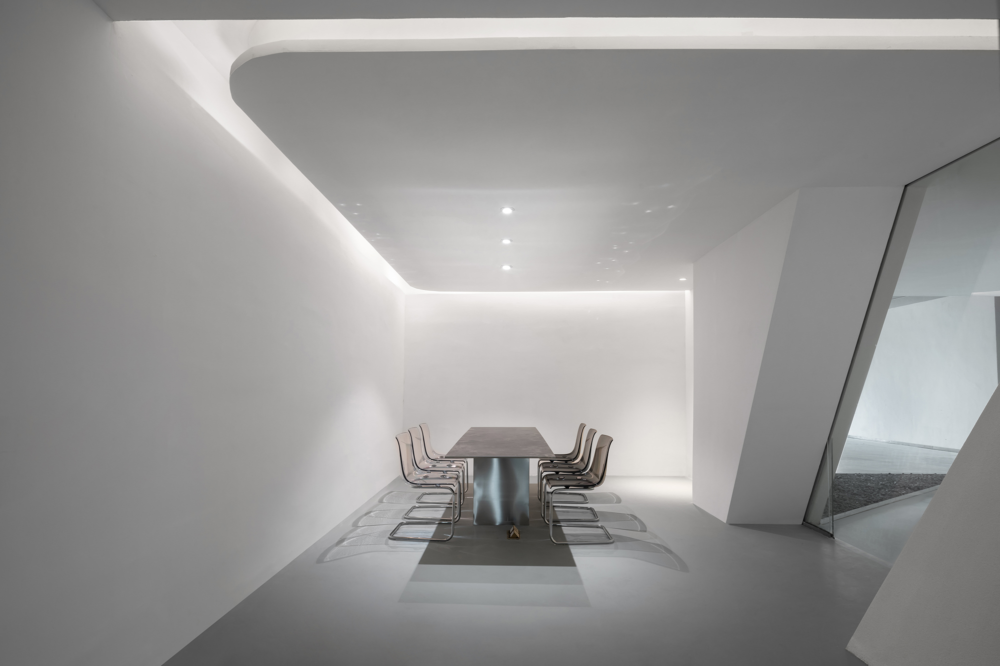
办公区依然简洁明朗。桌椅的线条是一气呵成的直接与流畅。没有复杂的灯光和装饰,只因这里传达的是专注、高效的工作氛围与文化。
The office area is still simple and clear. The lines of tables and chairs are direct and smooth. There is no complicated lighting and decoration, just because it conveys a dedicated and efficient working atmosphere and culture.
▲展厅办公室,lobby office
 ▲展厅办公室,lobby office
点、线、面在办公区交汇,清冷疏离而严丝合缝。
Point, line, surface meet here, cold and isolated and tight.
▲入口交界处,entrance junction
 ▲从办公厅看向展厅,the general office looks at the lobby
 ▲从办公厅看向展厅,the general office looks at the lobby
极简主义美学,意在最大程度地调动可以捕捉事物本质的感觉能力和洞察能力。
Minimalist aesthetics aims to maximize the sense and insight that can capture the essence of things.
从见山是山,到见山不是山,再到见山仍是山。没有了旁物的打扰,也许更能够充分体会“舍”与“得”的对立与统一,品味点线面的凝聚与分离,突破束缚,无拘无束,方能邂逅服装色彩、面料、廓形的魅力,追寻服装美学的神奇!
From seeing that a mountain is a mountain, seeing a mountain is not a mountain, and then seeing a mountain is still a mountain. Without the disturbance of other objects, perhaps we can fully understand the opposition and unity of black and white, taste the cohesion and separation of point, line and surface, encounter the charm and magic of light and shadow, and obtain the essence of beauty, nature and life!
项目信息——
项目名称:DUPU服装工作室
设计方:杭州构成建筑有限公司
联系邮箱:87404908@QQ.COM
项目设计 & 完成年份:2020/06/08 & 2020/07/10
主创及设计团队:陈凯雄、李方
项目地址:杭州萧山华媒数创园
建筑面积:290m²
摄影版权:瀚默视觉
客户:DUPU


