

建筑是研究如何浪费空间的艺术。
「Architecture is the art of how to waste space」
——Philip Johnson
开端 Beginning
一切的开始,源自一场关于「浪费」的思考。
The beginning of all, from a thinking about “waste”.

▲平面图
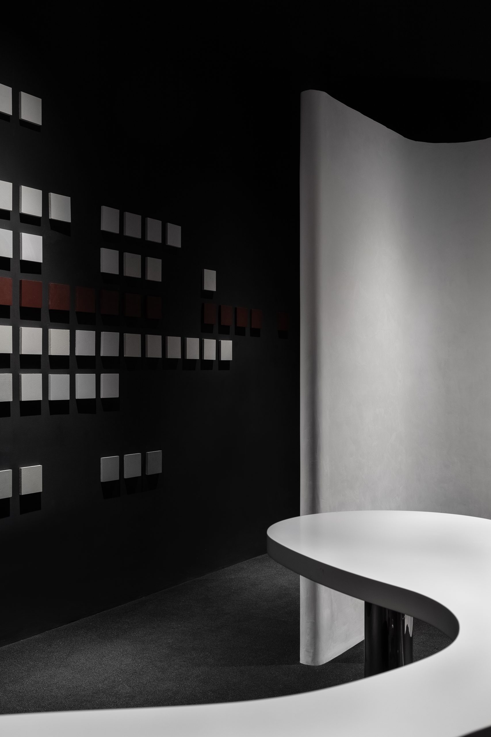
传统建材卖场的空间,97㎡的使用面积,远离卖场主动线的劣势铺位,我们需要置入多种漆面的展示,洽谈区,私密化的办公与仓储功能。
This is a traditional materials store space with 97 square meters of usable area, which is far from the active line of the store. We need to put in a variety of lacquered display areas, negotiation areas, private office and storage areas.
在有限的空间内,我们没有对场域进行激进式的索取,而是选择了「退让」,这种「退让」看似是一种「浪费」,却创造出更多的对话可能性,在趋同化的卖场里形成辨识感,从而达到商业引流的目的。
In the limited space, instead of making radical demands on the field, we chose to “give in”. This “give in” seems to be a “waste”, but it creates more dialogue possibilities and forms a sense of identification in the store, so as to achieve the purpose of commercial drainage.
观察 Observing
“当人们尝试去创作,最重要的部分应该开始于全神贯注的观察与凝视。创造力并不来自于对知识的掌握,而是不知从何处捡来的概念所发展出来的。不过是一场小小的游戏而已。”
——山本耀司。
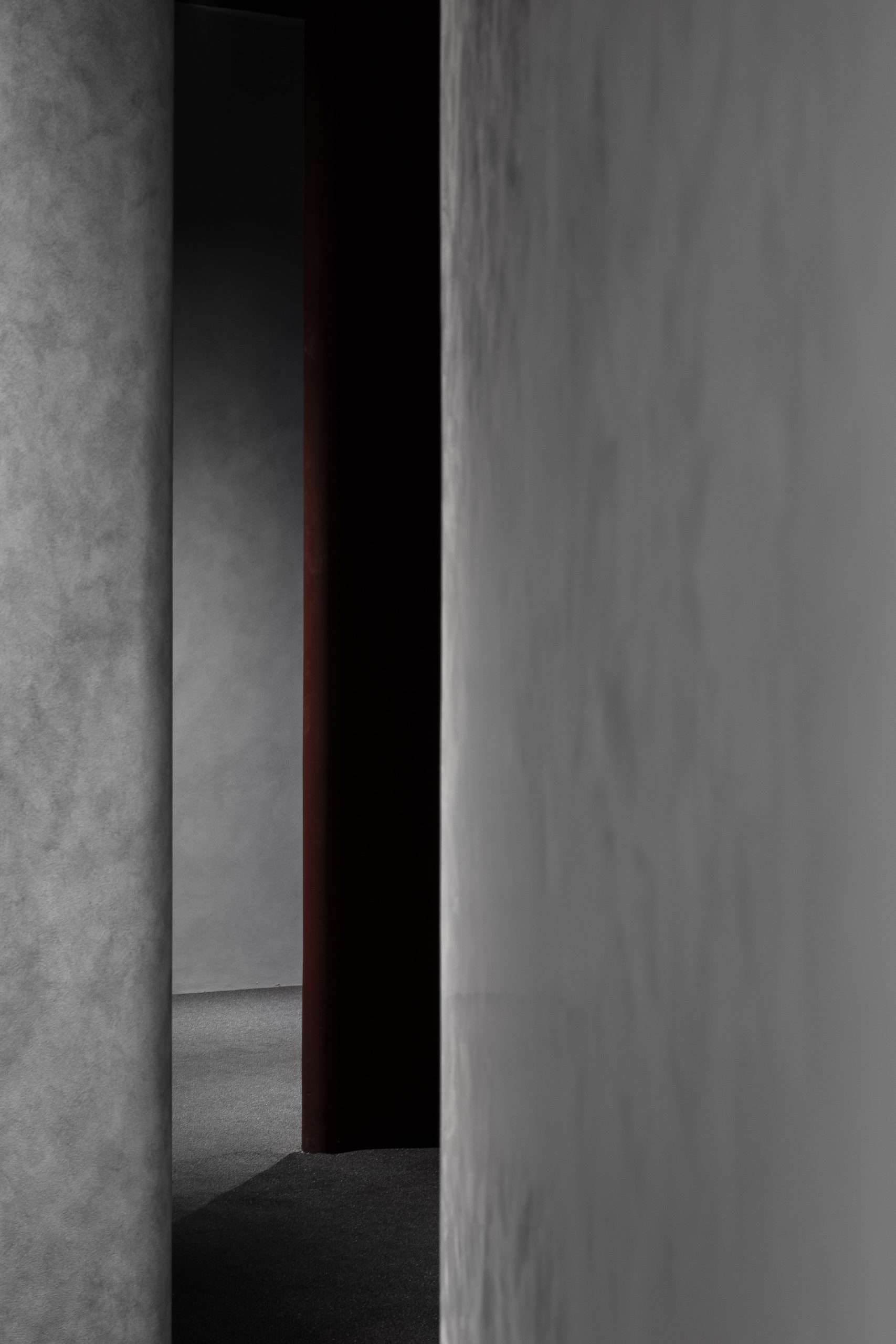
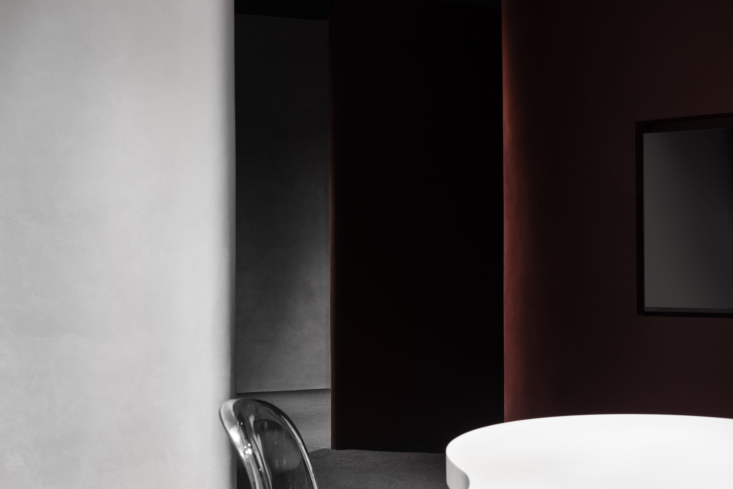
设计试图弱化“墙”作为划分空间的功能出现,以一种尽可能开放流动的姿态去承载其本质,径直与暧昧,独存而共生。
The designer tries to weaken the “wall” as the function of dividing space, bearing its essence in an open and flowing manner, which is straight and ambiguous, unique and symbiotic.

▲轴测图

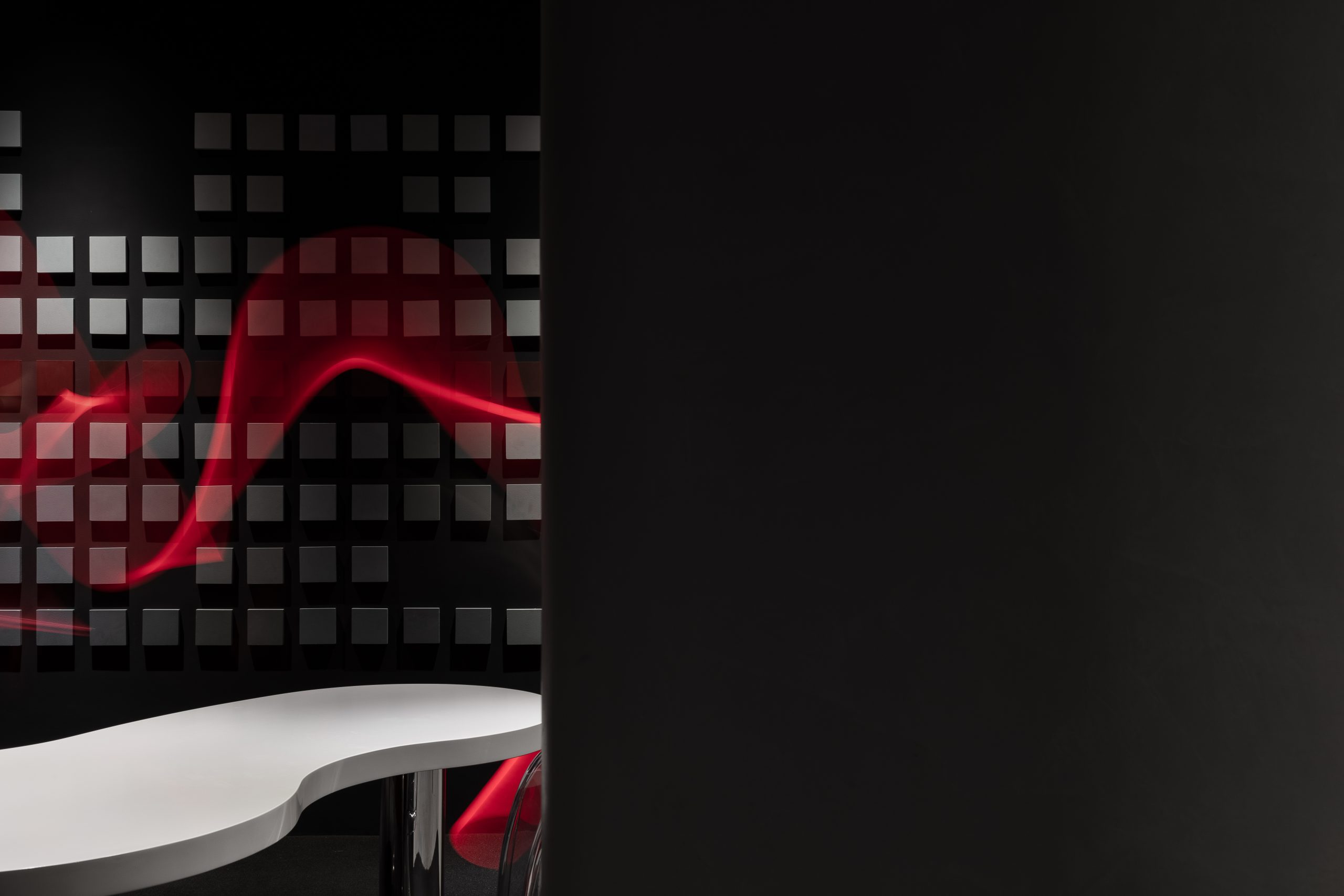
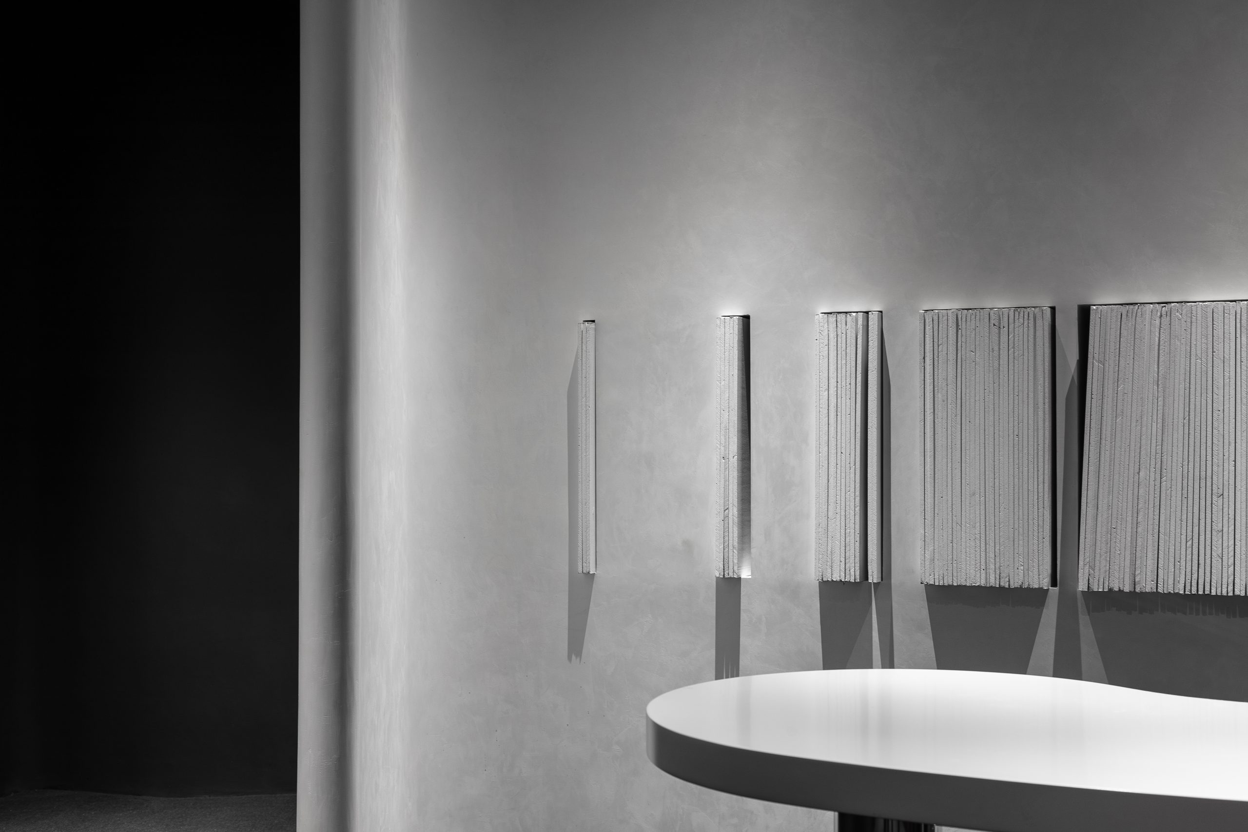
我们观察到涂料的物质形态,有着不受约束的自然张力,因此我们在空间中置入5组流动的曲线,作为隔离与联系的媒介,并在陈设结构形式上继续延续这一记忆。
We observed that the material form of the paint has an unrestrained natural tension, so we placed 5 groups of flowing curves in the space as a medium for isolation and connection, and continued this memory in the form of furnishings.


我们关注消费体验的整体感知,从发现、行走、探索、停驻,一切的行为发生希望能透过空间来述说品牌。
We focus on the overall perception of consumer experience. From the behaviors of discovery, walking, exploration, stopping and so on, which all happen in the space, we hope to tell the brand through the space.


干涉 Intervening
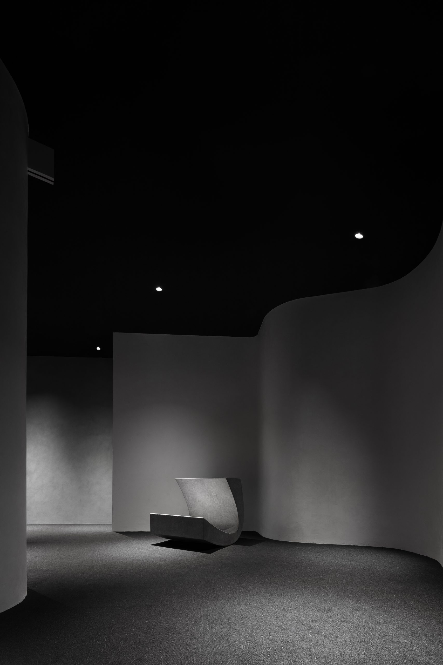
设计以结构的干涉,引导出曲折的动线,使观者在有限的场地中无法清晰的感知全局。
With the interference of structure, we guide the zigzag moving line, so that the viewers cannot clearly perceive the overall situation in the limited site.

▲动线图
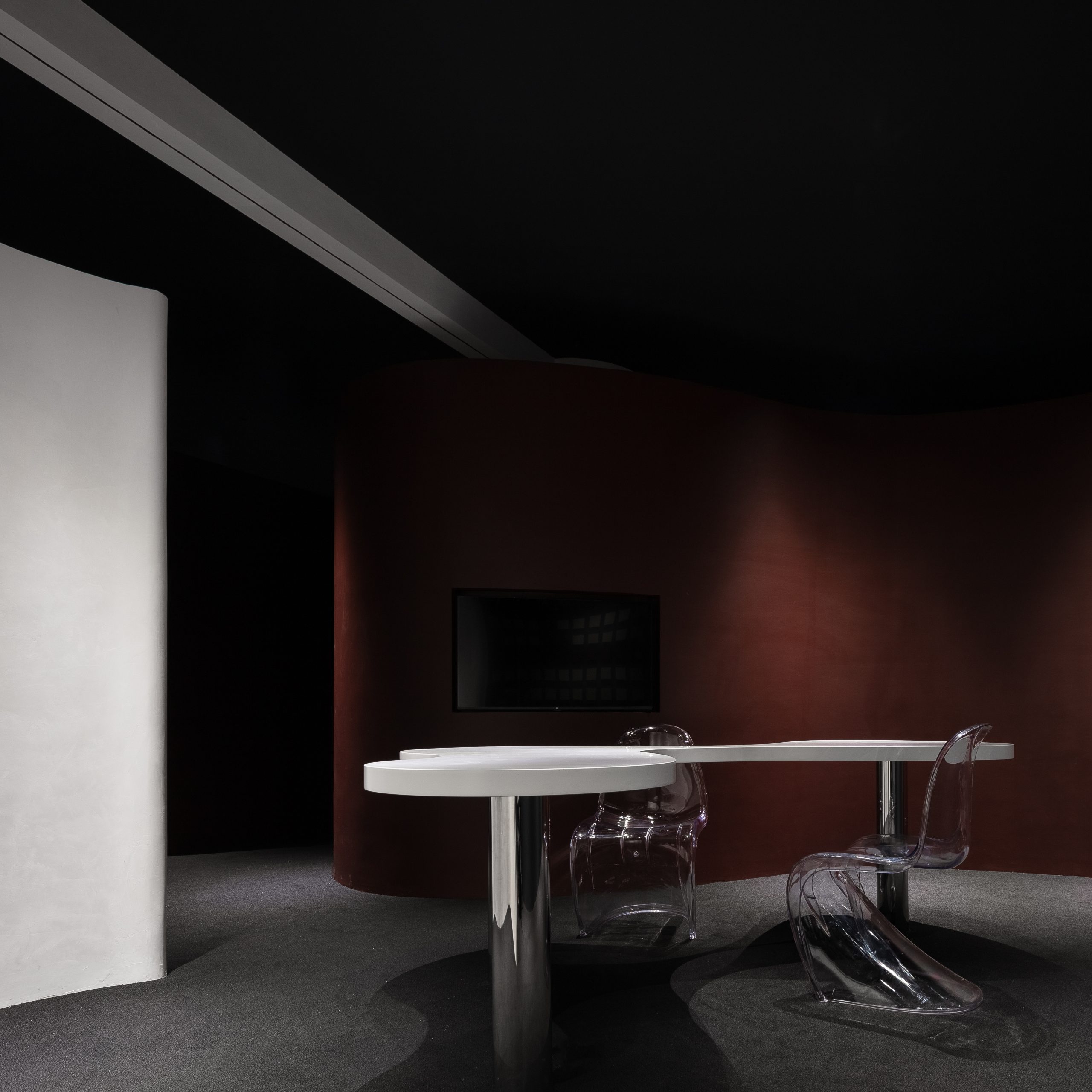
我们有意控制近人尺度,赋予空间节奏性,或压迫,或开阔,让行走在空间的人产生丰富的 体验与情绪。
We intentionally control the scale to give the space rhythm, or oppression, or open, so that people walking in the space will have rich experience and emotion.

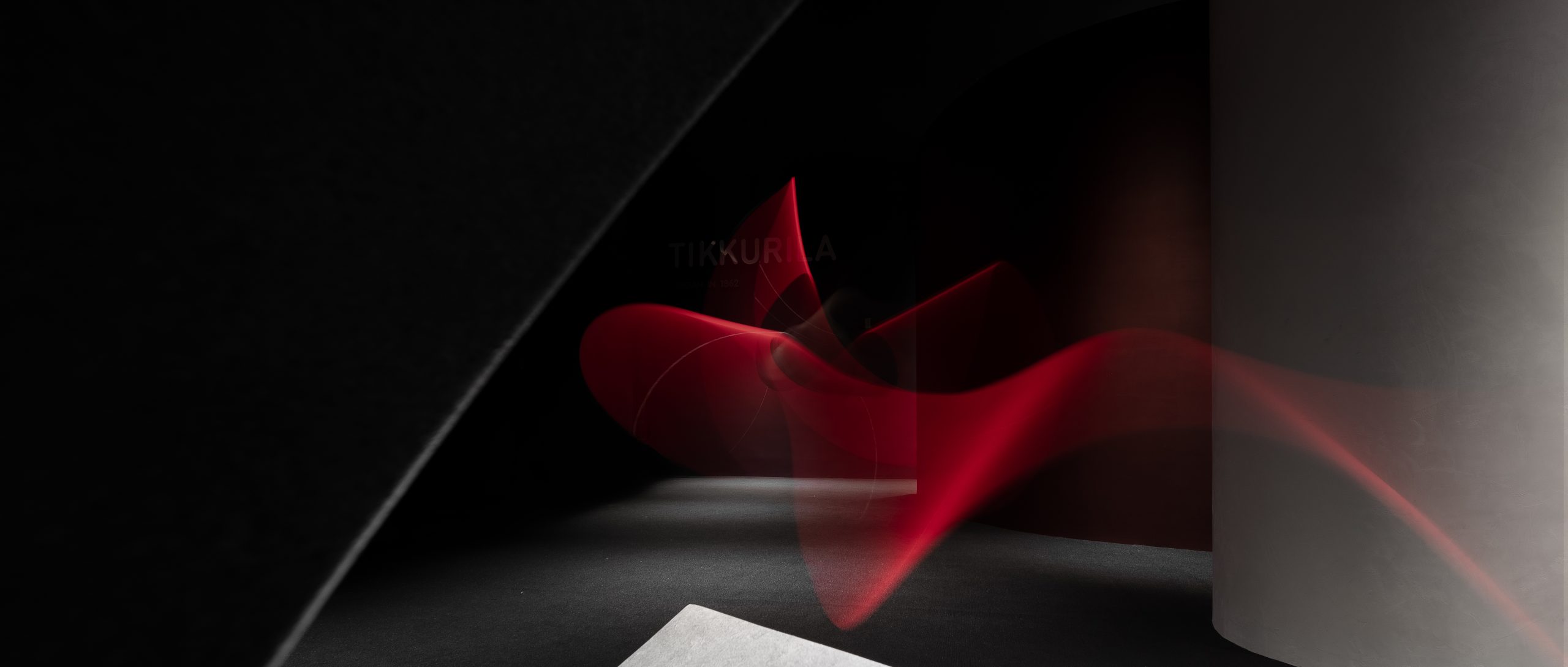
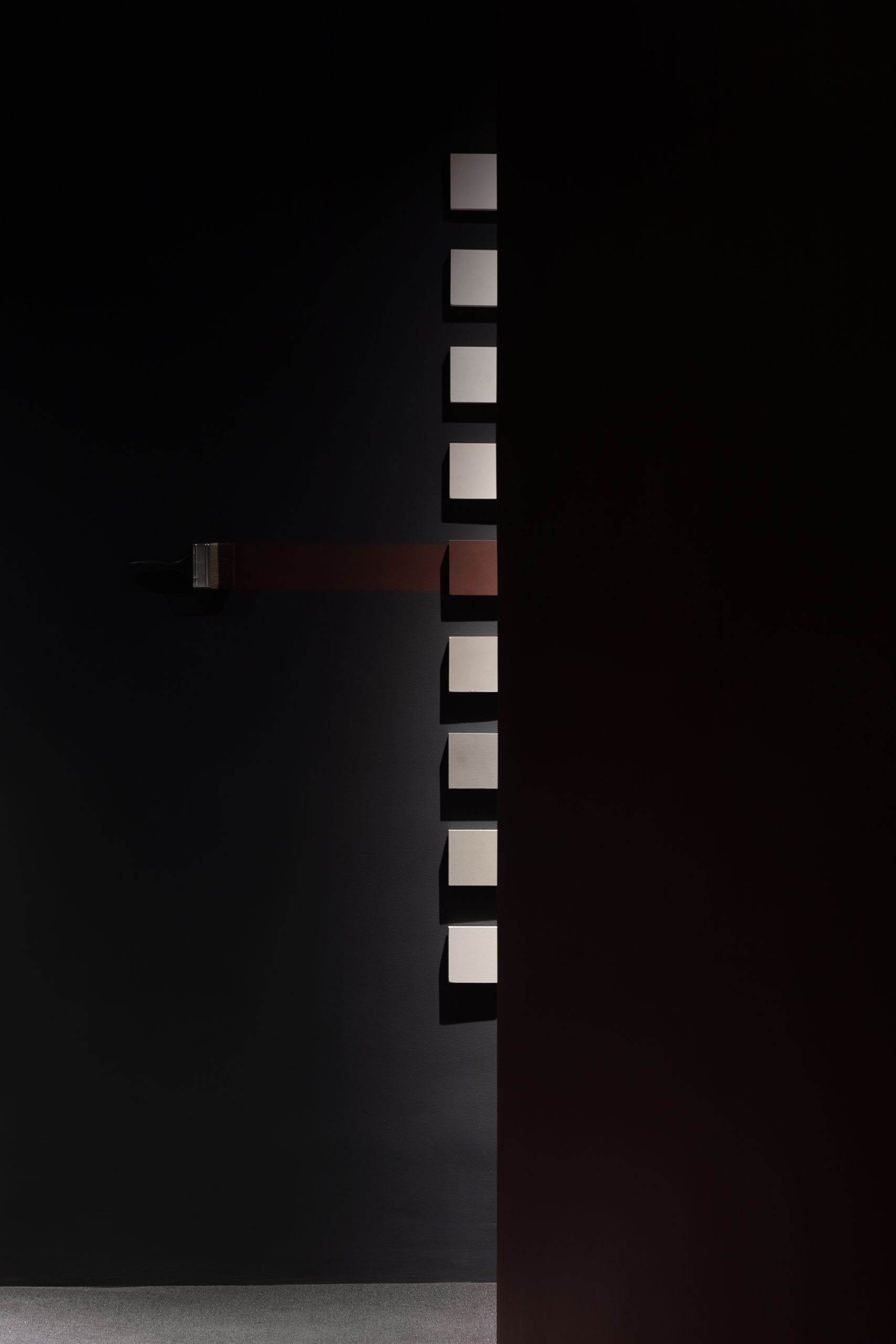
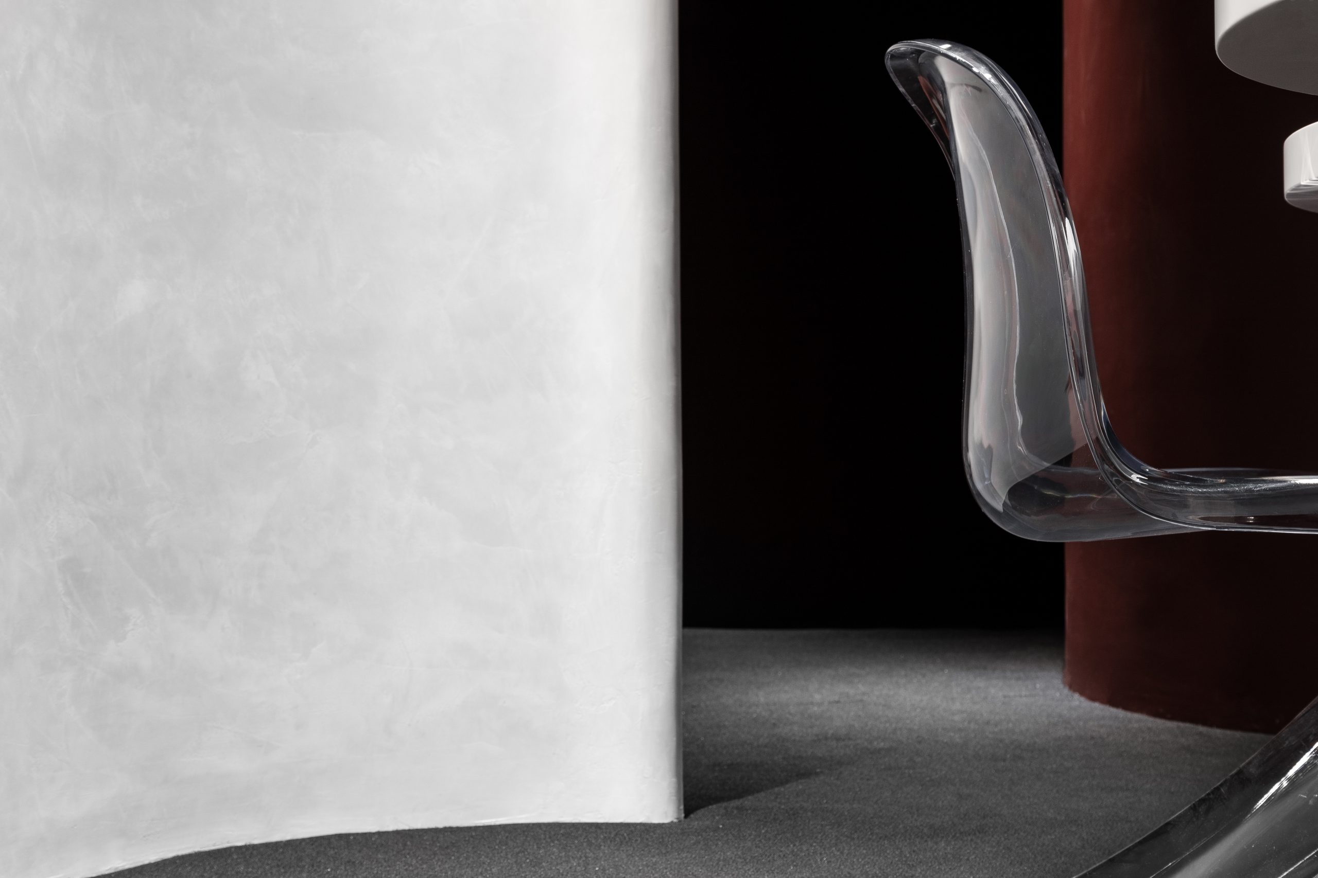
黑白灰围合的空间基底中,流动着一抹「红色」,带来视觉的冲击力,诱发进一步探索的潜意识行为。
In the space base surrounded by black, white and gray, a touch of “red” flows, bringing visual impact and inducing subconscious behavior for further exploration.
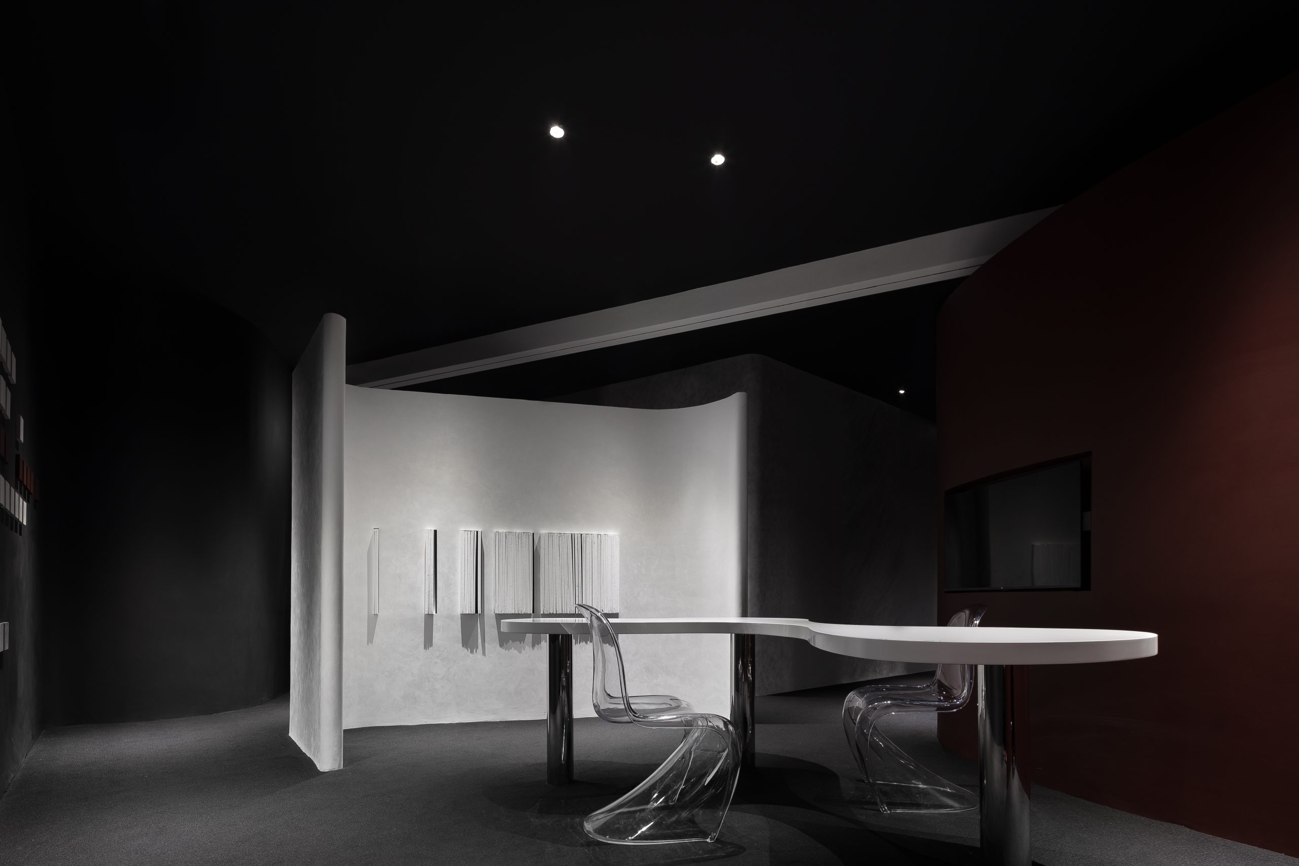
设计通过对高度落差的设定,以“L型”装置贯穿前后,来表达更多的精神内核与艺术性。
Through the setting of height drop, “L-shaped” device runs through the front and back, to express more spiritual core and artistic quality.

表达 Expressing
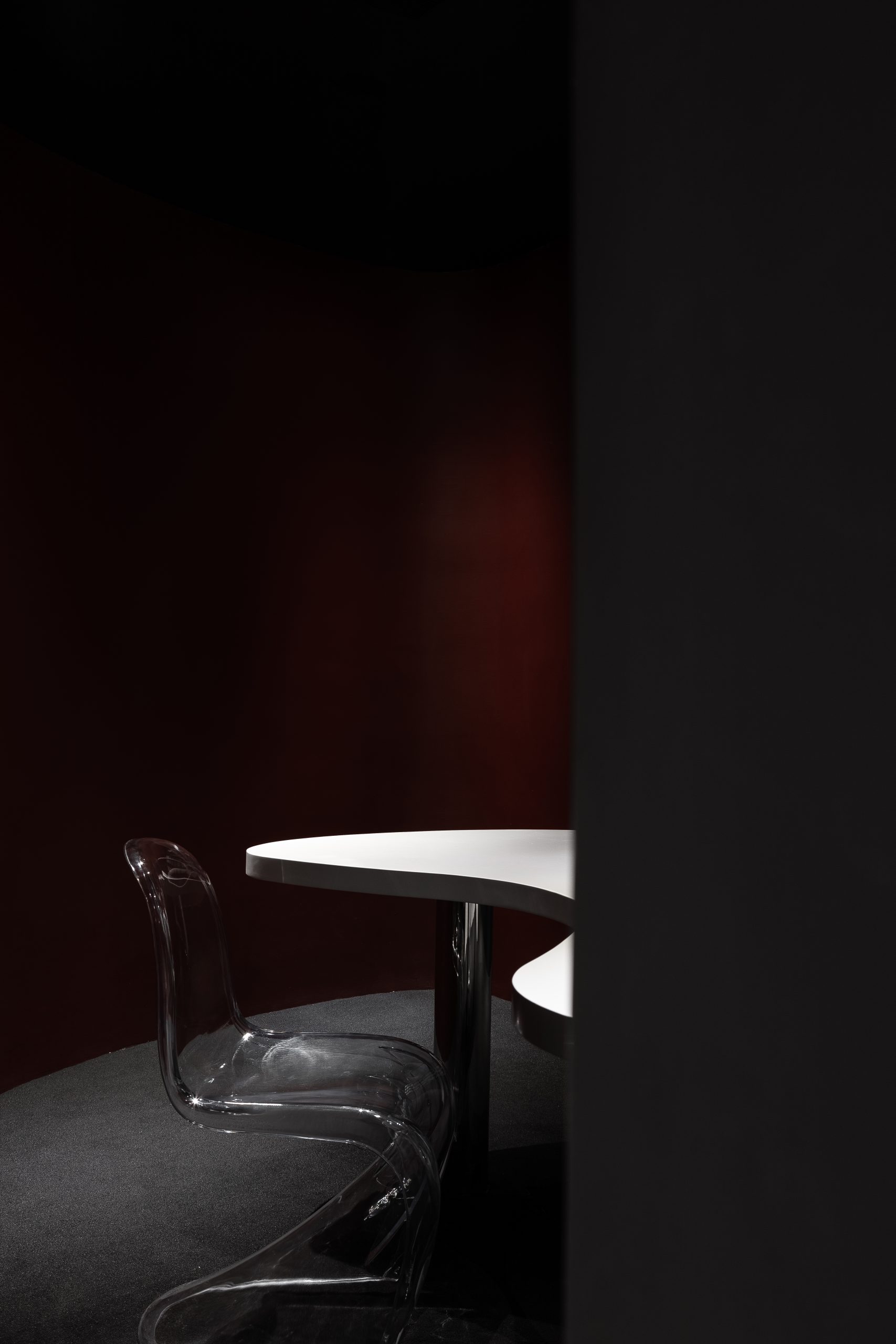
我们试图在喧闹的卖场里置入这样一个宁静的空间,是冲突的,是争议的,是无声的自我表达。
We try to put such a quiet space in the noisy store, which is conflicted, controversial and silent self-expression.
项目信息——
Location:Jiang yin,China
Design Time:July.2020
Project Complete:September.2020
Space Design:GHB INTERIOR DESIGN
Team Members:郭恒博、陈凌燕
Area:97㎡
Photographer:徐义稳


-50x50.jpg)