

重庆是一个富有三千年文化底蕴的历史名城,是中国最年轻的直辖市,也是中国最大的旅游网红城市。依山而上的重重楼房、干道和桥梁为纽带,层见叠出,构成了重庆高低井然、错落有致的大美山城景象,尤其到了晚上,万家灯火,流光溢彩,就像天上的街市。因为熟知,这些厚重的人文环境给我们太多的灵感。
Chongqing is a historical city with a cultural heritage of 3,000 years. It is the youngest municipality in China and the largest tourist network in China. The heavy buildings, the main roads and the bridges on the hills are the bridges, and the layers are stacked up, which constitutes the scene of the beautiful and beautiful mountainous city in Chongqing. Especially in the evening, thousands of lights are shining and shining like the sky in the sky. Because of the familiarity, these heavy human environments give us too much inspiration.

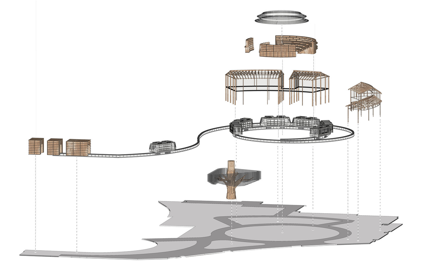
立项过程中,我们团队分析了苏宁极物的品牌定位,重庆来福士项目的地理位置,以及面对的消费群体,最终决定,以重庆的城市文化为核心,用大家熟知的场景书写重庆的故事。一是寻找场景的表达方式,二是寻找它们之间彼此存在的关系。考量到消费群体的年轻化趋势,我们并没有简单的去复刻那些经典复杂的场景,而是将重庆特有的这些视觉元素通过现代装置的手法做艺术加工,做了新的极简的建筑表达,形成符号化的场景形式。小时候随处可见的吊脚楼,最喜欢去的大礼堂,街口的黄桷树,台阶,还有时下热门的轻轨打卡,都是我们印象中能表达重庆城市的人文符号。
In the process of project establishment, our team analyzed the brand positioning of Suning JiWu, the location of Chongqing Raffles project, and the consumer groups facing it. Finally, we decided to use Chongqing‘s urban culture as the core to write Chongqing’s scenes with well-known scenes. story. One is to find the way the scene is expressed, and the other is to find the relationship between them. Considering the younger trend of the consumer groups, we have not simply re-enacted those classic and complex scenes. Instead, we have made these unique visual elements of Chongqing a modern device to make a new minimalist architectural expression. Form a symbolic scene form. When I was a child, I could see the hanging halls, the favorite auditoriums, the yellow banyan trees at the corners, the steps, and the popular light rails. It is a human symbol that can express Chongqing city in our impression.
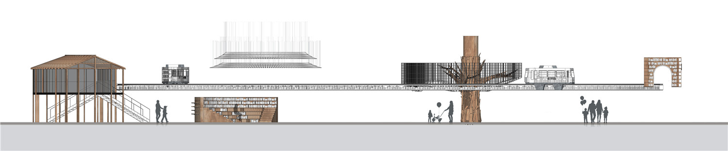
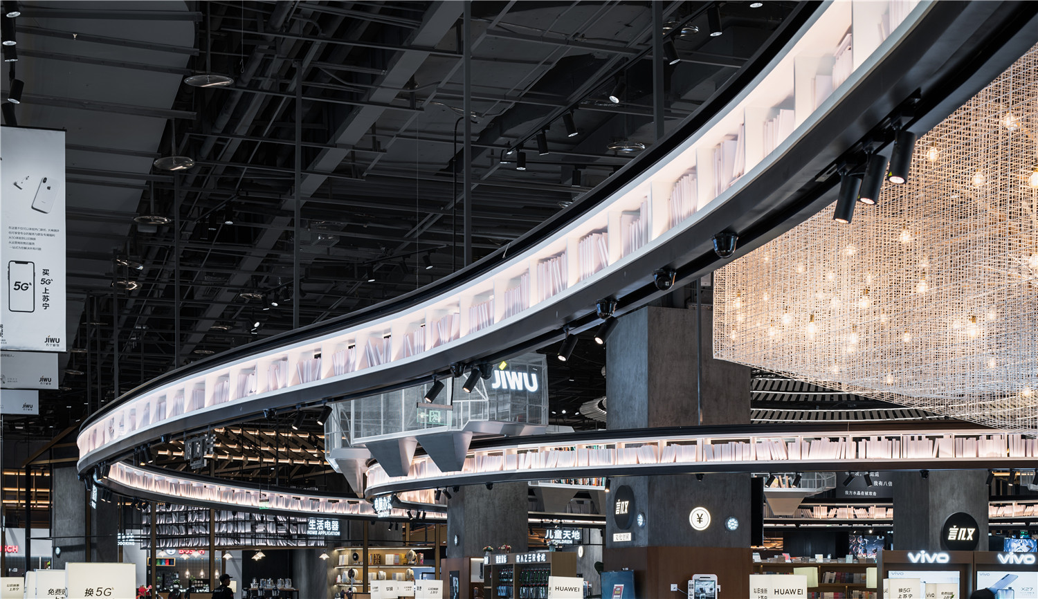
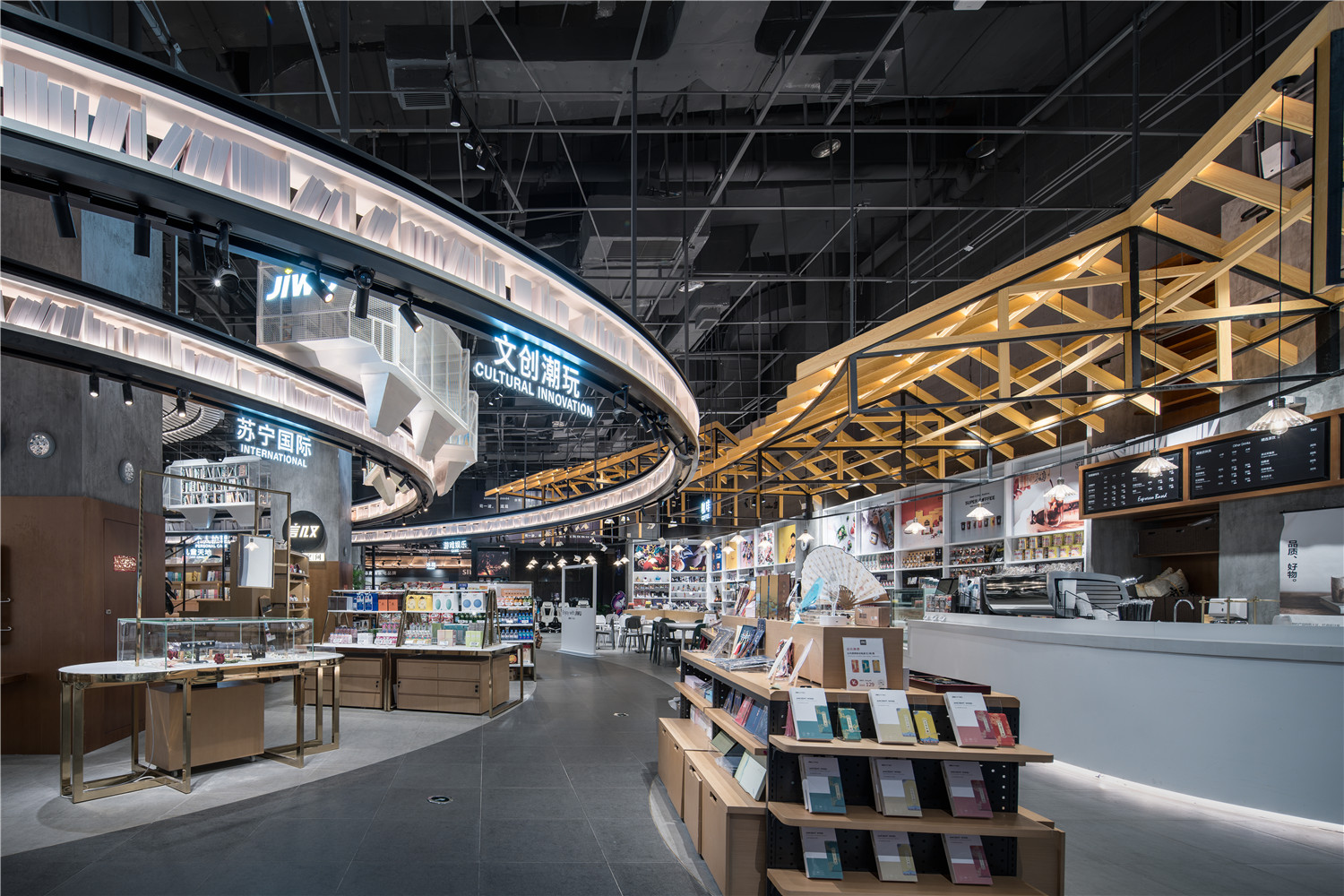
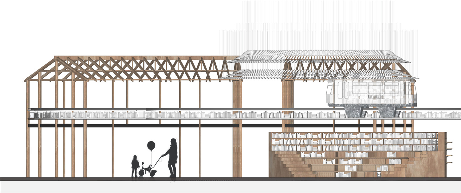
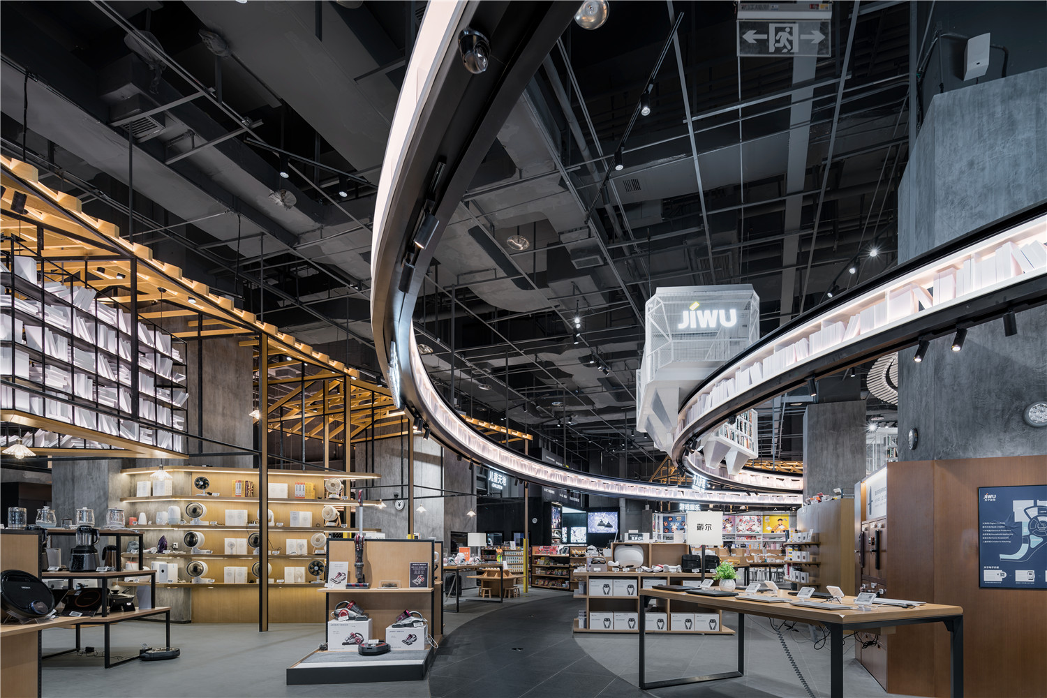
我们把这些元素,单独的做了一一分解。譬如艺术化之后的黄桷树、装载书籍的轻轨车体、装置化的大礼堂的屋顶、李子坝的穿楼轨道等等这些仅在重庆随处可见的场景,用现代装置的手法,进行了二次设计,形成了新的符号单元.还有通过常见的木质材料,以现代极简的方式将吊脚楼这一古典建筑场景表达在极物店内,在内场打造出复式空间,增加空间的层次感与趣味性。轻轨轨道从入口驶入,驶过黄桷树,略过吊脚楼,盘旋到中心区域,紧紧的围绕在中央图书馆周围,整个轨道以书架形式体现,串联全场,满足商店书籍配合展示的需求。而围绕在轻轨轨道之中的中央图书馆,顶部用大礼堂屋顶的装置进行艺术表达,场内的书架以同心圆的形式向外辐射,阶梯休息座,高低错落,形似山峦,又契合重庆“山城”之名。
We have decomposed these elements separately. For example, the art of yellow banyan tree, the light rail car body with books, the roof of the installation hall, the pier of the Lizi dam, etc., which are only visible in Chongqing, are carried out twice by modern means. Design, the formation of a new symbol unit. Also through the common wooden materials, the classical architectural scene of the hanging foot building is expressed in the polar store in a modern and minimalist way, creating a double space in the interior, increasing the layering of the space and Interesting. The light rail track enters from the entrance, passes through the yellow banyan tree, skips the hanging foot, circling to the central area, and tightly surrounding the central library. The whole track is embodied in a bookshelf, which is connected in series to meet the needs of the store books. Around the central library in the light rail track, the top is covered with the installation of the roof of the large auditorium. The bookshelf in the field radiates outward in the form of concentric circles. The rest of the stairs is high and low, resembling the mountains and fitting to Chongqing. The name of the mountain city.
我们把这些重庆经典元素构成的单位符号,由外到内,有机的串联在一起,给了它们特定环境下的彼此关系,打造了苏宁极物的分区场景和整体场景的雏形,也依此,设定了商品类目。
We put these unit symbols of Chongqing classic elements from the outside to the inside, organically connected together, giving them a relationship in a specific environment, creating the subdivision of Suning JiWu and the prototype of the overall scene. , set the product category.
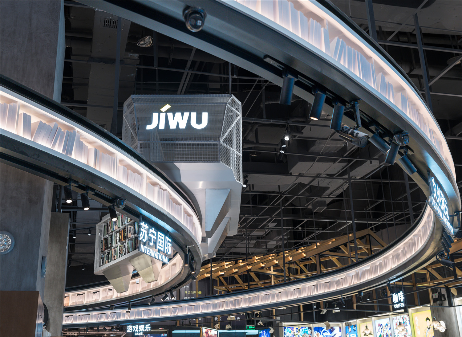
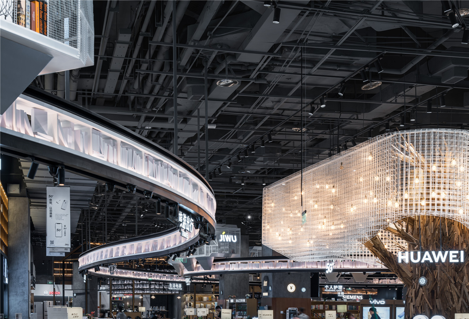
同时遵循商业空间设计所表达的商业逻辑,这些所有的符号建筑和商品,都是通过一条装满图书的发光轨道连接到一起的,除了交待了动线关系和分区商品逻辑,也是表达我们对重庆城市和文化的致敬。
At the same time follow the business logic expressed by the commercial space design, all the symbolic buildings and commodities are connected through a luminous track filled with books, in addition to confessing the dynamic relationship and the divisional commodity logic, it also expresses our A tribute to Chongqing‘s cities and culture.
有了场景设计,我们需要的是把商品融入进去,形成一个真正意义上的商店。我们对每一个道具进行了综合分析,功能、落位、样式、陈列方法、材质、以及和环境的融合度等等,最后,我们抽丝剥茧,几乎把每一个产品和装饰品都装了进去,这是一系列强度非常大的工作内容,目的是为了看清楚所有商品进入后商店的状态,然后做了全场景的效果图表达,这样,所有的一切都变得清晰起来。
With the scene design, what we need is to integrate the goods into a real store. We carried out a comprehensive analysis of each item, function, position, style, display method, material, and the degree of integration with the environment, etc. Finally, we took the smear and almost loaded every product and ornament. It is a series of very intense work content, in order to see the state of all the goods entering the store, and then make a full-effect rendering of the scene, so that everything is clear.


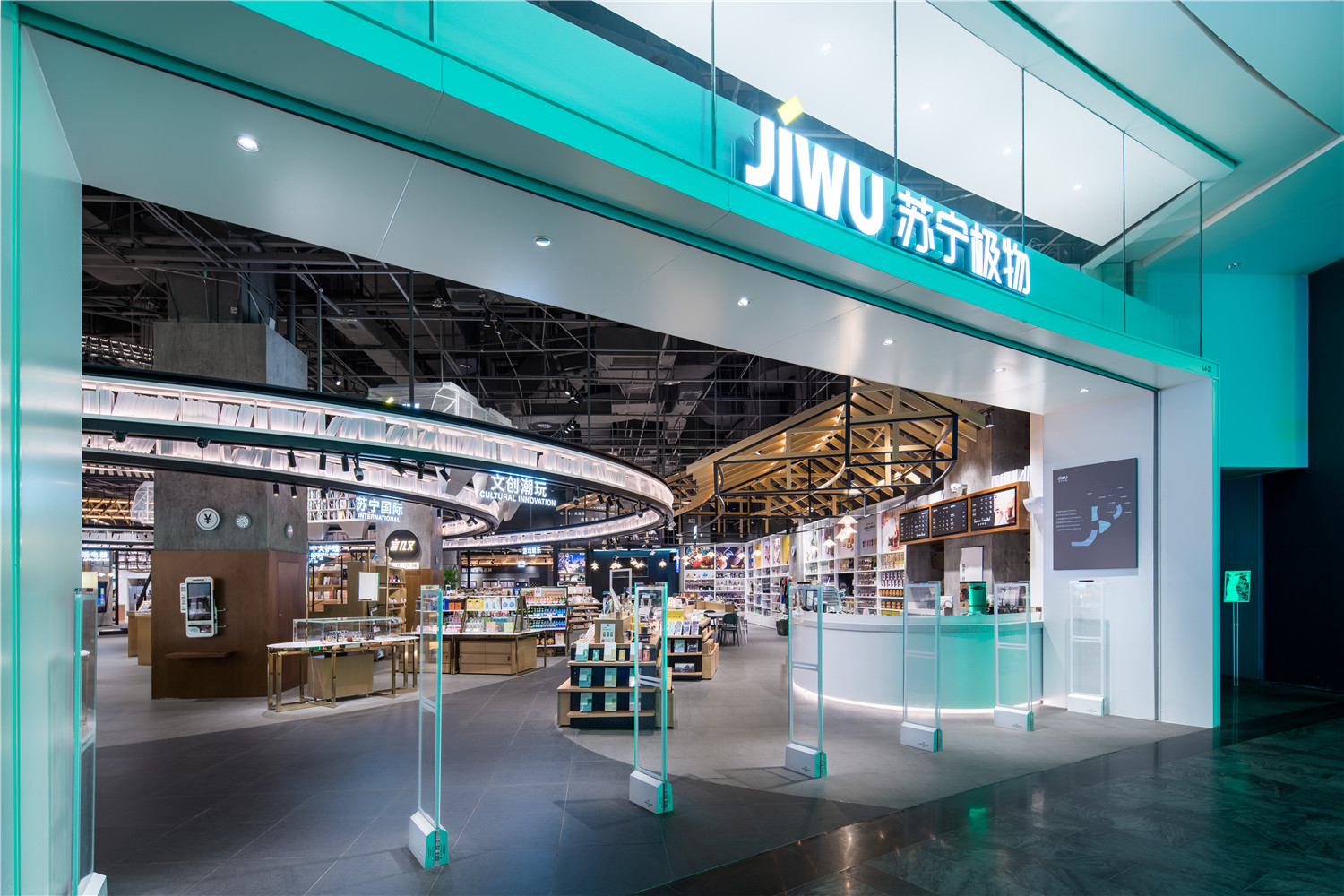
从外部可以看出,我们采用全透明的落地玻璃设计,使得商品类目、场景故事、纵深关系,跨业态融合清晰可见,很远处就开始吸引消费者视线,能观察到故事的主线索——轻轨轨道向内部蜿蜒,牵引消费者往里面行进。
From the outside, we can see that we use a fully transparent floor-to-ceiling glass design, which makes the merchandise category, scene story, depth relationship, and cross-industry integration clearly visible. From a distance, we begin to attract consumers’ attention and can observe the main clues of the story. ——The light rail track smashes inside and pulls the consumer to travel inside.

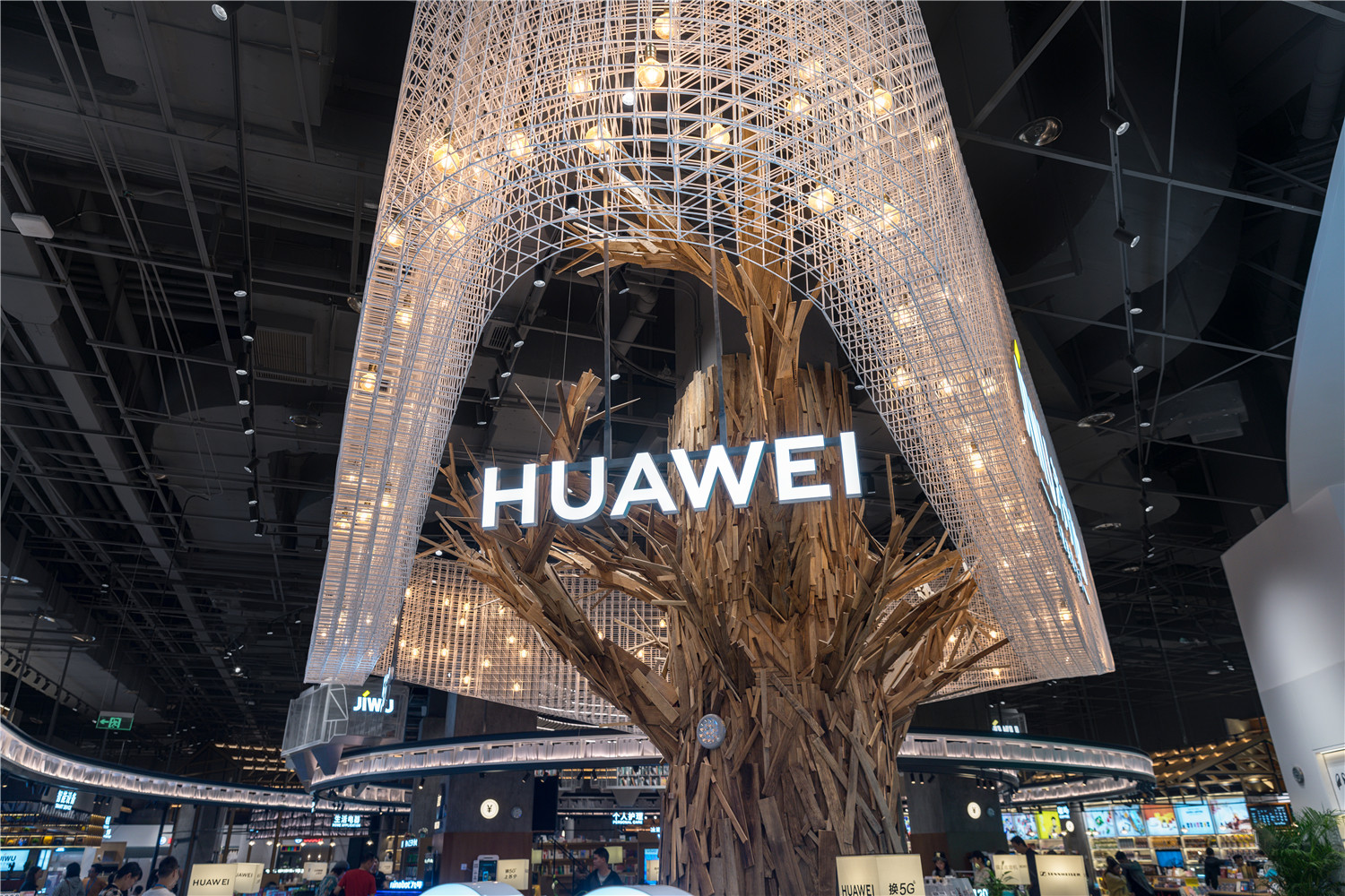
根据商店的面积和原始结构、形状,我们把整个空间从外到内分为三个层次的次序:第一层次序:从左至右是轻轨起点/黄桷树/吊脚楼建筑区, 三大视觉重锤,分别对应的商品是:极物生活类产品、华为5G+IOT,以及苏宁咖啡文创三种引流性和回转率极强的业态,视觉和产品双重的吸引,相得益彰,而且完全覆盖苏宁极物外围的动线,引流性得到极大加强,这也是开业这几天为什么这么多人入店的原因。
According to the size and original structure and shape of the store, we divide the whole space from outside to inside into three levels: first order: from left to right is the starting point of light rail / yellow eucalyptus / hanging foot building area, three major visions The hammers, the corresponding commodities are: the polar life products, Huawei 5G+IOT, and Suning Coffee Wenchuang three kinds of drainage and strong turnover, the visual and product double attraction, complement each other, and completely cover Suning The flow of the periphery of the JiWu has greatly enhanced the drainage, which is why so many people have entered the store these days.


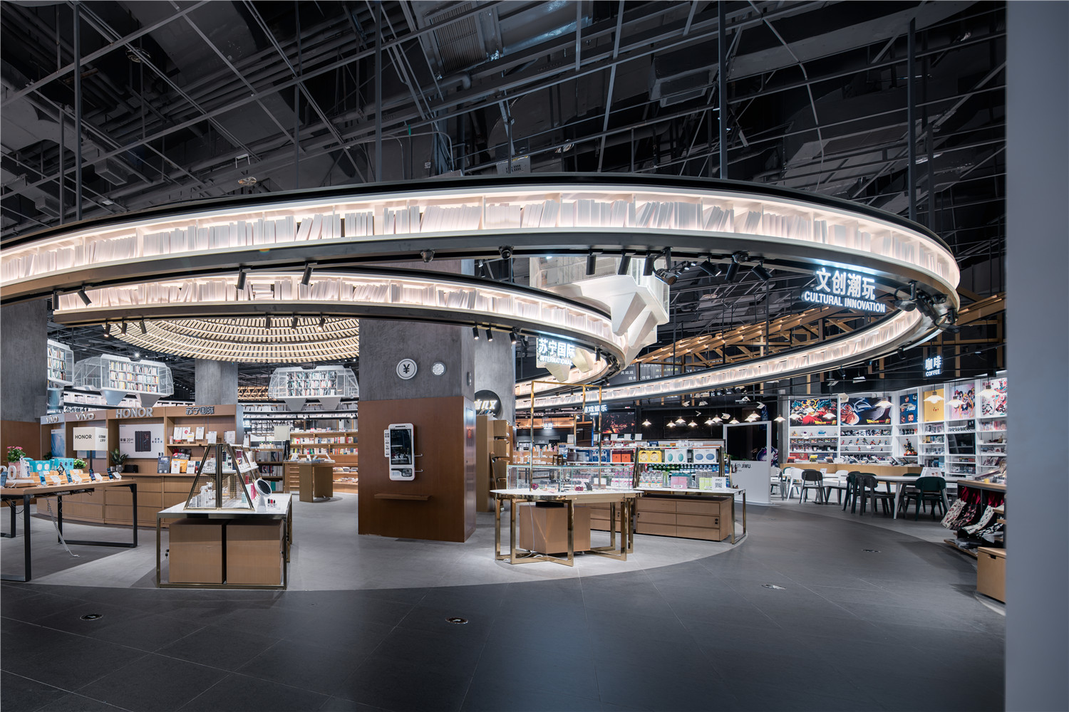
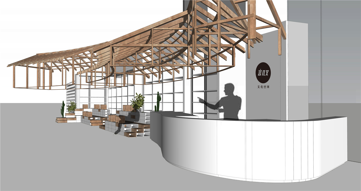
以中央图书馆“言几又”为核心的第二层次序, 这是一个正圆型的类似殿堂的空间,我们不但做了大礼堂屋顶的灯光装置,还用环形台阶抬高了地势,形成中间高四周低的环境,这个圆形图书馆,不但有大量图书可供翻阅,更是全场最大的一个商业绿洲点,消费者逛累了可以坐在台阶上休息、阅览图书,也可以作为阶梯教室传播资讯和活动场地使用。这个休息阅览区因完全处于全场的中心,而且地势较高,可以均衡任意一处销售区域,使得每一个进店消费者可以最快的找到购物之外的乐趣和轻松。除了这些,因为聚合性较强,更可以带动周边一圈最多品类的商品贩卖,手机、国际商品、美妆、个护、极物、儿童等坪效比较高的品类紧紧围绕着圆形图书馆一周。所以把该区域设定为本店最大的SKU 汇聚地带。
The second order of the central library, with the words “Yanjiyou”, is a round-shaped space similar to the temple. We not only made the lighting fixtures on the roof of the grand auditorium, but also raised the terrain with circular steps. Forming a middle and high four-week environment, this circular library not only has a large number of books to be read, but also is the largest commercial oasis point in the whole audience. When consumers are tired, they can sit on the steps and rest, read books, or Use as a lecture room for information and event venues. This rest reading area is completely in the center of the audience, and the terrain is high, which can balance any sales area, so that every in-store consumer can find the fun and relaxation outside the shopping. In addition to these, because of the strong polymerizability, it can also drive the most popular products in the surrounding circle. Mobile phones, international products, beauty products, personal care, polar objects, children and other high-efficiency categories are closely surrounding the round books. So set this area as the largest SKU gathering area in the store.
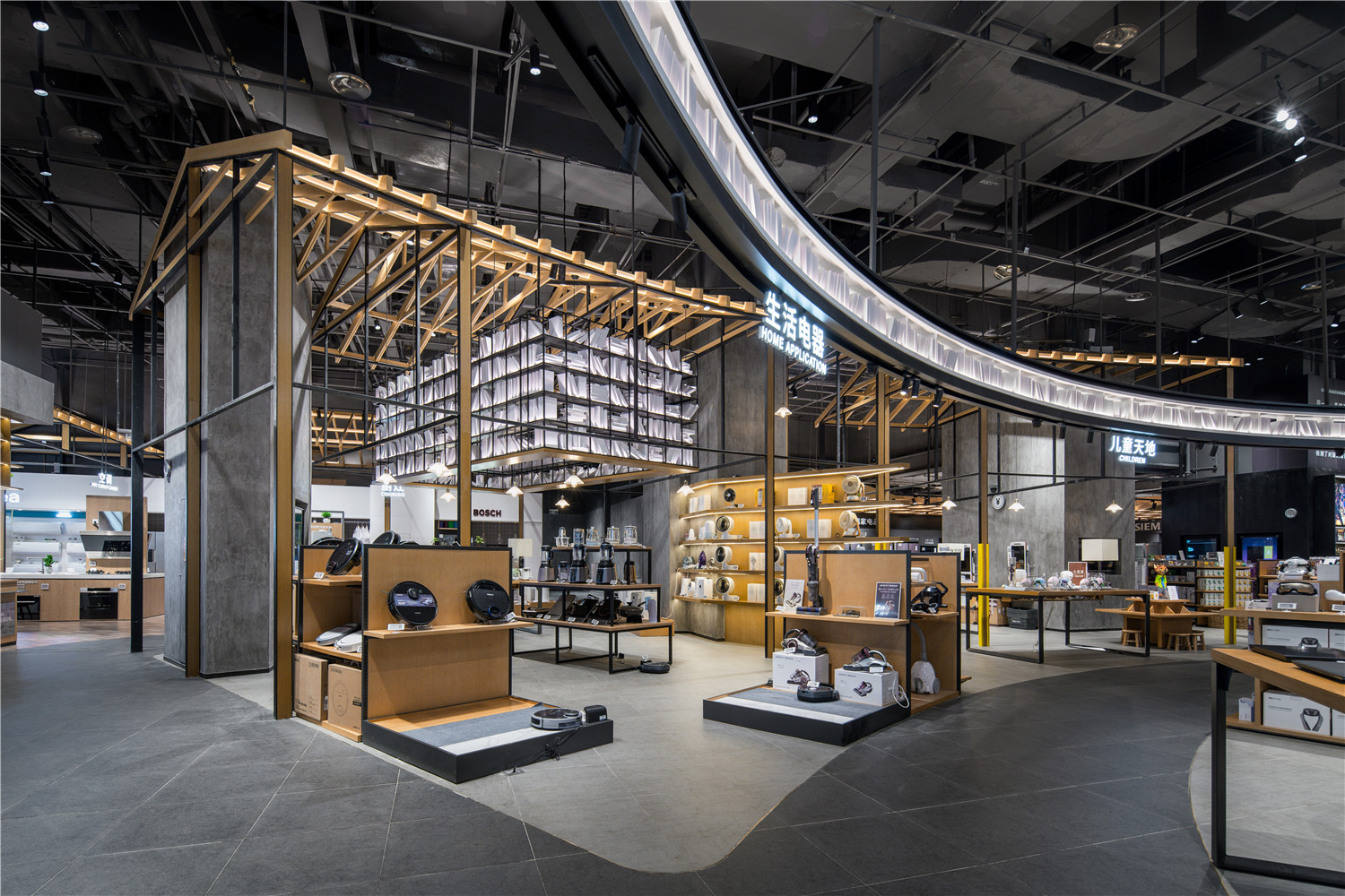
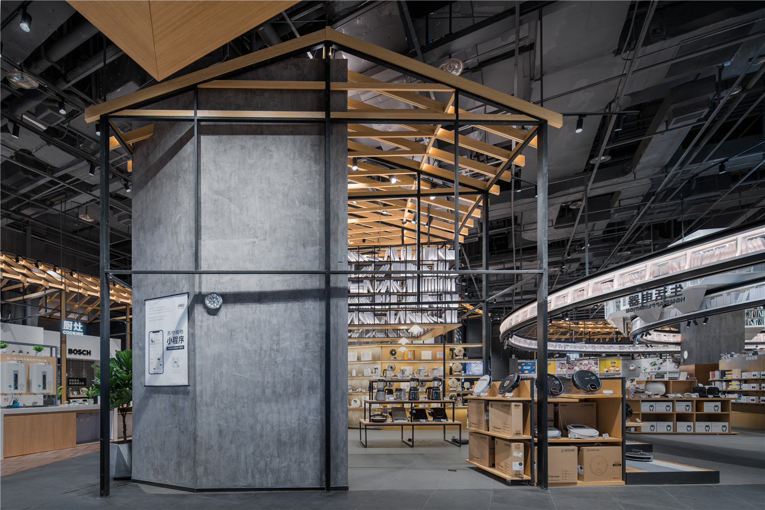
大家电区域我们用了吊脚楼建筑群的概念,因为建筑比较高,且轮廓灯光照明,可以吸引外围的消费者的目光,并被引进。大家电区我们规避了传统的品牌自有形象模式,打造了同类相似性陈列方法, 使得更加整齐划一,品类清晰,避免了良莠不齐,视觉冲突的弊端。货比三家,变成了货比千家,消费行为变得十分清晰而轻松。
The mains area We used the concept of the sling building complex, because the building is relatively high, and the outline lighting, can attract the attention of the peripheral consumers, and was introduced. In the large household appliances area, we have circumvented the traditional brand image mode and created a similar similarity display method, which makes it more uniform and clear, avoiding the disadvantages of good and bad, visual conflicts. Compared with the three, it became a shop for goods, and the consumption behavior became very clear and relaxed.
项目信息——
项目名称:苏宁极物旗舰店
设计方:杭州帮浦室内设计有限公司
项目设计&完成年份:2019.3设计,2019.9落地
主创:张杺、胡蓝心
设计团队:金威、徐德鹏、李国民
项目地址:重庆来福士
建筑面积:2000㎡
摄影:吴清山
客户:苏宁集团


