


清鬼作为一家成立近20年的刺青店,并没有太过宏大的理想,却依旧成为了国内刺青行业独树一帜的存在。我想这就是坚持的力量。
As a tattoo shop established for nearly 20 years, QG does not have a too ambitious ideal, but it still becomes a unique presence in the domestic tattoo industry. I think that’s the power of persistence.
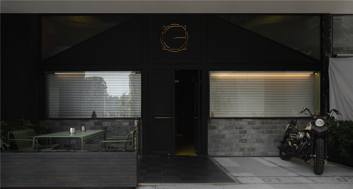
▲项目外观
iZ与清鬼创始人东&可可的缘分颇深。从QG TATTOO,到QG LAB,再到QG STATION的合作,是清鬼意识层面的延展,同样是iZ在“空间体验”尝试中的阶段性表达。
iZ and the QG founder Dong & Keke are destined for each other. From QG TATTOO to QG LAB to cooperation on QG STATION, it is an extension of QG consciousness and also a phased expression of iZ’s attempt of “space experience“.
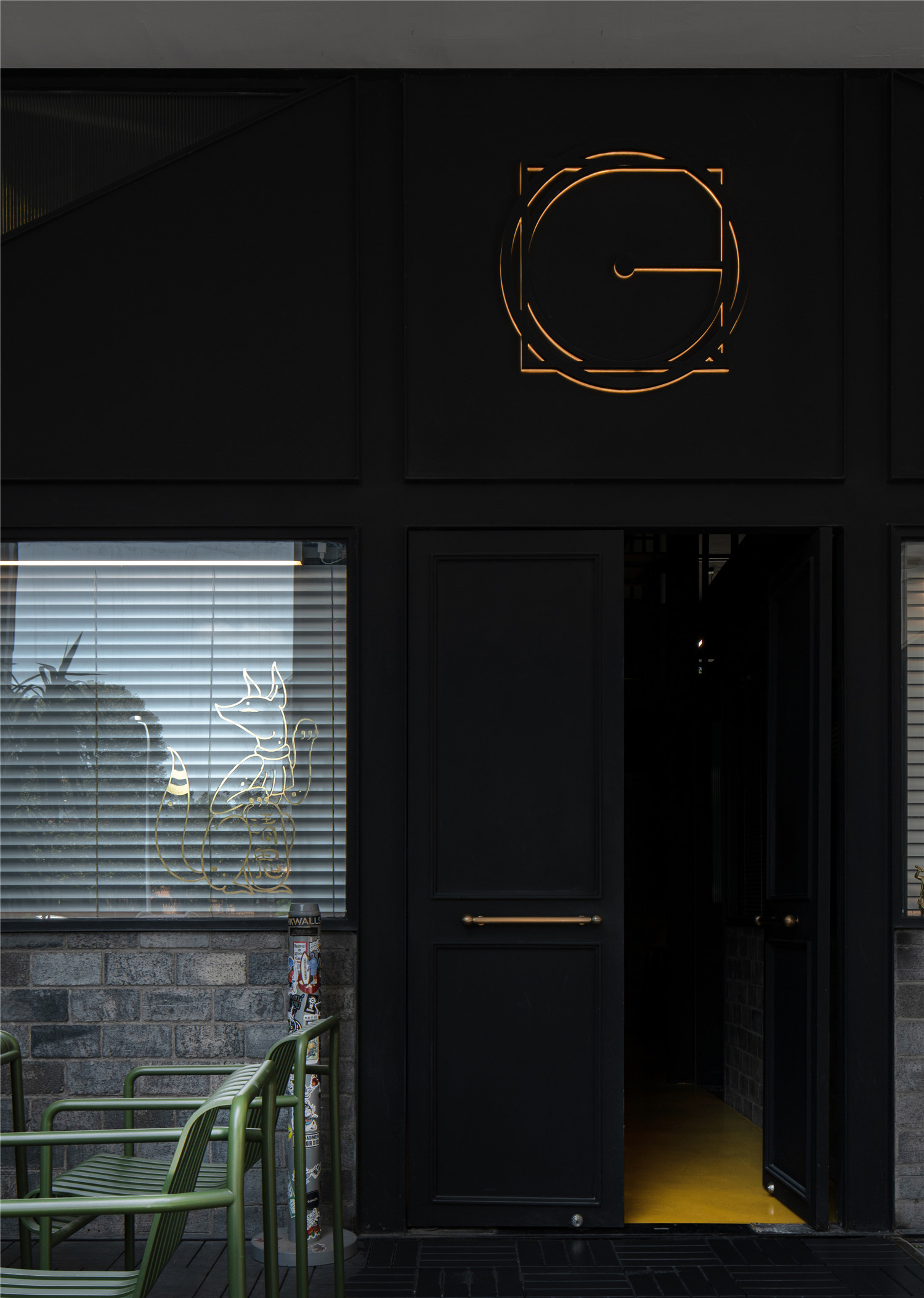
▲入口处
随着人年龄的增长,生活方式的改变,工作状态也在变化着。QG TATTOO从一家单纯的刺青店,过渡到QG LAB,成为清鬼内部培训、发散想法、投入创作的地方。
As people grow older, their working status changes with their lifestyle. QG TATTOO from a simple TATTOO shop, the transition to the QG LAB, which becomes a place of QG internal training, divergent ideas, and devoting to the creative.
QG STATION基于以上,进一步扩展了社交的属性,让这里成为客户交流、休憩和举办活动的场所。传达的是“车站”的空间概念。
Based on the above, QG STATION further expands its social properties, making it a place for customers to communicate, have a rest and hold activities. It conveys the spatial concept of “station”.
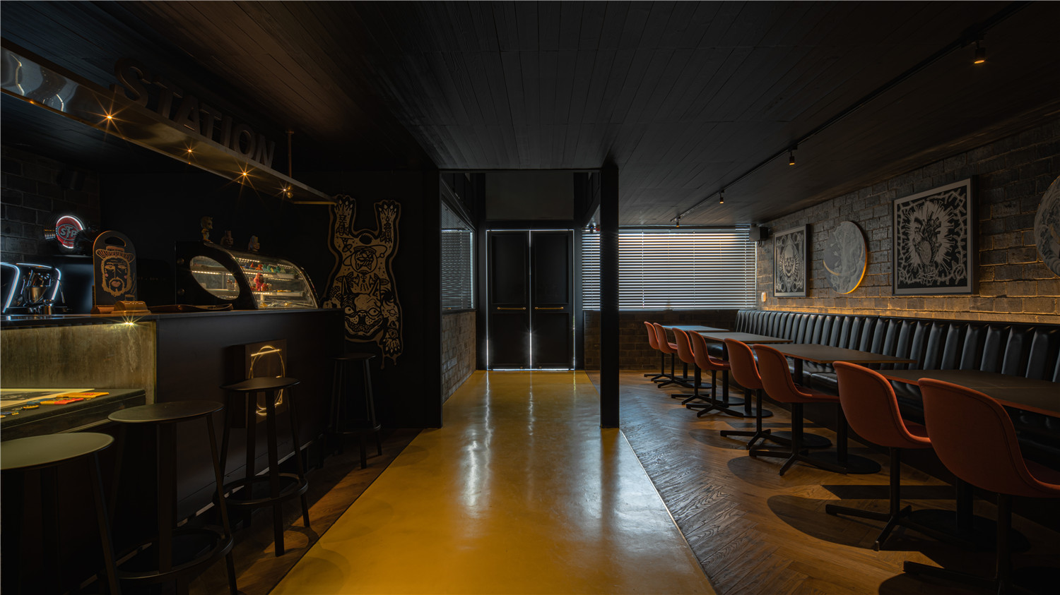
▲一楼空间概览
设计也由空间社交属性进行发想。当你来到QG STATION,将机车停在门口,在这里与人交流,燃起一支烟,得到一个有纪念意义的刺青,最后道别离开。
Design is also derived from spatial social attributes.When you arrive at QG STATION, stop your motorbike at the door, communicate with people here, light a cigarette, get a memorable tattoo, and finally say goodbye and leave.
以人来人往的场景延伸出车站的概念,传达人对迈向另一段旅程的期待,和对过往回忆的珍惜,就如同获得刺青的意义。
The concept of the station is extended with the scene of people coming and going, conveying people’s expectation of moving to another journey and cherishing the memories of the past, just like the meaning of obtaining a tattoo.
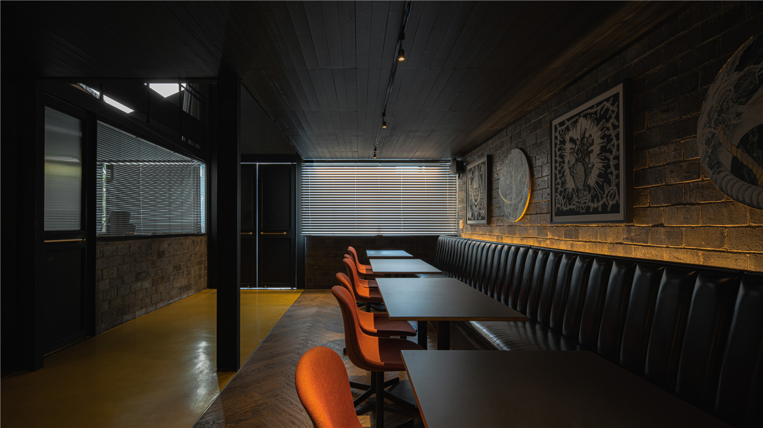
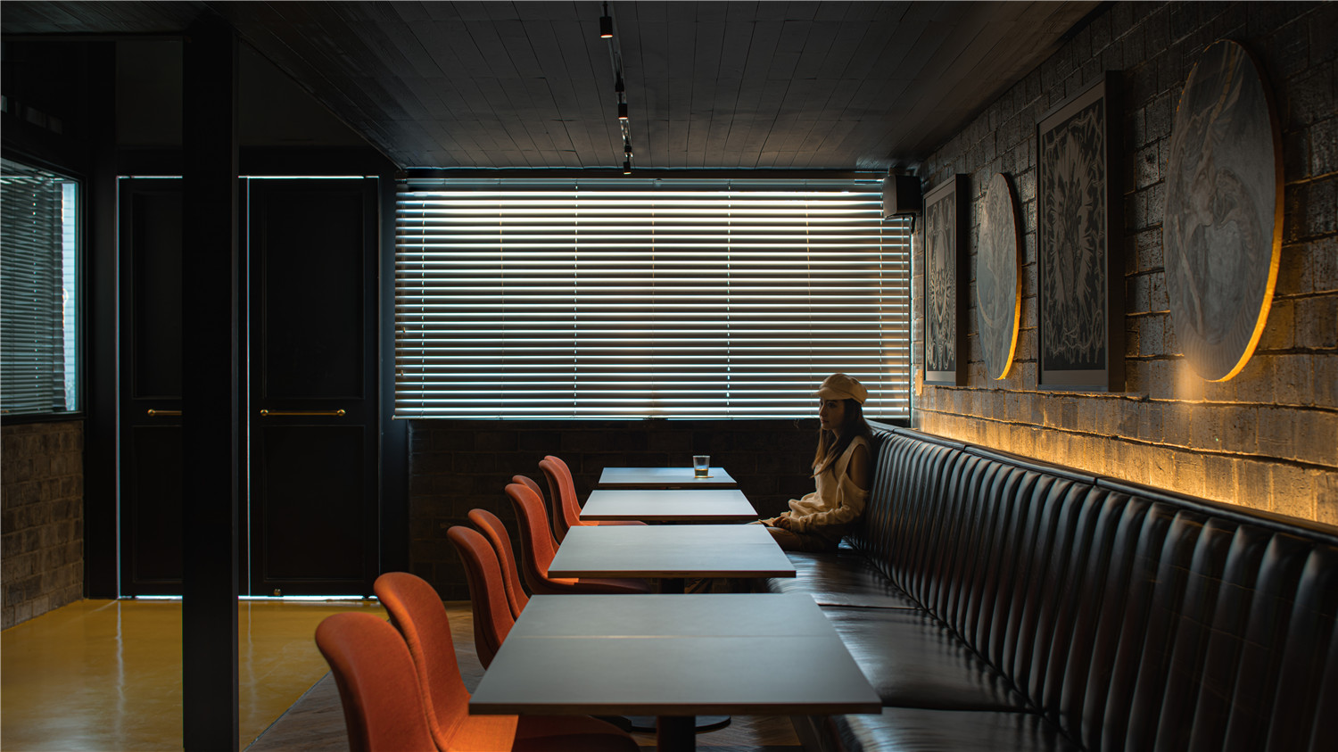
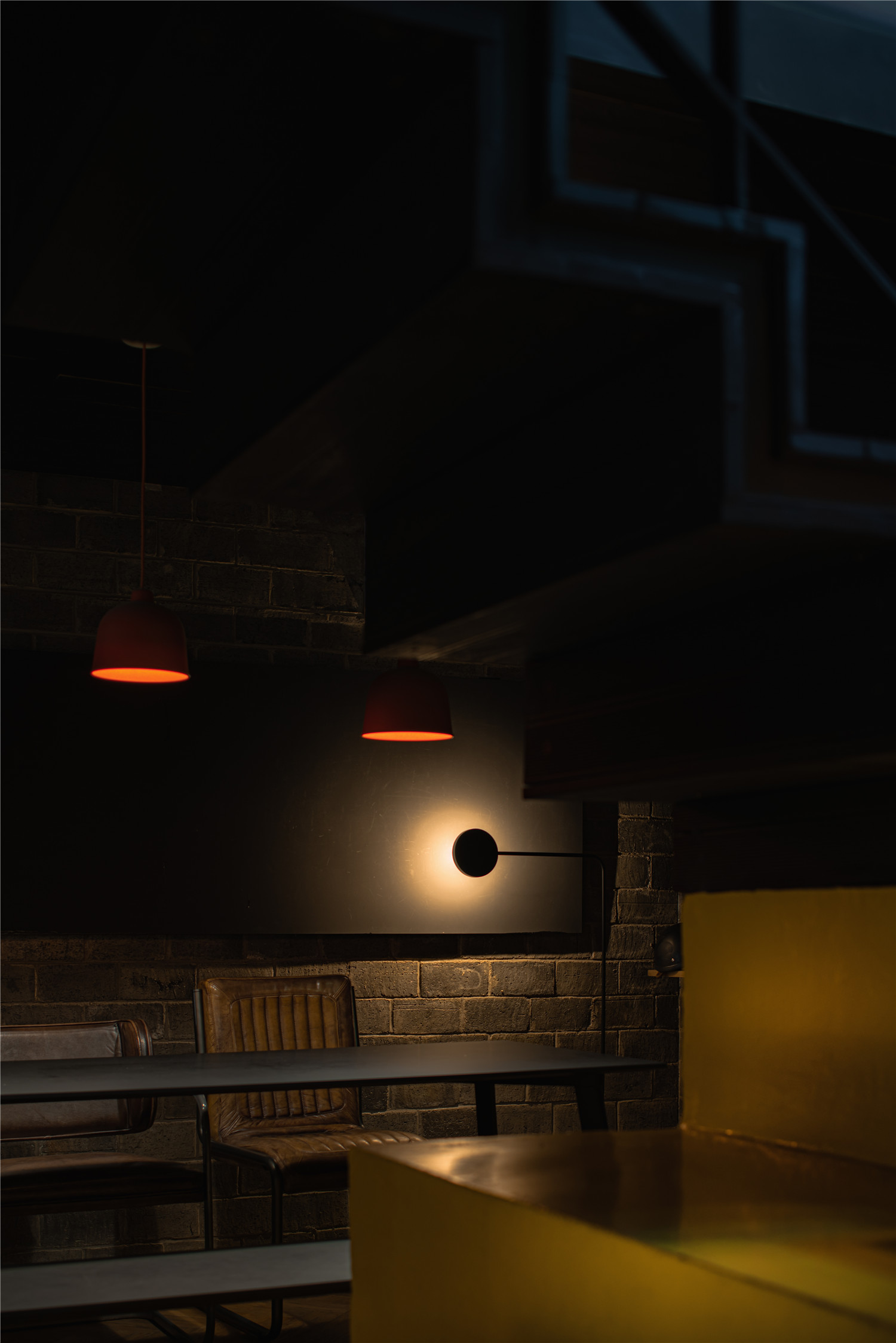
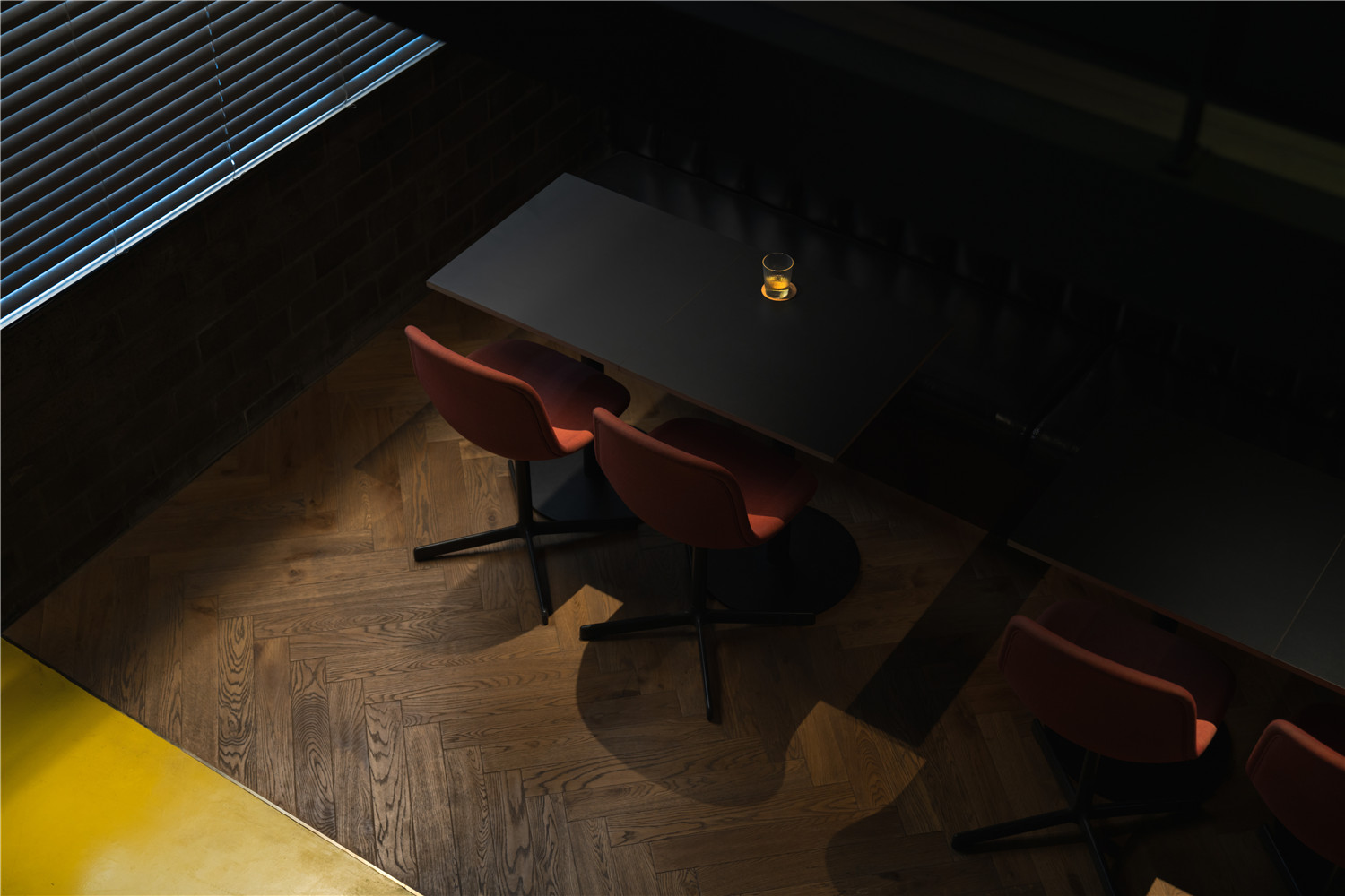
▲座位区
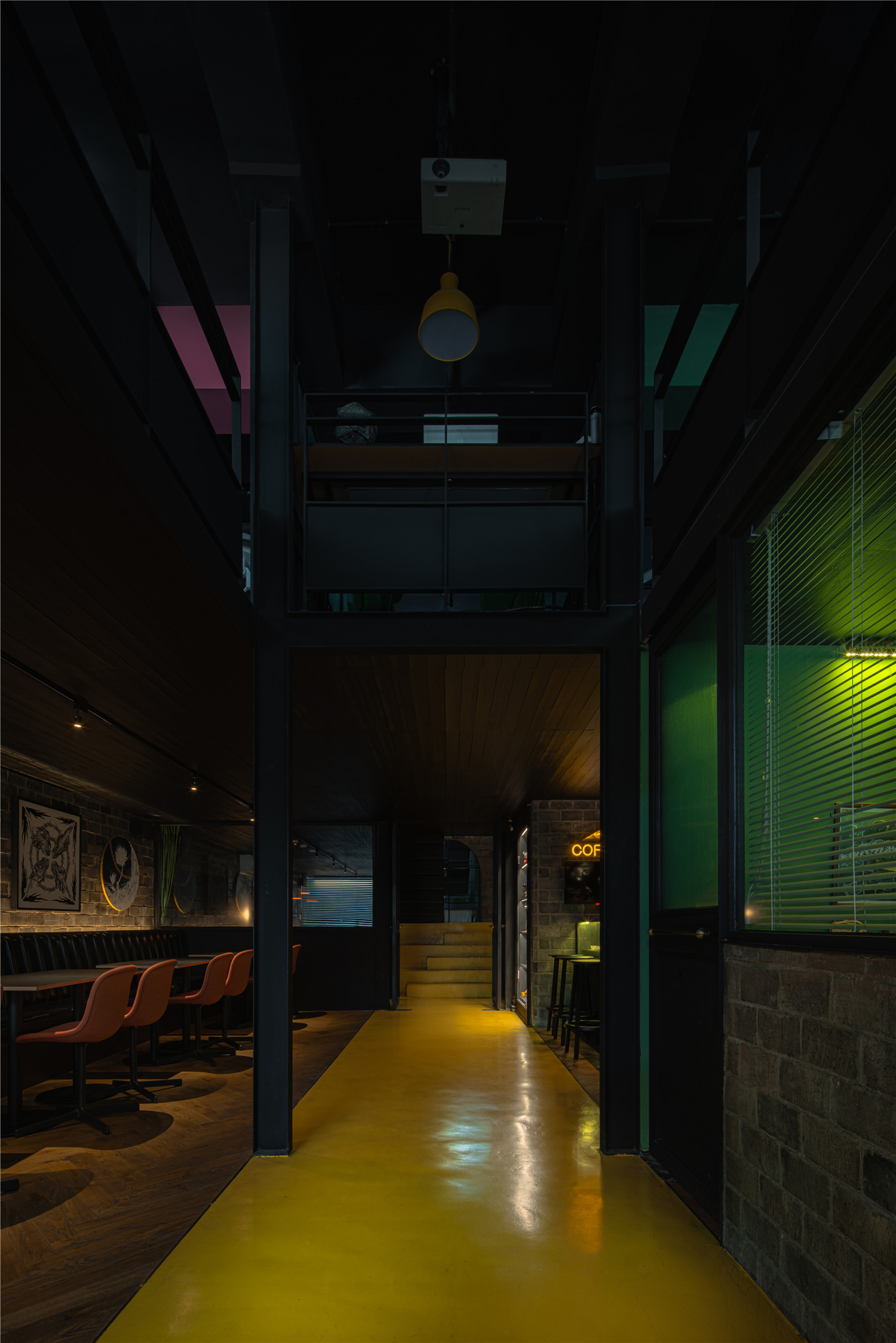
一楼大面积区域留白,用作客人和朋友们轻松交流的区域,并利用挑空来营造空间的层次。
A large area of the ground floor is left blank, used as an area for guests and friends to communicate easily, and empty spaces are used to create a level of space.

▲空间中的色彩搭配
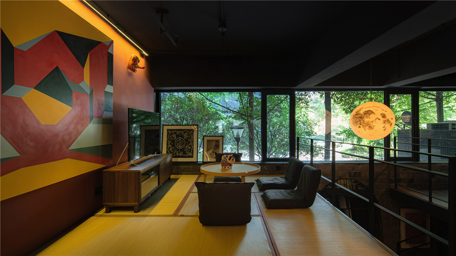
这些年清鬼对环境的打造,也都是以舒适、简洁、实用为重心,这与iZ Design Studio的设计理念不谋而合。设计中,色彩搭配选择了红黄绿三色,在一些文化中它代表对自由的向往。以此作为主要空间区域的分割,并在一二层区域整体呼应。
In recent years, QG has been focusing on environmental construction. Comfort, simplicity and practicality, which coincides with the design concept of iZ Design Studio.In the design, the colors of red, yellow and green are chosen, which represent the yearning for freedom in some cultures. This serves as the division of the main space area and echoes the whole of the first and second floor areas.

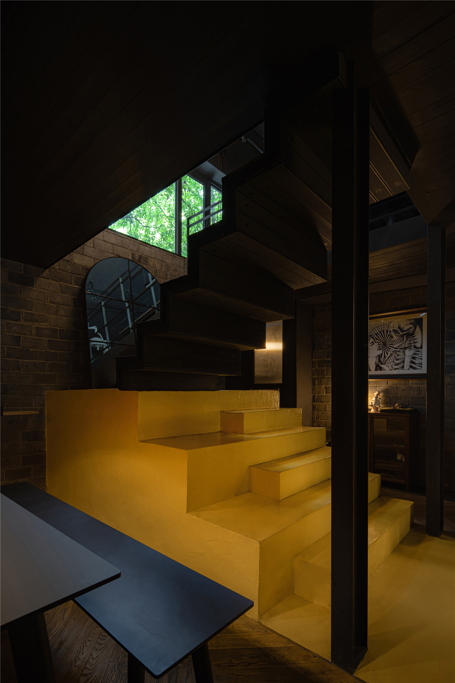
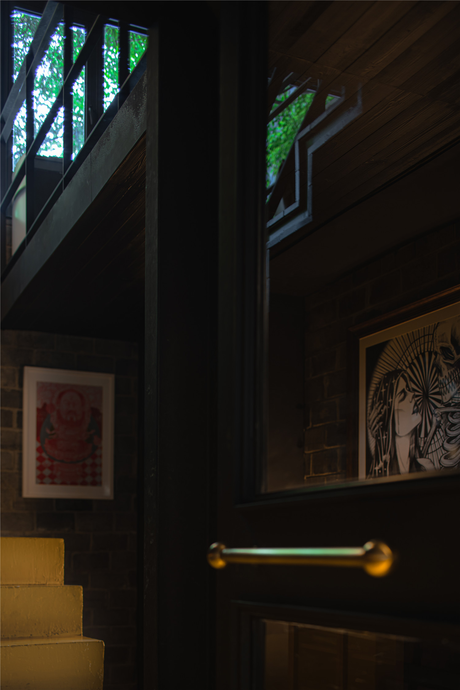
▲楼梯

▲二楼

▲休息区

▲刺青师创作的定稿区域
二楼以楼梯为中轴,分成了红绿两部分工作区域。榻榻米休息区供客人休憩等待,另一侧则是刺青师创作的定稿区域。黄色区域平时作为清鬼视觉传达区,在派对活动时,同样可以作为DJ音控台使用。
The second floor takes the staircase as the central axis and is divided into red and green working areas. The tatami lounge area is for guests to sit and wait, while on the other side is the area to finalize creation for tattooist.The yellow area is usually used as a visual communication area for the ghosts, and can also be used as a DJ audio console during party activities.
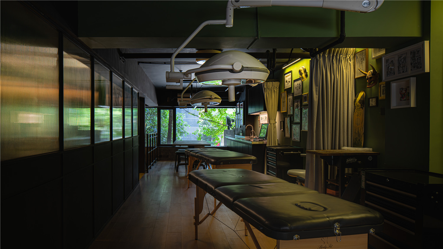
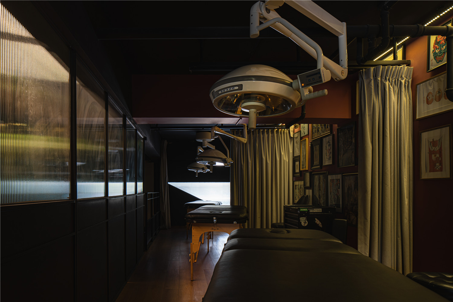
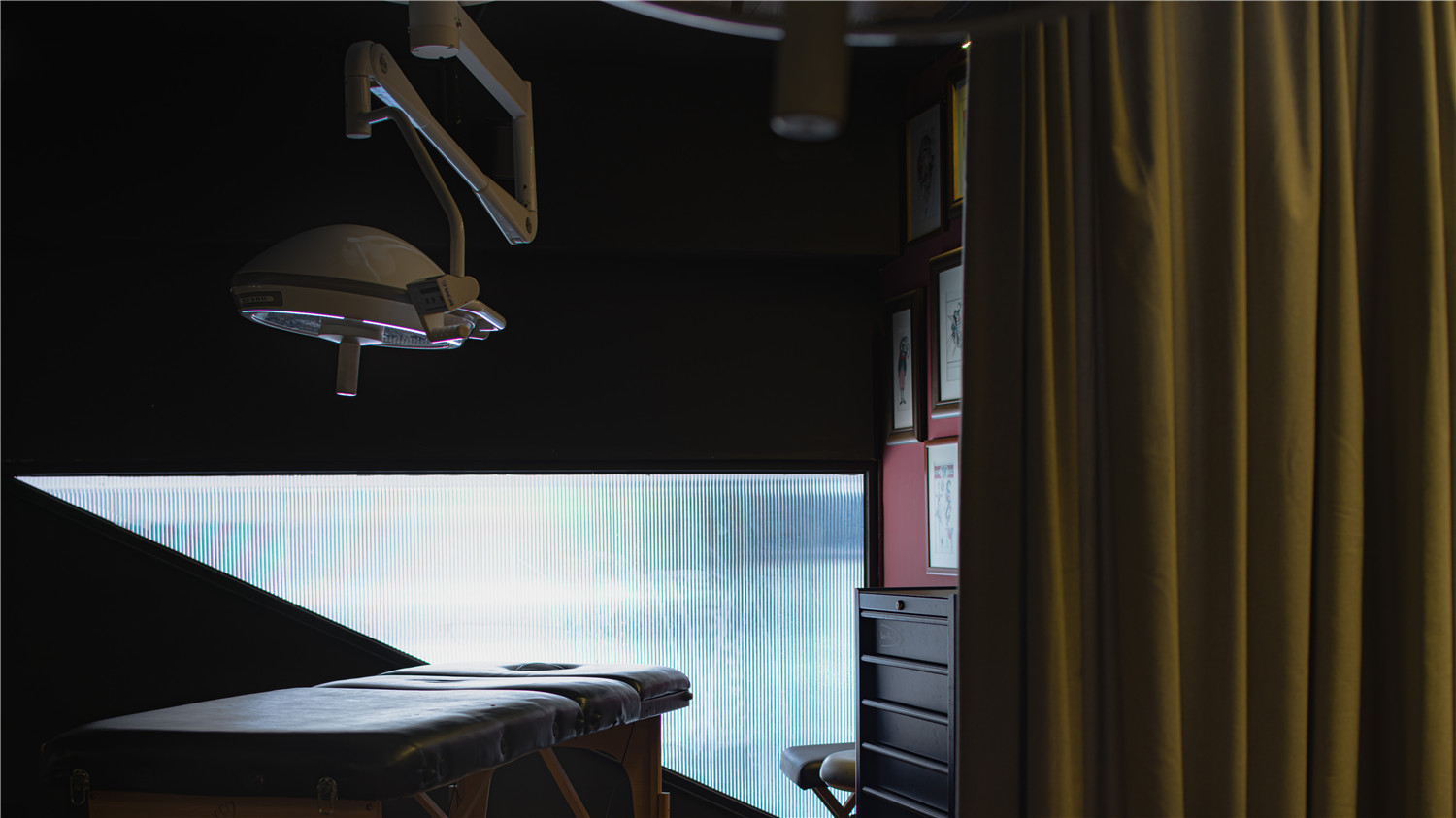
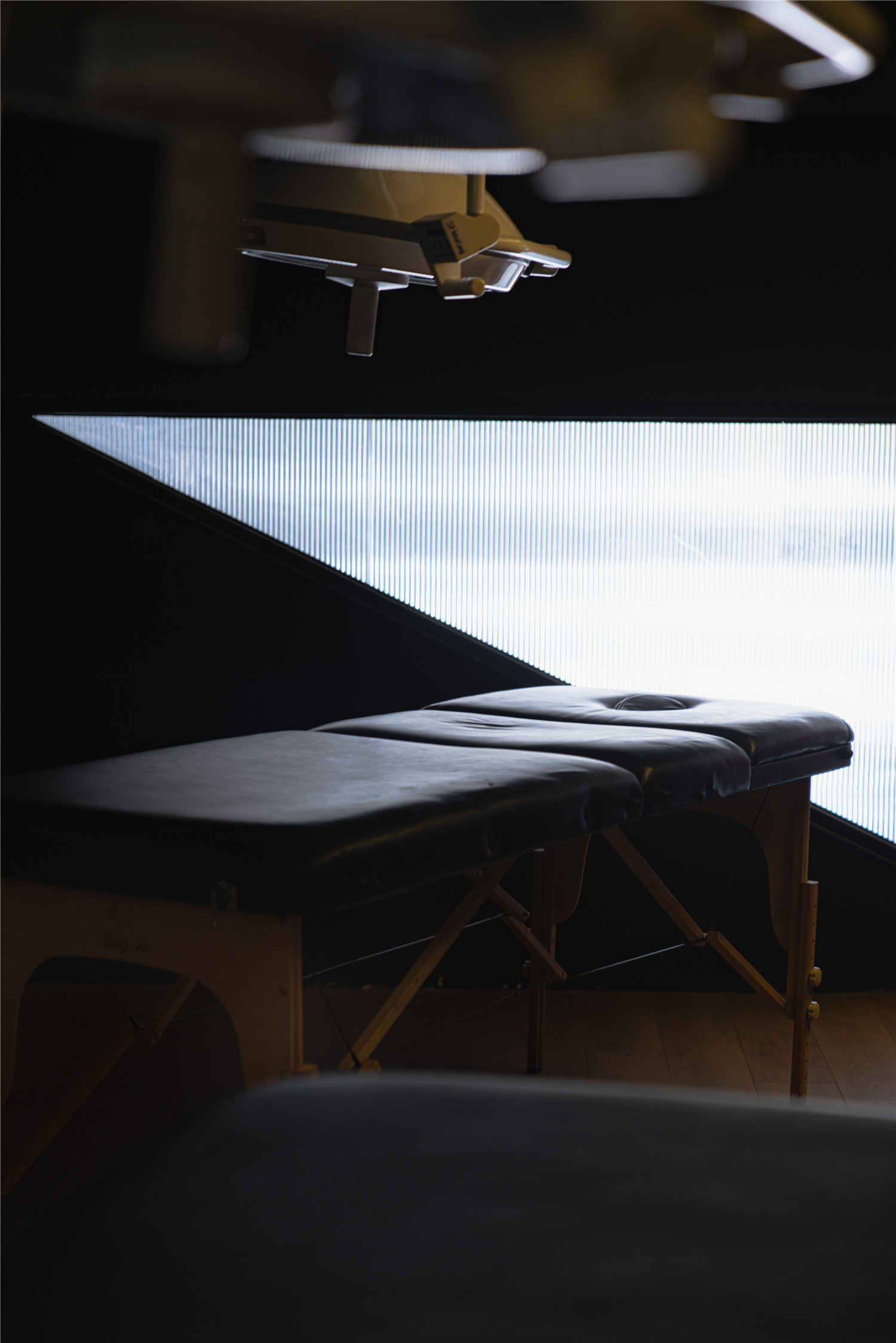
▲刺青工作区
刺青除了对皮肤有轻微的伤害以外,更多带来的是精神的寄托,个性的彰显,甚至是心灵的疗愈。
Besides the slight damage to the skin, tattoo brings more spiritual sustenance, personality manifestation and even the healing of the soul.
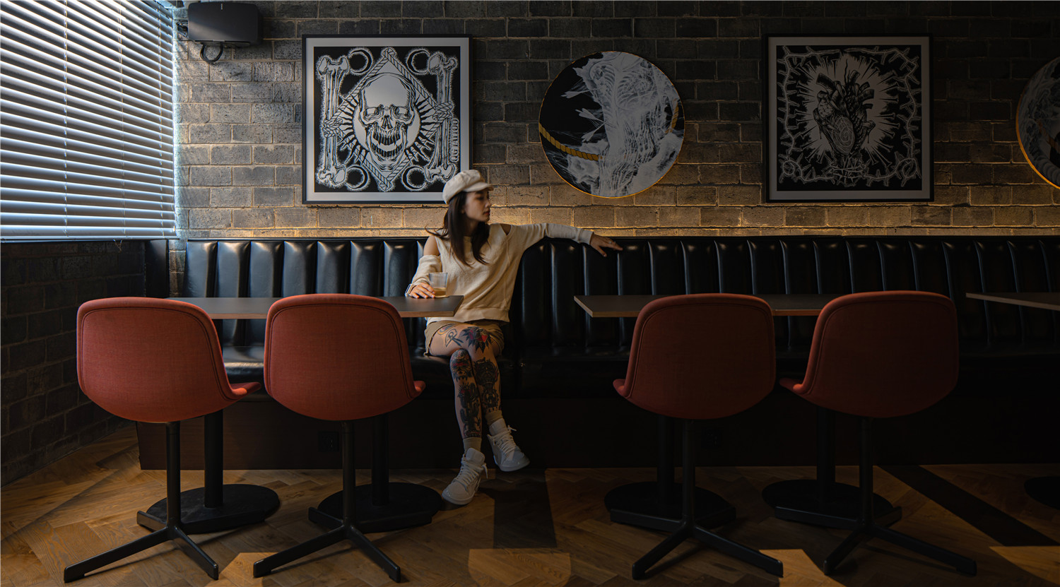
▲清鬼刺青创意人的作品
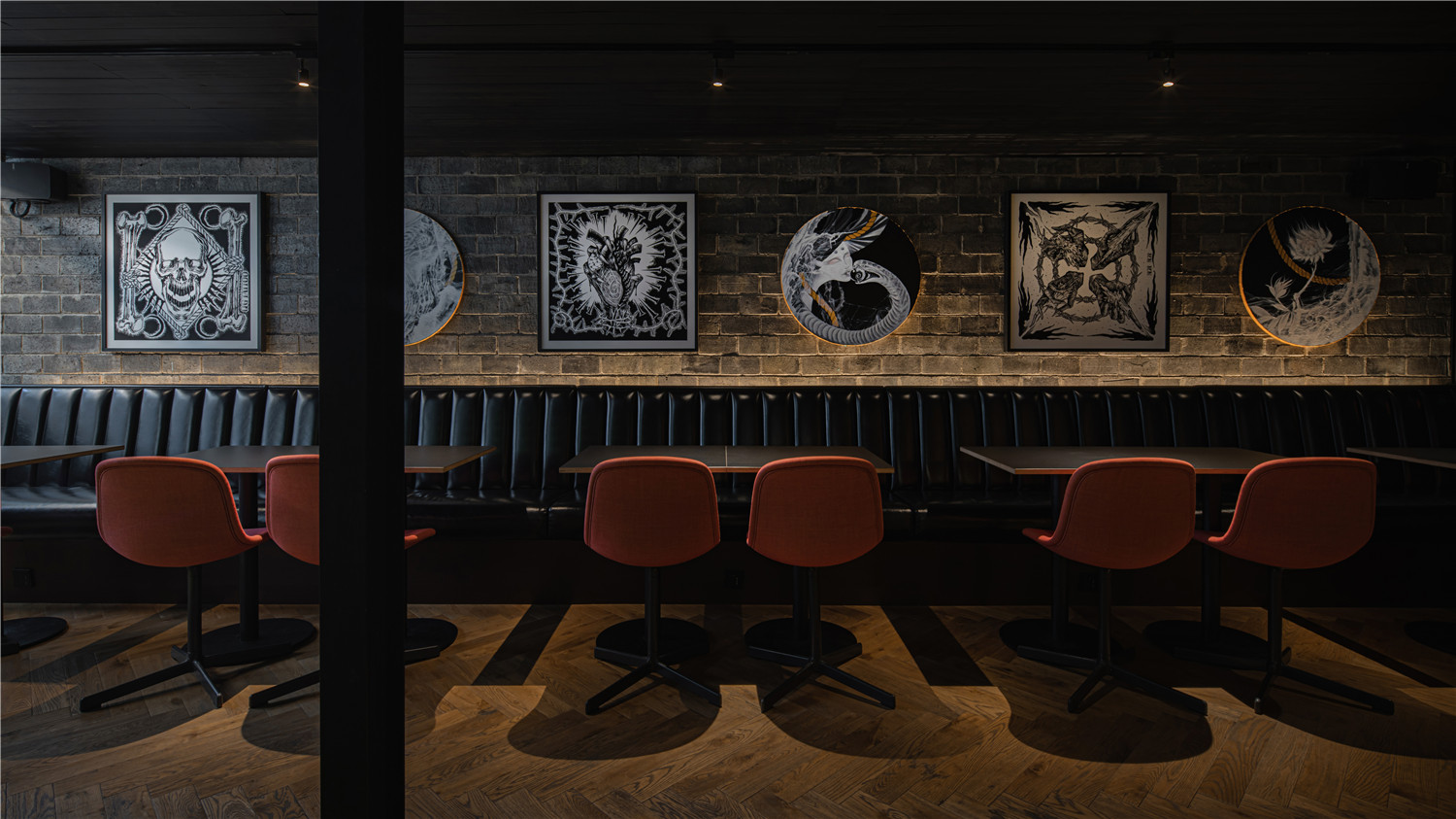
主理人东一直是把清鬼当做一家具有特殊意义的画廊在经营。因此一楼座位区,不断在更新着清鬼团队刺青创意人的作品。
Dong has always felt that he is running a special gallery with a special meaning for QG. Therefore, the seating area on the first floor is constantly updating works of QG creative people.

刺青创作最重要的是,创作者审美不断提高,思维不受局限。画画的人最忌浮躁,因此创作者心态的稳定更加重要。
The most important thing about tattoo creation is that the creator’s aesthetic is constantly improved and his thinking is not limited. People who draw need to avoids impetuosity, so the stability of the creator’s mentality is more important.

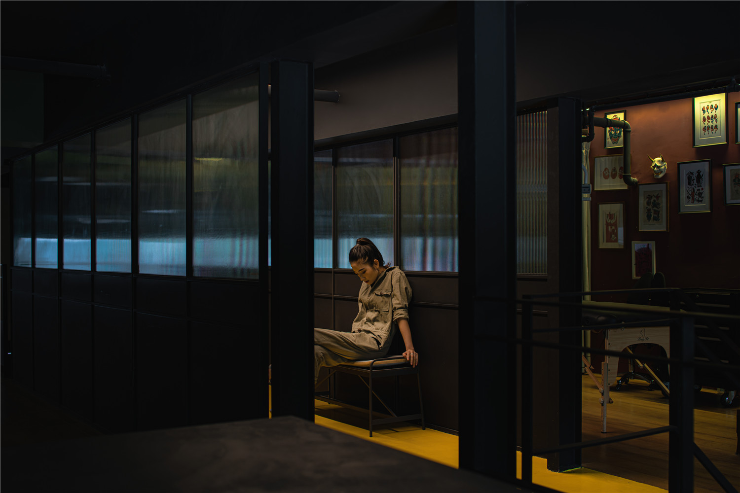
▲空间局部细节
清鬼希望在团队年轻的创意人输出灵感的同时,为他们提供好的创作环境,并拥有正面积极的生活信念。
QG hope to provide young creative people with a good creative environment and positive life beliefs while they are exporting their inspiration.
“在我心里我从来没有把清鬼当成一个品牌或企业。宇宙太大,人何其渺小,只希望每位接触到清鬼的人,能记住清鬼就好。”By 清鬼东
“In my mind, I have never considered QG as a brand or a company. The universe is too big and people are too small. I just hope everyone who comes into contact with QG will remember us.” By Dong of QG

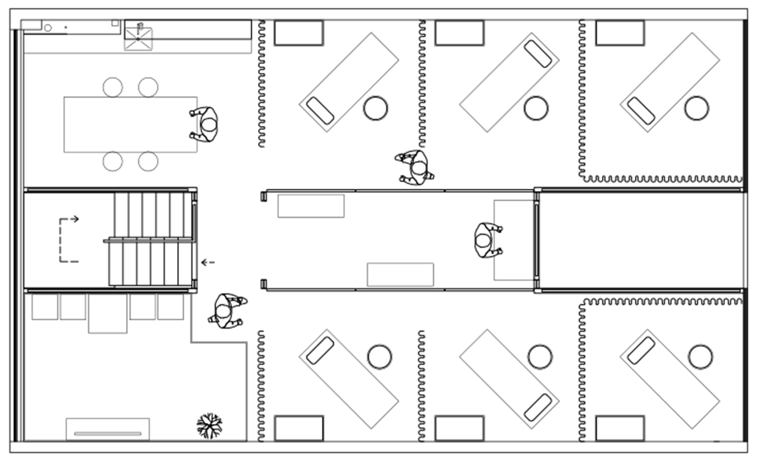
▲一楼平面图
▲二楼平面图
Project Information——
Project Name:QG STATION
Location: Chengdu, China
Project Complete: Feb. 2019
Space Designer: iZ.
Design Area: 1F: 100 sqm;2F: 80 sqm
Major Materials: Timber Floor | Black Brick | Self Leveling Floor
Furniture: HAY by Van Der Rohe Furniture
Lighting Equipment: Geosheen Lighting.
Photographer: Here Space Photography.
Model: Mi.
Article: Bo.


