


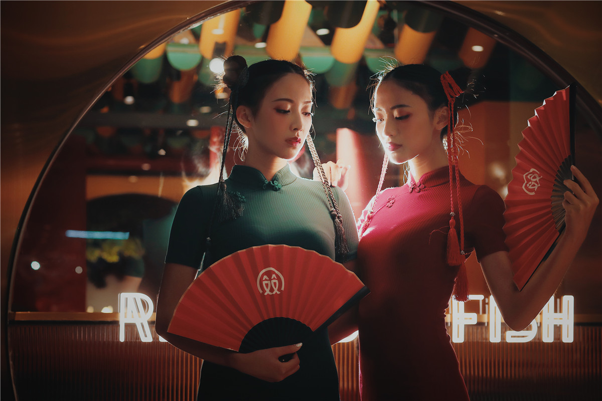
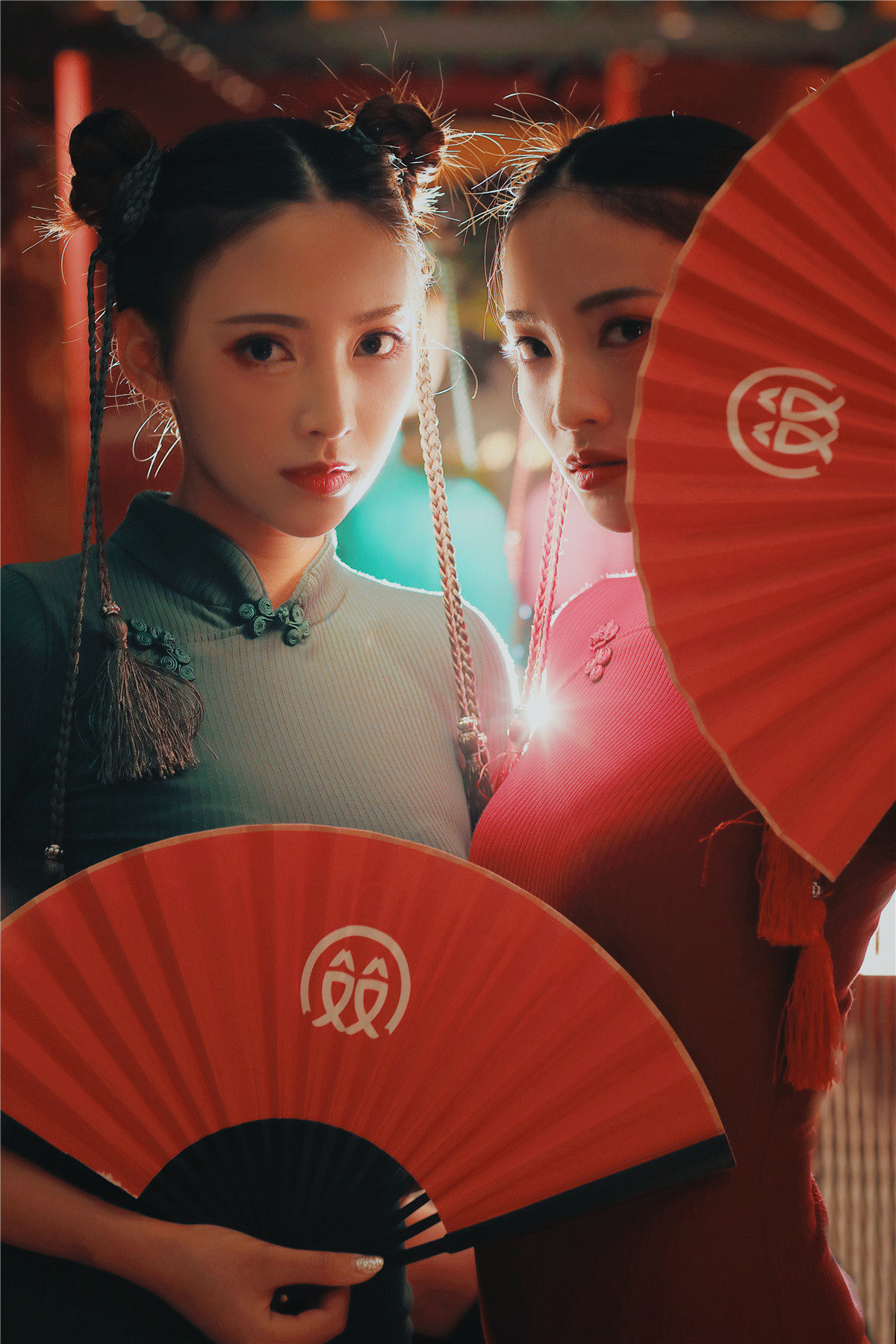
红双鱼是中国传统艺术与当代文化交流融合出的新国潮产物。设计师希望通过品牌体现出“吃”这件事的通感效应。在同一时间让消费者体验有形的产品和无形的文化,从而获得具象和抽象并存的感官享受。
The Redoublefish (For exquisite design, we replace ‘Red double fish’ with ‘Redoublefish’) design is the product of a new national fashion combining Chinese traditional art with contemporary cultural exchanges. Designers hope to show the synesthesia effect of eating through the brand. Meanwhile, consumers can experience tangible products and intangible culture to enjoy the concretization and abstraction.
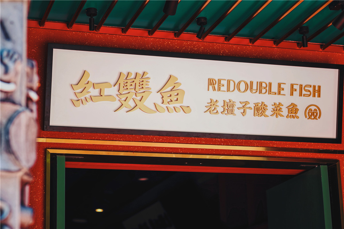
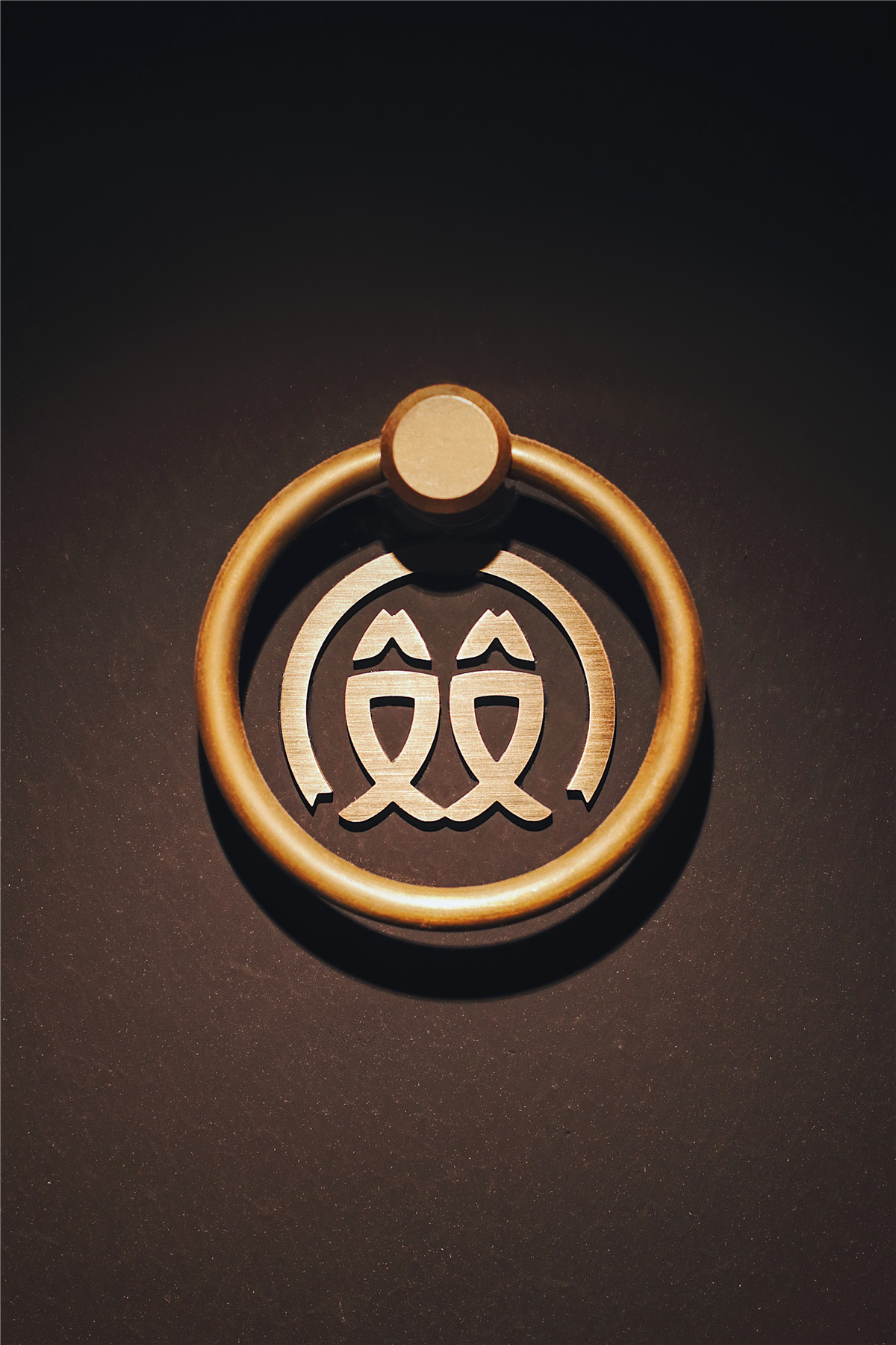
红双鱼的名称是以品类以及中国地域文化为考量,运用单字组合的手法为命名的。
The name of Redoublefish is based on the category and Chinese regional culture, using the word combination method for naming.
红,是中国传统喜庆色彩,代表着喜庆和祥和。双,在中国传统文化中代表着成双成对的美好寓意,同时也有交融融合之意。鱼,与品牌品类直接关联,可以通过名字来提升餐厅的品类辨识度。
Red is a traditional Chinese festive color, representing happiness and peace.Double, represents good implication of a pair in the traditional Chinese culture and the meaning of integration as well. Fish, which is directly related to the brand category, can be used to improve the classification of the restaurant through the name.
名称在包含了产品特征的同时更赋予了品牌极好的寓意,具有时代感且经典的“红双鱼”为该品牌笼罩了一种复古气质,让品牌形象更为丰满,突显品牌核心。
While containing the product features, the name also gives the brand excellent meaning. The classic “Redoublefish” with a sense of the times has covered the brand with a retro temperament, making the brand image more impressive and highlighting the core of the brand.
红双鱼的命名是构思整体设计的主导思想。
The name of Redoublefish is the dominant idea of the whole design.

在经过对红双鱼名称的剖析与提炼后,设计师在空间设计与平面设计上皆采用了许多与中国传统文化、喜庆文化息息相关的设计元素,将红双鱼的命名贯彻始终并饱满地落实到设计上。
After the analysis and extraction of the name of Redoublefish, designer adopted many design elements related to traditional Chinese culture and festive culture in both space and graphic design, and implemented the naming of Redoublefish throughout and fully into the design.
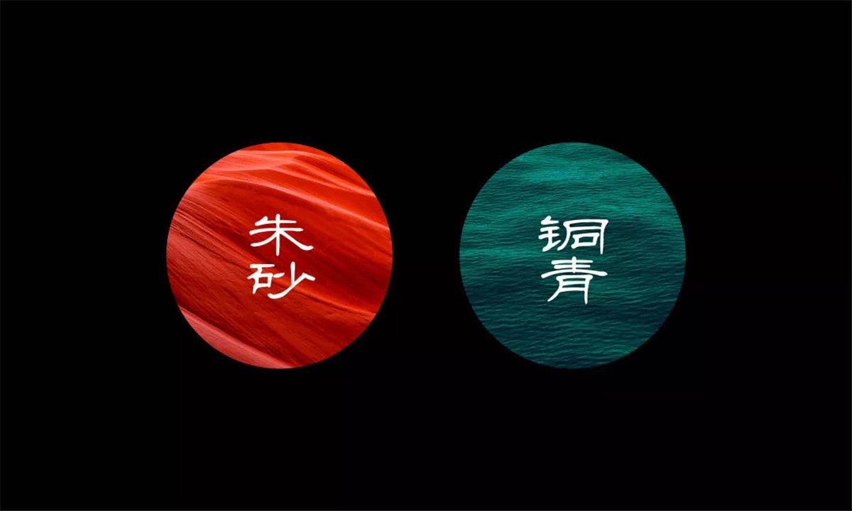
红:朱砂
Red: cinnabar
绿:石绿
Green: stone green
金:泥金
Gold: muddy gold
红双鱼的几种选色既是出自于中国传统国画颜料中的配色,又是中国传统建筑用色之一。
Several colors selection of Redoublefish are both the matching color of traditional Chinese painting pigment and one of the traditional architectural colors of China.
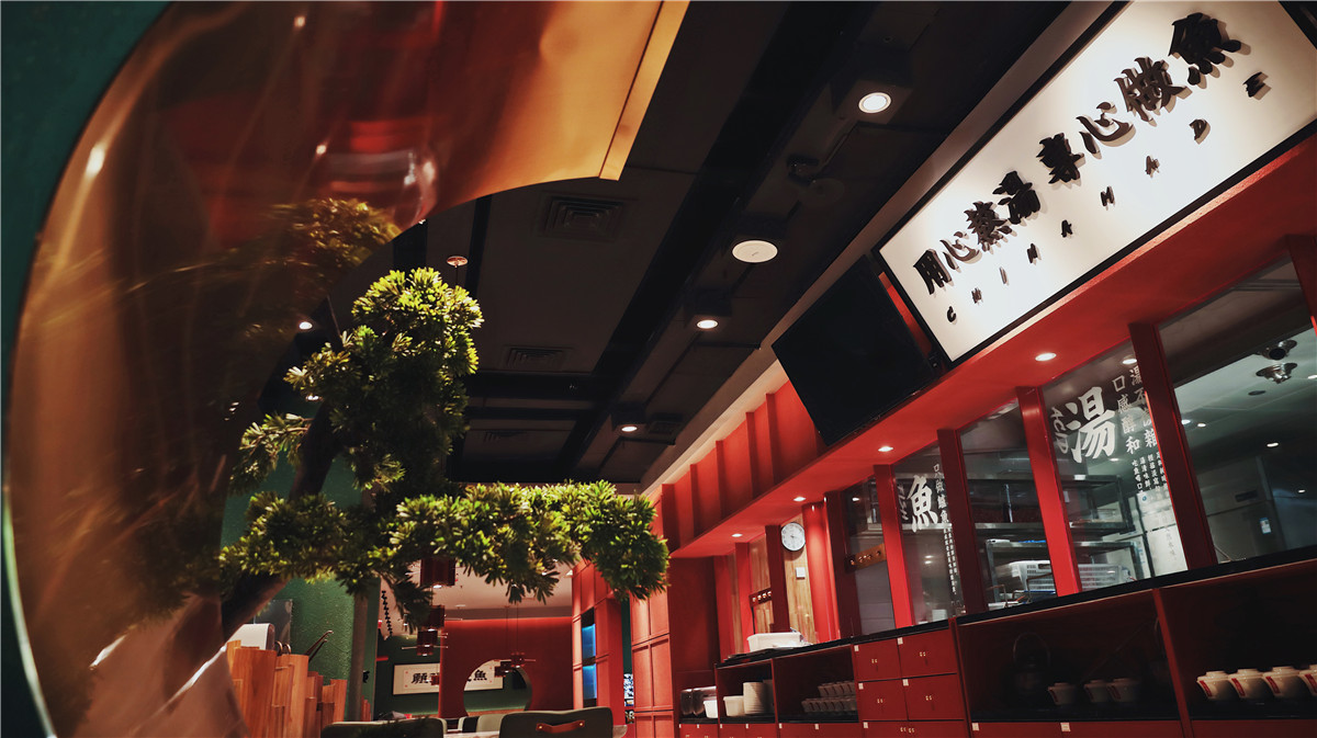
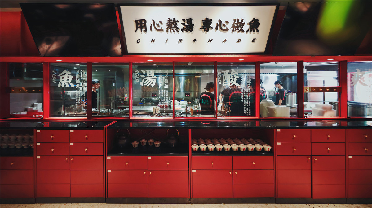
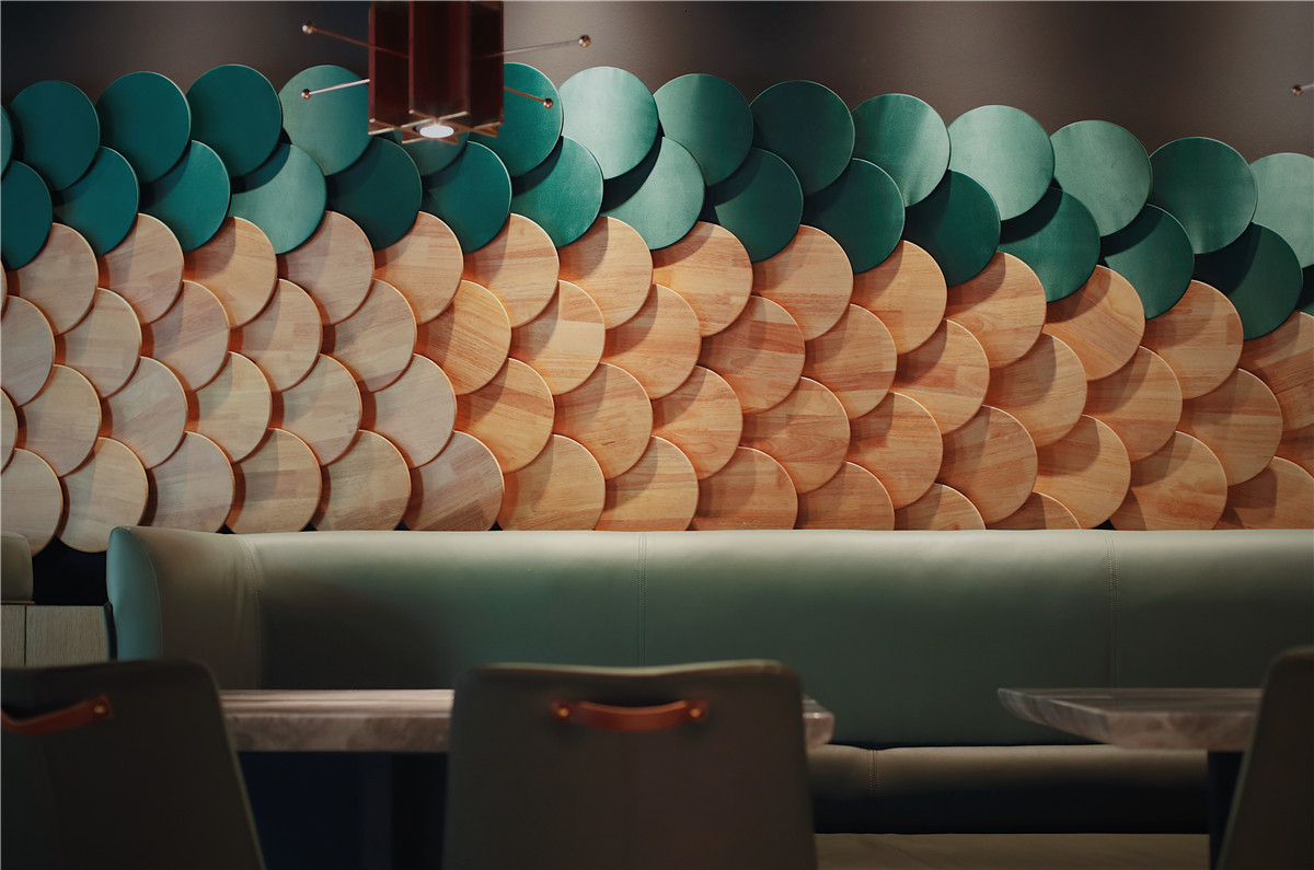
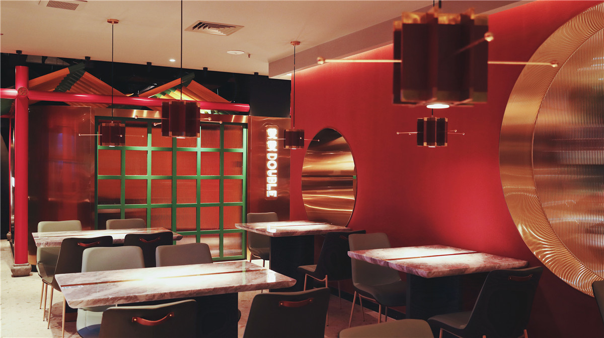
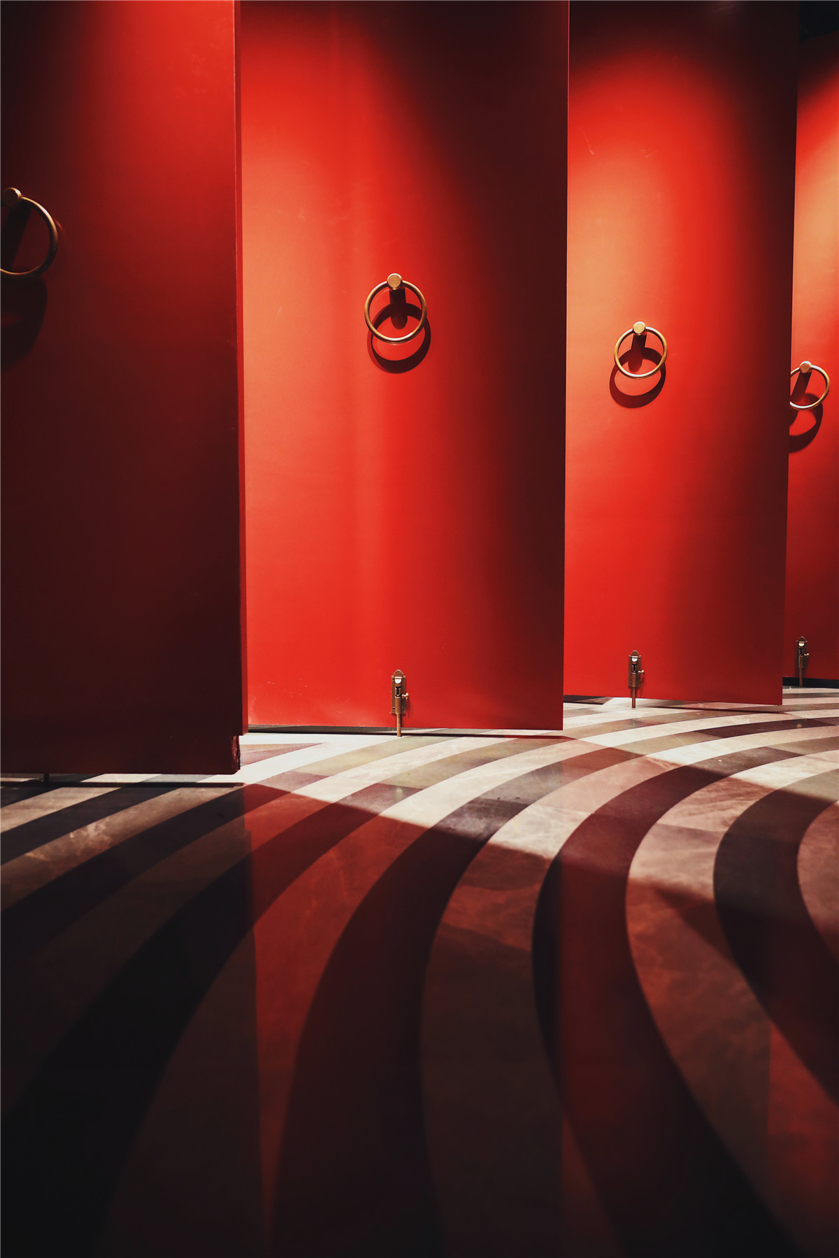
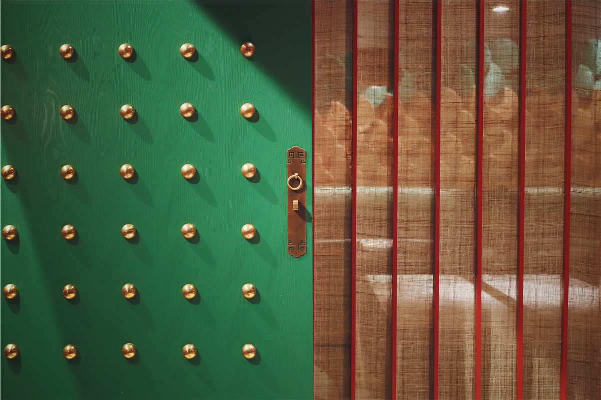
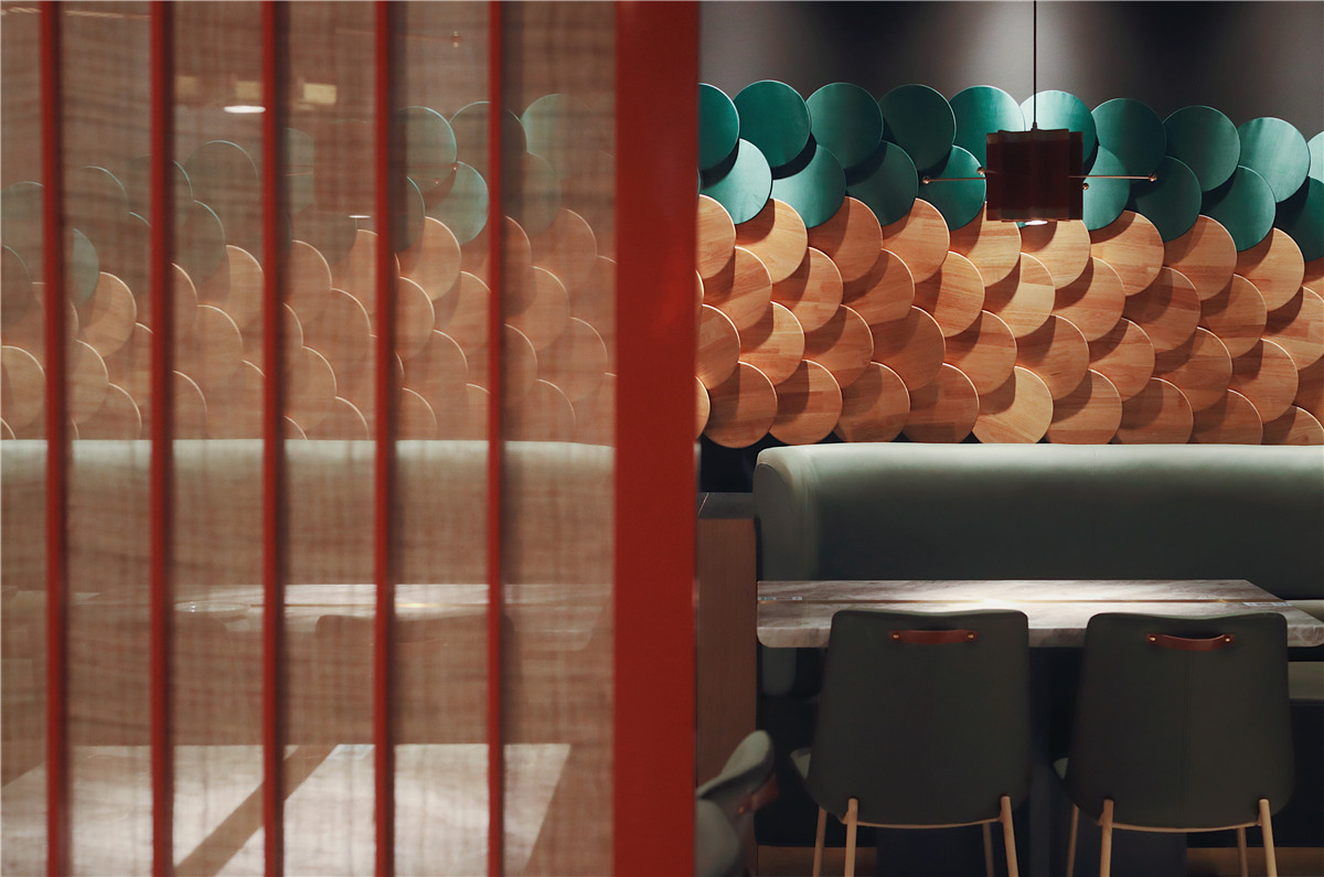
红色是中华大地上人们最为喜欢的颜色之一。在中国千年的流传运用中,红色俨然是最能代表吉祥、喜庆寓意的。设计师在空间中以红色为主色彩营造场景氛围,希望能带将此喜庆愉悦感带给顾客。设计师在场景中巧妙地缀入绿色,使空间整体冷暖反差充满质感,在轻快中不失稳重。再适当地加入金色,令空间变得更舒服和谐起来,富有精神和生命力。
Red is one of the most popular colors in China. In the thousands years of spreading in China, red can represent auspicious and happy implication the most. Designer built the scene atmosphere with red as the main colour in the space in the hope of bringing this happy and cheerful feeling to customer.Designer added green cleverly in the scene, making the whole space have the texture with cold and warm contrast with calmness in the liveliness. Adding certain amount of golden color to enable the space to become more comfortable harmonious with spirit and vitality.
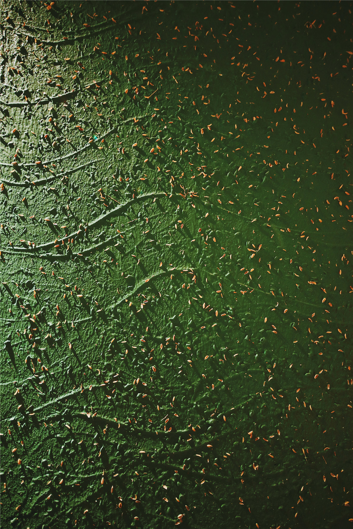
红双鱼在空间墙上运用了古代建筑原料中的夯土来衬托空间整体质感。稻谷在中国寓意着丰收与喜悦,设计师在夯土表面撒入谷壳,令平凡的夯土中能透露出不凡的寓意。
The Redoublefish uses rammed earth from the ancient building materials on its space wall to reflect the overall texture of the space.In China, rice symbolizes harvest and joy. The designer spread rice husk on the surface of the rammed earth, making extraordinary implication revealed in the ordinary rammed earth.

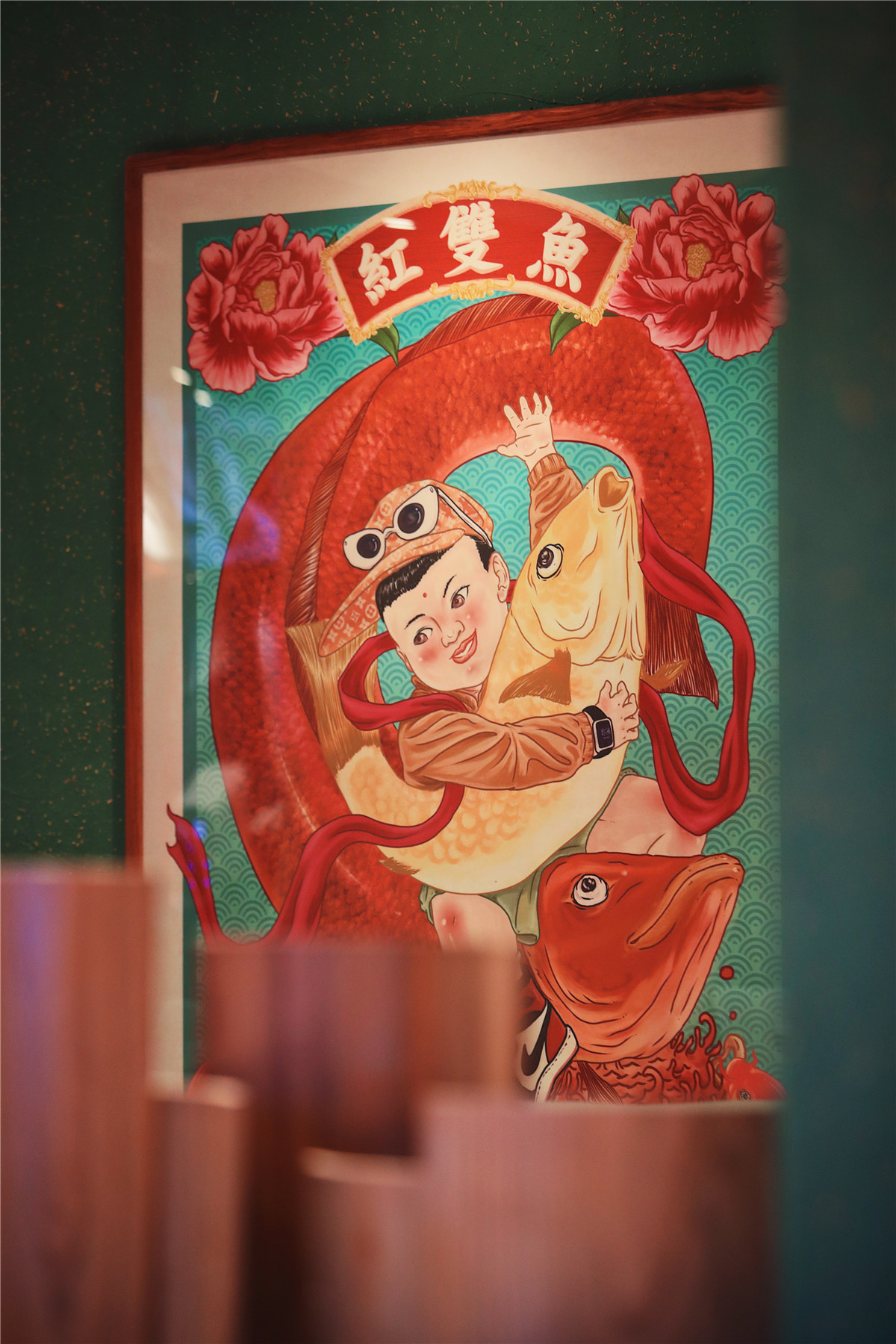
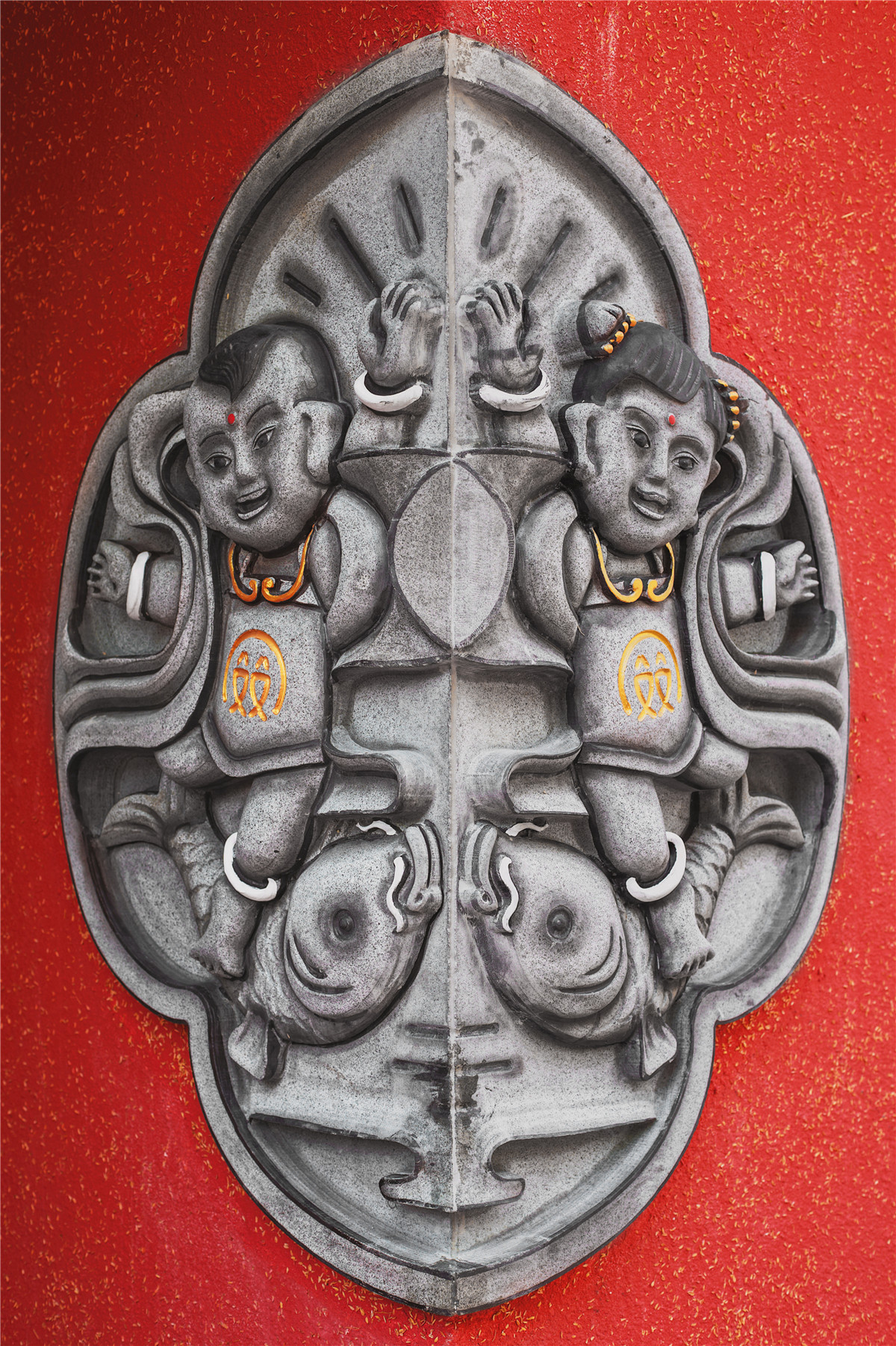
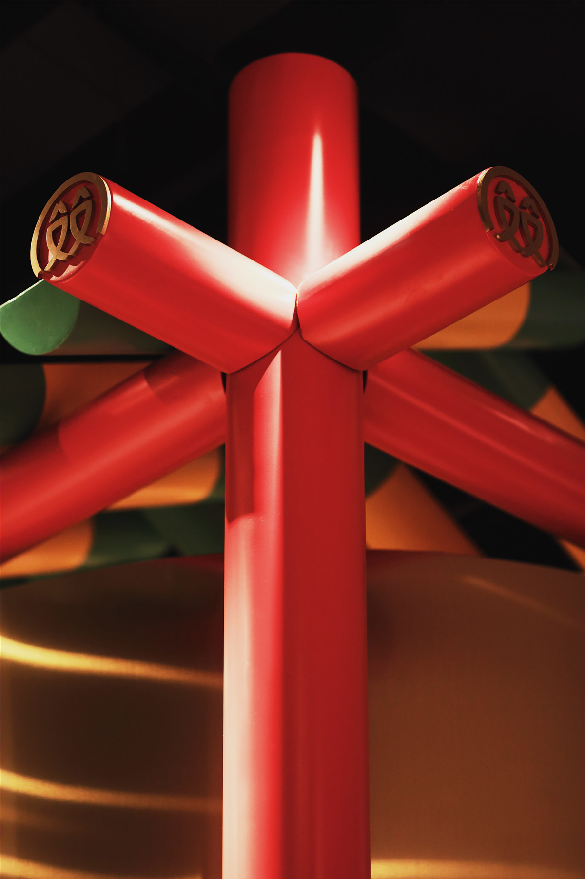
餐厅背景以双龙贯穿,画面既能让人忆起中国民间佳节时欢腾的舞龙场景,空间上涵盖着贯斗双龙的磅礴之气。
The background of the restaurant runs through with double dragons, which can not only remind people of the happy dragon dance scene in the Chinese folk festival, but also cover the magnificent atmosphere of double dragon.


悬挂于台面上的吊灯是以中国新年放鞭炮为景象的设计。
The chandelier hang on the countertop is designed with firecrackers during Chinese New Year as the scene.
远观像盏红灯笼,近看吊灯多面状呈现出的方条形又更像是鞭炮炸开后炮花四散的模样。于餐桌上独挂一盏,在细节之处亦能为提升餐厅的喜庆氛围。
From a distance, it looks like a red lantern. From a closer view, the square bar presented by the multiple sides of the chandelier is more like the scattered fireworks after the explosion of. Hung one above the table alone, the festive atmosphere can also be promoted in detail place.

包厢功能的外形是一个现代简化版的中式传统建筑结构,简化的设计让空间中整体看起来相对年轻,轻松。从外观上看,这是一个普通室内包厢的场景。
The appearance of the box is a modern simplified Chinese traditional architectural structure and the simplified design makes the whole space look relatively young and easy.From the outside, it‘s a scene of a normal indoor box.
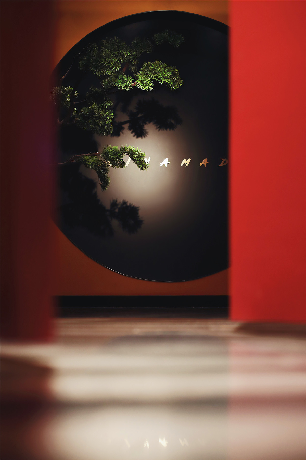
包间内的宁静感与门外的喧闹世界似乎毫不相关,独树一帜的松枝穿过包间中的洞门,鲜明地折射出静谧清雅的极致美感。
The sense of tranquility in the box seems to have nothing to do with the bustling world outside the door. The unique pine branches passing through the round door in the room, reflecting the extreme quiet and elegant beauty.
包厢中呈现的是一个以中式庭院为景象的空间。地面无极状黑白相间,形状好似水面激荡起的层层涟漪。如此,推开包间门,别有洞天。
The box presents a space with a scene of Chinese courtyard. The ground is an endless non-polar black and white with the shape like a rippling surface.Like this, open the door of the box, here is an altogether different world.

我们认为,在融合中国传统文化的创作过程中,要不断地汲取适于自己的新方向、新事物、新理念。红双鱼的设计是个不断汲取传统经验的过程,我们不断地从中国传统艺术中提取、获益,将中国传统文化整合转化,折射为现实,令品牌的设计在本体中散发着新时代特征,变成崭新且具有普世价值的国潮品牌。
We think that in the process of integrating Chinese traditional culture, we should constantly absorb new directions, new things and new ideas suitable for ourselves.The design of Redoublefish is a process of constantly absorbing traditional experience and we constantly extract and benefit from Chinese traditional art by integrating and transforming Chinese traditional culture into reality to make the brand design radiate new era features in itself, and become a brand new and universal national fashion brand.
项目信息——
项目名称:红双鱼
设计公司:广东省大诚当道品牌企划有限公司
启动时间:2017.12
完成时间:2018.8
主创设计:黄旭东 陈层锐
设计团队:大诚当道
建筑面积:450㎡
摄影版权:陈景鹏


