

LENTOSCANA是寻长设计完成的又一个从品牌视觉到品牌空间、再到艺术策划的“寻长”式品牌案例。
LENTOSCANA is the latest NARMAL branding case that covers brand VI, space and art project planning.
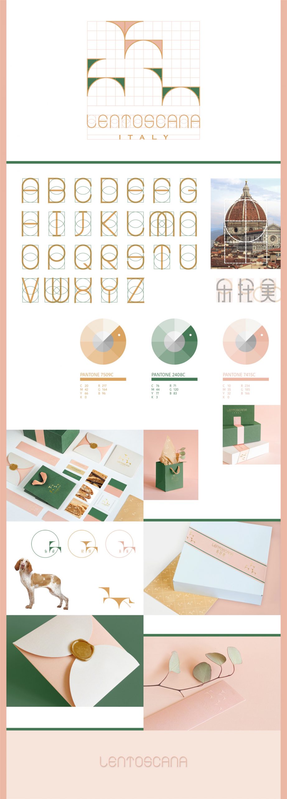
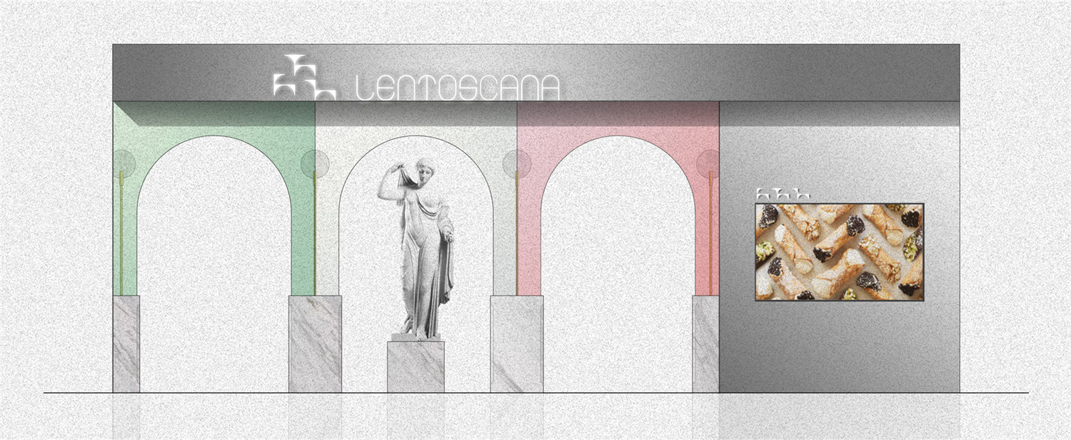
▲品牌VI
LENTOSCANA诞生于意大利中部大区——托斯卡纳,品牌名由意大利语“Lento”(慢慢的),与“Toscana”(托斯卡纳)两个词汇结合而成。古老的血统,年轻的面孔。品牌融合文艺复兴与古今慢食文化,将甜品、自然、艺术、人文合为一体,以传递文化和创造交流为己任。
LENTOSCANA was born in Tuscany, the central region of Italy. The name is a combination of Italian words “Lento” (slowly) and “Toscana” (Tuscany). It is old blood with a young face. The brand integrates the Renaissance slow food culture and the modern slow eating fashion, it integrates the dessert culture and nature, the necessity and humanity. Our clients also take the responsibility for cultural transmission and creative exchange in their business.
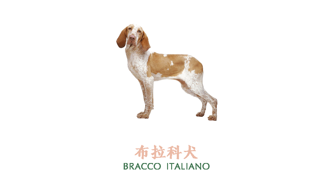
▲布拉科犬图形演化

▲衍生动画
我们用文艺复兴的建筑比例创造了LENTOSCANA的专用字体,并选取了文艺复兴时期极为流行的犬种“布拉科”为品牌代言。配合品牌中文名“乐托美”,创造了“乐乐”“托托”和“美美”三个IP形象。IP形象也是脱胎于文艺复兴建筑比例的表达。在这个基础上我们还为三只小狗创造了一系列的动作和表情。传达品牌精神的同时,也为未来的产品开发 (玩具/配饰/家具等)和客群互动预留了可能性。
We design the special font of LENTOSCANA from the scales of the Renaissance architectures, and selects the dog breed called “Bracco Italiano”, which was very popular in the Renaissance period, as the brand “spokesperson”. The three dogs “LeLe”, “TuoTuo” and “MeiMei” are also the IP images for the brand in Chinese —— “LeTuoMei”. IP images are also derived from Renaissance architecture. Also, we design a series of actions and expressions for the three puppies. While addressing the brand spirit, it also reserves space for future product developments (toys/accessories/furniture, etc.) and customized activities.

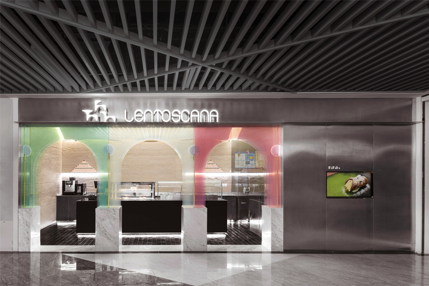
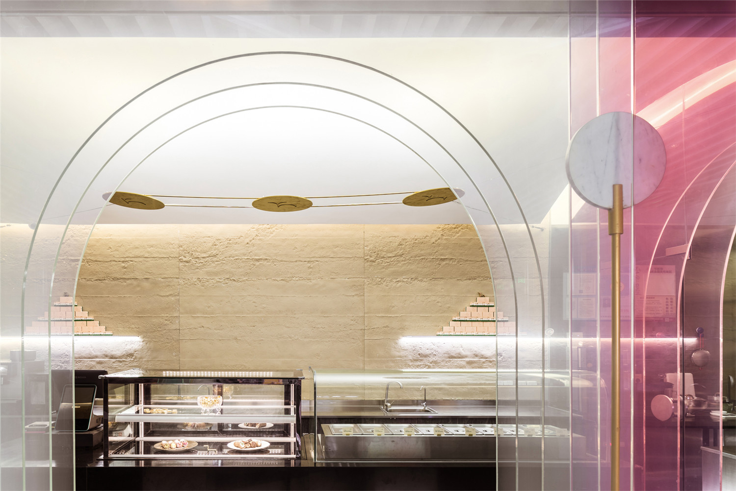
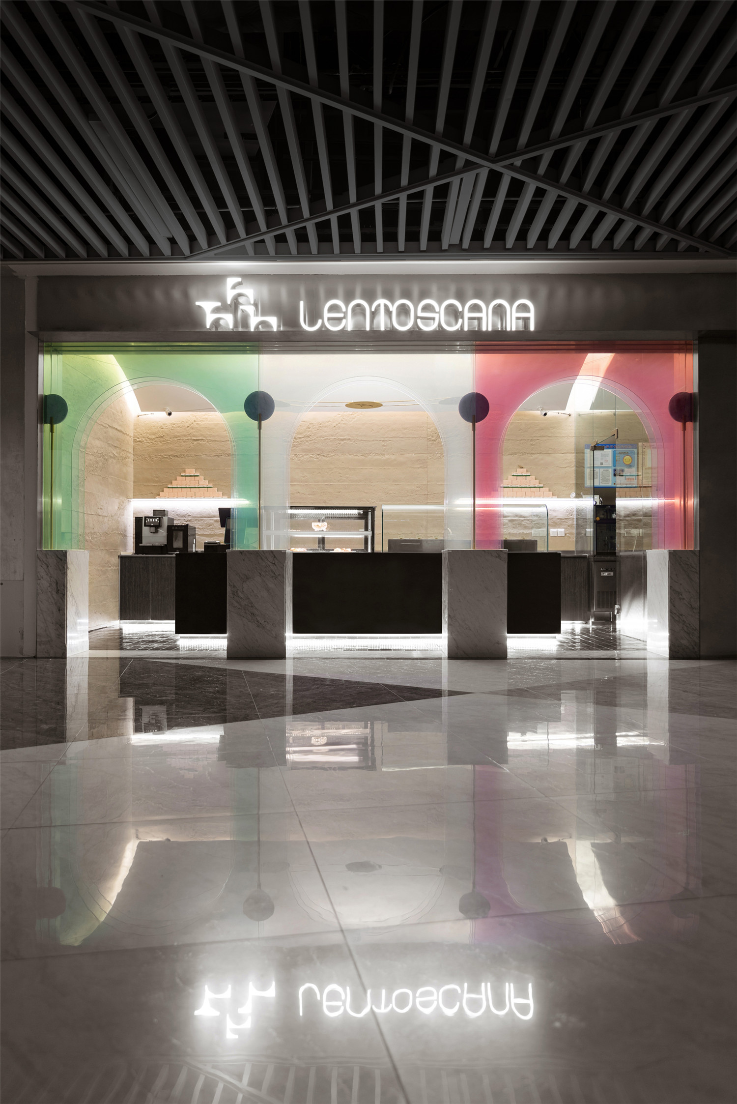
▲店铺门面
品牌色的设计灵感来自托斯卡纳的迷幻风光,以及其首府佛罗伦萨文艺复兴早期标志性建筑——圣母百花大教堂外墙使用的三色大理石贴面的色彩,后者正好似意大利国旗(绿白红三色纵旗)的灰度化处理。
The brand color inspiration comes from the beautiful scenery of Tuscany and the color of the three-color marble veneer used in the exterior wall of the early Renaissance landmark of Florence, the capital of Tuscany. The latter is also seen in the graying treatment of the Italian flag (green, white, and red vertical flag).
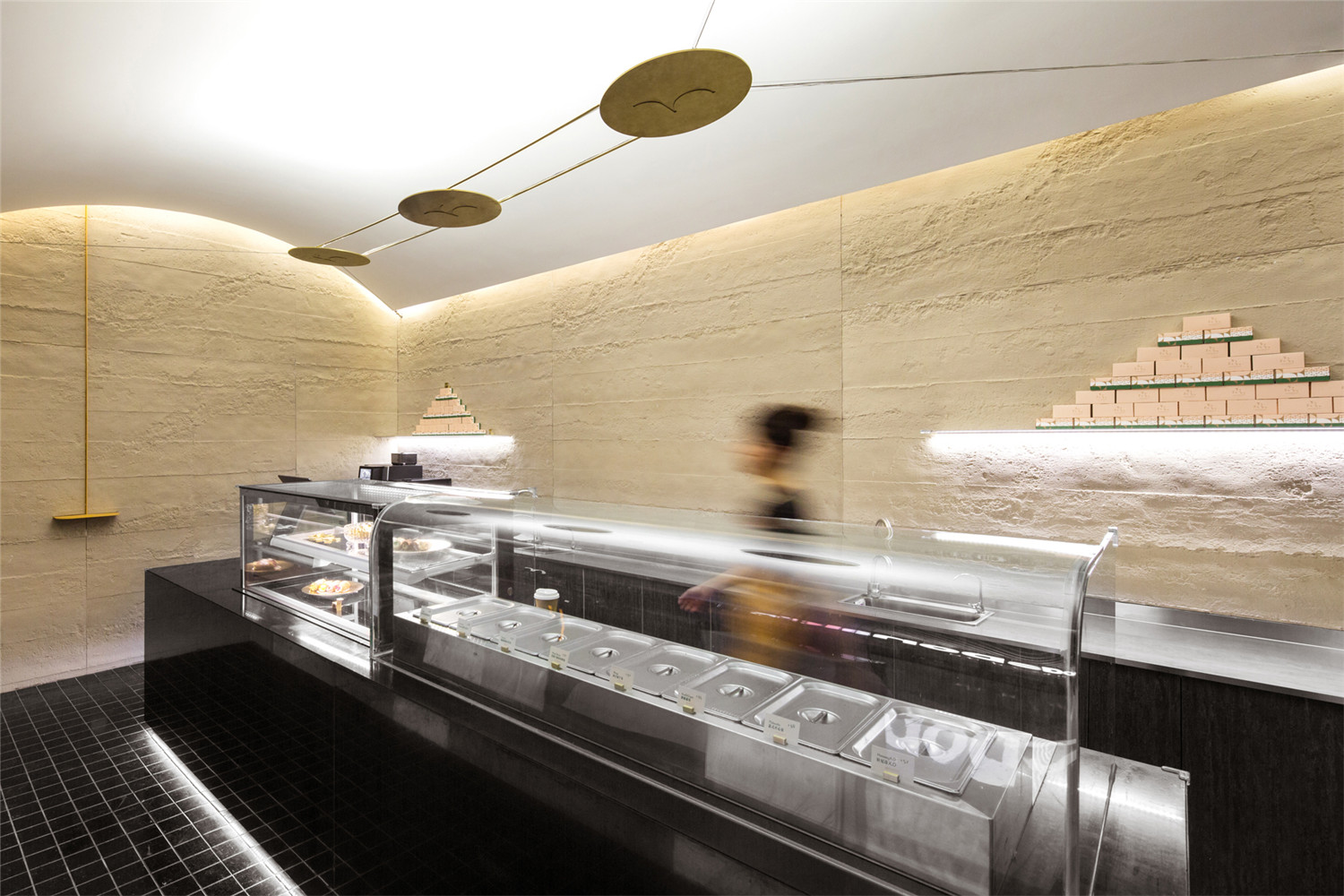
▲店铺内景
所有的品牌理念、视觉形象都将在空间设计中得到呼应和新的创造,这也是寻长与众不同的设计手法及思路。
All brand concepts and visual images echo with space and regenerated within it, which is also a unique NARMAL way of thinking.
▲ 从商场公共区看向店铺
不同于法式甜品精致、甜美的特征,意式甜品有一种朴实、自然的家庭感、亲切感。这一氛围和LENTOSCANA想要传递的“陪伴、成长、自然”的精神一脉相承。
Italian dessert has a simple and natural sense generates from the familial and intimacy tradition, which makes it different from the delicate and sweet French dessert. Being simple and natural is also the ingrain spirit of the company, our client wants to convey the energy of accompaniment, growth, nature through their business.
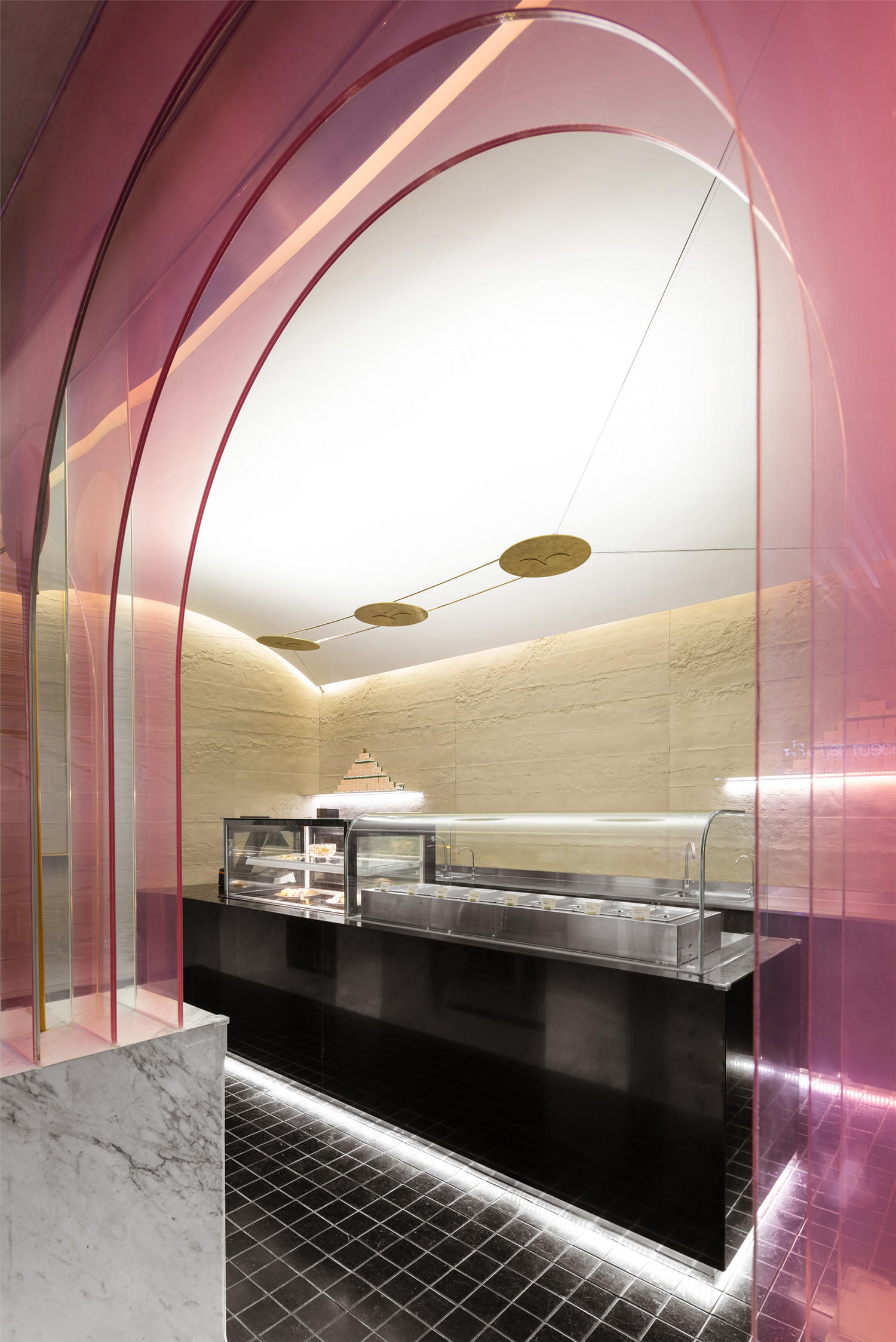
▲店铺入口“九重门”细节
▲看向西侧
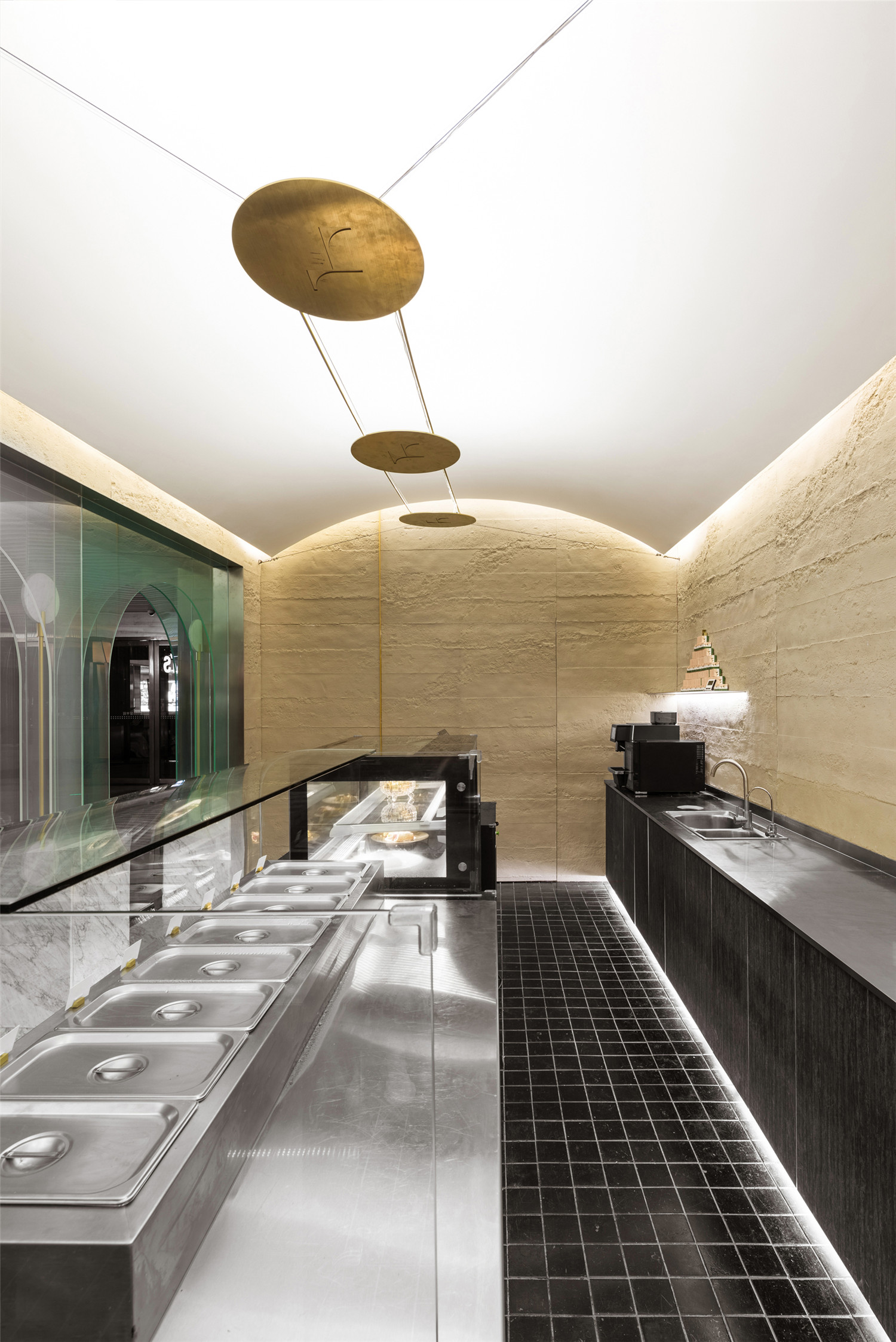
▲看向东侧厨房区
透过门口现代感的透明三色的“九重门”,我们进入到一个传统的单拱空间。这种“新”与“老”的对比,是我们想要传达的第一层品牌印象——一个全新而又有历史积淀的LENTOSCANA。
We enter into a traditional single arch space through the modern transparent three-color “nine doors”. The contrast between “new” and “old” is the first brand impression we want to convey——a modern and historical LENTOSCANA vibe.
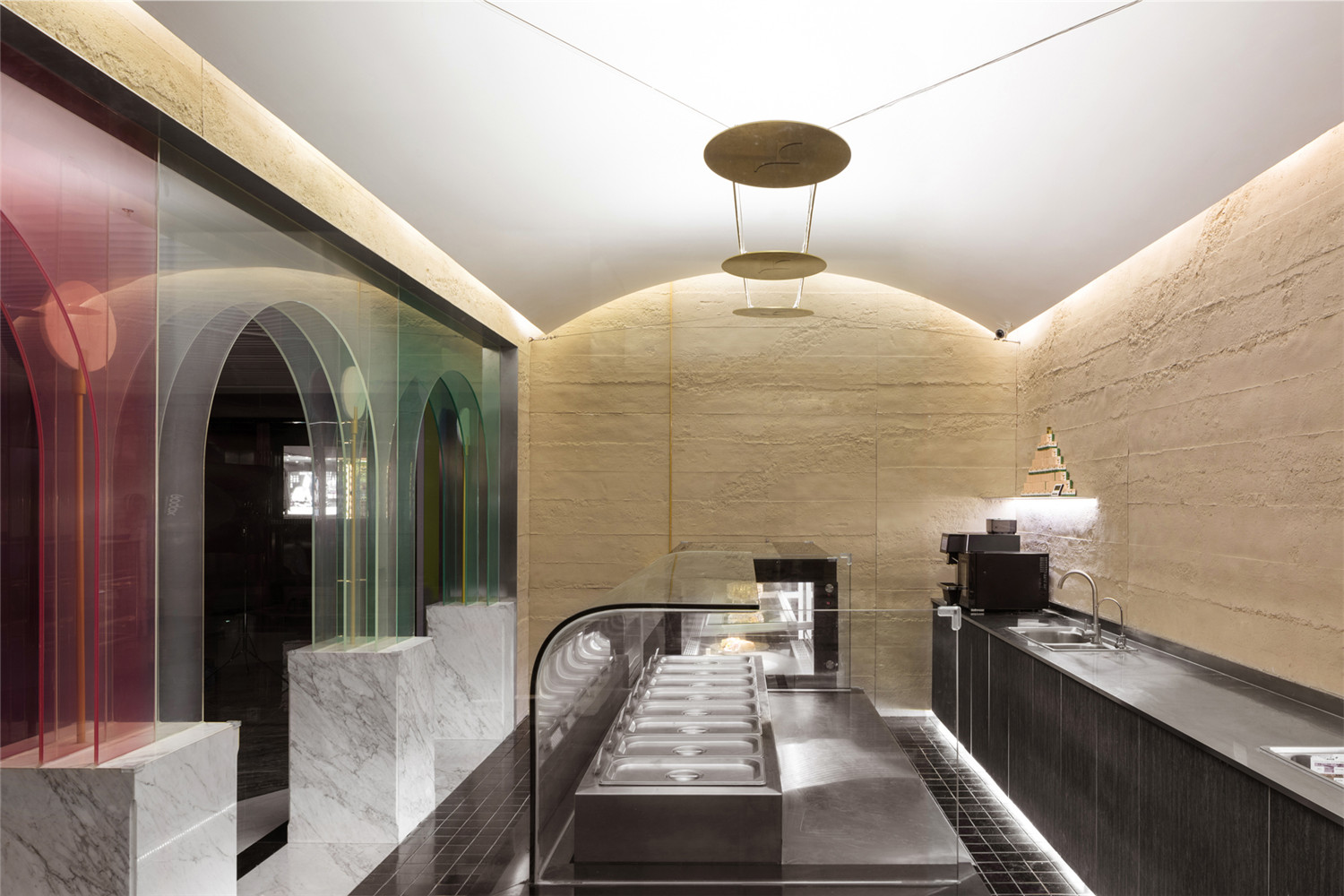
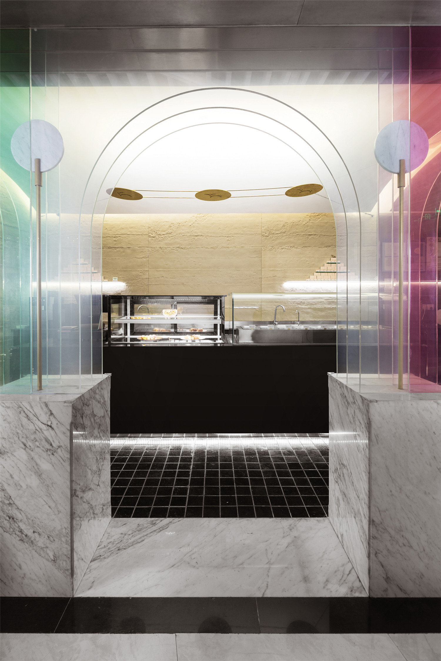
▲售卖区
▲操作区
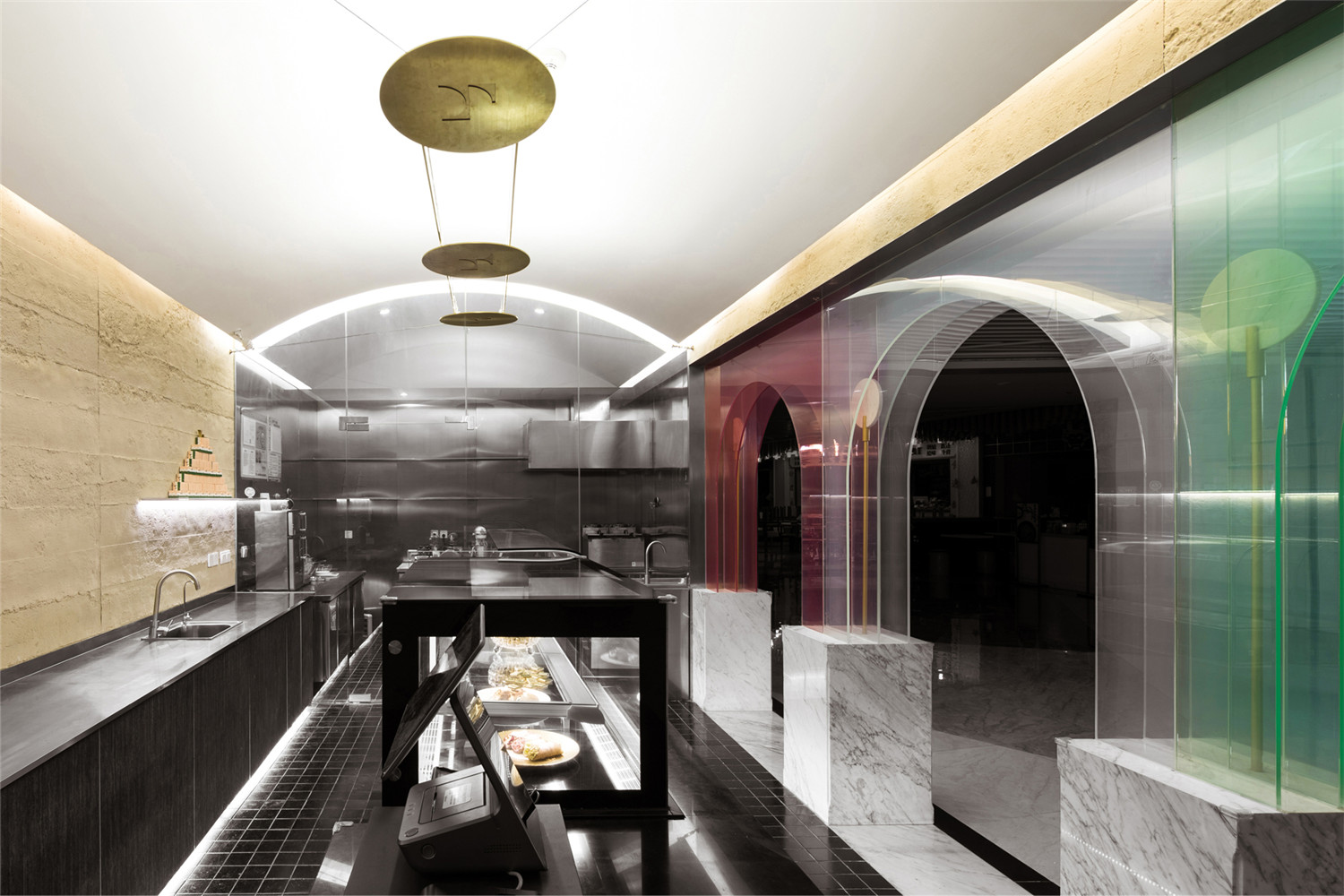
穿过“意大利”色的拱廊,地面满铺10*10切割的山青石,仿佛置身于意大利街道。我们希望这种细腻的触觉变化会将人带入“lento”的节奏,进入另一个“世界”。
Through the “Italian” color arcade, the ground is covered with 10 * 10 cut bluestone, which gives the costumers a déjà-vu of an Italian street. We hope that this delicate tactile change will bring costumers into a “Lento” rhythm as soon as they step into the store.
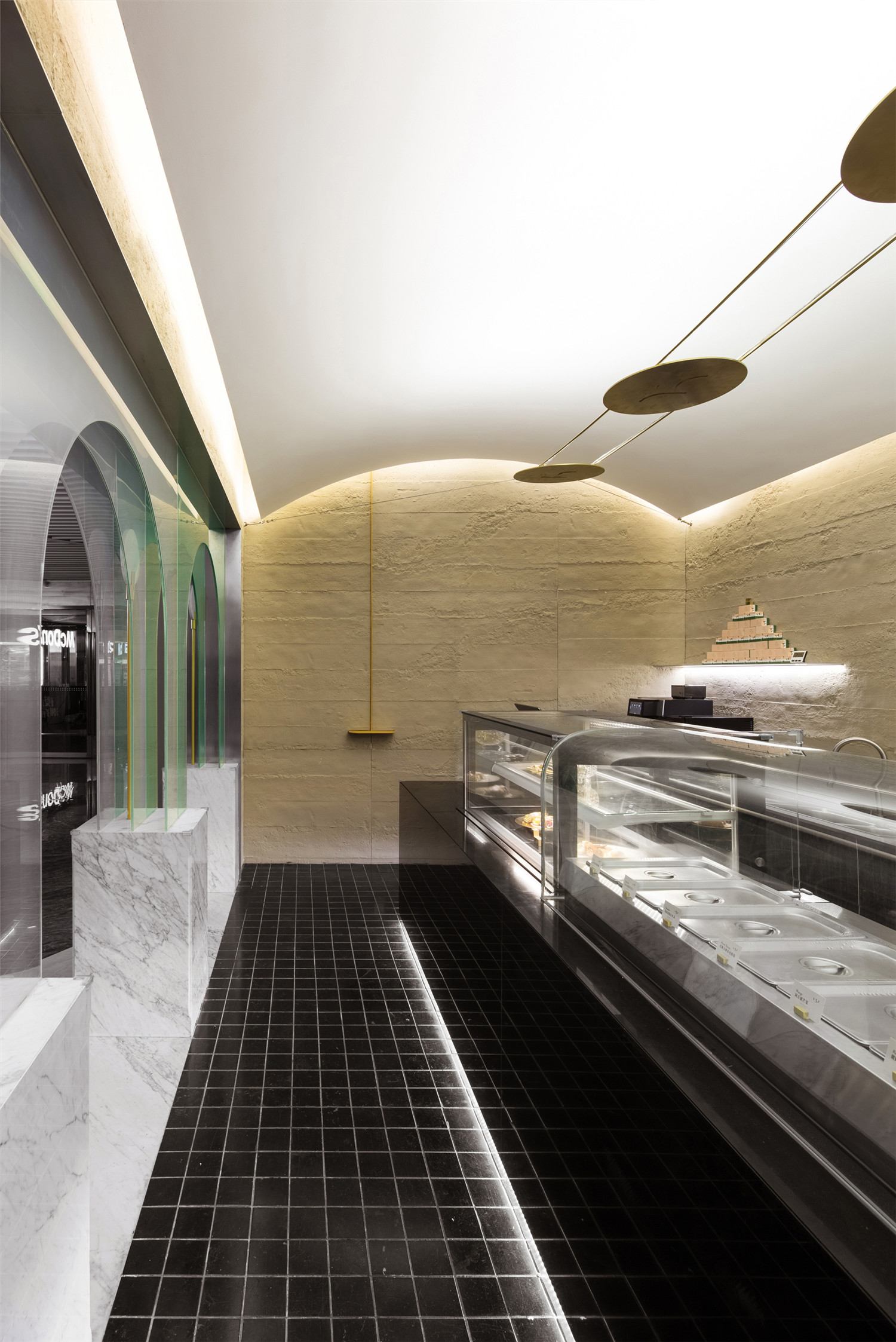
▲从东侧门洞看向店内

▲mini台面
▲细部

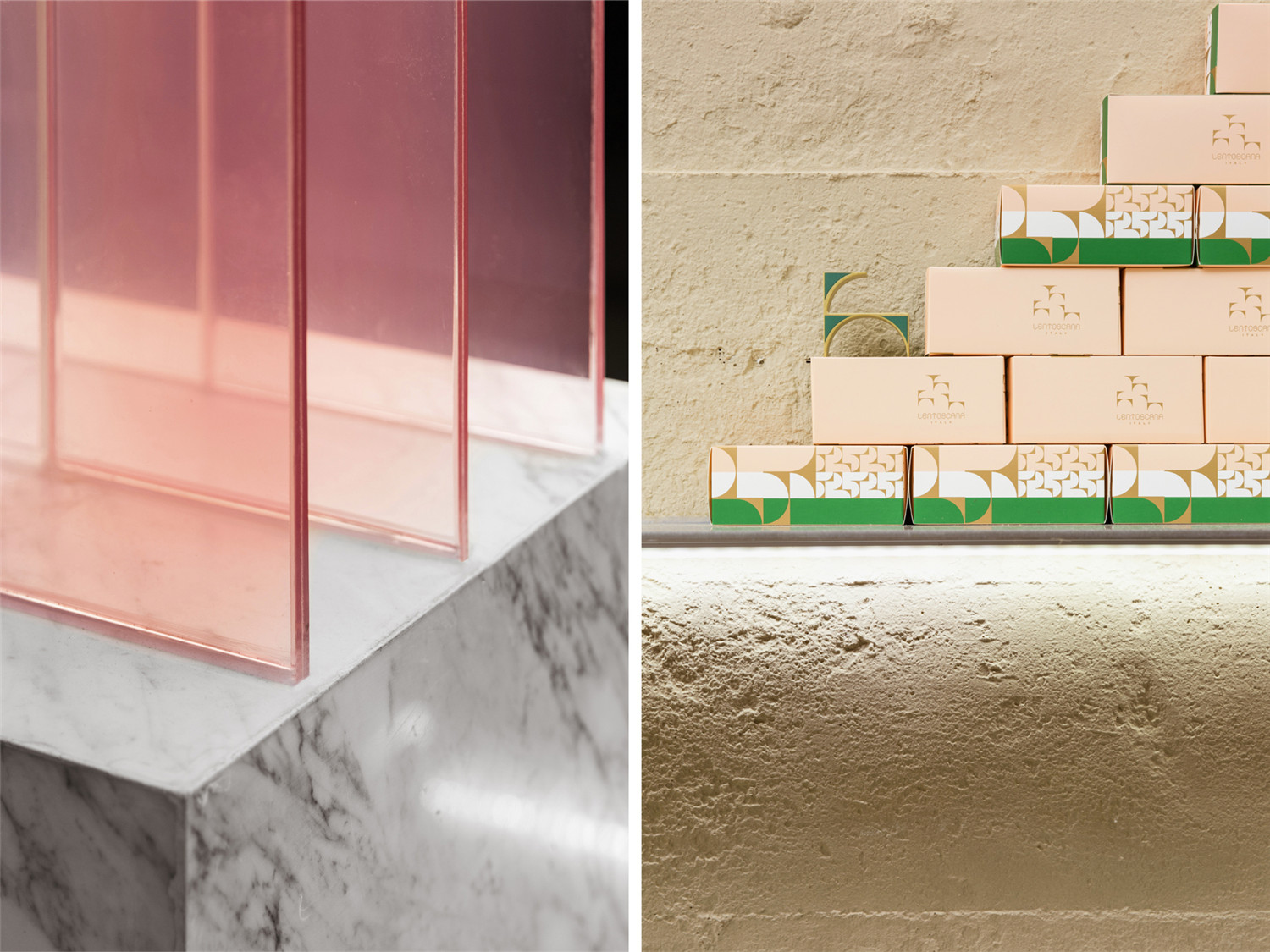
▲Cannoli包装设计:抽取方式如牵出小狗
墙体粗粝的表面和展示台的黑色大理石及不锈钢形成质感的冲撞,是对“印象中的甜品店”的一次想象力的解放。这种冲撞与意式甜品“朴实、惬意”的内核相呼应。粗粝墙面上设有一个非常mini的黄色台面,是对“亲切的消费场景”的一种引导和鼓励。倚墙而立,正是属于LENTOSCANA的惬意和随性。
The rough surface of the wall and the black marble and stainless steel of the exhibition platform form a texture contrast, which is a liberation of “the dessert store in memory”. This contrast corresponds to the essence of “simple and comfortable” Italian dessert. There is a very mini yellow table on the rough wall, which is a kind of guidance and encouragement for “friendly consumption scene”. Customers are encouraged to lean against the wall, to enjoy food in comfort and laid-back LENTOSCANA ambiance.

▲黄铜灯具
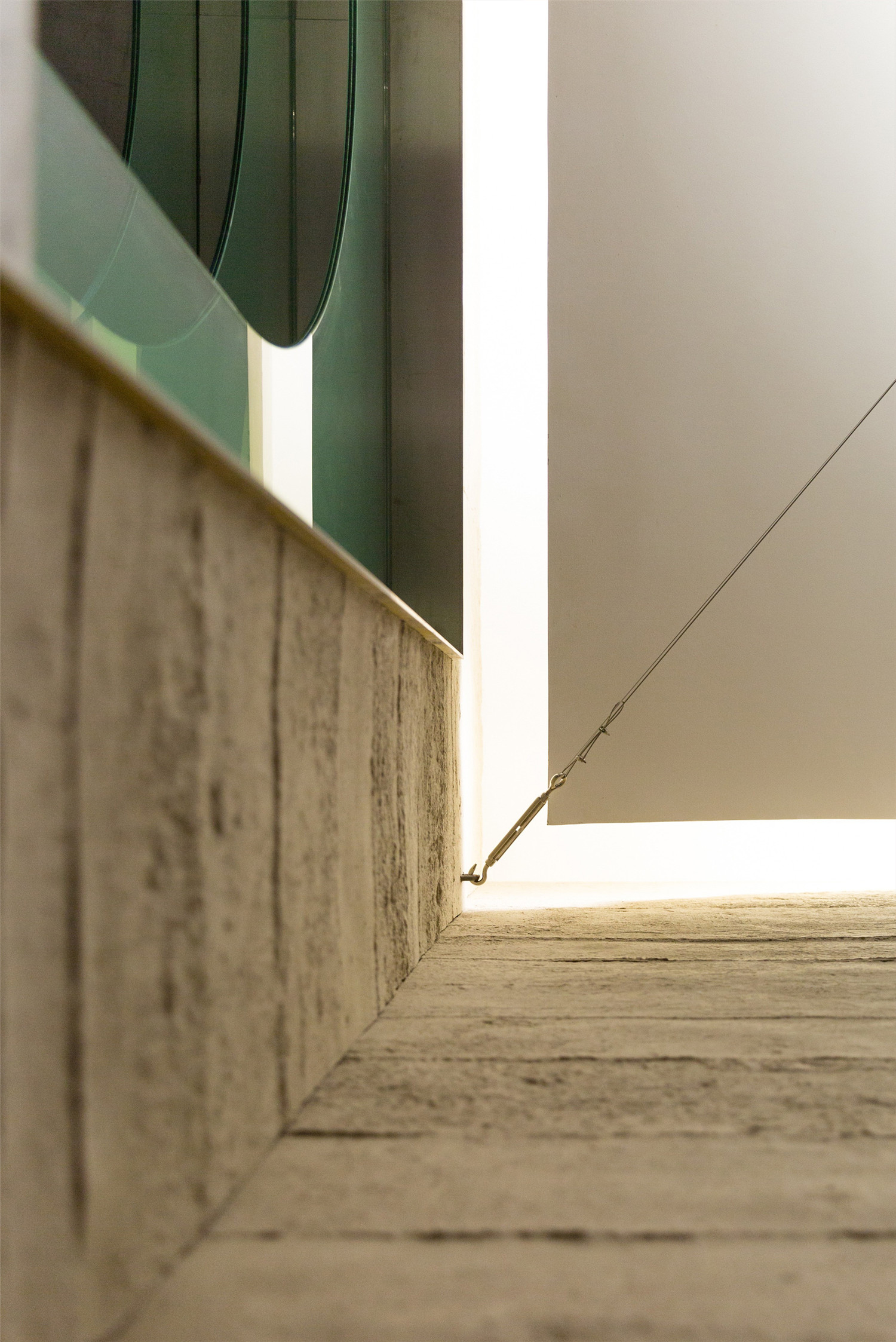
▲ 顶部细节
屋顶悬浮三只阴刻着“代言人”的黄铜灯具,在LENTOSCANA的笼罩下,展示来自“托斯卡纳”的别样氛围。
Three brass “spokesperson” lamps are hanging in the roof, showing a different atmosphere of “Tuscany” within the space of LENTOSCANA.
▲从商场公共区看向店铺
店铺设计过程中,最叫我们感慨的是交流和传递,是世界既无比遥远又近在咫尺的冲突——一个曾经印象中只有莫妮卡贝鲁奇的西西里岛的一种美味小食Cannoli,竟然原汁原味地出现在了上海。
In the process of designing the store, there are constant communications and transmissions, which reflects the feeling of the world being remote and close at the same time. Cannoli, a delicacy that is from Monica Bellucci’s remote Sicilian island, appears in Shanghai in its original flavor.
▲ 地面卡拉拉大理石与山青石交接
我们为店铺设计选用的“卡拉拉”“山青石”“中国黑”在平面和立面上呈现,就好像他们本来就来自同一座山脉一样简单。
The Karala marble,bluestone and Chinese black marble we selected for the store interior design are presented on the plane and facade as if they were from the same origin.
这种世界的共通和宇宙的时空扭结,让我们有了下面这一段纪录:
This intertwining of space and time inspired the following art project:
我们为这次表演设计了一件以“意大利”和“隐形”为主题的服装;
We designed a costume with the theme of “Italy” and “invisibility” for the performance;
我们为这次表演制作了一组“保护”和“运输”为主题的道具;
We made a set of devices with the theme of “protection” and “transportation” for the performance;
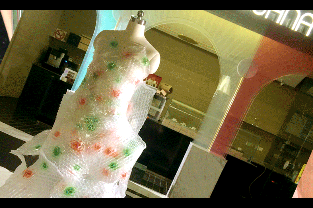
▲用于表演的服装、道具及舞者Olga
我们邀请好友俄罗斯舞蹈家Olga创作了一段表演《宇宙中的相遇》!
We invited our best friend Olga, a Russian dancer, to create a performance called “Encounter in the Universe”.
▲立面图
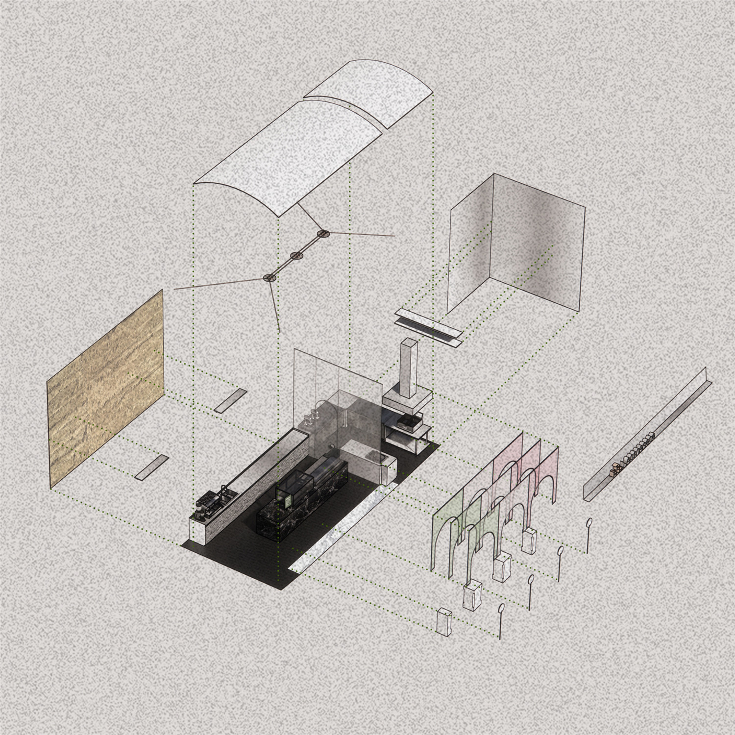
▲轴测爆炸图

▲平面图
项目信息——
项目名称:宇宙中的相遇——LENTOSCANA意式甜品环宇荟店
设计方:寻长设计(NARMAL)
项目设计 & 完成年份:2019.5&2019.8
主创及设计团队:高杰、李煜瑾、邹克阳、郭晶
项目地址:上海市黄浦区黄陂南路838弄3号中海环宇荟B132-2
建筑面积:40㎡
摄影版权:谢东叡
客户:上海乐托美餐饮管理有限公司
施工单位:上海飒噶建筑装饰工程有限公司
装修主材:倍砼堡/水泥浇筑板、戈仕玻璃/夹膜玻璃、松耐特/耐火板
视频拍摄:Sophia Liu
视频后期制作:折叠视觉设计工作室FOLDIN DESIGN STUDIO
艺术家:[俄]Olga Merekina


