


Allongé café ,法语词,是芭蕾舞里面一个经典动作,是一个最美的瞬间。动作很慢,看似简单,实际需要倾注很多的力量和感觉才能完成,造就美的一刻。
Allongé, a french term that describes a breathing moment of the arm in ballet, evokes elegance and beauty. Simple and slow as it looks, this moment can’t be articulated well without strength and a spur of inspiration.
出品的咖啡也要像这个瞬间一样打动人心。没有花俏的菜单,几件最经典出品,美好而隽永,用心做出品质,并不断精进延伸。
This is exactly the philosophy of Allongé’s coffee –– let the beauty of coffee strike you in the moment. It is grounded in careful souring and brewing. Allongé Café’s menu reflects its goal for quality, not for attention. You can only find classic coffee brewings that carry the flavor of time.
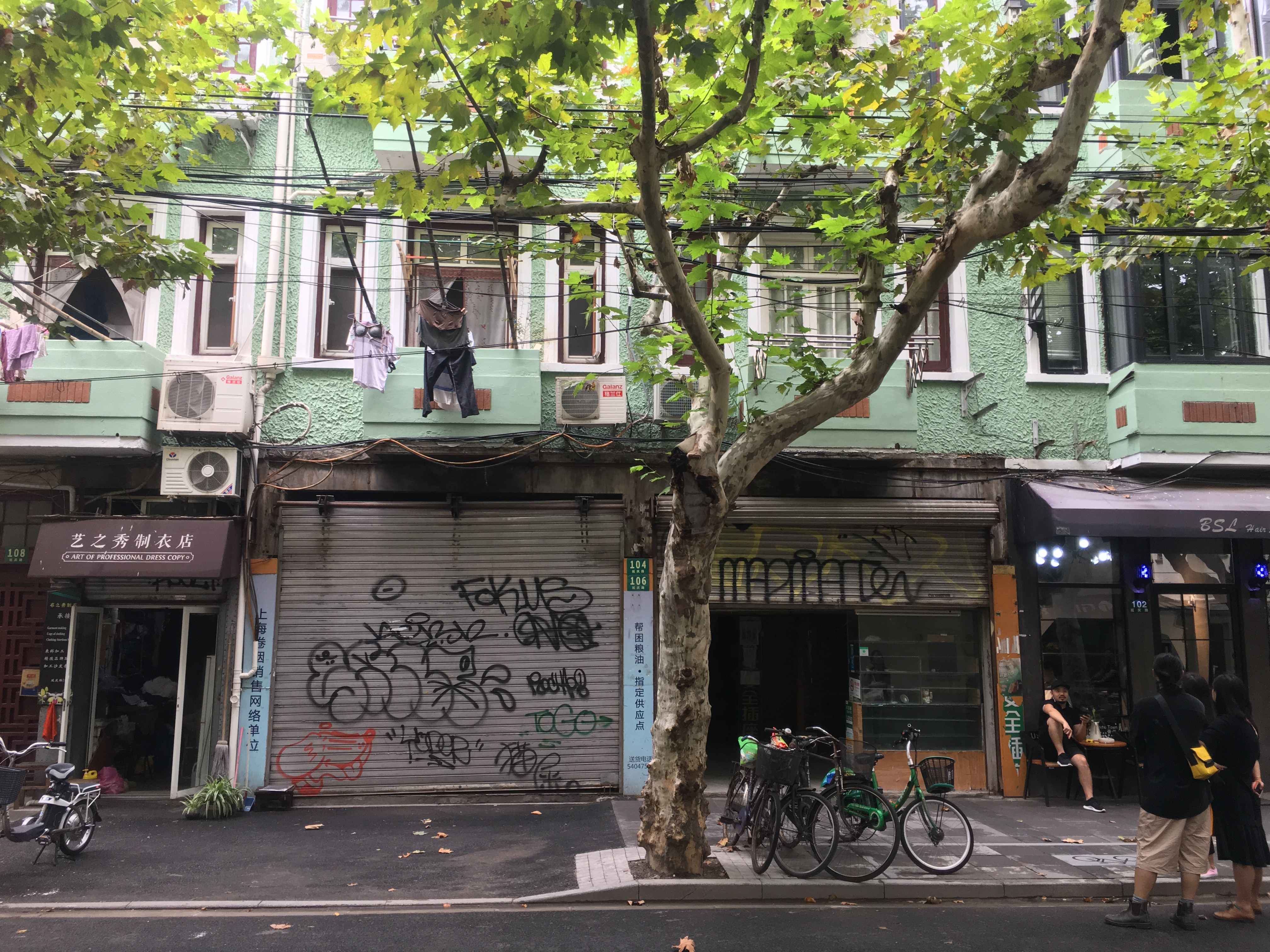
▲店铺原有外立面
Allonge cafe咖啡空间在没有改造前是一家粮油铺,带有强烈时代印记的那种。路两边是茂密的梧桐树叶,透过树叶依稀可见的是红白相间的窗户,阳台外面伸出去的长杆上是随意晾晒的衣物,隔壁是一间老裁缝的制衣店,“这才是上海街巷最真实的写照。”这是对话中印象最深刻的,也是测量现场最直接的描述。
The café is located in a very Shanghainese street. Before renovation, the space was a store selling rice, flour and oil –– a distinctive specialty store that existed probably only in the old China. Chinese parasol trees lined the street and blocked the windows in the building standing by the street. White and red window frames hardly show through the thick leaves. Long drying racks are sticking out from the balconies, with clothes flying with the breeze. The next door of the space is a tailor’s shop.
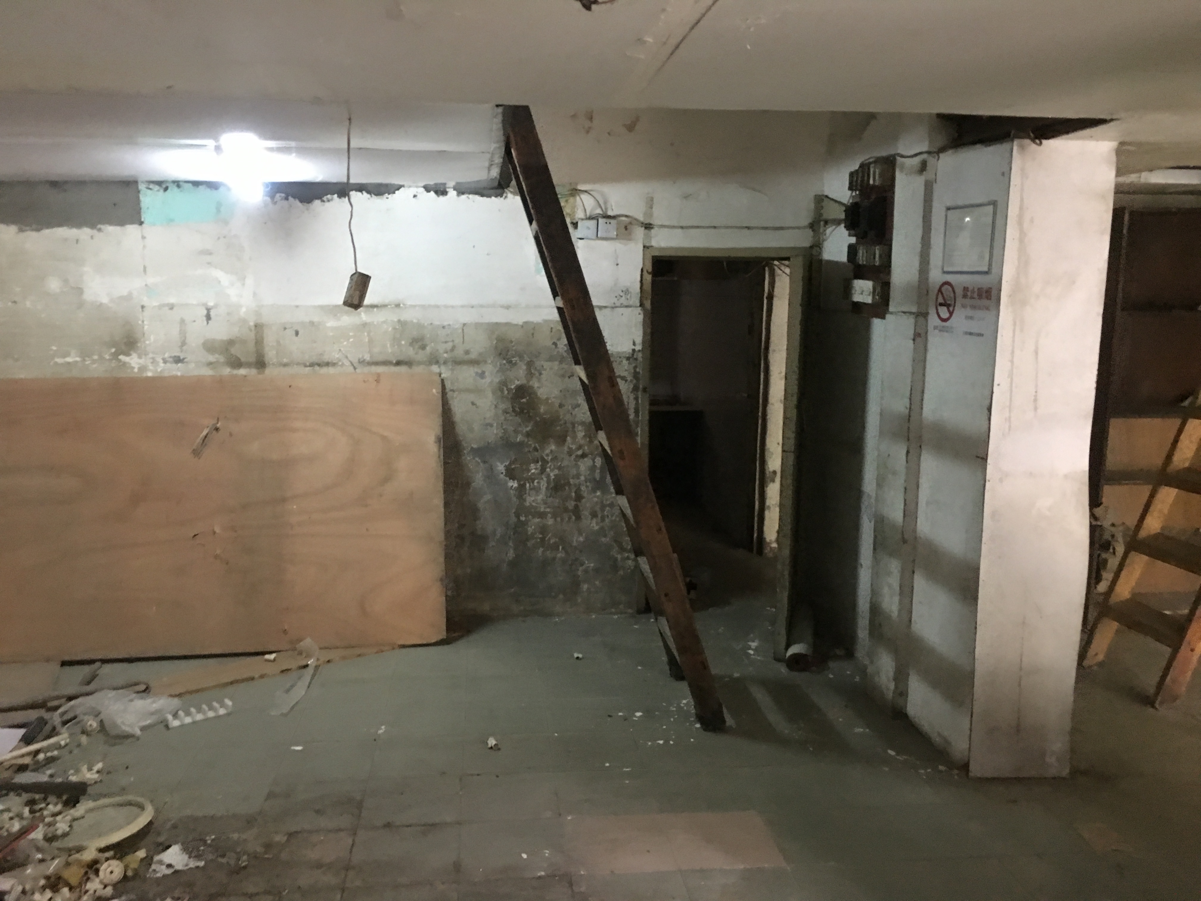
▲原室内
由于粮油铺的门头被拆除后,建筑外墙的绿色肌理涂料就勾勒出原先的轮廓,黑色和橘黄色电缆线也临时固定阳台底下呈现波浪的样子,那时候第一个浮现的想法是怎样最大限度保留这些看似琐碎而又有纪录性的部分,又能与之自然相处。
The sign for the old specialty store was taken down and the green paint used for the front facade outlines the store front. Black and orange power cables stretched under the balcony. The first thought came to my mind was that how to preserve these prints of history to the greatest extend and make the new cafe become an organic part of the old.
▲外立面
咖啡空间一直被当作艺术家和作家聚集地,既是思想开放之地也是观察事物的高地。那这里的咖啡空间应该是怎样的,可以承载咖啡分享与交流,还可以分享生活的琐碎和收藏的美好,另外使用许多经典设计家具,通过陈列的家具认识事物背后的故事,让空间更有解读与包容性。所有初步的想法都是模糊的,从模糊到清晰就是认识的过程,也是项目开始的状态。
Café has always been the meet place for artists and writers. It’s the birthplace of ideas and wisdom. What should Allongé Cafe become? The place should provide an atmosphere to inspire ideas and encourage friends to share the details their lives –– over a cup of coffee. Therefore, the furniture should take a classy style and tell a design story on their own. This can make the space look open for ideas and interpretations. All these are some vague initial ideas. As the project progressed, we started to have a cleared plan.
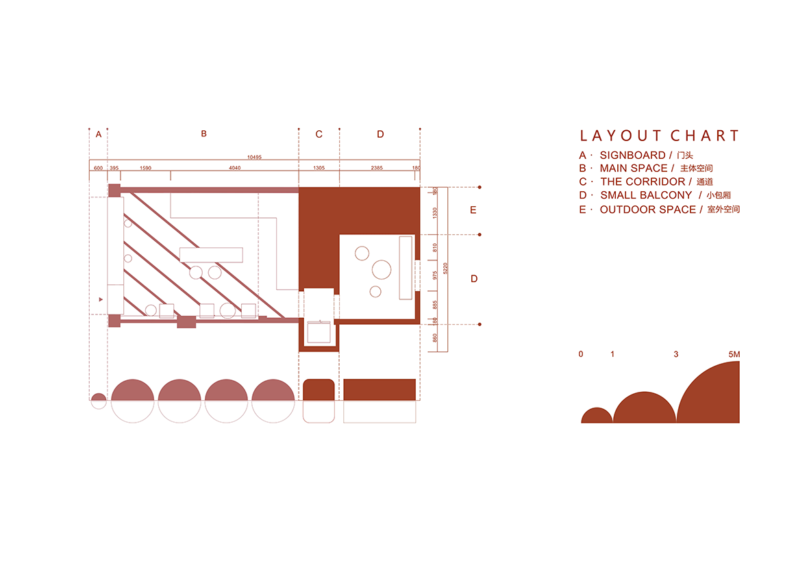
▲平面图
首要面对空间平面的试探,这里”平面”指的是空间功能平面图,这个阶段就是把具体的功能放到有限的空间里面,容器性是空间的基本属性。首先把功能拆解为主要的两个部分:咖啡的制作部分和享用咖啡的部分。平面的三个试探方向,第一个方向是边界清晰的传统布局,相对保守的方式但是方便打理,第二个方向是在边界清晰的传统布局介入特殊就餐方式,尝试了剧场式就餐区域,第三个方向全开放的布局取消边界,属于偏激进的布局,店铺空间可以被最大化使用,同时打理和收纳都需要时刻维护。尝试平面布局多种可能性也是熟悉空间尺度感的一种方式。
First is the layout plan. Here it means a layout that shows the space function and relationships. Planning functions in the limited space is fundamental to space design. Function can be broken down into two parts –– making coffee and enjoying coffee, and we proposed three ideas: 1) a conventional layout with defined border. It is not so much creative design-wise, but it makes cleaning easy. 2) a conventional layout with defined border mixed with theater style dining area. 3) completely open space with no defined border. This is an avant-garde layout where the space can be fully used. But the open style requires frequent cleaning and organizing. We played with these layouts to get a better understanding of the dimensions of the space.
根据店铺营运方式的差异和品牌属性不同,原来的优劣点也可能被重新定义,这也是空间复杂性的一部分。全新的品牌全新的经营理念,设计师和业主都更倾向第三个方向,取消边界开放式布局。
Designing space is a complex process. There’s no absolute pros or cons for a layout, and it’s all based on the store operation and branding concept. The client and we are leaning towards the third idea of the open space.
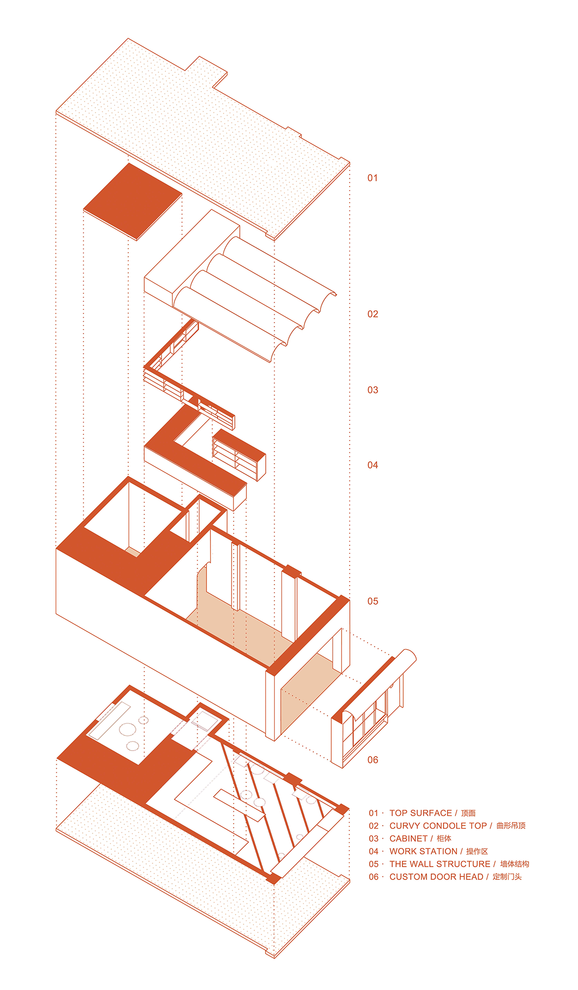
▲模型分解图
这个阶段的过程是把整体拆解成部分,然后再将细化的部分重组成一个整体,重组后的整体其实是涵盖了计划的部分和未被计划的部分,因为空间本来就不需要什么都清清楚楚。
After deciding on the layout, we started to play with elements. We broke the whole thing down to experiment with elements, and then put elements together to view them as a whole. The whole space after breaking down and re-arranging contains planned elements and unplanned elements.
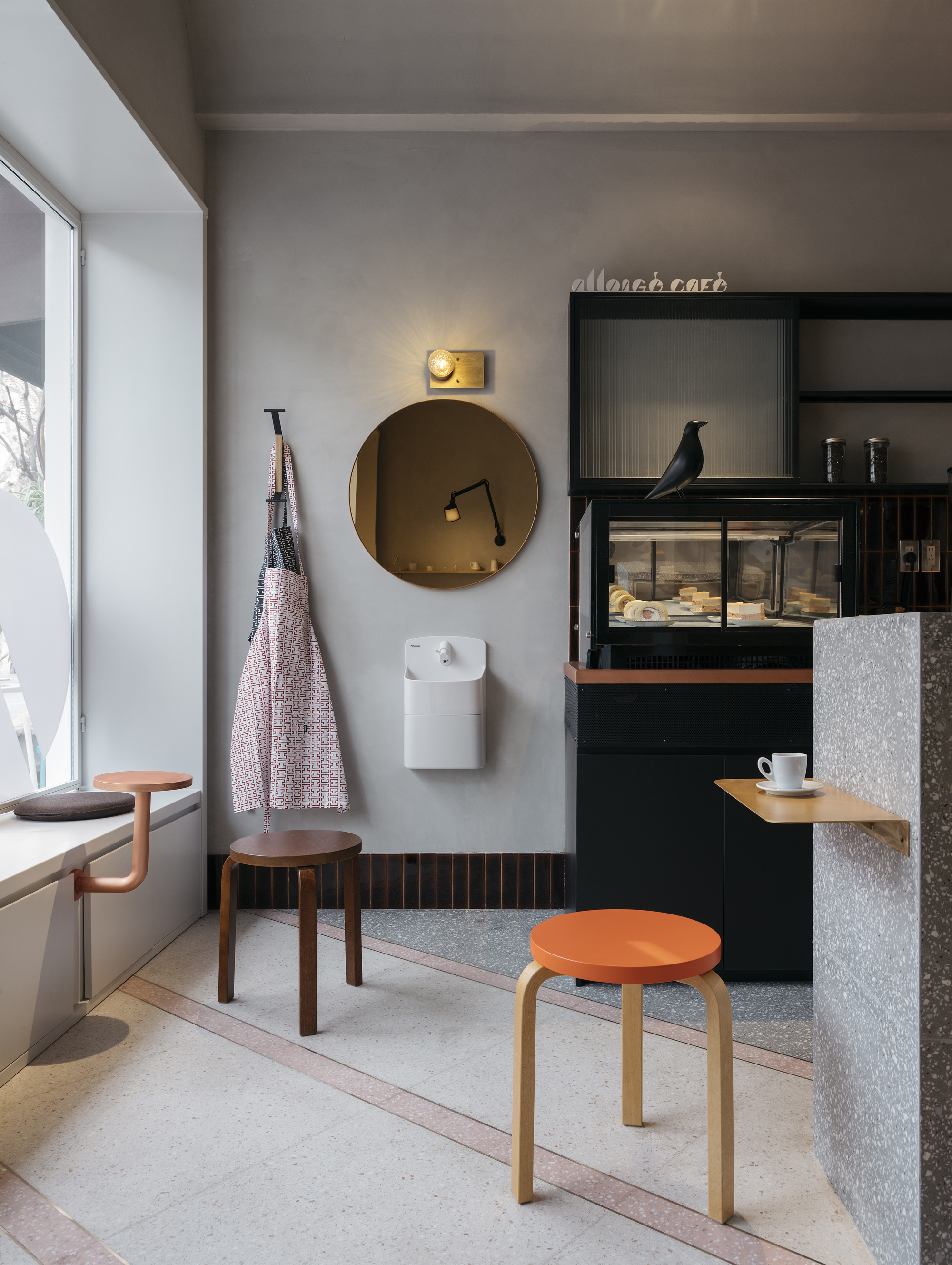
▲入口洗手区
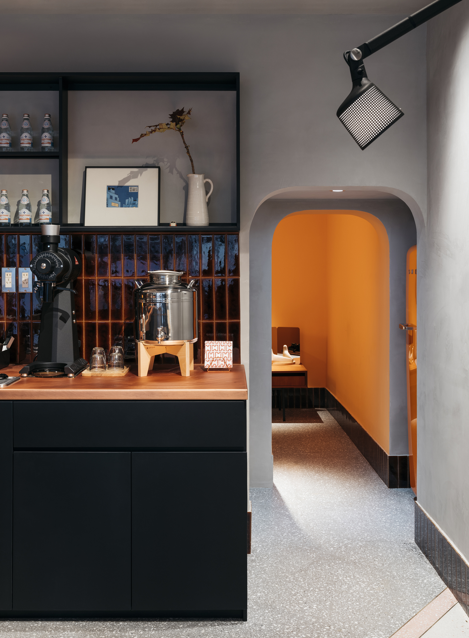
L形吧台承载所有品类的咖啡出品和糕点展示,这样的布局虽然可以被最大使用,但是太多的设备需要被安置。开始的准备工作就是整理所有设备的摆放尺寸和内嵌尺寸,安排在吧台的位置根据咖啡师具体操作流程的顺序区分干区和湿区,几次沟通下来水槽被安排在转角的位置才可以兼顾意式咖啡和手冲区块使用,台面的垃圾收集和粉渣槽都做隐藏式设计,在台面上只能看到洞口。
The L-shape counter can be used for serving coffee and dessert display. In this way, the function of the counter can be maximized. However, the cafe has many equipment that need to be accommodated. Therefore, we started with measuring all equipment dimensions for both placing outside and insertion, and then arrange them in the counter area. Based on the coffee making process, the kitchen needs to be divided into wet area and dry area. After discussion, we decided to the best place for the sink is at the corner of the L-shape counter, where the barista can easily access it no matter whether they are making espresso or pour-over. Trash can and coffee grounds can are hidden under the counter. They are not visible from outside except the two holes on the surface of the counter.

▲中岛
中岛被赋予多重功能,收纳,,收银,接待,外带打包等…,原先内部的小厨房作为小包厢来使用,由于整个店铺的空间不大可以增加就餐的座位。另外设计师尝试不同场景下的多种座位布置方式,让小包厢通过座椅的调整最多同时容纳六个人,在飘窗部分设计可以折叠打开的窗户,合适的天气就打开窗户就可以转变成户外使用的座椅。
The middle island can serve for multiple purposes, including storage, reception, cashier, and packing. To maximize the number of the seats that can be placed in the cafe, the little kitchen in the back from the old store is repurposed as a private booth. We tested different ideas of arranging the seats for various scenarios and make it possible for the booth to reach the capacity of accommodating six people. In addition, the glasses for the bay window can fold when they are open, converting the seats by the window into outdoor seats.
▲过道
没有独立的储藏间,设计师通过两种方式解决,第一种就近分类收纳,根据收纳工具的大小设计单独存放工具的抽屉;过道部分设置隐形柜门作为洗杂工具的收纳;两台冰箱配合需要冷藏的材料分类存放。展示型收纳,将日常使用的器具以展示的方式收纳在吧台上方的铁质挂柜和桦木层板上。另外小包厢的铝制茶几,其实是德国产户外车载防水收纳箱。
We created two solutions to the problem of lacking storage room. 1) creating storage space by category. We designed drawers for tools of all sizes and storage in the hallway for cleaning supplies. The two fridges store different stocks. Instead of putting the coffee making tools away in a drawer, they are stored in the metal cabin or birch shelves on the wall as display. The aluminum coffee table is German water-proof outdoor storage that can be used as extra storage space.

▲拱形通道与橙色冰箱
所有的事物,缩小比放大更令人满意,小空间具备让人亲和的感受,更容易产生人情味。希望穿过矮矮的门洞进入小屋的每个人都惊讶的说“哇!好小啊!“,其实缩小也是一种美学方式。内部选择橙色空间带着一种偶然性,就像之前选购的黄色冰箱出现情况被意外卖掉一样,才有现在橙色的小房间和橙色冰箱这样默契的搭配。这个时候设计师能做的就是让它更合理与完整,因为本身就是个橙色爱好者,顶面和门洞侧边都要是橙色的,还需要一个橙色的顶灯和橙色椅面的Stool 60,偏差到极致也一定有人喜欢。
Small space is always more cozy and intimate. We expect everyone who enters the private booth through the arched doorway would get surprised and say “wow, it’s so cute!” In fact making things smaller is an aesthetic technique. The orange color of the wall was unplanned, just because the original choice of a yellow fridge was sold out and we have to go with the orange fridge. The color of the booth therefore naturally becomes orange to match the fridge color. We love the color of orange, so we decided to paint the ceiling and sides of the doorway in orange. There is going to be an orange ceiling light and an orange top Stool 60 to jazz the space up. This departure from tradition and conservativeness should attract certain people.

▲从包间看向外部空间
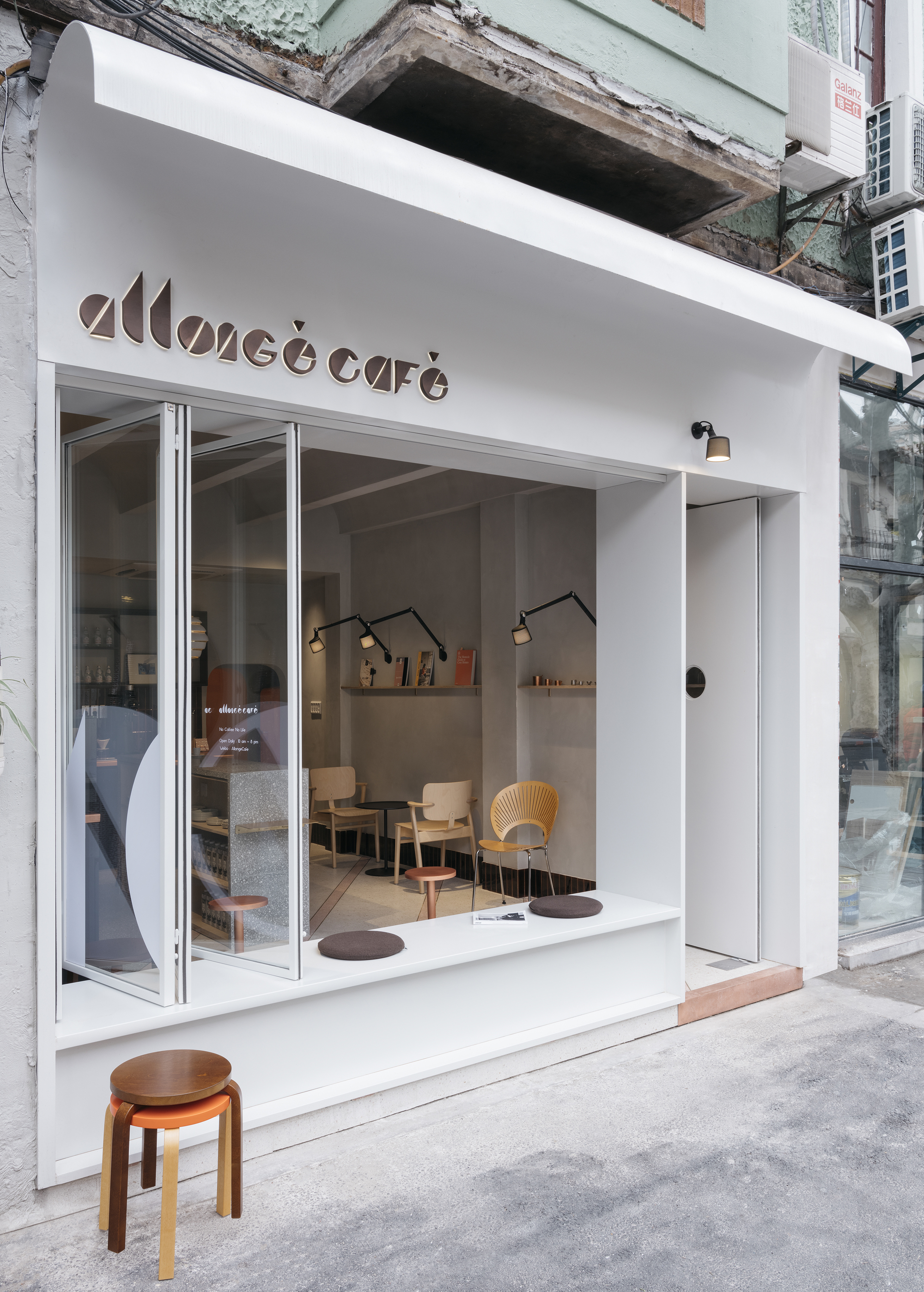
整个店铺的外立面设计是采用嵌入式设计,原先的构想是制作好后,运输到现场整体安装,但实际执行由于运输和安装的关系被拆解成三个独立的部分,弧形的雨棚门头;飘窗和竖向支撑框;门和折叠窗。嵌入式设计可以限度保留那些纪录性的部分,也是与老建筑共处的一种边界处理。
The facade of the coffee shop is Embedded design。The original plan was to transport and install the whole facade, but the actual transportation forced us to dissemble it into three parts –– the arched sign that also acts as a rain shelter, bay window and frames, front door and the folding window. mosaic texture can preserve the history of the old building and create a harmonic relationship.
▲从外面看向室内
手冲咖啡的想象空间,设计师想把手冲咖啡制作过程中的记忆切片悄悄的放到空间里。冲泡水滴的状态,咖啡滤杯的孔,玻璃圆柱状的分享杯,咖啡豆被磨成粉的颜色,当这些切片对应到店铺设计不同的部分。门头的logo上的倒三角形是法语中的符号也是冲泡时水滴的样子。门上的大猫眼是滤杯的孔的隐喻,进去的身影仿佛一个个咖啡粉末颗粒,到过的客人才是咖啡空间里不同的风味。顶面和门头的弧形其实是看不见的玻璃杯负形,只是真的太透明了而已。其实这里Bug,本来两个弧形的门洞也是半圆的,考虑到高度很容易碰头才调整成两边圆角处理。操作吧台背后的咖啡色瓷砖和踢脚瓷砖,虽然踢脚线在建筑范畴中不是那么纯粹的存在,但是真的可以使这样的空间更耐用一些,建筑师西扎在他的建筑还一直保留墙裙的设计,有时耐用的处理与生活更接近一些。
We hope the space can convey the beauty of coffee making through little details –– the shape of a drop, the hole in a coffee dripper, the shape of a sharing glass and the color of grounded coffee. And these details are transformed into tangible design throughout the space. The reverse triangle in the “Allonge” logo is the accent in French and also a drop of water when brewing coffee. The big peak hole on the front door represents the dripper –– every guest who goes through the “dripper” are like coffee beans going through grinder, beginning to release aroma and possess unique flavors. The arches in the ceiling and for the shop sign are negative space of a sharing glass, and a very clear one. One regret here is that the arched doorway should have been round. Considering the height could bump people’s heads, the arch is eventually shaped rectangular with round corners. The tiles and tile skirting for the kitchen wall are in coffee color. Although skirting is optional, it can add durability to the space. Architect Alvaro Siza keeps skirting in many of his designs because design should be as practical as beautiful.
▲入口
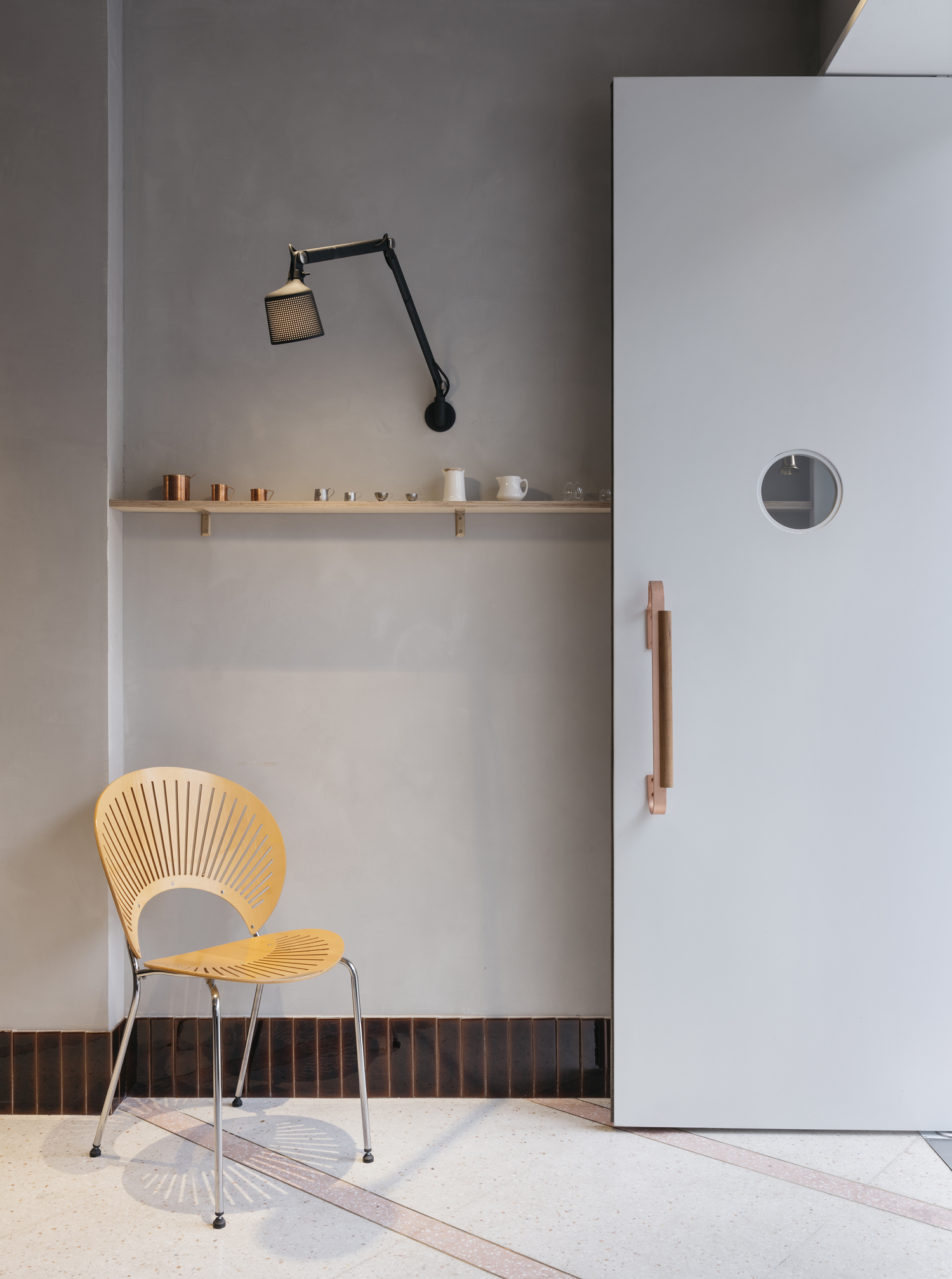
细节的设计,店铺主体空间地面的材质拼接是模拟太阳照射进来的视觉感受,让日照时间不长的内部空间增添暖意。入口地面的红铜踏面防止地面铺贴的材质出现磕边破损而设计的,大门上的拉手是不是很熟悉,但是尺寸和细节已经按实际的使用调整,使用多种款式的开关,随着使用时间久了,你一眼就能认出哪个开关是对应哪一路灯,迷你的黄铜支架为项目特意定制,小小的支架窄窄的桦木板陈列上器皿和杂志很协调。
There are more details. the flooring design is trying to imitate the sunshine coming through the window, adding warmness to the space that lacks lighting. Copper flooring was used to prevent wear and tear in the flooring material. The copper handle on the front door looks familiar, doesn’t it? The size and details are adjusted to its functionality. We used various types of light switches to control lighting so that one can spot the right one immediately after you get familiar with the switches. The brass support brackets are customized for the narrow birch wood shelf –– where magazines and coffee cups makers can find a perfect home.

▲靠墙对座
经典设计家具的选择是个人喜好选择,更是理念认同的选择。Artek贯穿了芬兰自然元素的家具,对于那个时代是艺术和技术的最好的结合。选用了橙色和胡桃木色的Stool 60,是阿尔瓦•阿图(Alvar Aalto)最经典的作品。另外还选用了原木色的Domus Chair ,它是芬兰第二设计大师依马里•塔皮奥瓦拉(Ilmari Tapiovaara)的作品。中岛的吊灯选择的是A331“Beehive“是阿尔瓦•阿图最广泛被认可的灯具设计,点亮后会产生温暖、弥漫的光线,最初是为芬兰的耶夫斯基莱大学于设计的。过道层板上的壁灯和开门扶手上方的壁灯是vipp 的产品,同样是一款光线柔和的灯具,这样的选择更偏向个人喜好一些。另外还选择两个经典的设计师vintage家具,橙色小屋里有抽屉和桌子的长椅是夏洛特•贝里安(Charlotte Perriand)的作品和门口摆放的是南娜·迪策尔(Nanna Ditzel)设计的扇形单椅(trinidad chair),还有中岛前面很应景的咖啡豆吧椅Pirkka Bar Stool。
Choosing classic furniture is not just an aesthetic preference, but also a reflection of life philosophy. Artek is an exemplary Finish style furniture brand that speaks to the best craftsmanship and artistic creation. We picked one of the most classic design by Alvar Aalto –– pecan and orange Stool60, and wood DomusChair –– a masterpiece by Ilmari Tapiovaara. Above the middle island hangs the well accepted A331 “Beehive” light by Alvar Aalto. The lighting was originally designed as a decor for the University of Jyvaskyla. When turned on, the diffused light will create a warm atmosphere. The wall lamps used for the doorway and hallway come from Vipp, which also will create gentle light –– this is more of a personal preference of the client. Last but not least, the bench and the attached drawer in the private booth come from Charlotte Perriand. The trinidad chair by the front door is a design of Nanna Ditzel, and the Pirkka Bar stool by the middle island has a coffee bean inspired top.
▲靠窗卡座
当上海冬日的阳光透过玻璃窗打在门口的椅子上,灰色的墙面上就是出现序列整齐的光影,随着时间推移光线,图案也会慢慢的被拉长然后再渐渐消失,这是allonge café的咖啡时光,如同咖啡的味蕾产生到结束。
When the sun shines through the window and sheds light on chairs by the door during winter time in Shanghai, it casts well spaced shadows on the grey wall. As the sun is setting, the shapes on the wall are stretched long and fading into oblivion. It is like drinking coffee at Allonge Cafe –– you will get the brightest flavor at the first sip and the feeling will endure to the last drop.
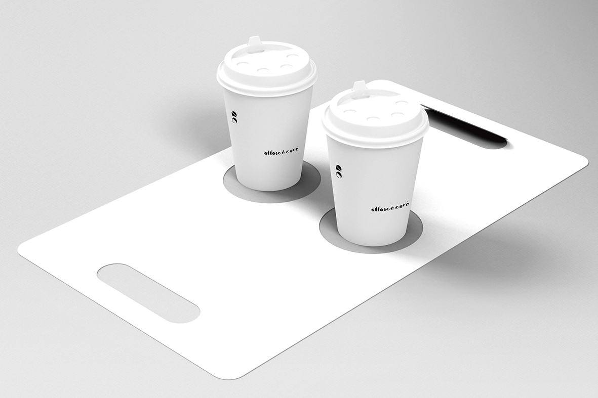
▲外带设计
有计划的部分和偶然的部分,有碰撞与认同的部分,还有一直在进步的部分和可以继续拓展的部分,但是这些部分都不是所有的部分。所有的部分是指这些部分加上时间的状态,是在空间里游走的身体感受和正在空间里发生的存在。
The whole project is filled with moments –– the planned and unexpected, conflicting ideas and consensus. We have seen progress and envisioned potential improvement. However, they are not all the moments that can happen in this space. The space is an existence. It wouldn’t complete without the time that’s passing by in here, the feeling connected to the design and whatever happens in this space.

▲VI设计
项目信息——
项目名称:Allongé café
平面设计:周洪
项目拍摄:稳摄影
家具供应:Enjoyspace家具
标识制作:良良广告
道具制作:卓尔道具
项目地点:上海延庆路106号
项目规模:室内面积33平方
完工时间: 2019年1月
项目类型:精品咖啡
主要材料:水磨石\手工砖\铁艺金属 \红铜\手刮漆


